* {
	box-sizing: border-box;
}
html,
body {
	height: 100%;
	overflow: hidden;
}
body {
	display: flex;
	flex-direction: row;
	flex-wrap: wrap;
	justify-content: center;
	align-items: center;
	margin: 0;
	background: #000;

	font-size: calc(var(--_size) * 0.01);
	--_size: min(min(600px, 50vh), 50vw);
	--base-clr: #b7b5b4;
	--degofrot: 0.8;
}

.bell-container {
	width: 80em;
	height: 80em;
	opacity: 1;
	cursor: pointer;

	transform-origin: 50% -50vh;
	animation: 5s ease-in-out infinite bell;
}
@keyframes bell {
	0% {
		rotate: calc(1deg * var(--degofrot));
	}
	50% {
		rotate: calc(-1deg * var(--degofrot));
	}
	100% {
		rotate: calc(1deg * var(--degofrot));
	}
}

* {
	transition: filter 0.4s ease-in-out, box-shadow 0.4s ease-in-out,
		opacity 0.4s ease-in-out, color 0.4s ease-in-out, background 0.4s ease-in-out,
		text-shadow 0.4s ease-in-out;
}

*::before,
*::after {
	transition: filter 0.4s ease-in-out, box-shadow 0.4s ease-in-out,
		opacity 0.4s ease-in-out, color 0.4s ease-in-out, background 0.4s ease-in-out,
		text-shadow 0.4s ease-in-out;
}

.bell-container,
.bell-container * {
	position: absolute;
	left: 0;
	right: 0;
	top: 0;
	bottom: 0;
	margin: auto;
}

.rope {
	height: 50vh;
	width: 2em;
	translate: 0 -52%;
	background: linear-gradient(90deg, #2d54744d 0%, #000b 30%, transparent 100%),
		repeating-linear-gradient(-70deg, #252525, #888 2%, #3a3a3a 3%);
}

.bell-top {
	width: 14%;
	height: 14%;
	border-radius: 50%;
	translate: 0 -28em;
	background: var(--base-clr);
	box-shadow: inset -1em -0.5em 2em 0.5em #fff, inset 1em -1em 2em 3em #000,
		0 -0.1em 0.4em 0.3em #c6eaffa8;
}

.bell-base {
	width: 50%;
	height: 50%;
	border-radius: 50%;
	translate: 0 -24%;
	background: var(--base-clr);
	box-shadow: 0 -0.1em 0.4em 0.2em #c6eaffa8;
}
.bell-base:before {
	content: "";
	background-image: radial-gradient(
		circle at -80% -12%,
		transparent 50em,
		var(--base-clr) 50em
	);
	position: absolute;
	translate: -18em 20em;
	width: 100%;
	height: 80%;
}
.bell-base:after {
	content: "";
	background-image: radial-gradient(
		circle at -80% -12%,
		transparent 50.1em,
		#cacaca 50.3em,
		var(--base-clr) 50.5em
	);
	position: absolute;
	translate: 18em 20em;
	width: 100%;
	height: 80%;
	transform: rotateY(180deg);
}
.bell-base:nth-child(2) {
	filter: brightness(3) blur(1em);
	scale: 0.74 0.84;
	translate: 0em -11em;
}
.shadow-l1 {
	width: 30em;
	height: 42em;
	border-radius: 50%;
	rotate: 12deg;
	translate: -3em -6em;
	filter: blur(2em);
	background: #797a80;
}
.shadow-l2 {
	width: 130%;
	height: 90%;
	filter: blur(5em);
	translate: -6em 9em;
}
.shadow-l2::before {
	display: block;
	content: "";
	width: 68%;
	height: 64%;
	border-radius: 50%;
	rotate: -54deg;
	translate: -8em 2em;
	scale: 1;
	background: red;
	background: #000000;
}
.glow {
	width: 100%;
	height: 100%;
	filter: brightness(2) blur(2em);
}
.glow::before {
	clip-path: polygon(
		9% 83%,
		12% 79%,
		15% 74%,
		18% 68%,
		20% 62%,
		22% 56%,
		23% 50%,
		24% 43%,
		25% 38%,
		25% 34%,
		26% 29%,
		26% 26%,
		27% 22%,
		29% 19%,
		30% 15%,
		32% 13%,
		34% 10%,
		37% 7%,
		41% 5%,
		44% 4%,
		47% 3%,
		51% 3%,
		55% 3%,
		58% 5%,
		62% 6%,
		73% 29%,
		72% 25%,
		70% 20%,
		67% 16%,
		63% 12%,
		60% 9%,
		58% 8%,
		55% 7%,
		52% 6%,
		48% 6%,
		44% 8%,
		41% 9%,
		37% 12%,
		36% 14%,
		33% 16%,
		31% 20%,
		30% 23%,
		29% 26%,
		28% 31%,
		27% 36%,
		27% 39%,
		26% 44%,
		26% 48%,
		26% 52%,
		25% 56%,
		23% 61%,
		22% 65%,
		21% 69%,
		19% 72%,
		17% 75%,
		15% 78%,
		13% 81%
	);
	width: 100%;
	height: 80%;
	translate: 0 6em;
	scale: 0.94 0.94;
	background: #fff3;
	display: block;
	content: "";
}
.glow2 {
	width: 100%;
	height: 100%;
	filter: brightness(1) blur(0.3em);
	opacity: 0.1;
}
.glow2::before {
	clip-path: polygon(
		9.21% 83%,
		12.28% 79%,
		15.35% 74%,
		18.41% 68%,
		20.46% 62%,
		22.51% 56%,
		23.53% 50%,
		24.55% 43%,
		25.58% 34%,
		26.6% 29%,
		27.62% 22%,
		29.16% 18.5%,
		30.95% 15.75%,
		32.74% 13%,
		34.78% 10%,
		37.85% 7%,
		41.94% 5%,
		45.01% 4%,
		48.08% 3%,
		52.17% 3%,
		56.27% 3%,
		64.01% 6.36%,
		55.75% 4.5%,
		47.83% 4.75%,
		42.84% 5.88%,
		39.51% 7.88%,
		36.45% 10.38%,
		33.38% 14.88%,
		30.69% 19%,
		29.67% 22.5%,
		28.8% 26.72%,
		28.21% 31.36%,
		26.92% 38.44%,
		26.57% 43.67%,
		25.51% 48.34%,
		25% 54.34%,
		23.4% 60.69%,
		21.23% 65.38%,
		18.41% 71.5%,
		16.88% 74.75%,
		12.28% 80.5%
	);
	width: 100%;
	height: 84%;
	translate: -1em 8.4em;
	scale: 1;
	background: #fff3;
	display: block;
	content: "";
}
.left-glow {
	--lgc: #5d819666;
	width: 50%;
	height: 50%;
	border-radius: 50%;
	translate: 0 -24%;
	background: transparent;
	box-shadow: inset 1em 0em 1em 0.2em var(--lgc);
	clip-path: polygon(0 0, 100% 0, 100% 50%, 0 50%);
}
.left-glow2 {
	--lgc2: #5d819666;
	width: 49%;
	height: 50%;
	background-image: radial-gradient(
		circle at -80% -12%,
		transparent 50em,
		var(--lgc2) 50.3em,
		transparent 52em
	);
	position: absolute;
	translate: -19em 10.35em;
	clip-path: polygon(0 0, 100% 0, 100% 78%, 0 78%);
}
.r-glow {
	--lgc: #fffaf680;
	width: 50%;
	height: 50%;
	border-radius: 50%;
	translate: 0 -24%;
	background: transparent;
	box-shadow: inset 1em 0em 1em 0.2em var(--lgc);
	clip-path: polygon(0 0, 100% 0, 100% 50%, 0 50%);
	transform: rotateY(180deg);
}
.r-glow2 {
	--lgc2: #fffaf680;
	width: 49%;
	height: 50%;
	background-image: radial-gradient(
		circle at -80% -12%,
		transparent 50em,
		var(--lgc2) 50.3em,
		transparent 52em
	);
	position: absolute;
	translate: 18.2em 10.35em;
	clip-path: polygon(0 0, 100% 0, 100% 78%, 0 78%);
	transform: rotateY(180deg) rotateZ(-2deg);
}
.mid-ring.small {
	translate: 0.04em -8em;
	scale: 0.8 0.5;
}
.mid-ring {
	width: 64%;
	height: 10%;
	border-radius: 50%;
	translate: -0.1em 10em;
	box-shadow: inset -0.3em 1.3em 0.4em -1em #fff5,
		-0.2em -1.2em 0.4em -0.4em #505050, -0.1em -1.8em 0.4em -0.4em #fff5,
		0 -2.5em 0.4em -1em #000000;
	mix-blend-mode: hard-light;
	filter: brightness(0.8);
}
.mid-ring::before,
.mid-ring::after {
	content: "";
	display: block;
	background: #000;
	width: 2em;
	height: 2em;
	top: 10%;
	border-radius: 50%;
	position: absolute;
}
.mid-ring::after {
	right: -2%;
}
.mid-ring::before {
	left: -2%;
}
.bell-buff-t {
	background: #fff2;
	width: 72%;
	height: 12%;
	border-radius: 50%;
	translate: 0 16em;
	filter: blur(1em);
}
.bell-buff {
	background: linear-gradient(90deg, black 40%, var(--base-clr) 90%);
	width: 88%;
	height: 20%;
	border-radius: 50% 50% 50% 50% / 50% 50% 30% 30%;
	translate: 0 20em;
	box-shadow: inset 1em 0 2em -1em #5d819666, inset -1em 0 2em -1em #fff;
}
.bell-btm {
	width: 88%;
	height: 18%;
	border-radius: 50%;
	translate: 0 23em;
	background: linear-gradient(90deg, black 40%, var(--base-clr) 90%);
}
.bell-btm2 {
	width: 74%;
	height: 12%;
	border-radius: 50%;
	translate: 0 24em;
	background: #fffff6;
	box-shadow: 0 0 1em 0.6em #ffe9d4, -0.8em 0.2em 2em 1em #cca37f,
		-5.4em -0.6em 3em -1em #ce6e1abb, 6em -0.6em 3em -1em #ce6e1abb,
		inset 0em 30.3em 0.3em -30em #c7962d, inset 0 -2em 2em -2em #ffe9d4,
		inset 0em -1em 2em 1em #ce6e1a66;
	filter: brightness(1);
}
.off .bell-btm2 {
	filter: brightness(0.02);
}
.bell-ring-container {
	width: 74%;
	height: 24%;
	border-radius: 50% 50% 50% 50% / 25% 25% 0% 0%;
	translate: 0 29.2em;
	overflow: hidden;
}
.bell-ring {
	width: 12em;
	height: 12em;
	background: #fff;
	border-radius: 50%;
	translate: 0 -6em;
	box-shadow: 0 0.8em 1em -0.3em #f8e1d0, inset 0 -6em 4em -4em #e3b695,
		inset 0 1em 3em 1em #fff4, inset 0 2em 3em 1em #fff,
		inset 0 100em 0 100em #2c2c2c;
}
.off .bell-ring {
	background: #000;
	box-shadow: 0 0.8em 1em -0.3em #f8e1d000, inset 0 -6em 4em -4em #e3b69500,
		inset 0 1em 3em 1em #fff0, inset 0 -2em 3em 1em #fff2,
		inset 0 100em 0 100em #000;
}

.bell-rays {
	mix-blend-mode: soft-light;
	box-shadow: inset 0 -21em 4em -20em #000;
	width: 100%;
	height: 140%;
	translate: 0 -4em;
	border-radius: 50%;
}
.bell-rays::before {
	content: "";
	display: block;
	width: 100em;
	height: 100em;
	transform-origin: 50% 50%;
	position: absolute;
	left: -21em;
	top: -77em;
	border-radius: 100%;
	filter: blur(0.6em);
	background: repeating-conic-gradient(
		at 50% 50%,
		#fff2 0%,
		transparent 0.6%,
		#fff2 0.8%
	);
	animation: radiate 1s linear infinite;
}
.off .bell-rays {
	opacity: 0;
}
@keyframes radiate {
	0% {
		rotate: 0deg;
	}
	100% {
		rotate: 6deg;
	}
}

.volumetric {
	width: 98%;
	height: 224%;
	translate: 0 124em;
	opacity: 0.2;
}
.volumetric .vl {
	width: 100%;
	height: 100%;
	transform-origin: 50% 20em;
	rotate: 22deg;
	box-shadow: inset 40em 0 20em -20em #fff1;
}
.volumetric .vr {
	width: 100%;
	height: 100%;
	transform-origin: 50% 20em;
	rotate: -22deg;
	box-shadow: inset -40em 0 20em -20em #fff1;
}
.off .volumetric {
	opacity: 0;
}

.grain {
	z-index: 10;
	position: absolute;
	pointer-events: none;
	width: 100%;
	height: 100%;
	top: 0;
	bottom: 0;
	margin: auto;
	background: radial-gradient(circle at 50% 50%, #000, #0000),
		url("data:image/svg+xml,%3Csvg viewBox='0 0 600 600' xmlns='http://www.w3.org/2000/svg'%3E%3Cfilter id='noiseFilter'%3E%3CfeTurbulence type='fractalNoise' baseFrequency='2' numOctaves='3' stitchTiles='stitch'/%3E%3C/filter%3E%3Crect width='100%25' height='100%25' filter='url(%23noiseFilter)'/%3E%3C/svg%3E");
	filter: contrast(100%) brightness(200%) grayscale(1) opacity(0.168);
	mix-blend-mode: screen;
}

.button {
	position: relative;
	font-size: 6em;
	font-family: monospace;
	background: #000;
	top: 8em;
	width: fit-content;
	height: fit-content;
	color: #000;
	cursor: pointer;
	padding: 0.4em 1.2em;
	border-radius: 0.4em;
	text-shadow: 0 -1px 3px #fff0;
	box-shadow: inset 0 0.04em 0.06em 0 #fff, inset 0 1em 1em 0 #fff5,
		inset 0 0.2em 0.2em 0 #e3b695;
	animation: 5s ease-in-out infinite lumenbtn;
}
.button:hover {
	color: #fff;
	text-shadow: 0 -1px 3px #fff;
	transition: all 0.16s ease-in-out;
}
.button::before,
.button::after {
	content: "";
	display: block;
	width: 100%;
	height: 54%;
	position: absolute;
	top: 6em;
	left: 0;
	right: 0;
}
.button::before {
	background: #e3b695;
	scale: 2;
	z-index: -2;
	filter: blur(12px);
	border-radius: 100%;
	animation: 5s ease-in-out infinite lumen;
}
.button::after {
	background: #000c;
	z-index: -1;
	filter: blur(0.3em);
	border-radius: 30%;
}

@keyframes lumenbtn {
	0% {
		box-shadow: inset 0 0.04em 0.06em 0 #fff,
			inset calc(-0.2em * var(--degofrot)) 1em 1em 0 #fff5,
			inset calc(-0.2em * var(--degofrot)) 0.2em 0.4em 0 #e3b695;
	}
	50% {
		box-shadow: inset 0 0.04em 0.06em 0 #fff,
			inset calc(0.2em * var(--degofrot)) 1em 1em 0 #fff5,
			inset calc(0.2em * var(--degofrot)) 0.2em 0.4em 0 #e3b695;
	}
	100% {
		box-shadow: inset 0 0.04em 0.06em 0 #fff,
			inset calc(-0.2em * var(--degofrot)) 1em 1em 0 #fff5,
			inset calc(-0.2em * var(--degofrot)) 0.2em 0.4em 0 #e3b695;
	}
}
@keyframes lumen {
	0% {
		translate: calc(-0.8em * var(--degofrot));
	}
	50% {
		translate: calc(0.8em * var(--degofrot));
	}
	100% {
		translate: calc(-0.8em * var(--degofrot));
	}
}

.off + .button {
	opacity: 0;
	pointer-events: none;
}

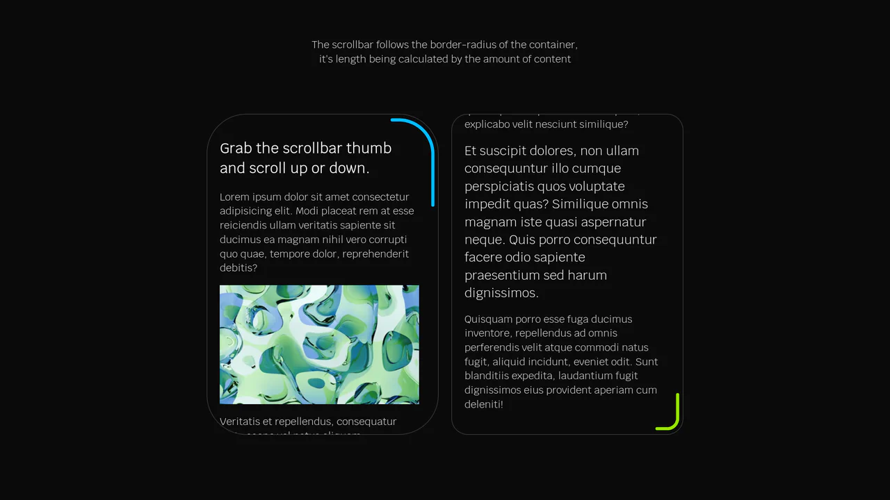
 Chrome
 Edge
Edge
 Safari
 Firefox
