5 amCharts JS Examples
Visualize data beautifully with this collection of AmCharts JS examples. From dynamic bar and pie charts to interactive maps and complex dashboards, these snippets demonstrate how to build powerful, customizable data visualizations using the AmCharts JavaScript library.
Examples
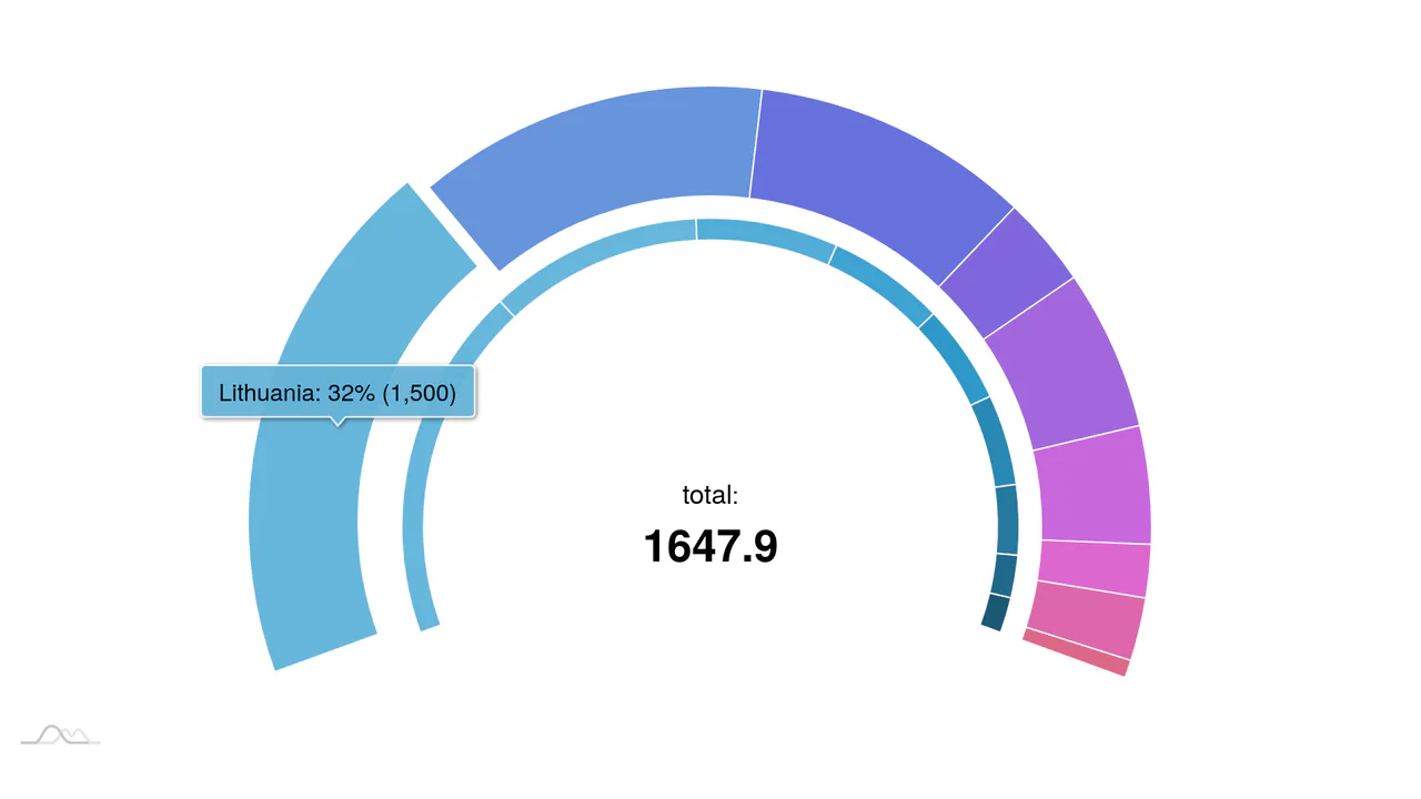
Nested Animated Doughnut Data Visualization
This component is a Nested Animated Doughnut Data Visualization built with the amCharts 4 framework. It renders two concentric data series within a single circular coordinate system. Its function is to provide a high-density comparison of related metrics, utilizing a central dynamic label to summarize the aggregate total. (Requires: amCharts 4)
 Chrome 60+
 Edge 79+
 Firefox 55+
 Safari 11+
See the Pen Nested Animated Doughnut Data Visualization.

Semicircular Animated Radar Gauge
This is a Semicircular Animated Radar Gauge built with the amCharts 4 engine. It distills complex metrics like Carbon and Energy into a high-contrast radial format that covers only 270 degrees of a circle. Its function is to provide an at-a-glance KPI status within professional data dashboards, replacing cluttered line charts with clean, weighted arcs. (Requires: amCharts 4)
Chrome 60+
Edge 79+
Firefox 55+
Safari 11+
See the Pen Semicircular Animated Radar Gauge.
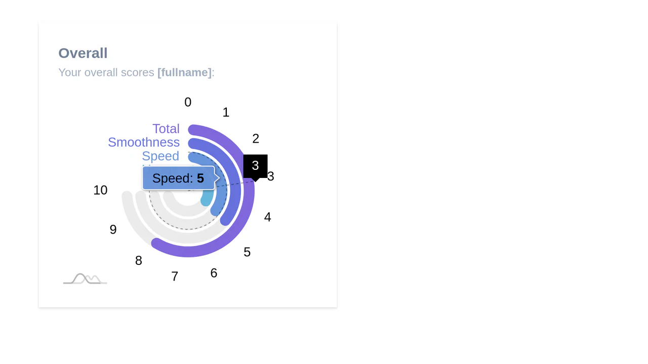
Alpine.js and Tailwind Radial Chart
A visually engaging radial bar chart widget created with amCharts 4 and styled within a Tailwind CSS card container.
See the Pen Alpine.js and Tailwind Radial Chart.

Serpentine Timeline Chart
This serpentine Gantt chart implementation leverages amCharts’ specialized SerpentineChart and CurveColumnSeries to visualize project timelines along a curved axis. JavaScript orchestrates multiple bullet types for event markers while CSS properties like strokeDasharray create the distinctive dashed guideline aesthetic, resulting in an elegant spiral timeline with interactive tooltips and smooth animations.
See the Pen Serpentine Timeline Chart.
