20+ Bootstrap Buttons
This collection offers a comprehensive overview of Bootstrap button capabilities, from basic styles to functional form components. Design variations, size management, and creating block-level buttons using grid utilities are explored. Special attention is paid to interactivity: implementing disabled/active states, toggle button groups, and integrating loading spinners. Examples also demonstrate shape customization and adding icons to enhance visual communication.
Examples
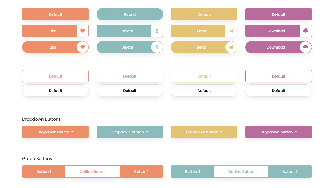
Bootstrap 5 Button with Icon
Modern pill-shaped buttons built with Bootstrap 5 flexbox utilities. A nested span creates a circular icon container, styled with rounded-5 and contrasting background colors to visually separate the graphic from the label.
See the Pen Bootstrap 5 Button with Icon.
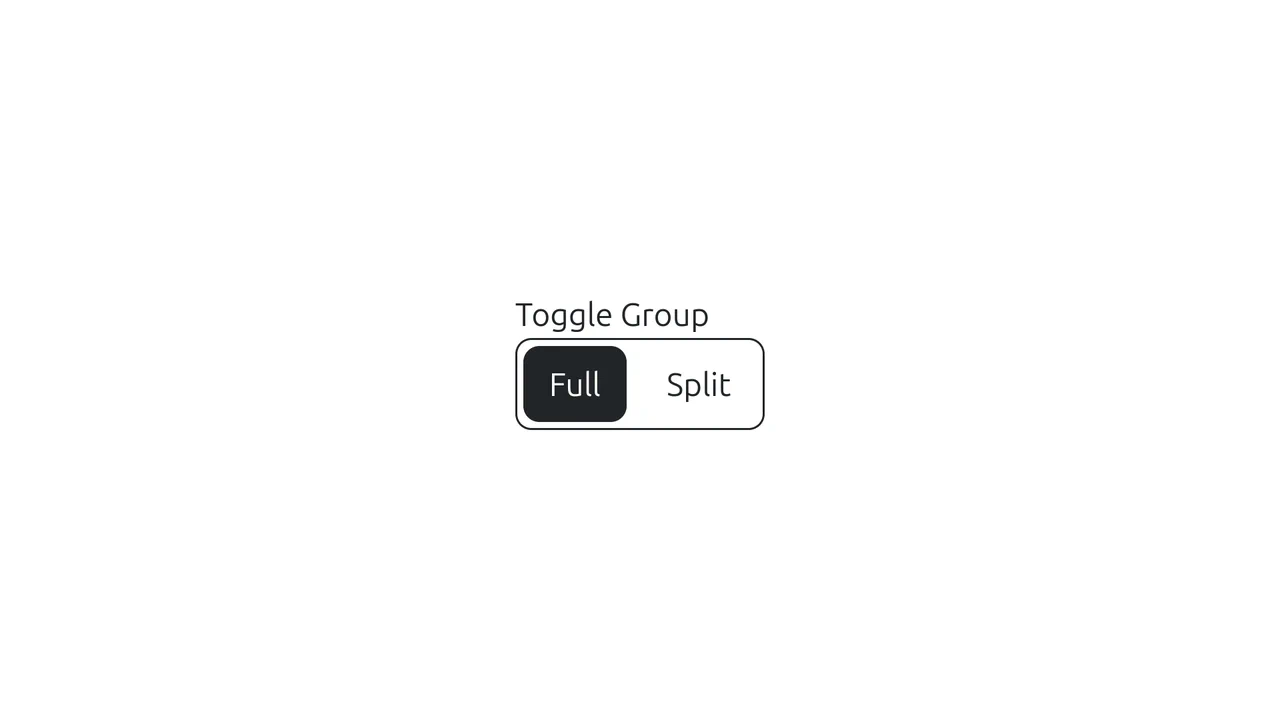
Bootstrap Button Group Toggle
A custom segmented control built on Bootstrap’s button group.
See the Pen Bootstrap Button Group Toggle.

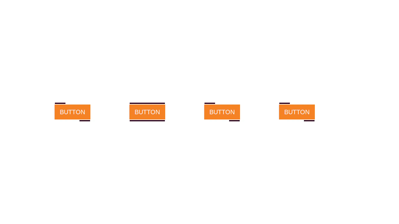
Buttons: Bootstrap 5 and vanilla-tilt.js
A visual presentation of how a basic component can be modified from a simple clickable element to a complex interactive object with a 3D parallax hover effect.
See the Pen Buttons: Bootstrap 5 and vanilla-tilt.js.

Eye-Catching Bootstrap 5 Button
A vibrant CTA button featuring a neon linear gradient and a continuous ‘shine’ animation implemented via a moving radial gradient on the ::before pseudo-element. On hover, it scales up and intensifies its colored drop-shadow for enhanced interactivity.
See the Pen Eye-Catching Bootstrap 5 Button.