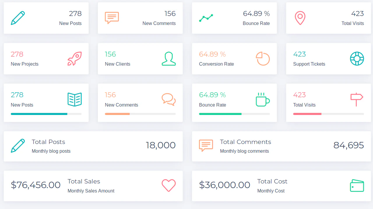
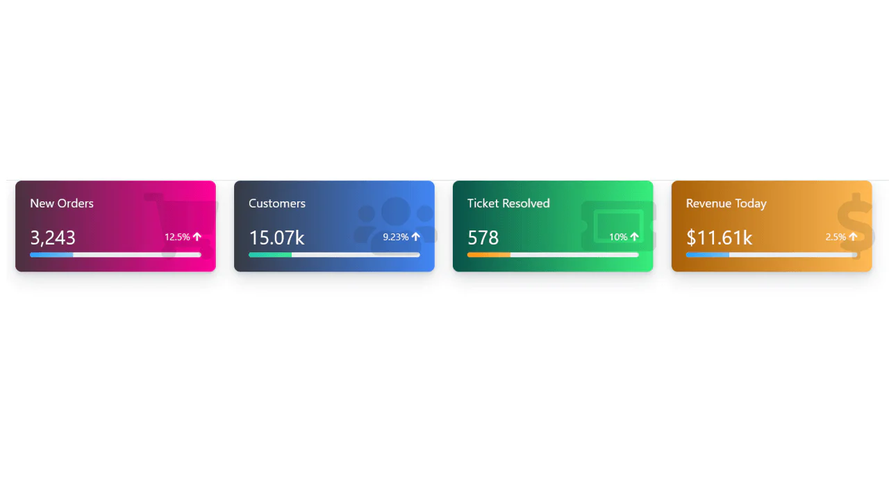
40+ Bootstrap Cards
This collection provides a comprehensive guide to using Bootstrap Cards for building modular interfaces. Component structure (header, body, footer) and media integration, such as cover images and overlays, are detailed. Special attention is paid to layout: from responsive grids with height alignment to merged card groups. Examples also cover style customization via background utilities and shadows, transforming standard containers into unique design elements.
Examples
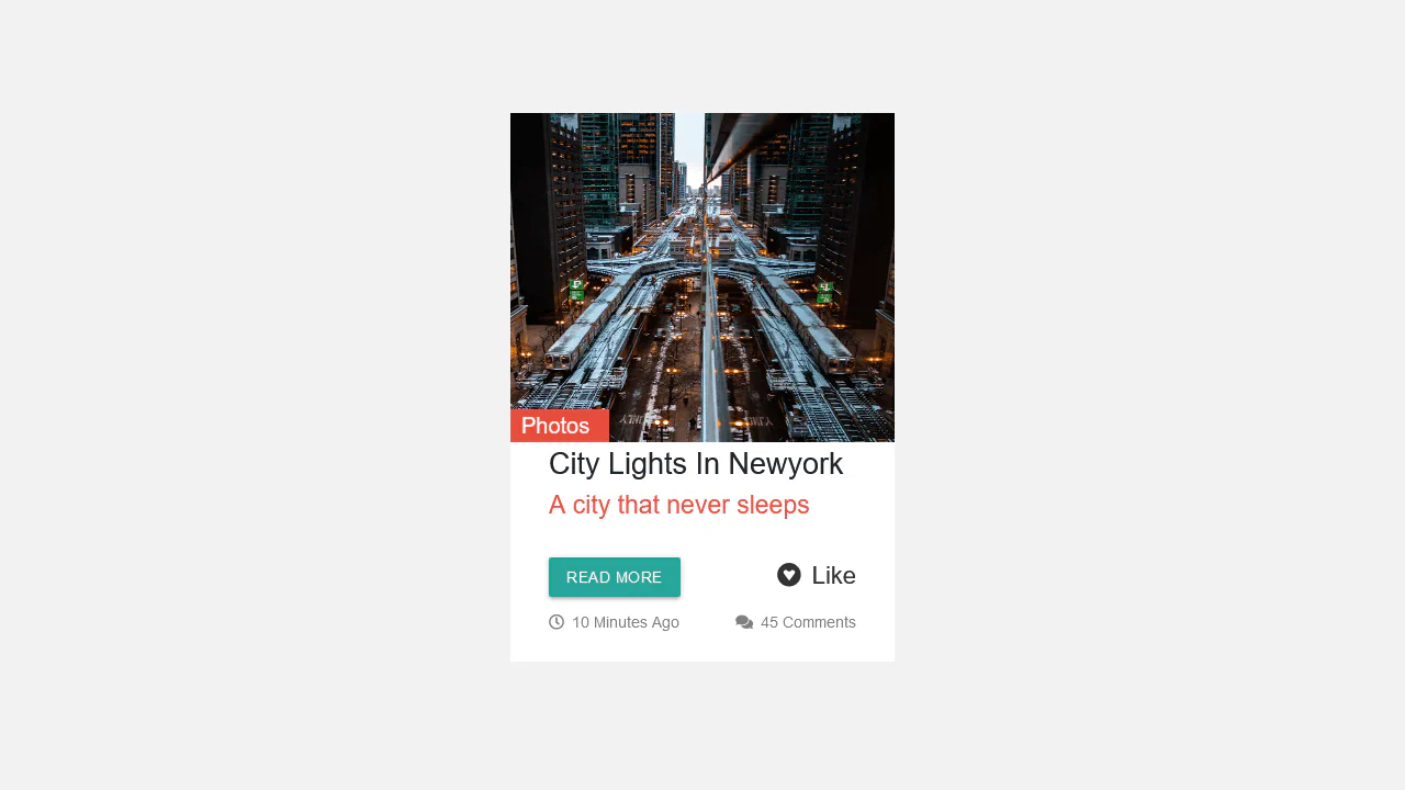
Content-Aware Cards
This is a Content-Aware Bootstrap Card. It uses the structural :has() pseudo-class to dynamically alter its internal layout, background, and typography based solely on the presence of an image node. Its function is to provide an adaptable, self-managing container that eliminates the need for redundant state-tracking classes in your JavaScript logic. (Requires: bootstrap)
 Chrome 105+
 Edge 105+
 Firefox 121+
 Safari 15.4+
See the Pen Content-Aware Cards.

CSS Scroll-Animated Accordion Vertical Timeline
This is a Scroll-Animated Bootstrap Accordion Timeline. It structures sequential data into a central vertical axis, combining visual anchor points (images) with collapsible text modules (accordions). Its function is to compress dense historical or process-oriented information into a scannable format. Nodes remain hidden until scrolled into the viewport, forcing user focus on the active temporal step. (Requires: bootstrap, font-awesome)
Chrome 115+
Edge 115+
Firefox 114+ (flag)
Safari 26+
See the Pen CSS Scroll-Animated Accordion Vertical Timeline.
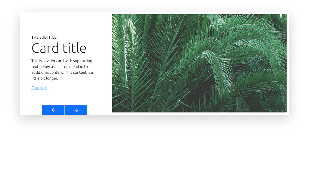
Bootstrap 5 Card Carousel Animation
A custom card carousel featuring staggered entrance animations where images slide in horizontally while text rises vertically.
See the Pen Bootstrap 5 Card Carousel Animation.
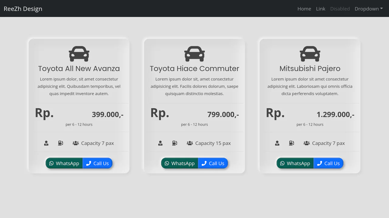
Bootstrap 5 Card for Car Rental Website
A Bootstrap 5 car rental card designed in a Neumorphic (Soft UI) style using complex SCSS box-shadows.
See the Pen Bootstrap 5 Card for Car Rental Website.

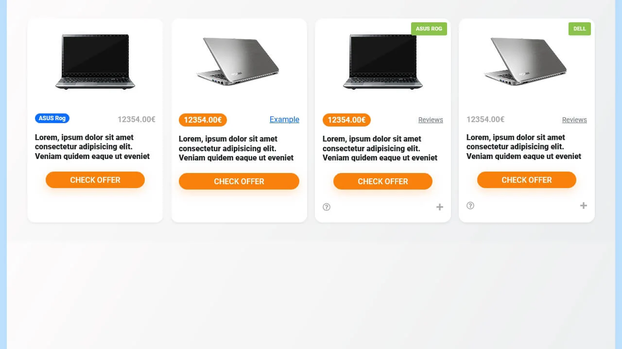
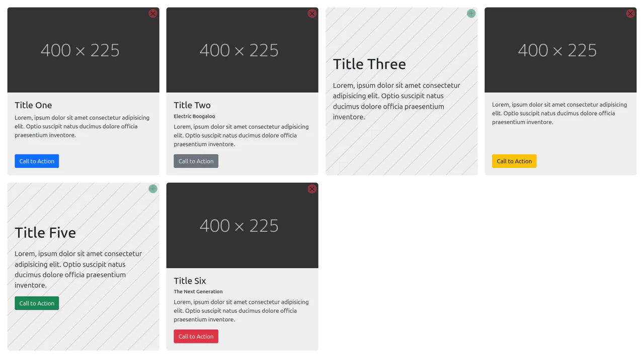
Bootstrap 5 E-commerce Product Listing Card
A clean, professional shop interface where the static grid comes alive on interaction, offering purchasing tools through smooth micro-animations.
See the Pen Bootstrap 5 E-commerce Product Listing Card.
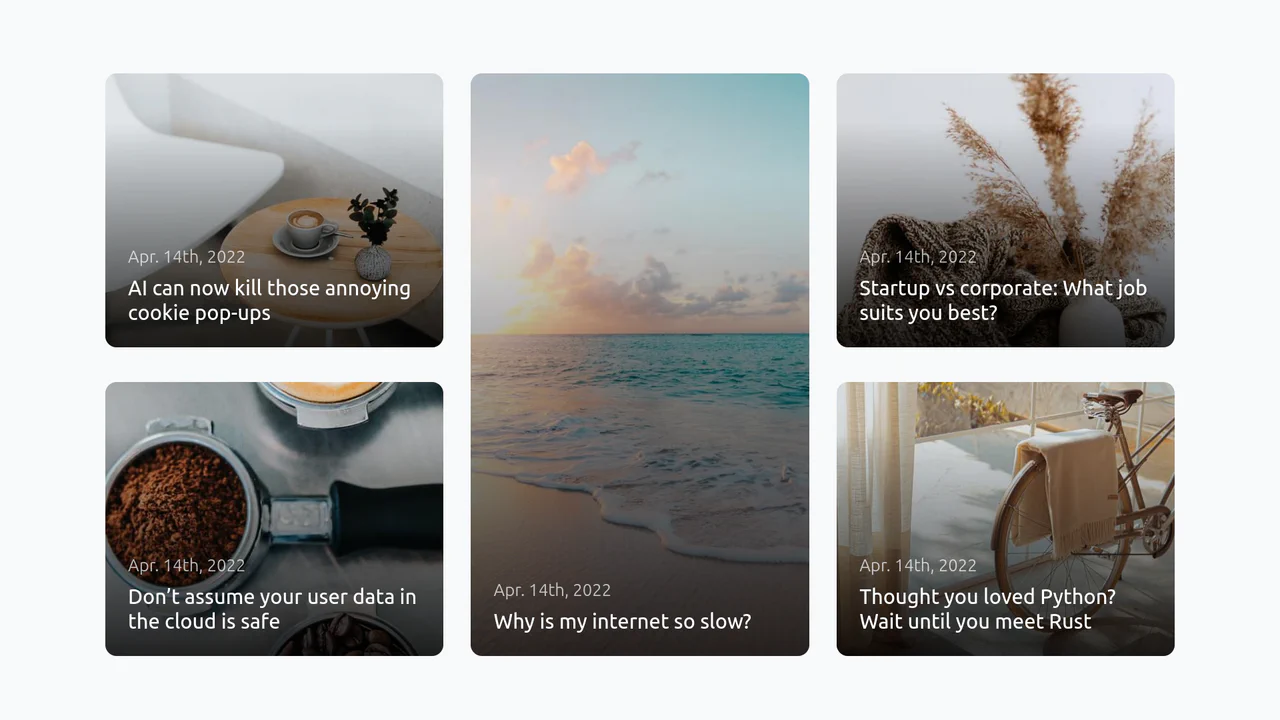
Bootstrap 5 Gallery Grid
A responsive magazine-style blog grid featuring a central vertical highlight flanked by stacked horizontal posts. It utilizes CSS gradients via pseudo-elements for text readability over images.
See the Pen Bootstrap 5 Gallery Grid.

Bootstrap 5 Gift Card with Mix Blend Mode
A luxurious, festive digital card that looks expensive and appealing, utilizing complex gradients, textures, and exquisite fonts.
See the Pen Bootstrap 5 Gift Card with Mix Blend Mode.
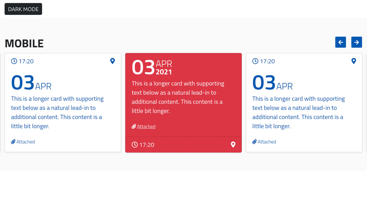
Bootstrap 5 Mobile Card Slider with Swiper.js and Dark Mode
A fully functional agenda widget that beautifully presents events in a carousel format while offering user control over the theme.
Bootstrap 5 Nice Box-Shadow Hover
A playful, airy card with a sense of depth and tactility, where UI elements smoothly react to the cursor.
See the Pen Bootstrap 5 Nice Box-Shadow Hover.
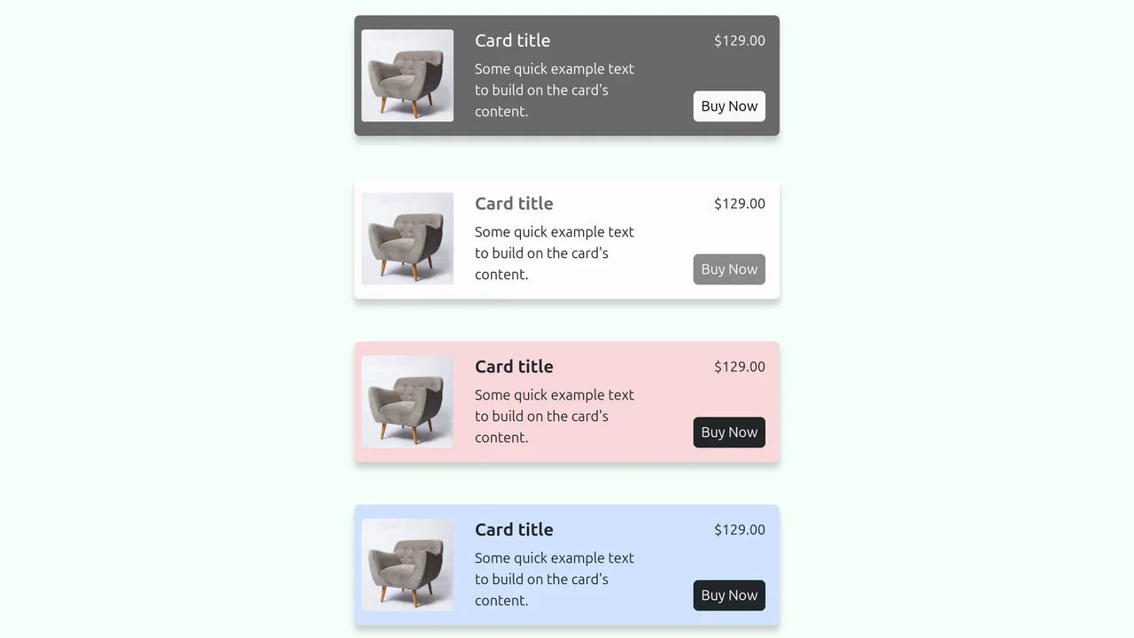
Bootstrap 5 Product Card
A neat, structured product list with clear separation of information and actions, easily adaptable to any brand color theme.
See the Pen Bootstrap 5 Product Card.

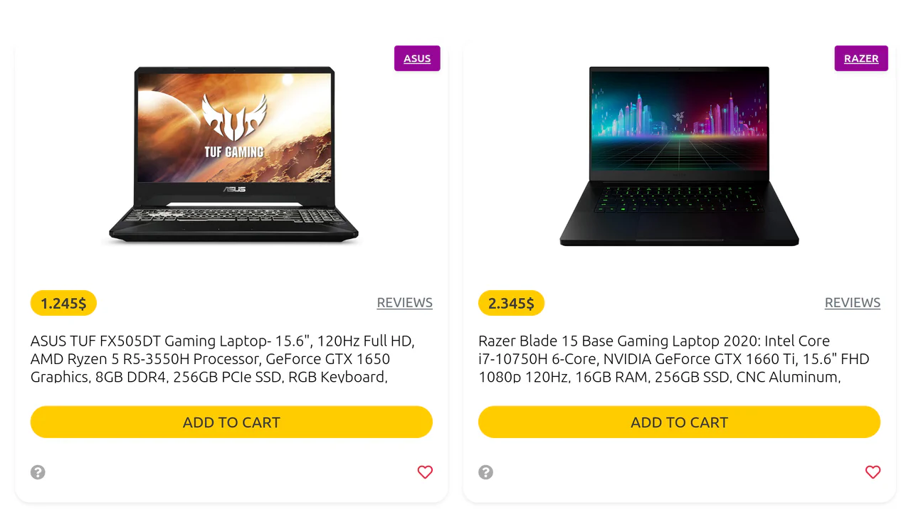
Bootstrap 5 Product Card
A Bootstrap product card featuring an embedded image carousel in place of a static header image. Custom CSS overrides default button colors with a vibrant orange theme, while standard Bootstrap data attributes power the slide navigation logic.
See the Pen Bootstrap 5 Product Card.

Bootstrap 5 Product Card: Oval Design
A distinctive capsule-shaped product card created purely with Bootstrap 5 utility classes. The rounded-pill class defines the geometry, while overflow-hidden ensures the image clips perfectly to the oval border, creating a seamless, sticker-like aesthetic without custom CSS.
See the Pen Bootstrap 5 Product Card: Oval Design.
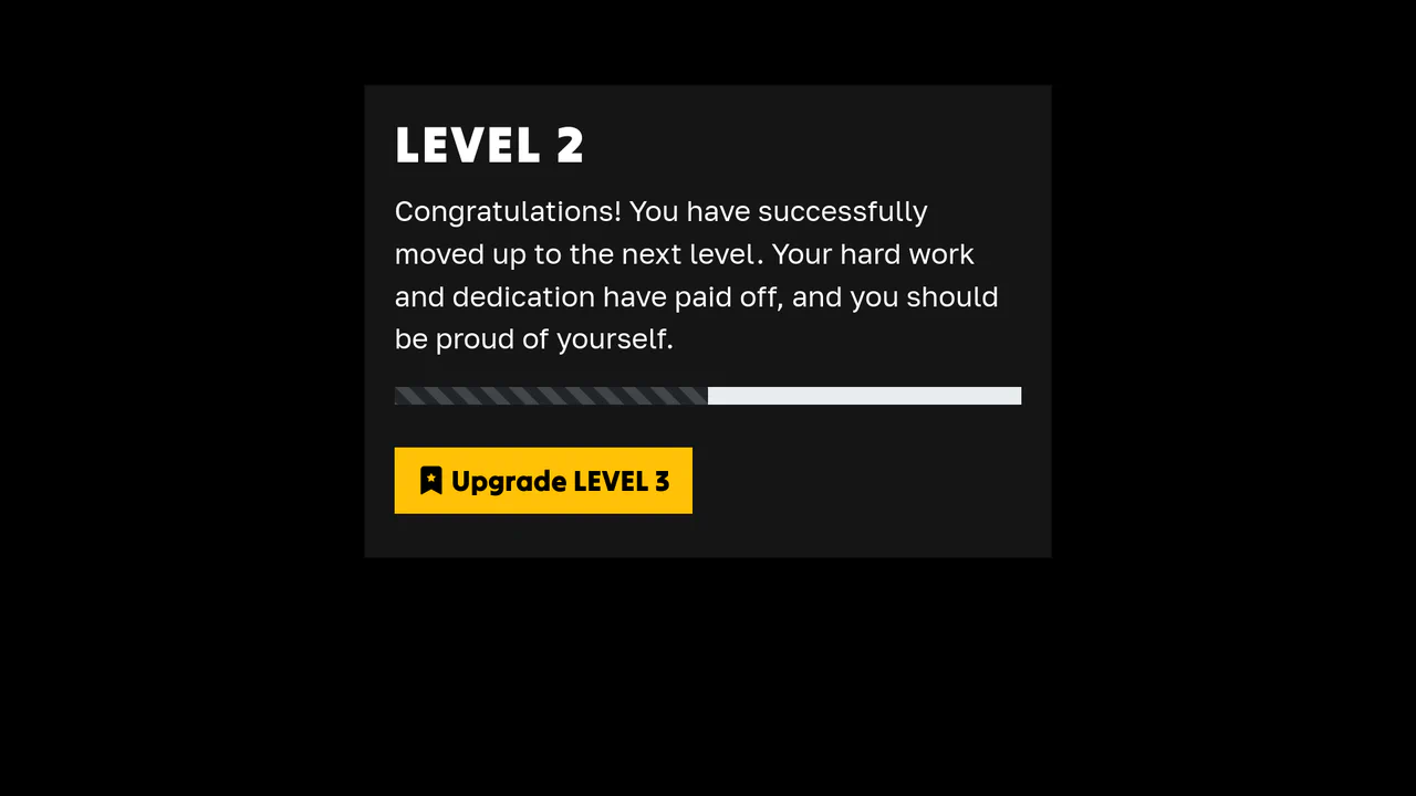
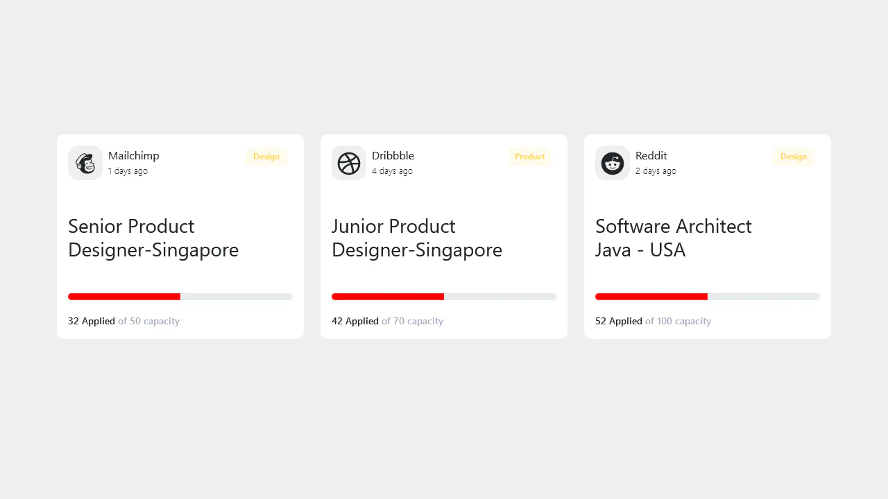
Card Progress: Bootstrap 5 (Dark Mode)
A stylish dark card with an animated progress bar that clearly communicates achievement and encourages progression to the next level.
See the Pen Card Progress: Bootstrap 5 (Dark Mode).
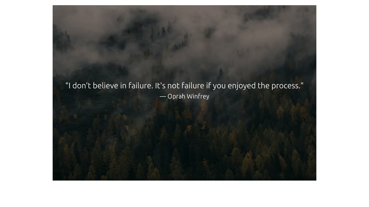
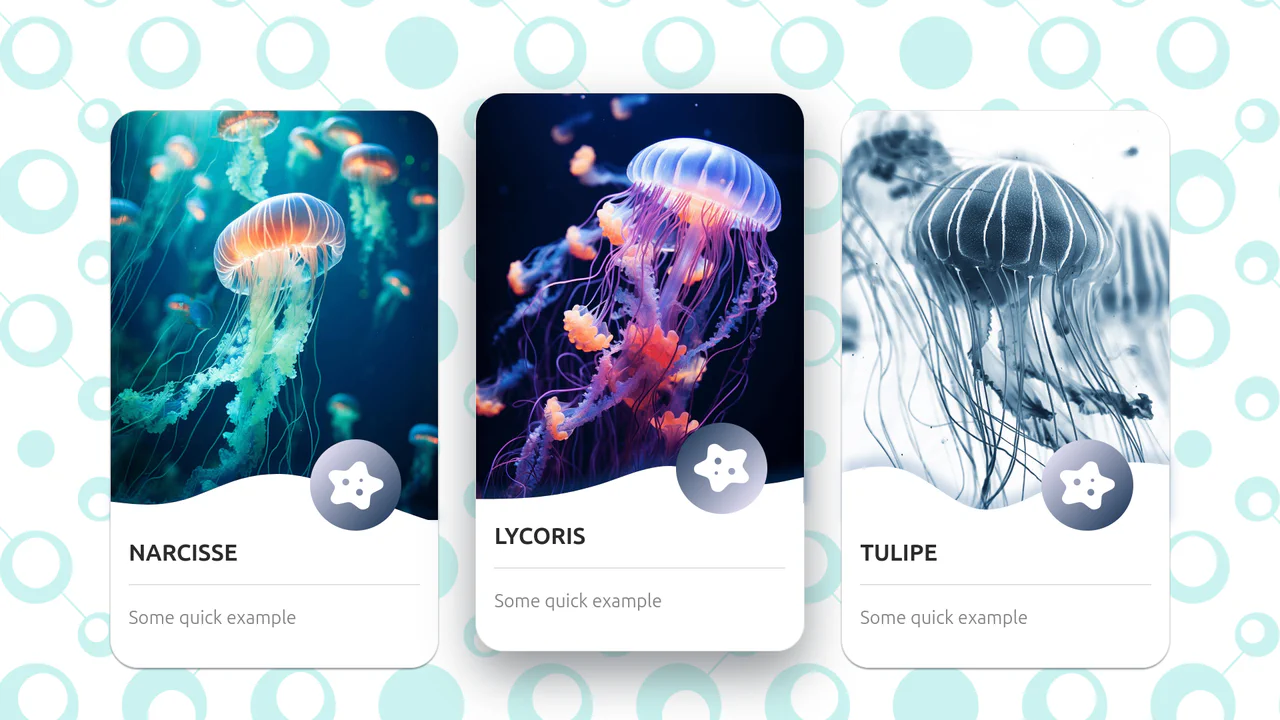
Dynamic Image Quote Card
A dynamic quote generator that pairs random nature images from Unsplash with inspirational quotes fetched asynchronously via Promise.all.
See the Pen Dynamic Image Quote Card.
Image Card Slide in Bootstrap 5
A playful and dynamic content presentation where the user physically “discards” cards to reveal the next message, achieved without page reloads or scripts.
See the Pen Image Card Slide in Bootstrap 5.
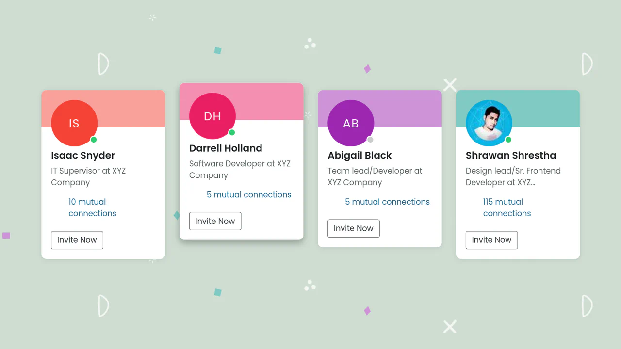
LinkedIn-Style User Profile
A professional, responsive, and interactive card grid that automatically adapts to content (initials, colors) and screen sizes, providing a polished user experience.
See the Pen LinkedIn-Style User Profile.
Responsive E-commerce Product Card
A professional, ready-to-use product card delivering excellent UX through a clear structure and pleasant micro-interactions on hover.
See the Pen Responsive E-commerce Product Card.
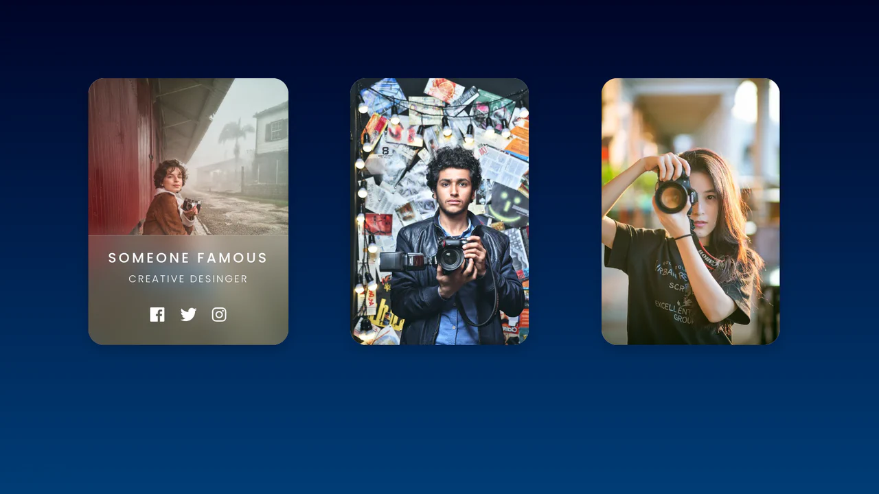
Simple Bootstrap 5 User Profile Cards Using Glassmorphism
A glassmorphism-style profile card featuring a slide-up reveal effect. CSS backdrop-filter creates a frosted glass overlay, while custom properties drive a staggered entrance animation for text and social icons upon hover, delivering a polished, interactive user experience without JavaScript.

Styling Bootstrap 5 Cards with Hover Effects
A sophisticated Bootstrap 5 card set featuring advanced CSS-only interactions.
See the Pen Styling Bootstrap 5 Cards with Hover Effects.
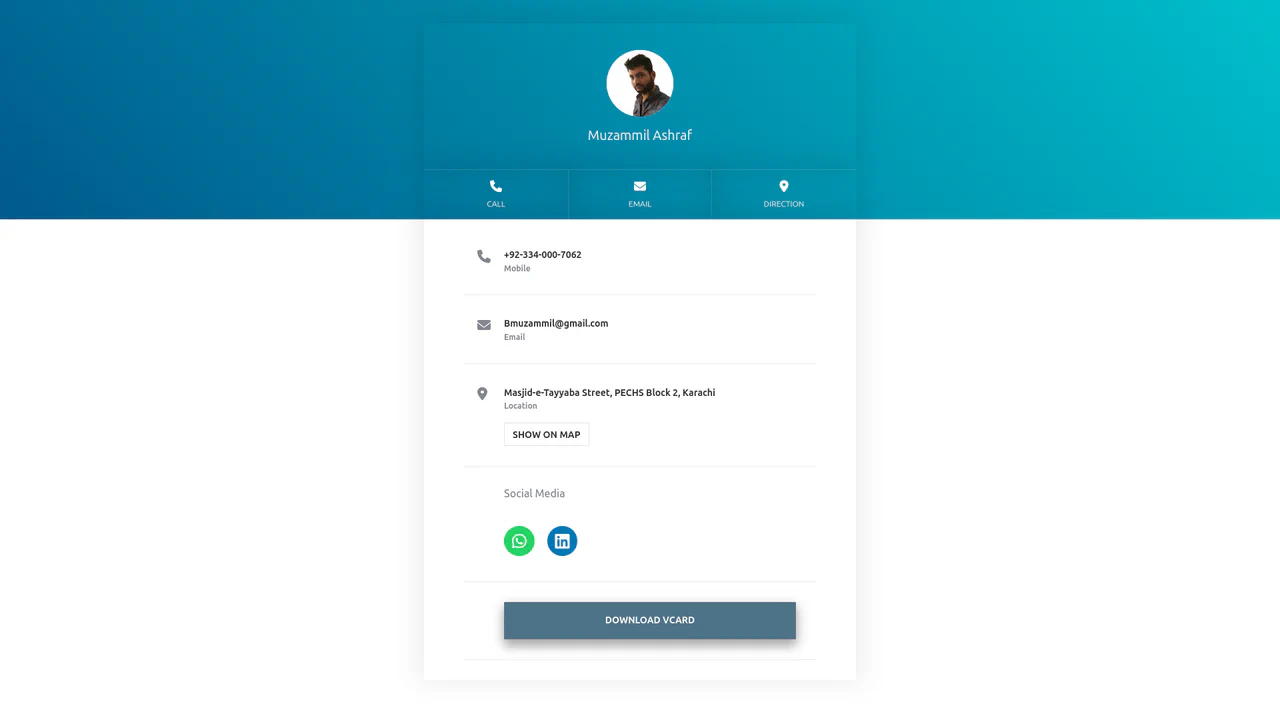
vCard or Contact Profile (Bootstrap 5)
A responsive digital business card (vCard) built on Bootstrap 5, featuring a gradient header and a clean contact list. It utilizes Font Awesome icons for social links and quick-action buttons (Call, Email, Map), creating a mobile-optimized profile page ready for QR code integration.
See the Pen vCard or Contact Profile (Bootstrap 5).