20+ Bootstrap Grid Examples
This collection is a comprehensive guide to the Bootstrap grid system, the foundation of modern responsive design. Both the basic 12-column structure with responsive prefixes and the advanced Flexbox utilities for perfect content alignment are detailed. Examples also cover modern spacing control via g-* (gutter) classes and complex layouts using offsets and ordering. This is your toolkit for building any layout, from simple to asymmetrical.
Examples
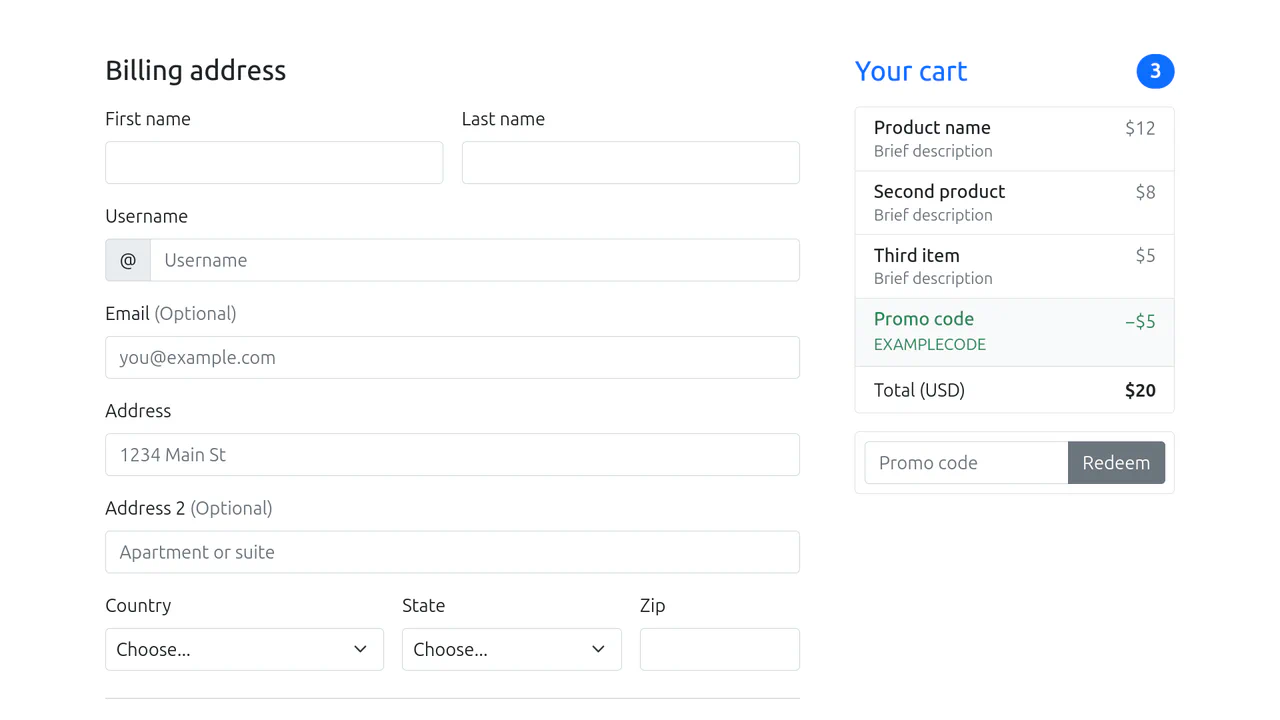
Bootstrap 5 Checkout Page
A clean, functional, and responsive payment page with ready-to-use client-side validation logic, fully adhering to Bootstrap guidelines.
See the Pen Bootstrap 5 Checkout Page.

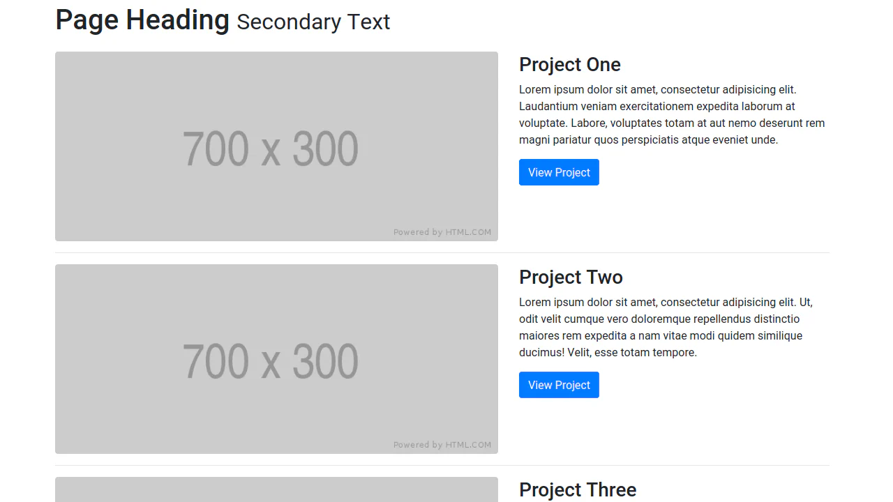
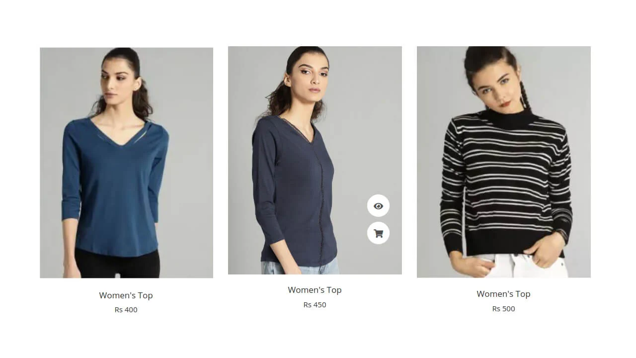
Bootstrap 5 Grid
A clever Bootstrap 5 grid hack enabling a split layout where an image extends to the viewport edge (fluid) while text stays within the standard grid (container).
See the Pen Bootstrap 5 Grid.
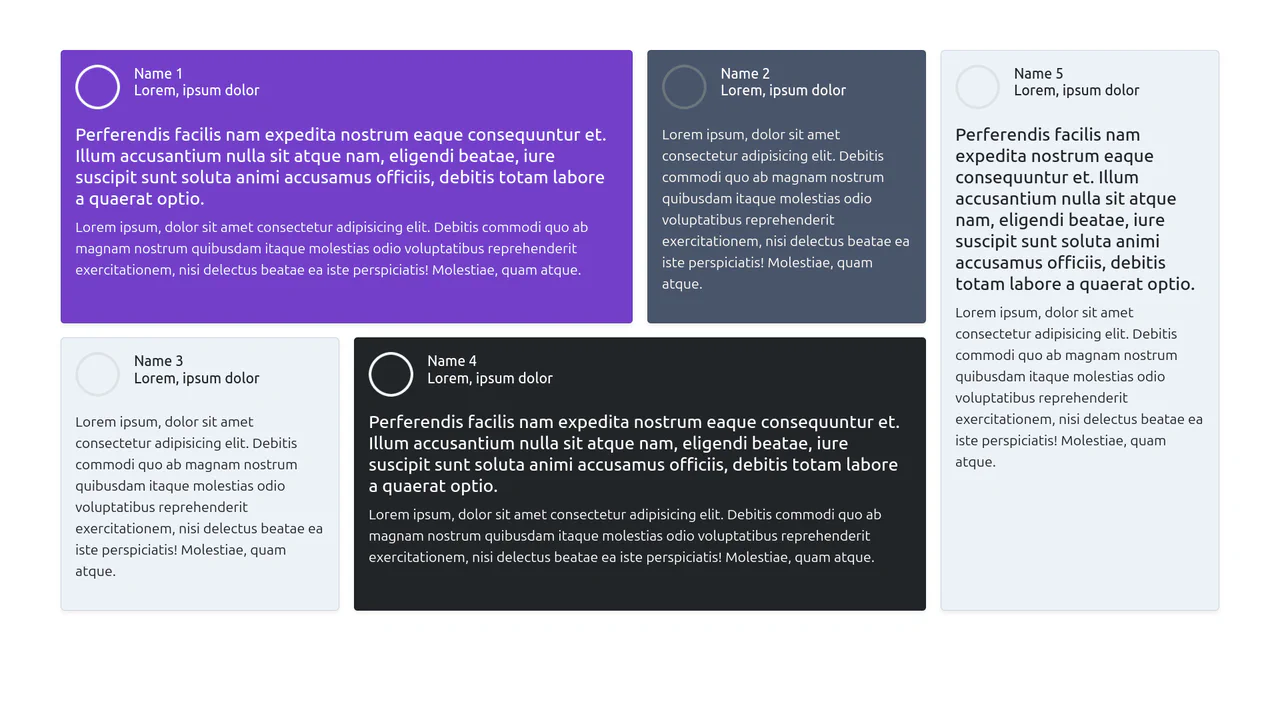
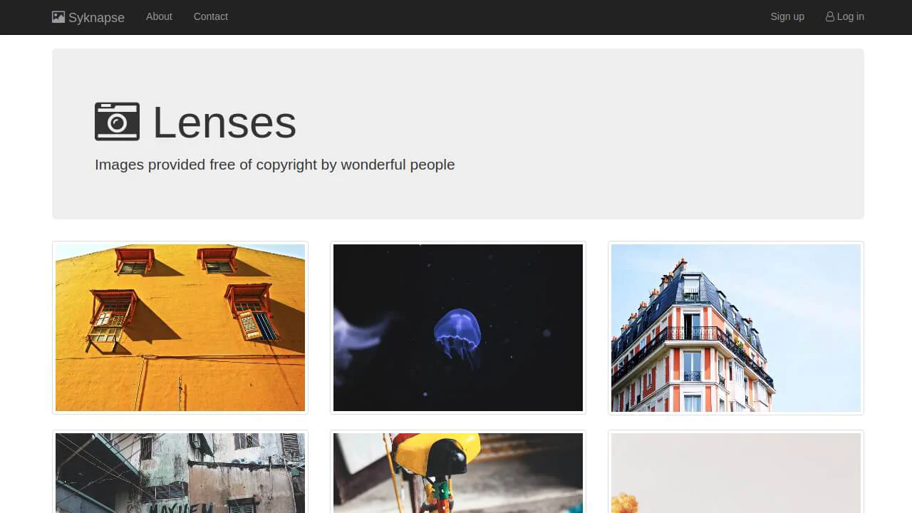
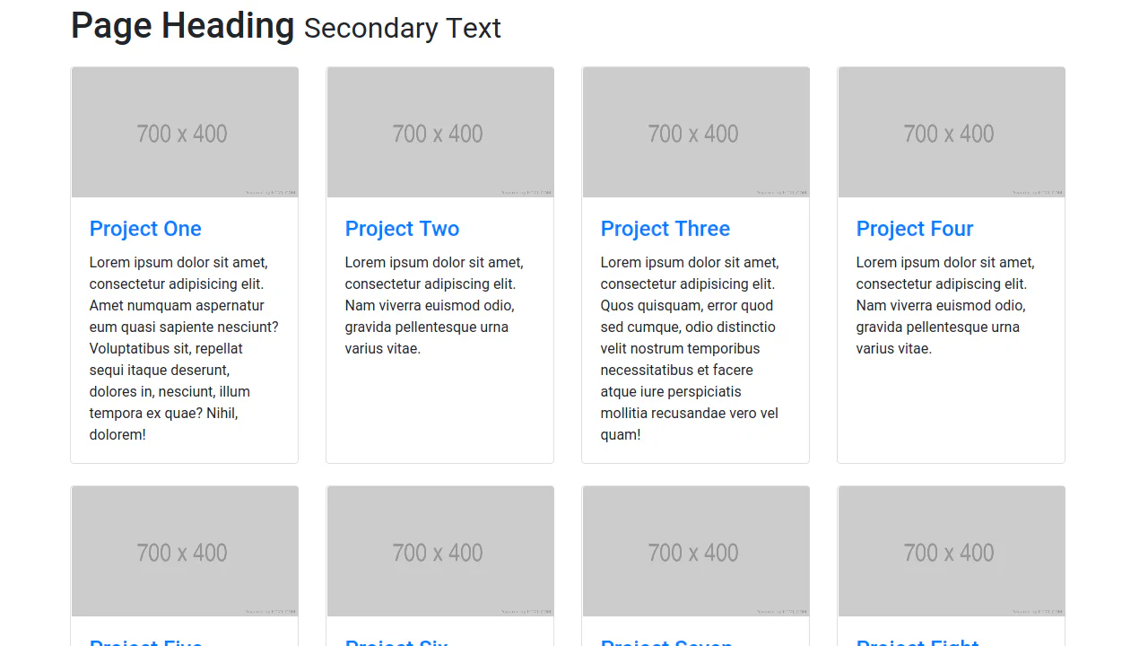
Bootstrap 5 Responsive Grid
A complex yet tidy masonry-like layout of testimonials that appears as a unified block on large screens and gracefully stacks into a single vertical column on mobile devices.
See the Pen Bootstrap 5 Responsive Grid.
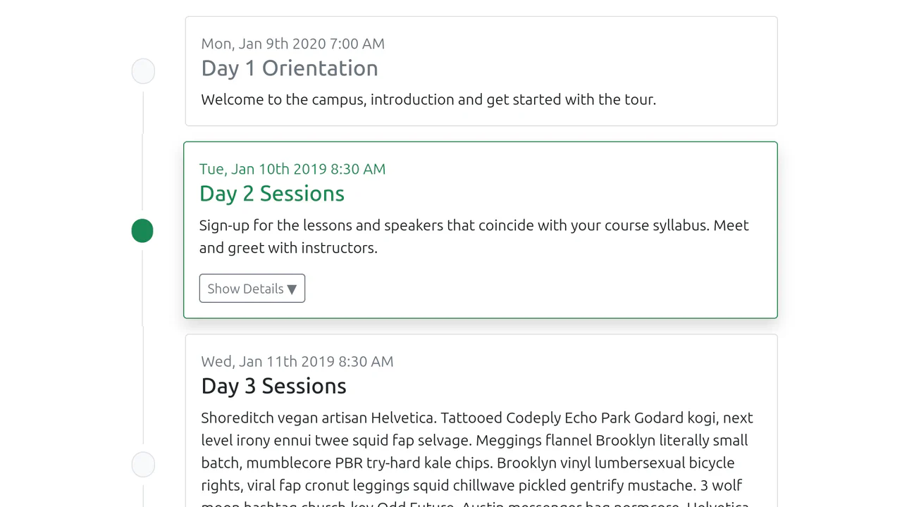
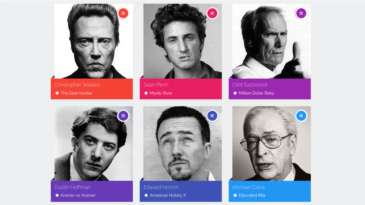
Bootstrap 5 Timeline
A structured, easy-to-read schedule that looks professional and responsive, offering interactivity (collapsible details) without complex code.
See the Pen Bootstrap 5 Timeline.

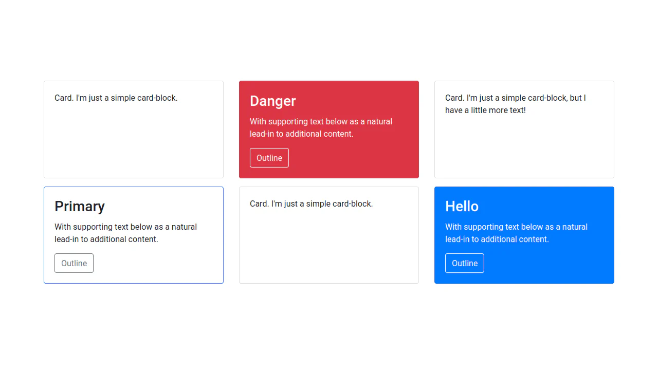
Radio Buttons and Checkboxes (Bootstrap 5)
A collection of custom radio buttons and checkboxes styled as interactive cards.
See the Pen Radio Buttons and Checkboxes (Bootstrap 5).
