5 Bootstrap Hero Sections
This collection is your guide to building responsive hero sections with Bootstrap 5. It leverages the power of the grid system and Flexbox utilities to create perfectly balanced layouts that look great on any screen. The examples heavily utilize pre-built classes for typography and buttons, speeding up development. For easy customization and branding, CSS variables are applied, allowing you to change the color scheme without overriding styles.
Examples
Bootstrap 5 Header 1
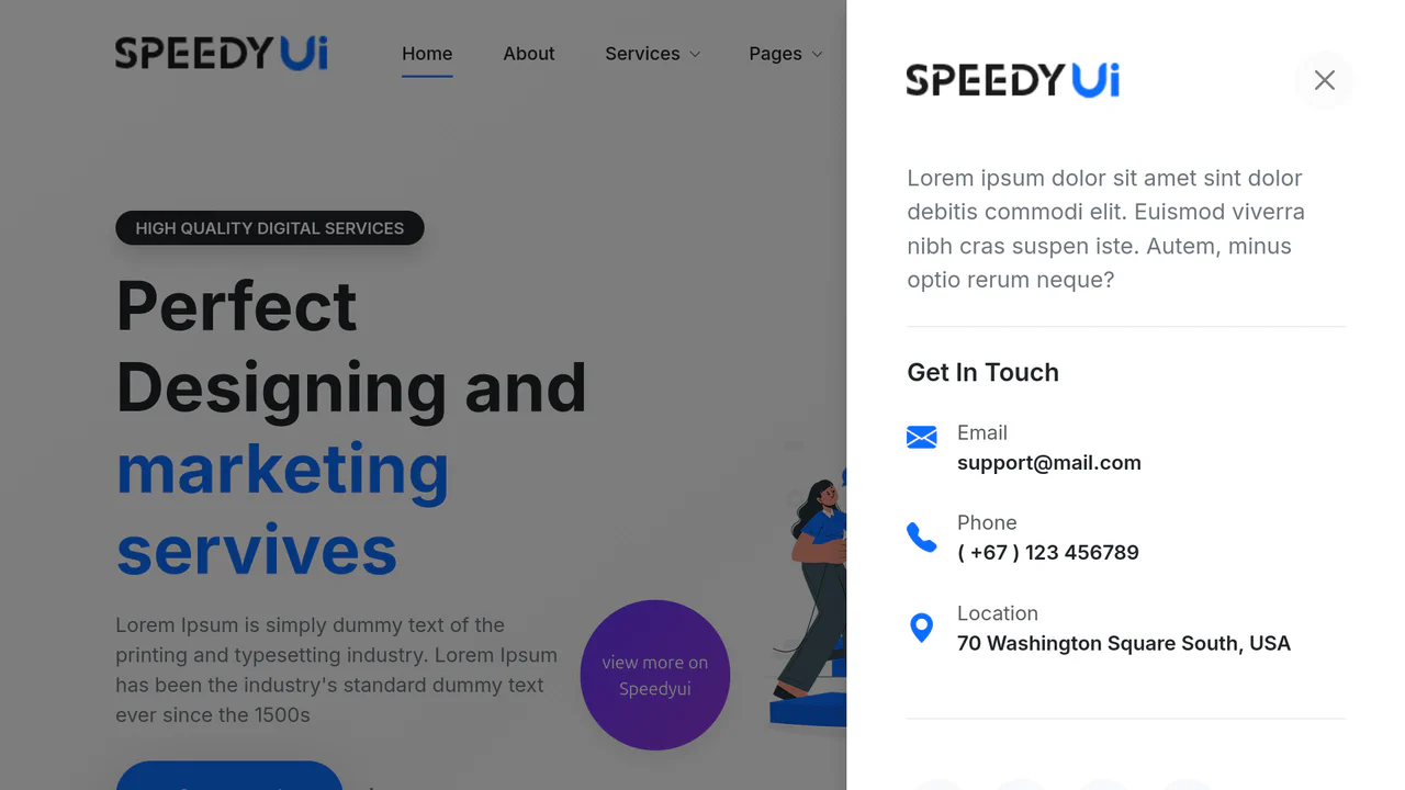
A feature-rich hero header built on Bootstrap 5, showcasing a custom animated navbar with scaleX hover effects and dual Offcanvas panels for responsive contact/menu display. The hero section integrates a floating CTA button, partner logos, and subtle CSS transitions for enhanced interactivity.
See the Pen Bootstrap 5 Header 1.
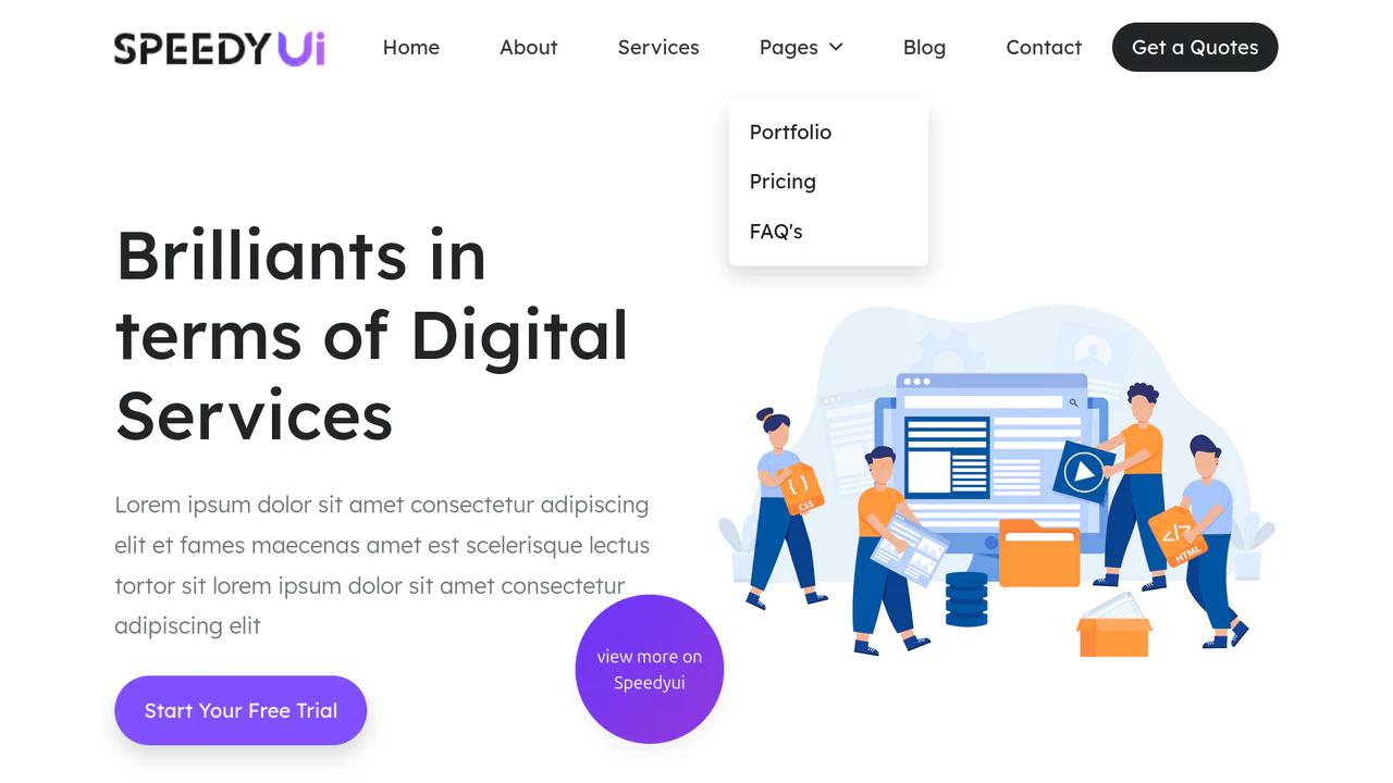
Bootstrap 5 Header 2
A modern, clean, and professional landing page header featuring smooth navigation hover states and an attention-grabbing CTA button with a sleek skew animation.
See the Pen Bootstrap 5 Header 2.

Bootstrap 5 Header 3
A highly functional, interactive site header offering a rich user experience, from animated backgrounds to convenient navigation and quick contact access via a side panel.
See the Pen Bootstrap 5 Header 3.

HTML5 Bootstrap Slider with Swiper and Animate.css
A cinematic fullscreen slider powered by Swiper.js with a cross-fade effect.
See the Pen HTML5 Bootstrap Slider with Swiper and Animate.css.
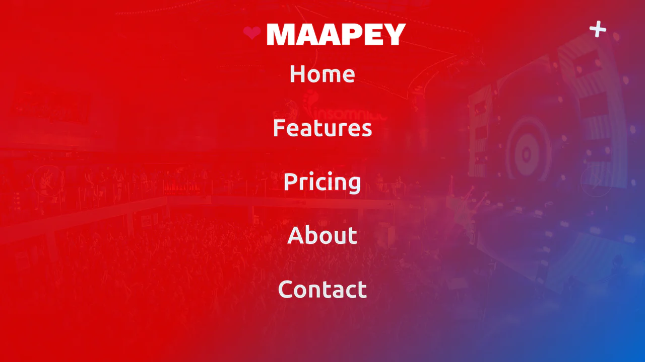
Side Menu with Smoke Effect (Bootstrap 5)
A cinematic hero slider featuring a multi-layered CSS smoke animation and a sticky navigation bar that transitions on scroll. It incorporates a full-screen overlay menu toggled via jQuery, responsive typography, and complex button hover effects using pseudo-elements.
See the Pen Side Menu with Smoke Effect (Bootstrap 5).