30+ Bootstrap Hover Effects
This collection demonstrates how to add interactivity to Bootstrap components using CSS hover effects. A wide range of techniques are covered: from creating “lifting” cards with transforms and shadows to smoothly revealing icon overlays on images. Examples also include elegant background and text color transitions for buttons and links. All effects are built on Bootstrap utility classes and CSS transitions, ensuring high performance and easy customization.
Examples

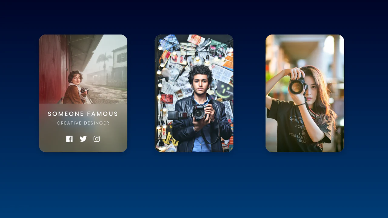
Bootstrap 5 E-commerce Product Listing Card
A clean, professional shop interface where the static grid comes alive on interaction, offering purchasing tools through smooth micro-animations.
See the Pen Bootstrap 5 E-commerce Product Listing Card.
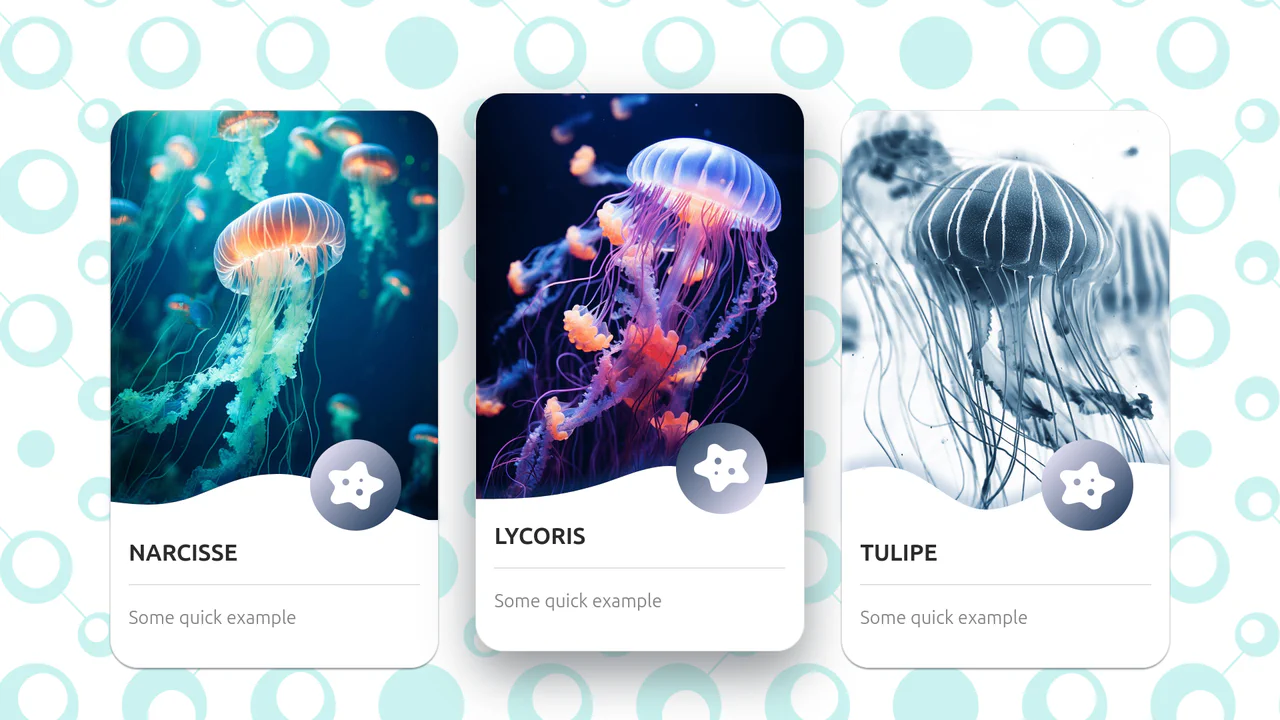
Bootstrap 5 Nice Box-Shadow Hover
A playful, airy card with a sense of depth and tactility, where UI elements smoothly react to the cursor.
See the Pen Bootstrap 5 Nice Box-Shadow Hover.

Buttons: Bootstrap 5 and vanilla-tilt.js
A visual presentation of how a basic component can be modified from a simple clickable element to a complex interactive object with a 3D parallax hover effect.
See the Pen Buttons: Bootstrap 5 and vanilla-tilt.js.
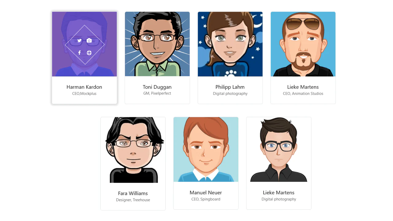
Simple Bootstrap 5 User Profile Cards Using Glassmorphism
A glassmorphism-style profile card featuring a slide-up reveal effect. CSS backdrop-filter creates a frosted glass overlay, while custom properties drive a staggered entrance animation for text and social icons upon hover, delivering a polished, interactive user experience without JavaScript.

Styling Bootstrap 5 Cards with Hover Effects
A sophisticated Bootstrap 5 card set featuring advanced CSS-only interactions.
See the Pen Styling Bootstrap 5 Cards with Hover Effects.