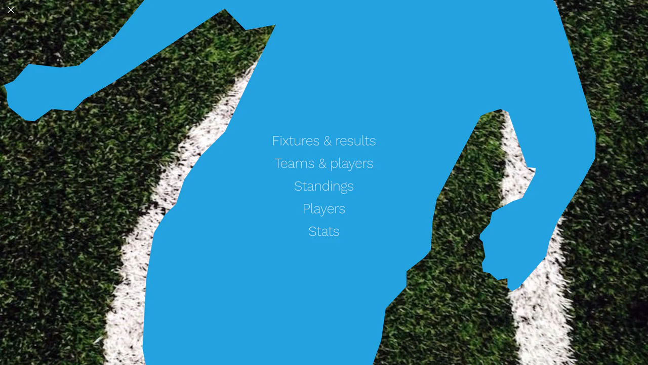
Cinematic Parallax Reactive Navigation Menu
See the Pen Cinematic Parallax Reactive Navigation Menu.
Tech & Dependencies
Features
- ✓ Background Shifting
- ✓ Parallax Interaction
- ✓ State-Driven Styling
Browser Support
Core
This is a Cinematic Parallax Reactive Navigation Menu. It synchronizes large-scale typographical navigation with multi-layered background shifts. Its function is to transform a standard menu into a high-end atmospheric gateway for editorial or premium portfolio websites, using user interaction to drive the visual narrative.
Specs
- Weight: ~2 KB. Vanilla implementation.
- Performance: High. Uses CSS transitions for positional properties, though animating
background-positioncan be more expensive thantransformon some devices. - Theming / Customization: Easily controlled via HSL values and background image URLs.
- Responsiveness: Excellent. Utilizes
clamp()andvminunits for fluid typography and pattern sizing across all viewports. - Graceful Degradation: Fails to a static list if JavaScript is disabled. The interaction logic relies on
data-active-index.
Anatomy
The structure is composed of three distinct layers looking through a single viewport.
- HTML (The Skeleton): A primary
#menuwrapper containing the#menu-itemsand two sibling background layers:#menu-background-patternand#menu-background-image. - CSS (The Skin): Sets the atmospheric dark tone. It uses
clamp()to scale font sizes dynamically. Background layers useabsolutepositioning and long800mstransitions to create a cinematic feel. - JS (The Nervous System): Minimalist state manager. It detects
mouseoverevents on menu items and pushes the currentindexto the parent container’sdata-active-indexattribute.
Logic
The intelligence of this snippet lies in “Attribute-Based State Mapping”:
#menu[data-active-index="1"] > #menu-background-pattern {
  background-position: 0% -50%;
}

#menu[data-active-index="1"] > #menu-background-image {
  background-position: center 50%;
}
Instead of using JS to manipulate styles directly, the script only changes a single data attribute. The CSS then maps this “state” to specific visual coordinates for both the radial pattern and the background image. This separation ensures that the animation logic remains entirely within the stylesheet, allowing for easier maintenance and smoother hardware acceleration.
Feel
Cinematic and heavy. The 800ms ease-based transition gives the background a physical momentum, making it feel like a heavy camera lens shifting focus. When the user hovers, the dimming of inactive items combined with the slight zoom and shift of the background creates an immersive focus mode.