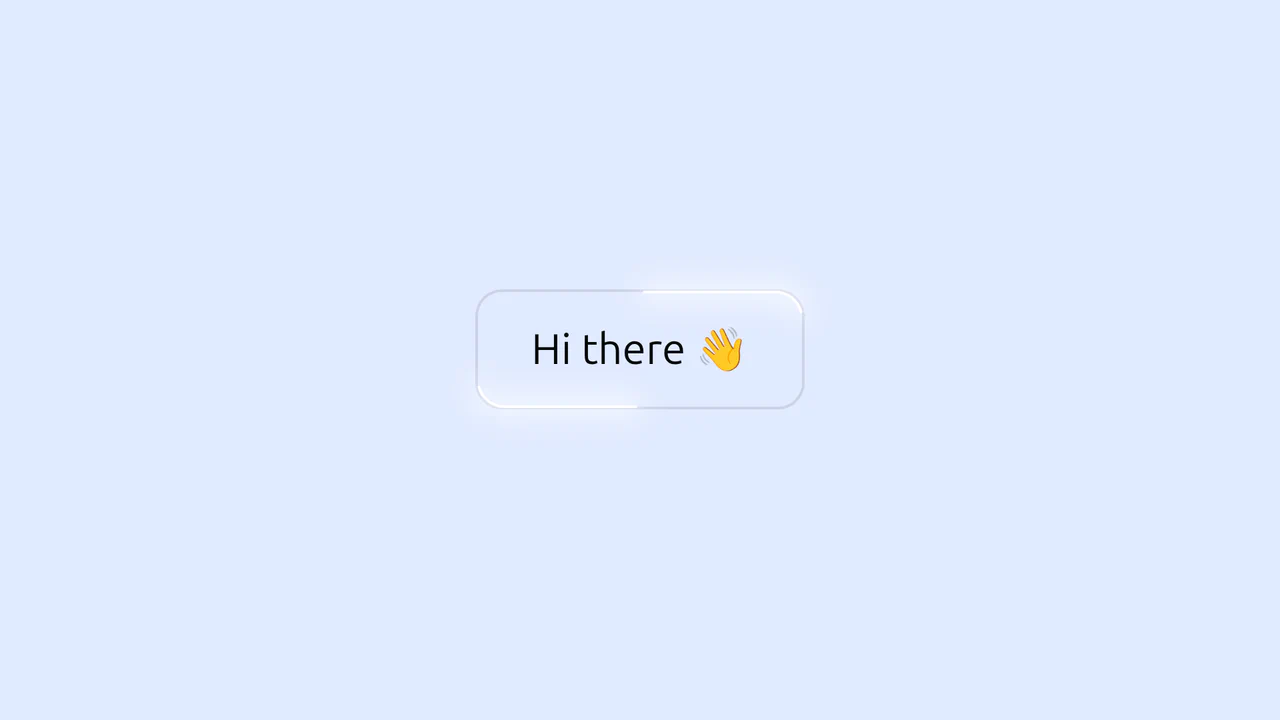
Cosmic 3D Galaxy Button
See the Pen Cosmic 3D Galaxy Button.
Tech & Dependencies
Features
- ✓ 3D Rotation
- ✓ Particle System
- ✓ State-Driven Styling
Browser Support
Core
This is a Cosmic 3D Galaxy Button. It replaces a standard solid color hover state with a dynamic, multi-layered particle system. Its function is to serve as a high-impact primary call-to-action, using spatial depth and global page illumination to draw maximum user focus.
Specs
- Weight: ~3 KB. No external libraries.
- [!] Performance: GPU-intensive. Heavy reliance on
preserve-3d, rotating conic gradients, and multiple layered alpha masks. Best restricted to a single instance per page. - Theming / Customization: Globally controlled via the
--hueCSS custom property. State shifts are dictated by a binary--active: 0 | 1switch. - Responsiveness: Fluid. Scales proportionally based on
emunits and a dynamiccalc()font-size block. - Graceful Degradation: Relies heavily on the CSS
:has()pseudo-class to shift the page background on hover. If:has()is unsupported, the button itself functions, and a fallback.bodydropelement triggers the background shift via adjacent sibling combinators.
Anatomy
The structure isolates the moving parts into distinct DOM layers to prevent animation conflicts.
- HTML (The Skeleton): A
<button>wrapper housing specificspanlayers:.spark(animated border),.backdrop(base color),.galaxy__container(static stars), and.galaxy(the 3D rotating ring of particles). - CSS (The Skin): Utilizes
mask: linear-gradientandconic-gradientfor the tracing border effect. The inner galaxy usesrotateXandrotateYto tilt the orbital plane into 3D space. - JS (The Nervous System): Runs exactly once. Generates random spatial and temporal coordinates (angle, delay, distance, size) and injects them into the DOM as inline CSS variables.
Logic
The core logic relies on “Variable Seeding”. This is the Glyph-logic of the snippet:
PARTICLES.forEach(P => {
  P.setAttribute('style', `
    --duration: ${RANDOM(6, 20)};
    --delay: ${RANDOM(1, 10)};
    --size: ${RANDOM(2, 6)};
    --distance: ${RANDOM(40, 200)};
  `)
})
Instead of using requestAnimationFrame to calculate particle positions every 16ms, JavaScript is solely used as a configuration engine. It seeds each .star with unique physics parameters. The CSS @keyframes engine takes over entirely, interpolating these static values via calc() functions to create independent, continuous orbits. This drastically reduces CPU overhead.
Feel
Deep and immersive. Hovering does not just highlight the button; it turns the element into a viewport looking into physical space. The simultaneous dimming of the background page (:has(button:is(:hover))) contextualizes the interaction, shifting the environment’s focus entirely to the miniature orbital system inside the boundary.