Direction Aware 3D Cube Gallery
See the Pen Direction Aware 3D Cube Gallery.
Tech & Dependencies
Features
- ✓ Direction Aware Hover
- ✓ 3D Transforms
- ✓ CSS Custom Properties
- ✓ Minimal DOM
Browser Support
Core
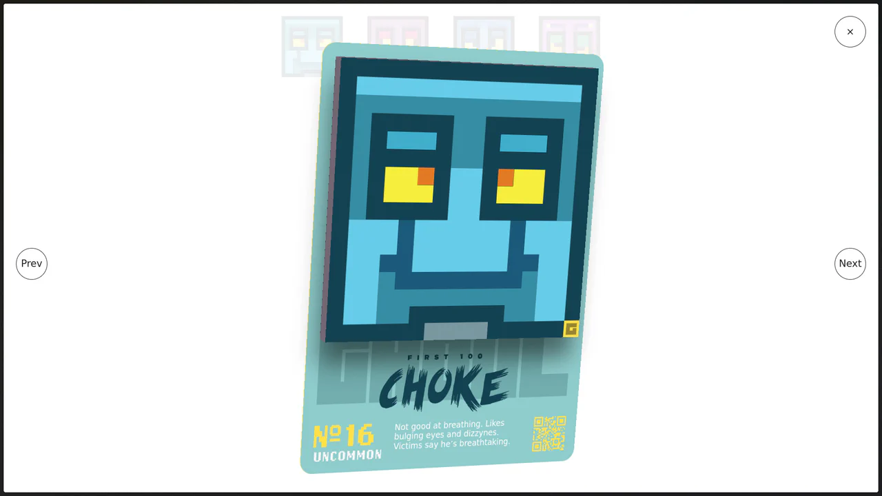
This is a Direction Aware 3D Cube Gallery. It tracks the exact angle at which a cursor enters or leaves an image tile, applying a responsive 3D cube rotation that follows the mouse’s trajectory. Its function is to provide highly contextual, physical feedback during interaction, making a flat image grid feel like an array of tangible, rotatable blocks.
Specs
- Weight: ~3 KB. Zero external dependencies.
- Performance: High. The 3D rotation (
rotate3d) is hardware-accelerated. The JavaScript only fires upon boundary crossing (mouseenter/mouseout), completely avoiding heavy, continuousmousemovelisteners. - Theming / Customization: Controlled by a robust set of CSS variables (
--size,--drfor duration,--prfor perspective) defined in the:root. - Responsiveness: Native flow layout using
inline-block. The mathematical hover logic usesoffsetWidthandoffsetHeight, meaning it adapts dynamically if the grid items scale on smaller screens. - Web APIs: Standard DOM events (
mouseenter,mouseout,getBoundingClientRectequivalents). - Graceful Degradation: [!] If JavaScript fails, the 3D flipping effect will not trigger, rendering the gallery as a static list of images without access to the hidden backside descriptions. Keyboard navigation (Tab focus) is completely missing, rendering the hidden content inaccessible to screen readers.
Anatomy
- HTML (Pug): An unordered list
<ul>mapping over data. Each<li>represents a tile. Instead of building a full 6-sided 3D cube in the DOM, it only uses two faces:.f(front) and.b(back), wrapped in a.w(wrapper) which acts as the rotational pivot. - CSS: The spatial engine. Sets
perspectiveon the parent<li>andtransform-style: preserve-3don the wrapper. It defines four sets of@keyframes(top, right, bottom, left) that dictate the exactrotate3dmath required to flip the cube on different axes. - JS: The directional math controller. A lightweight class-based script that calculates the entry/exit vector of the cursor using
Math.atan2, mapping the trajectory to a number (0-3). It then applies a specific CSS class (e.g.,.in-top,.out-left) to trigger the corresponding CSS animation.
Logic
The architectural highlight is the combination of the Math.atan2 direction calculation and the “2-face cube” trick.
_getDirection(ev) {
  const w = this.w, h = this.h,
    x = (ev.pageX - this.l - (w / 2) * (w > h ? (h / w) : 1)),
    y = (ev.pageY - this.t - (h / 2) * (h > w ? (w / h) : 1)),
    d = Math.round(Math.atan2(y, x) / 1.57079633 + 5) % 4;
  return d;
}
Instead of running a physics engine, the script calculates the exact center of the element and measures the angle (atan2) of the mouse coordinate relative to that center. It normalizes this angle into four discrete zones (0=top, 1=right, 2=bottom, 3=left).
Crucially, the DOM does not contain 6 sides. When the mouse enters from the top, CSS instantly moves the hidden backface (.b) to the top edge and rotates it 90 degrees (transform: translate3d(0, -100%, 0) rotate3d(1,0,0,90deg)). The wrapper (.w) then animates the entire assembly down 90 degrees. This “just-in-time” positioning fakes a solid 3D cube while keeping the DOM incredibly light.
Feel
Tactile and reactive. Because the animation trajectory strictly obeys the mouse’s physical entry and exit paths, the interface feels deeply connected to user intent. Swiping the mouse quickly across a row of images causes them to flip like a line of mechanical dominos. The lighting effects on the backface (radial-gradient) emphasize the depth, making the digital grid feel heavy and substantial.