Fluid Shared Element Image Gallery
See the Pen Fluid Shared Element Image Gallery.
Tech & Dependencies
Features
- ✓ FLIP Animation
- ✓ Shared Element
- ✓ Hardware Accelerated
Browser Support
Core
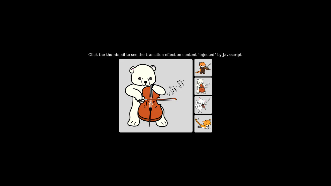
This is a Fluid Shared Element Image Gallery. It connects a thumbnail grid to a full-screen detail view through continuous spatial morphing. Its function is to eliminate context loss, carrying the user’s visual focus seamlessly from a macro overview to a micro inspection.
Specs
- Weight: ~3 KB. Zero dependencies.
- Performance: High. The transition strictly animates
transform(translate and scale), ensuring GPU acceleration without triggering expensive DOM reflows during the animation cycle. - Theming / Customization: Layout is governed by a few SCSS variables (
$app-width,$app-height). - Responsiveness: Handled via CSS Flexbox and
vminunits, ensuring the application container retains its proportions across devices. - Web APIs: Web Animations API (
element.animate), DOM Rect API. - Graceful Degradation: [!] Fundamentally relies on JavaScript for layout switching and mathematical calculation. If JavaScript fails, the detail view remains hidden permanently. Keyboard navigation and screen reader attributes are absent, severely breaking accessibility.
Anatomy
- HTML: A dual-scene architecture.
.scene.-galleryholds the base grid..scene.-detailserves as the destination container. - CSS (SCSS): Establishes the spatial boundaries. It uses absolute positioning for the scenes to allow them to overlap perfectly in the Z-axis.
transform-origin: top leftis applied to elements to simplify the scaling math. - JS: The logic engine. It binds click events, retrieves image attributes, calculates the geometric differences between the thumbnail and the target container, and executes the native
animatemethod.
Logic
The architectural core of this snippet is the manual implementation of the FLIP technique (First, Last, Invert, Play) using the native Web Animations API.
let firstRect = itemImage.getBoundingClientRect();
let lastRect = detailItem.getBoundingClientRect();

detailItem.animate([
  {
    transform: `
      translateX(${firstRect.left - lastRect.left}px)
      translateY(${firstRect.top - lastRect.top}px)
      scale(${firstRect.width / lastRect.width})
    `
  },
  { transform: `translateX(0) translateY(0) scale(1)` }
], { duration: 600, easing: 'cubic-bezier(0.2, 0, 0.2, 1)' });
Instead of moving the original DOM node, the script hides the thumbnail and shows the destination image in its final state (Last). It immediately calculates the difference between the starting coordinates (firstRect) and the ending coordinates (lastRect). It applies a negative transform (Invert) to force the large image to visually match the thumbnail’s exact size and position. Finally, it animates those transforms back to zero (Play). This ensures perfect, jank-free rendering.
Feel
Direct and mechanical. The image does not vanish into a loading screen; it physically travels to its new destination. The specific cubic-bezier(0.2, 0, 0.2, 1) easing gives the movement a fast, decisive acceleration followed by a smooth, deliberate settling. It feels less like navigating through discrete web pages and more like manipulating physical objects on a continuous plane.