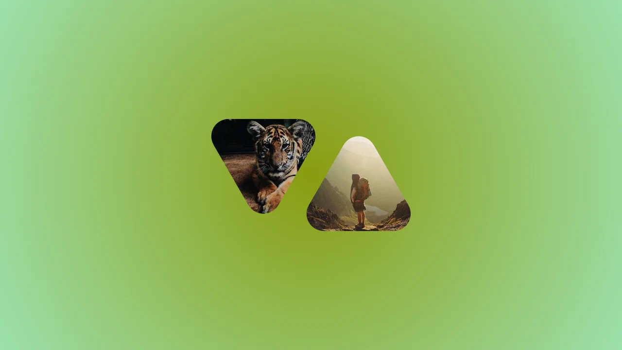
Frameless Blurred Background Image Effect in CSS
See the Pen Frameless Blurred Background Image Effect in CSS.
Tech & Dependencies
Features
- ✓ Border-image Trick
- ✓ CSS Custom Properties
- ✓ Pure CSS
Browser Support
Core
This is a Frameless Blurred Background Image Effect. It uses an innovative CSS technique to generate a soft, atmospheric background for an image by duplicating, stretching, and blurring the image itself. The function is to create a polished, “pro” look for profile pictures or product thumbnails without requiring image editing software or complex JavaScript canvas manipulations.
Specs
- Weight: ~1 KB. Zero dependencies. No JavaScript.
- Performance: Excellent. The effect relies on the browser’s native CSS rendering engine, using hardware-accelerated
filterproperties for the blur. - Theming / Customization: Fully parameterized. The foreground image size (
--w) and the background blur intensity (--b) are controlled by CSS custom properties, allowing for easy real-time adjustments. - Responsiveness: Inherently responsive. The component is designed to center itself within any container.
- Graceful Degradation: Fails safely. If a browser does not support the
border-imageproperty, the background simply won’t appear, leaving the foreground image perfectly intact.
Anatomy
The structure uses a CSS Grid pseudo-element overlay to create the background layer.
- HTML (The Skeleton): A simple
<div>wrapper containing a single<img>tag. The image URL is passed to CSS via an inline style variable (--img). - CSS (The Skin): The core of the effect. It uses
display: gridto place the<img>and the::beforepseudo-element in the same grid cell (1/1), stacking them. The::beforeelement is the magic layer. - JS (The Nervous System): Completely absent.
Logic
The entire effect is driven by the border-image Trick:
div:before {
  content: "";
  grid-area: 1/1;
  border-image: var(--img) 2/calc(50% - var(--w)/2 + var(--b))/calc(1.5*var(--b));
  filter: contrast(.8) blur(var(--b));
}
Instead of using background-image, the code applies the image to the border-image property of the ::before pseudo-element. The border-image property has three key values: source, slice, and outset. By using a tiny slice value (2) and a large outset value (calc(1.5 * var(--b))), it forces the browser to take a very thin slice of the image and stretch it to fill a massive border area that extends far beyond the element’s actual box. This stretched, low-resolution version is then heavily blurred with the filter property, creating a soft, atmospheric backdrop that perfectly matches the color palette of the foreground image.
Feel
Soft, focused, and professional. The effect draws the user’s eye directly to the crisp foreground image while providing a subtle, non-distracting context in the background. It feels like a high-end photo editing effect (similar to “Content-Aware Fill” in Photoshop) but is generated entirely in real-time by the browser’s CSS engine.