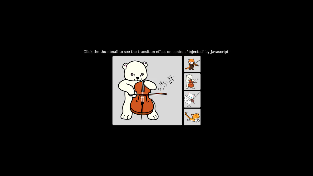
Fullscreen View Transition Gallery
See the Pen Fullscreen View Transition Gallery.
Tech & Dependencies
Features
- ✓ View Transitions
- ✓ Image Zoom
- ✓ OKLCH Colors
Browser Support
Core
This is a Fullscreen View Transition Gallery. It transforms standard grid images into a focused, screen-filling view upon interaction. Its function is to provide seamless, native visual continuity without relying on heavy third-party animation libraries or complex transform calculations.
Specs
- Weight: ~2 KB. Zero dependencies.
- Performance: High. Relies on the browser’s native rendering engine to interpolate between the DOM states.
- Theming / Customization: Managed via standard CSS custom properties and modern
oklchcolor functions. - Responsiveness: Fluid. CSS Grid handles the base layout, and viewport units (
vw,vh) manage the zoomed state. - Web APIs: View Transitions API.
Anatomy
- HTML: A clean
<main>container with.gallery-itemwrappers around<img>tags. - CSS: Handles the structural grid and the heavy lifting of the transition logic. It assigns
view-transition-name: zoom-imageto the active fullscreen image and defines the keyframe interpolations for the pseudo-elements (::view-transition-old,::view-transition-new). - JS: The trigger mechanism. It toggles the
.fullscreenclass, strictly wrapped within thedocument.startViewTransition()method to capture the layout delta.
Logic
The snippet elegantly outsources animation mathematics directly to the browser:
document.startViewTransition(() => {
  galleryItems.forEach(i => i.classList.remove('fullscreen'));

  if (!alreadyFullscreen) {
    item.classList.add('fullscreen');
  }
});
Instead of manually calculating bounding rectangles (the FLIP technique) in JavaScript, the code simply alters a CSS class. The startViewTransition API automatically takes a snapshot of the “before” and “after” states. Meanwhile, the CSS view-transition-name directs the browser to seamlessly morph the specific element across these two spatial dimensions.
Feel
Fluid and intentional. The image doesn’t merely scale up; it glides from its grid slot directly to the center of the screen, creating a physical connection between the thumbnail and the full view. It feels native to the OS, effectively bridging the gap between flat web documents and spatial, app-like interfaces.