Glassmorphic Advanced Navigation System
See the Pen Glassmorphic Advanced Navigation System.
Tech & Dependencies
Features
- ✓ Glassmorphism
- ✓ Sticky Header
- ✓ Mobile Overlay Menu
- ✓ Smooth Scroll
Browser Support
Core
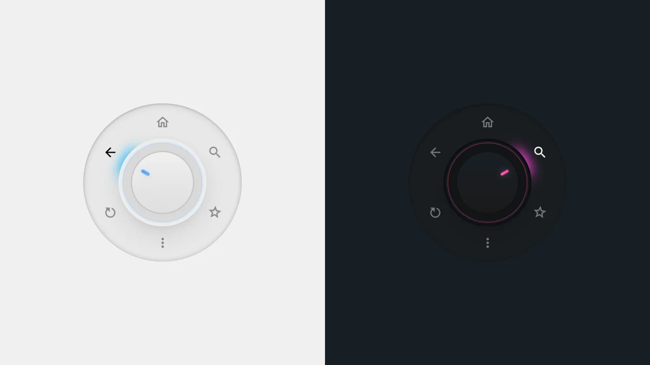
This is a Glassmorphic Advanced Navigation System. It provides a central, floating control hub for single-page applications. Its function is to persistently guide the user across different content sections while maintaining a high-end, translucent aesthetic that adapts fluidly between desktop and mobile environments.
Specs
- Weight: ~15 KB. Zero dependencies. No external icon libraries (uses inline SVGs).
- Performance: High. The glassmorphism (
backdrop-filter: blur(20px)) is GPU-accelerated. The mobile menu transitions usetransformandopacityrather than animating width or height, preventing layout thrashing. - Theming / Customization: Relies heavily on CSS gradients (
linear-gradient(135deg...)) and translucent rgba backgrounds. Easily customizable by modifying the core gradient hex codes. - Responsiveness: Robust. At
992px, the desktop links collapse, and a custom animated hamburger toggle activates, linking to a full-screen, scroll-locked overlay menu. - Graceful Degradation: Functional. If
backdrop-filteris unsupported (older browsers), it falls back to the semi-transparentrgbabackground color.
Anatomy
The component separates the desktop “pill” layout from the mobile “overlay” structure.
- HTML (The Skeleton): The
.navbar-containerholds the primary.navbar, the brand logo, and the desktopul.navbar-nav. A separate.mobile-menudivexists outside the normal flow, waiting to be triggered by the.mobile-togglebutton. - CSS (The Skin): Extensive use of
backdrop-filterandbox-shadowto create the glass effect. The active link state utilizes an inset shadow to simulate depth (inset 0 1px 0 rgba(255, 255, 255, 0.3)). - JS (The Nervous System): A comprehensive event listener block. It handles the mobile menu state (toggling classes and locking
bodyoverflow), syncs active states between mobile and desktop links, implements native smooth scrolling (scrollIntoView), and adds ascrolledclass to the navbar on window scroll.
Logic
The standout UI interaction is the animated hamburger toggle:
.mobile-toggle.active .hamburger span:nth-child(1) {
    transform: rotate(45deg) translate(6px, 6px);
}
.mobile-toggle.active .hamburger span:nth-child(2) {
    opacity: 0;
    transform: translateX(-20px);
}
.mobile-toggle.active .hamburger span:nth-child(3) {
    transform: rotate(-45deg) translate(6px, -6px);
}
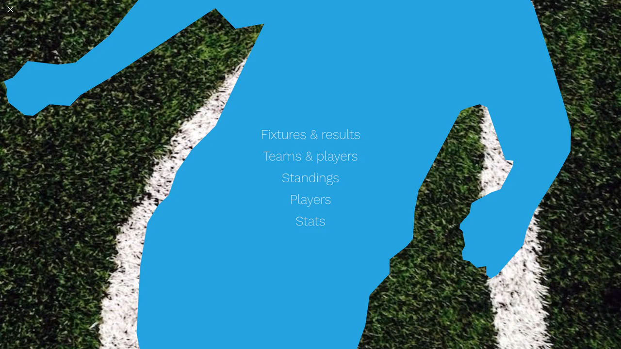
Instead of simply replacing an icon on click, the CSS targets the three individual <span> lines of the hamburger menu. When JavaScript adds the .active class to the parent button, the middle line slides out to the left and fades away, while the top and bottom lines simultaneously rotate and translate inward to form a perfect “X”. This provides immediate, mechanical feedback to the user’s tap.
Feel
Sleek and polished. The navigation bar feels like a solid piece of frosted glass hovering just above the page content. The hover states don’t just change color; they physically react, lifting slightly (translateY(-2px)) and deepening their shadows. The native smooth scrolling makes navigating the page feel like gliding rather than jumping.