Glassmorphism Profile Info Card
See the Pen Glassmorphism Profile Info Card.
Tech & Dependencies
Features
- ✓ Glassmorphism
- ✓ CSS Masking
- ✓ Grid Stacking
Browser Support
Core
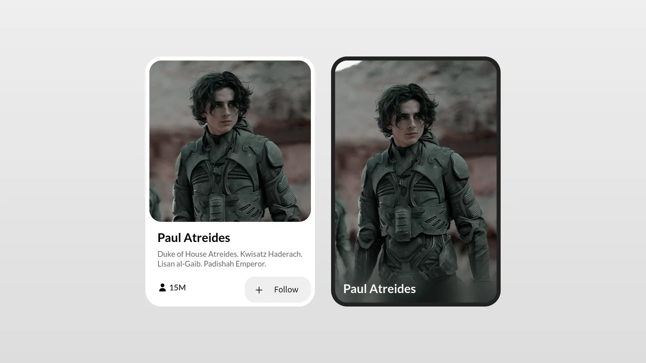
This Glassmorphism Profile Info Card is a high-end UI component that replicates the sleek, frosted-glass aesthetic found in modern operating systems like iOS and macOS. It features a sophisticated interplay between background imagery and foreground content, using advanced CSS masking and backdrop filters to create a natural sense of depth and hierarchy.
Core Technique
The visual depth of this component is not achieved by simple opacity, but through a combination of stacking contexts and selective blurring.
1. Grid Stacking logic
The card uses CSS Grid with a single named area called "stack". This allows the background cover image and the text content body to occupy the exact same coordinate space without traditional absolute positioning hacks.
&__inner {
    grid-template-areas: "stack";
    display: grid;
}

&__cover, &__body {
    grid-area: stack; /* Both elements overlap */
}
2. Advanced Masking and Blur
The “Frosted” effect is localized using a pseudo-element (:after). Instead of blurring the whole image, we apply backdrop-filter: blur(100px) only to a specific layer. The real magic happens with the mask property: a linear gradient is used to define which parts of the blur are visible. This creates a smooth transition where the top of the image remains sharp, while the bottom (where the text sits) becomes heavily diffused.
&:after {
    content: "";
    position: absolute;
    inset: 0;
    backdrop-filter: blur(100px);
    /* The mask creates the progressive fade */
    mask: linear-gradient(-14deg, black 30%, transparent 66%);
}
3. Tactile Feedback
The design is reinforced by an inset box-shadow on the borders, which mimics the thin refractive edge of a physical piece of glass. This subtle highlight is what separates a generic transparent box from a professional glassmorphism effect.
Browser Support
This component provides a premium look on modern browsers. On older browsers (pre-2019), the content remains perfectly readable, but the background will appear as a solid semi-transparent color without the blur effect (graceful degradation).