Popping Form Controls
See the Pen Popping Form Controls.
Tech & Dependencies
Features
- ✓ Confetti Effect
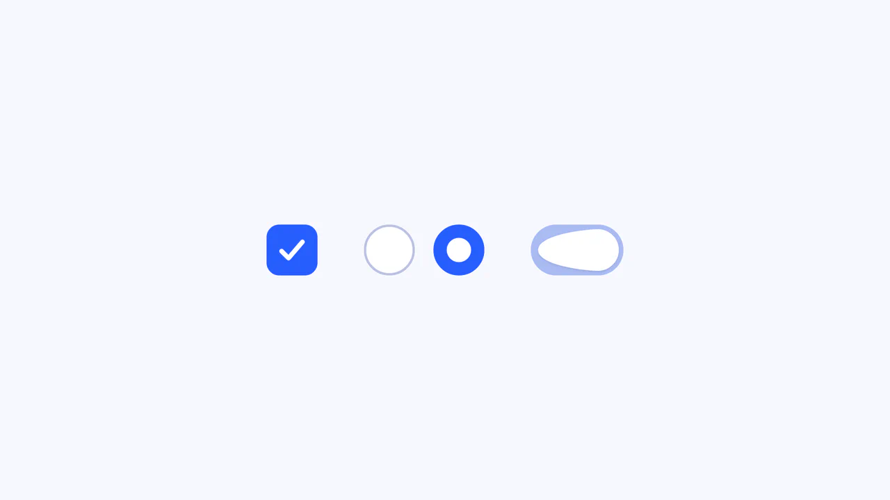
- ✓ Custom Checkboxes
- ✓ Custom Radios
- ✓ Dark Mode
Browser Support
Core
This is a Popping Form Controls component. It replaces standard browser checkboxes and radio buttons with highly stylized, interactive versions. Its function is to provide delightful micro-interactions by triggering a localized, physics-based confetti burst whenever an input is successfully checked.
Specs
- Weight: ~5 KB. Zero external dependencies.
- Performance: High. The core input animations rely on CSS
@keyframesmanipulatingbox-shadowandtransform. The confetti particles use the Web Animations API (element.animate), ensuring hardware acceleration. - Theming / Customization: Entirely driven by CSS variables (
--primary,--bg,--fg). Natively respects the system’s light/dark mode preference via@media (prefers-color-scheme: dark). - Responsiveness: Fluid. Uses
emunits tied to a dynamically calculated rootfont-size(calc()), allowing the inputs to scale naturally with viewport width. - Web APIs: Web Animations API (
element.animate()). - Graceful Degradation: Fails safe. If JavaScript or the Web Animations API is disabled, the inputs still function normally and retain their CSS bouncy scaling animations; only the confetti particles are omitted.
Anatomy
The structure maintains semantic HTML validity while adding visual flair.
- HTML (The Skeleton): A standard
<form>containing<label>wrappers around native<input type="checkbox">and<input type="radio">elements. - CSS (The Skin): Removes the native styling (
appearance: none). Usesbox-shadowto draw the borders and inner filled states of the radio buttons, and the::afterpseudo-element to render the checkmark (\2713). - JS (The Nervous System): Listens for the
changeevent. When an input is checked, it dynamically generates multiple<span>elements (particles), calculates their trajectory using trigonometry, animates them via the Web Animations API, and removes them from the DOM upon completion.
Logic
The standout technical implementation is the “Radial Particle Dispersal” using trigonometry and the Web Animations API:
let angleInRad = angle * Math.PI/180,
    angleSin = Math.sin(angleInRad),
    angleCos = Math.cos(angleInRad),
    pointA = { x: start * angleSin, y: start * angleCos },
    pointC = { x: end * angleSin, y: end * angleCos };

let animation = particle.animate([
    { transform: `translate(${pointA.x}em,${pointA.y}em) scale(0)` },
    { transform: `translate(${pointC.x}em,${pointC.y}em) scale(0)` }
], { duration: 375, easing: "linear" });

animation.onfinish = particle.remove.bind(particle);
Instead of using a heavy physics library or writing complex CSS @keyframes for 14 different directions, the script calculates the exact Cartesian coordinates (x, y) for each particle based on its angle in the circle using Sine and Cosine. It then uses the native element.animate() method to push the particle outward while scaling it down to zero. The onfinish callback ensures the DOM is immediately cleaned up, preventing memory leaks.
Feel
Playful and tactile. The interaction consists of two synchronized layers: the heavy, bouncy CSS animation of the input itself (which mimics a physical button being pressed and popping back up), and the weightless, explosive scattering of the confetti. The combined effect turns a mundane form-filling task into a series of satisfying mini-celebrations.