Pulsing Circle Optical Illusion
See the Pen Pulsing Circle Optical Illusion.
Tech & Dependencies
Features
- ✓ Optical Illusion
- ✓ Pure CSS
- ✓ No Animation
Browser Support
Core
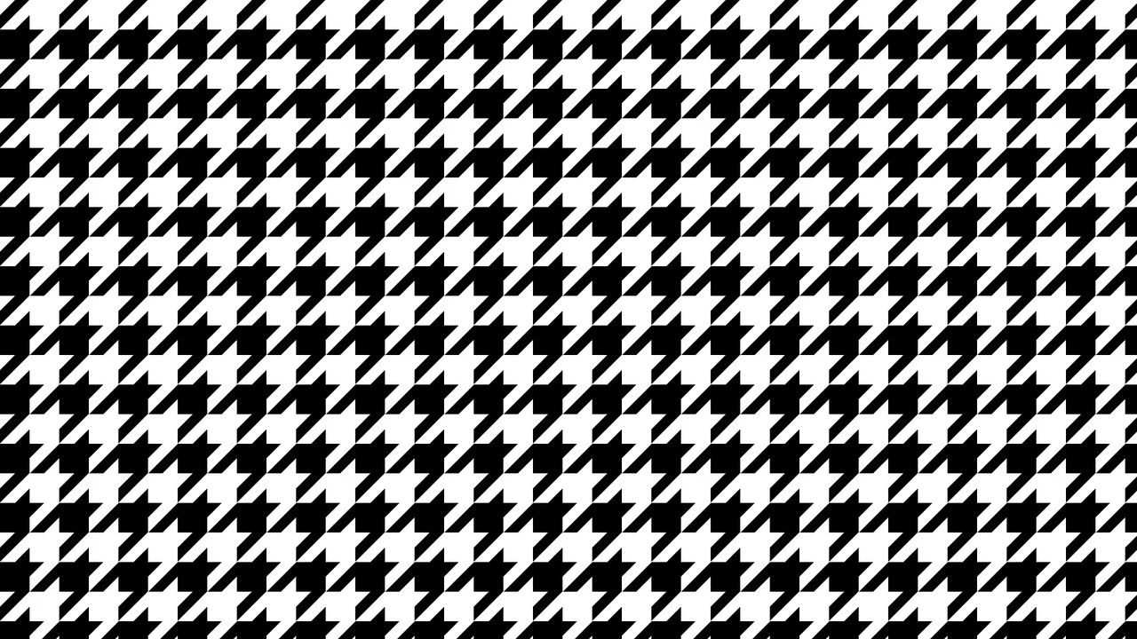
This is a Pulsing Circle Optical Illusion. It generates a static, high-contrast geometric pattern that exploits peripheral vision to create a false sense of motion. Its function is to serve as a lightweight, visually arresting background or artistic centerpiece using only a handful of CSS properties and zero JavaScript.
Specs
- Weight: < 1 KB. Zero dependencies. No image files.
- Performance: Optimal. Rendered entirely by the browser’s CSS gradient engine without triggering any reflows or requiring animation loops.
- Theming / Customization: The entire structure scales dynamically based on the
--xcustom property. The aspect ratio of the rectangles is governed by the--ycalculation. Colors are easily swapped within therepeating-conic-gradientdefinition. - Responsiveness: Centered via CSS Grid. The background pattern seamlessly fills the viewport (
min-height: 100vh), while the central circle scales relative to the--xvariable. - Graceful Degradation: Fails safe. If
repeating-conic-gradientis unsupported in ancient browsers, the background will default to a blank screen.
Anatomy
The effect is achieved with a minimal DOM footprint, utilizing a single pseudo-element.
- HTML (The Skeleton): None required. The styles apply directly to the
<body>element. - CSS (The Skin): Defines a repeating black-and-white grid pattern on the body. A
::beforepseudo-element generates the central circle, inheriting the exact same background pattern but rotating it by90degto create the perceptual clash. - JS (The Nervous System): Completely absent.
Logic
The core trick relies on “Perceptual Drift via Orthogonal Patterns”.
body {
  --x: 130px;
  --y: calc(var(--x) / 4);
  background: repeating-conic-gradient(#fff 0 25%, #000 0 50%) 0 0 / var(--x) var(--y);
}

body::before {
  /* ... */
  background: inherit;
  rotate: 90deg;
}
Instead of writing a complex animation, the developer uses structural geometry to fool the brain. By drawing a highly repetitive, high-contrast grid (repeating-conic-gradient sized by --x and --y) and placing an identical, but 90-degree rotated copy of that grid inside a central circle (body::before), the eye struggles to resolve the boundaries between the horizontal and vertical lines. As the user’s eyes scan across the screen, peripheral vision misinterprets this structural conflict as subtle, pulsing movement.
Feel
Unsettling and hypnotic. Despite containing absolutely no animation code, the central circle appears to vibrate or expand slightly as you move your eyes around the screen. Because the pattern is generated via CSS mathematics rather than a rasterized image, the high-contrast edges are razor-sharp, intensifying the optical trickery.