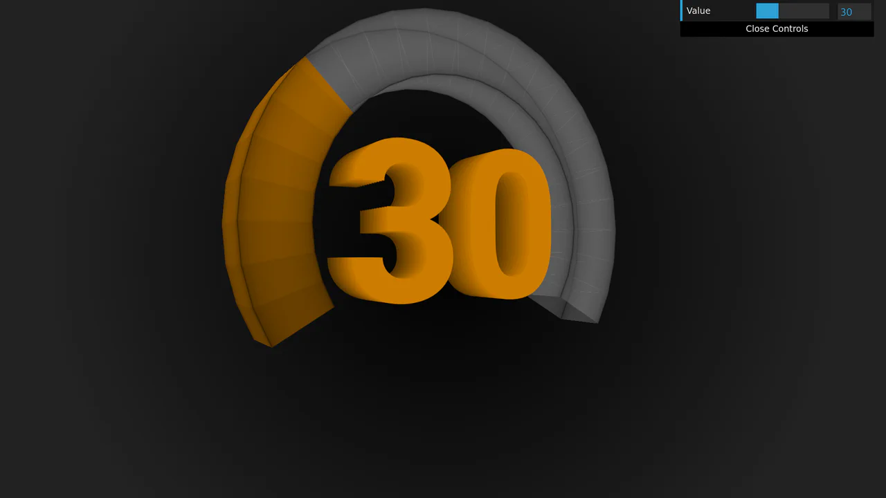
Semicircular Animated Radar Gauge
See the Pen Semicircular Animated Radar Gauge.
Tech & Dependencies
Features
- ✓ Radial Progress
- ✓ Dynamic Theming
- ✓ Rounded Columns
- ✓ Animated Entry
Browser Support
Core
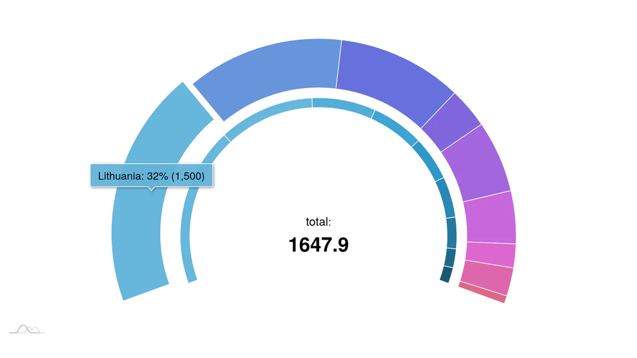
This is a Semicircular Animated Radar Gauge built with the amCharts 4 engine. It distills complex metrics like Carbon and Energy into a high-contrast radial format that covers only 270 degrees of a circle. Its function is to provide an at-a-glance KPI status within professional data dashboards, replacing cluttered line charts with clean, weighted arcs.
Specs
- Weight: ~380 KB (amCharts 4 library footprint).
- Performance: High. The rendering is handled via an optimized SVG engine.
- Theming / Customization: High. Uses an adapter pattern to sync label colors with bar indexes.
- Responsiveness: Fluid. Recalculates based on the parent container’s dimensions.
- Graceful Degradation: Fails to an empty container if the library is not loaded.
Anatomy
The component maps numerical data to a polar coordinate system.
- HTML (The Skeleton): A singular
div#chartdivacting as the canvas mount point. - CSS (The Skin): Minimal. Ensures the container has enough height to house the radial elements and uses a modern sans-serif stack.
- JS (The Nervous System): An amCharts
RadarChartinstance. It configures aCategoryAxisfor labels and aValueAxisfor the progress range (0 to 10), then layers two series to create the visual “track” and “fill” effect.
Logic
The primary logic resides in the arc definition and the dual-series stacking.
chart.startAngle = -90;
chart.endAngle = 180;
// ...
series1.dataFields.valueX = "full"; // The background track
series2.dataFields.valueX = "value"; // The actual progress
By setting the start and end angles specifically, the chart breaks the standard 360-degree loop. The first series is set to a “full” value (10 in this case) with a low opacity (0.08), serving as a visual guide for the maximum capacity. The second series sits directly on top, using the same category axis but mapping to the actual value, creating a physical “filling” effect within the radial track.
Feel
Precise and industrial. The heavy rounded corners (cornerRadius = 20) give the data a physical mass, making the bars feel like solid plastic components. The animation is smooth and weighted, avoiding the jitter common in low-level canvas implementations. It feels less like a webpage and more like a high-end hardware diagnostic screen.