Skeuomorphic Wood Texture Toggles
See the Pen Skeuomorphic Wood Texture Toggles.
Tech & Dependencies
Features
- ✓ Skeuomorphism
- ✓ CSS Patterns
- ✓ Input Hack
- ✓ Detailed Shadows
Browser Support
Core
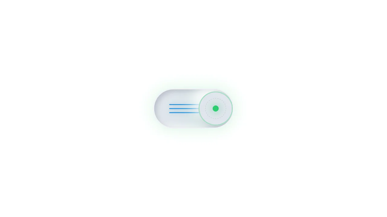
This collection of Skeuomorphic Wood Texture Toggles brings a tactile, nostalgic feel to digital interfaces. It showcases four distinct variations of toggle switches (sliding, dotted handle, separated track, and embedded text), all unified by a realistic wood grain texture and intricate lighting effects. The implementation demonstrates the power of modern CSS features like :has() to control complex state changes without a single line of JavaScript.
Core Technique
The visual richness relies on layering multiple background images and shadows.
- Wood Texture: A repeatable wood pattern image is applied to the
.toggle-handleelements. - Depth via Shadows: Multiple
box-shadowlayers (bothinsetand external) create the illusion of depth, beveled edges, and light sources. - State Management: The CSS pseudo-class
:has(:checked)is the engine here. It allows the parent container to detect when the hidden<input type="checkbox">is clicked, triggering changes in background color, handle position (transform: translateX), and even text opacity/color within children elements.
Customization
The wood texture is external, but you can easily swap it for a CSS gradient or another image.
/* Changing the handle texture */
.toggle-handle {
  /* Replace URL with your texture or gradient */
  background-image: url('path/to/texture.png');
  /* Or use a CSS gradient for a modern look */
  /* background-image: linear-gradient(to bottom, #444, #222); */
}
To modify the “On” and “Off” colors, target the parent container’s checked state:
.toggle-container.a:has(:checked) {
  /* Change active color */
  background-color: #5698bb;
}
Tips
1. Browser Support (:has):
This code relies heavily on the :has() selector. While supported in all major modern browsers, ensure your target audience isn’t on legacy versions (older than 2022-2023). A fallback script would be needed for perfect backward compatibility.
2. Accessibility:
The inputs are visually hidden but functionally present. The text labels “ON” and “OFF” have aria-hidden="true" because they are purely decorative visual cues. The screen reader relies on the checkbox state itself. For better accessibility, add an aria-label to the <input> element describing what setting it controls (e.g., aria-label="Toggle Sound").