CSS Staggered Bars Reveal Animation
See the Pen CSS Staggered Bars Reveal Animation.
Tech & Dependencies
Features
- ✓ Zero JavaScript
- ✓ Keyframe Animation
- ✓ Background Size/Position
- ✓ Responsive Design
Browser Support
Core
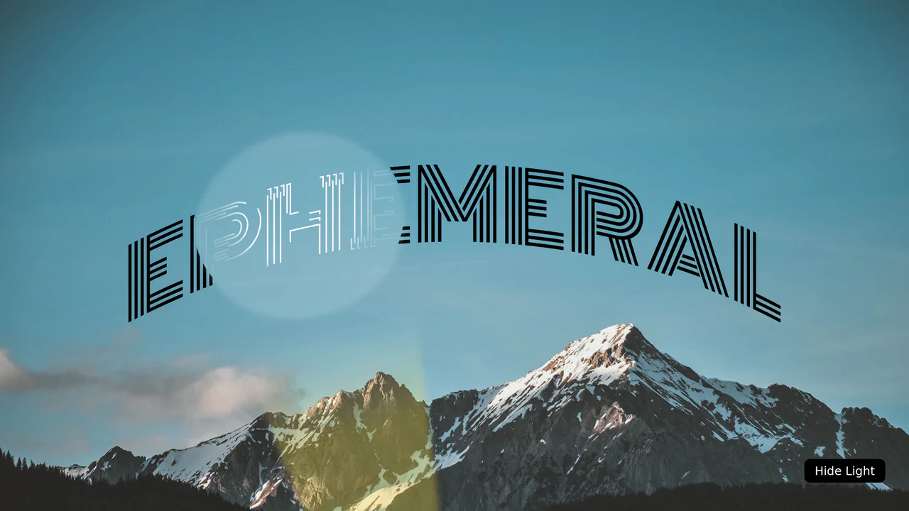
This Staggered Bars Reveal Animation creates a cinematic intro for landing pages using zero JavaScript. By orchestrating a single pseudo-element (::after) with complex linear-gradient backgrounds, the component simulates seven distinct bars sliding into place. The animation cleverly shifts the background-position of each gradient strip sequentially, creating a rhythmic “wipe” effect that culminates in the text appearing.
Core Technique
The visual complexity comes from a single element doing the work of many.
1. Multi-Background Animation
Instead of creating 7 separate divs for the bars, the developer uses multiple backgrounds on the header::after pseudo-element. Each “bar” is actually a linear-gradient sized to roughly 1/7th of the container (7% width or height depending on screen size).
header::after {
  /* 7 distinct gradients creating the bars */
  background-image:
    linear-gradient(var(--c1), var(--c1)),
    linear-gradient(var(--c2), var(--c2)),
    /* ... 5 more ... */
    linear-gradient(var(--c1), var(--c1));

  /* Keyframes animate these positions independently */
  animation: showBars 3.5s;
}
2. The Keyframe Sequence
The @keyframes showBars rule is meticulously timed. It moves the background-position of each gradient strip one by one.
- 0% - 14%: Move the 1st bar.
- 14% - 28%: Move the 2nd bar.
- … This creates the staggered feel without requiring animation delays or multiple DOM nodes.
@keyframes showBars {
  /* Pattern: Move background-position X or Y for specific gradients */
  0%  { background-position: -400% 7%, 500% 21%, ... }
  14% { background-position:    0% 7%, 500% 21%, ... } /* 1st arrives */
  28% { background-position:    0% 7%, 100% 21%, ... } /* 2nd arrives */
}
3. Responsive Direction
Using a media query (min-width: 768px), the animation logic flips completely.
- Mobile: Bars are horizontal and animate horizontally (
flex-direction: column). - Desktop: Bars become vertical and animate vertically. The
background-sizeandanimation-nameare swapped toshowBarsBig.
Accessibility (A11y)
- Reduced Motion: The code includes a
@media (prefers-reduced-motion)block. If a user has requested reduced motion, the intense bar animation is disabled (animation: none), and the text fades in gently instead of sliding. This prevents motion sickness triggers. - Text Contrast: The colors defined in
:rootgenerally provide good contrast, though specific combinations (like light blue on dark blue) should be checked against WCAG standards.
Browser Support
This technique relies on standard CSS Backgrounds and Animations, supported everywhere for over a decade.