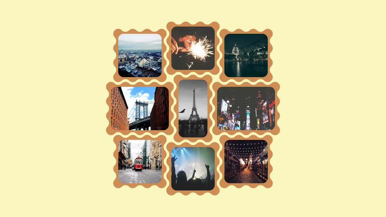
Tactile Long Press Image Grid
See the Pen Tactile Long Press Image Grid.
Tech & Dependencies
Features
- ✓ Long Press Interaction
- ✓ Responsive Grid
- ✓ Touch Support
- ✓ Instant Preview
Browser Support
Core
In a world obsessed with speed, we often forget the power of distinct intent. The standard “click” is binary and abrupt. This component introduces a moment of pause — a “breath” — allowing the user to peek into content without committing to a navigation event. By utilizing the “long press” (or click-and-hold) mechanic, we bridge the gap between desktop precision and mobile intuition, creating a gallery experience that feels organic and responsive to the user’s curiosity.
Core Technique
The elegance of this solution lies in its reliance on Viewport Minimum (vmin) units and a unified event strategy.
- Geometric Harmony: The grid layout uses
vminfor both columns and rows. This ensures the grid maintains a perfect aspect ratio and fits within the screen regardless of whether the device is in portrait or landscape mode. - Unified Interaction: The JavaScript normalizes the experience by binding
mousedown(desktop) andtouchstart(mobile) to the samepseudohoverfunction. It treats the finger and the cursor as equals. - Zero-State transitions: The preview modal exists in the DOM but with
0vmindimensions. The expansion is animated via CSS transitions, ensuring a GPU-accelerated “pop” effect without layout thrashing.
Customization
The design is highly adaptable. You can modify the grid density or the timing of the reveal to suit different content types.
Adjusting the Grid
.container {
    /* Create a 3x3 grid instead of 4x4 */
    grid-template-columns: repeat(3, 25vmin);
    grid-template-rows: repeat(3, 25vmin);
}
Browser Support
The code uses standard CSS Grid and basic Event Listeners. It is compatible with all modern browsers.