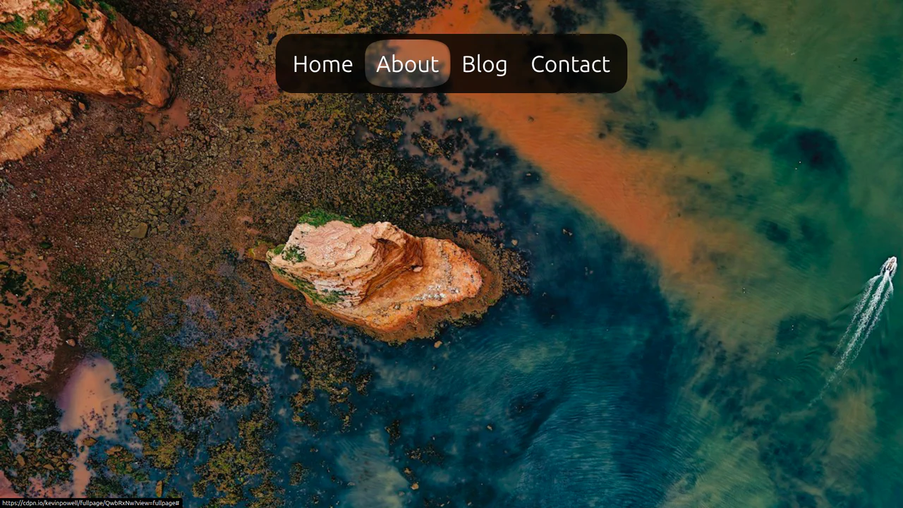
Vertical Ghost Text Hover Effect
See the Pen Vertical Ghost Text Hover Effect.
Tech & Dependencies
Features
- ✓ Text Shadow Stacking
- ✓ CSS Layers
- ✓ light-dark() Colors
- ✓ Typography Animation
Browser Support
Core
This Vertical Ghost Text Hover Effect adds a spectral, sci-fi vibe to navigation menus without requiring extra HTML elements or pseudo-elements. By animating a stack of vertical text-shadows, the component creates a fading “echo” or “glitch” visual that expands outward when a user interacts with the link. It utilizes the modern light-dark() function to handle system theme preferences automatically.
Core Technique
The visual impact relies entirely on the manipulation of the text-shadow property and the smart use of CSS units.
1. The Shadow Stack
Instead of using complex ::before or ::after pseudo-elements to duplicate the text, this technique uses a comma-separated list of shadows. On hover, three pairs of shadows appear: one set moves up (negative Y-offset) and one set moves down (positive Y-offset).
a:where(:hover, :focus-visible) {
  text-shadow:
    /* First pair: Close and semi-transparent */
    0  2ex rgb(var(--rgb) / 0.35),
    0 -2ex rgb(var(--rgb) / 0.35),

    /* Second pair: Further and fainter */
    0  4ex rgb(var(--rgb) / 0.15),
    0 -4ex rgb(var(--rgb) / 0.15),

    /* Third pair: Distant and barely visible */
    0  6ex rgb(var(--rgb) / 0.075),
    0 -6ex rgb(var(--rgb) / 0.075);
}
2. The ex Unit
Notice the use of ex units (e.g., 2ex) instead of px or rem. The ex unit is relative to the x-height of the current font. This ensures that the spacing of the “ghost” text remains perfectly proportional to the typography, regardless of the font size or family used.
3. Modern Theming
The code leverages the new CSS color function light-dark(). This eliminates the need for manual prefers-color-scheme media queries.
:root {
  /* Automatically switches based on system theme */
  --clr-bg: light-dark(var(--bg-light), var(--bg-dark));
}
Accessibility (A11y)
This effect is purely decorative and does not interfere with the readability of the main text link.
Browser Support
The shadow effect works everywhere, but the color implementation uses light-dark(), which is a 2024 feature.
If you need to support older browsers (e.g., older Chrome versions), provide a fallback color definition before the light-dark() declaration.