30+ CSS 3D Buttons: Free Examples & Code Snippets
CSS 3D buttons bring tactile depth to flat interfaces, transforming standard call-to-action points into pressable, volumetric elements that feel physical and responsive. These effects create spatial affordance without the overhead of full 3D engines.
- These buttons use transform: translateZ() and rotate3d() combined with perspective on the parent container to extrude the button surface into a true 3D space, rendered entirely on the GPU compositor thread.
- Pseudo-elements with backface-visibility: hidden and transform-style: preserve-3d construct the extrusion sides, creating a physical thickness effect without allocating additional DOM nodes.
- Press states animate translateZ toward zero combined with scale reduction, simulating the tactile compression of a physical button while maintaining 60fps compositor performance.
Browse this collection of CSS 3D buttons to master hardware-accelerated depth effects that make your call-to-action points feel as responsive as they look.
Table of Contents:
Examples
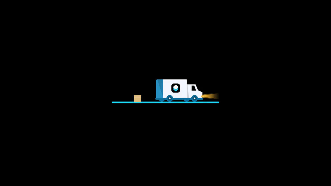
3D Truck Delivery Download Button
An advanced interactive download button featuring a complex 3D truck delivery animation. Powered by GSAP and SCSS, clicking the button triggers a 90-degree backward flip using CSS preserve-3d to convert the top edge into a flat road. A styled vector truck drives in from the left, catches a falling cargo box, departs off-screen, and flips back to reveal a success checkmark. (Requires: gsap.js)
 Chrome 55+
 Edge 79+
 Firefox 54+
 Safari 9.1+
See the Pen 3D Truck Delivery Download Button.
3D Isometric Neon Glow Buttons
An interactive set of 3D-perspective dashboard buttons styled with vibrant neon glowing highlights. Hovering over a card rotates its panel dynamically along the X and Y axes using native CSS preserve-3d and perspective properties, while styling the SVG icon with custom scaling and color-matched drop-shadow filters. Clicking triggers a quick, synchronized scale-pulse animation.
Chrome 57+
Edge 16+
Firefox 52+
Safari 10.1+
See the Pen 3D Isometric Neon Glow Buttons.

Iridescent 3D Neumorphic Button
This is an Iridescent 3D Neumorphic Button. It pushes CSS styling to the limit, using stacked gradients, oklch color spaces, and advanced blend modes to create a button that feels like a piece of polished, translucent hardware. Its function is to serve as a high-fidelity “Hero” element, delivering a tactile, light-responsive experience that feels alive under the cursor.
Chrome 105+
Edge 105+
Firefox 121+
Safari 15.4+
See the Pen Iridescent 3D Neumorphic Button.
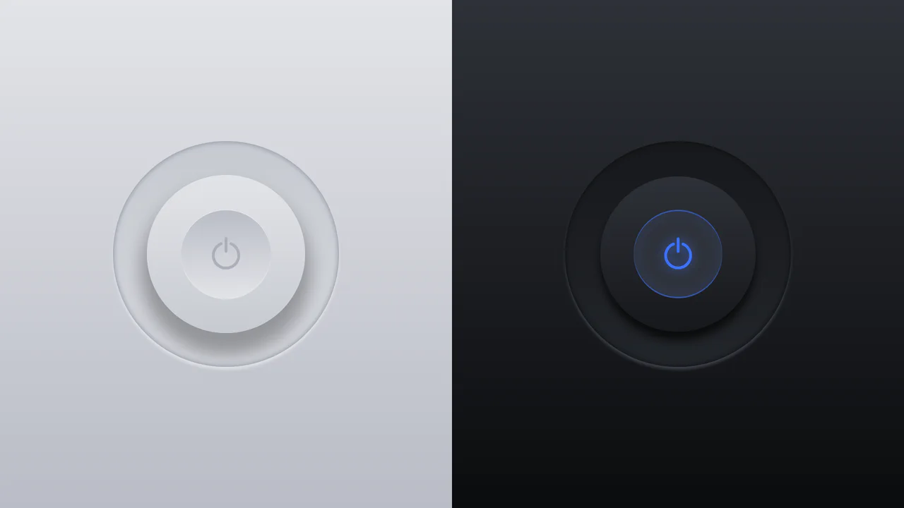
Glowing On/Off Buttons
A skeuomorphic toggle button where the entire press effect is implemented in pure CSS using box-shadow and transform: scale(). JavaScript is only used to toggle the WAI-ARIA attribute aria-pressed on click.
See the Pen Glowing On/Off Buttons.

Neomorphic Button
A striking button with a neomorphic design and a pulsating element, built using pure CSS variables and pseudo-elements. The hover and active state animations provide a smooth UX, making it perfect for drawing attention to key CTAs.
See the Pen Neomorphic Button.
Push Button (CSS 3D Button)
A skeuomorphic 3D button created with multi-layered box-shadow and linear-gradient to simulate volume, highlights, and shadows. On :hover, the box-shadow styles are animated, creating a “pressed” effect.
See the Pen Push Button (CSS 3D Button).
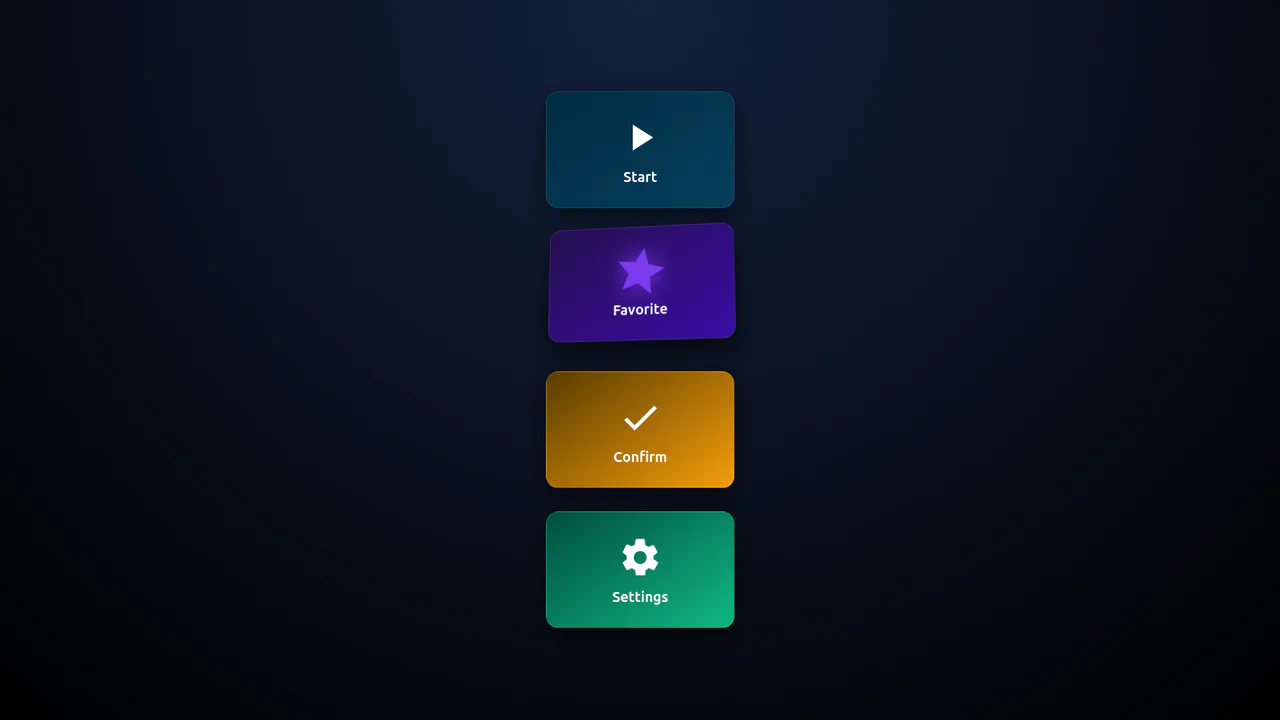
3D Buttons
This collection of 8 advanced pure CSS 3D hover effects is built using a single HTML element without any pseudo-elements or JavaScript. By leveraging clip-path, perspective, and conic-gradient, these performance-optimized snippets deliver deep visual feedback and smooth transitions. It is a perfect, lightweight solution for developers looking to add interactive 3D micro-interactions to modern web interfaces.
See the Pen 3D Buttons.
Simple Buttons
This collection features five interactive button styles built with SCSS, showcasing advanced techniques like dynamic pseudo-elements, box-shadow manipulation, and calc()-based animations. These lightweight snippets provide high-performance UI micro-interactions, offering everything from 3D offset shadows to smooth color inversions for modern frontend projects.
See the Pen Simple Buttons.
CSS Only 3D Perspective Button
A high-performance 3D CSS button utilizing perspective and rotateY transforms for a realistic tilt interaction. It features a sleek linear-gradient shimmer and dynamic text-shadow manipulation on hover, providing a modern, JavaScript-free solution for creative and lightweight frontend design.
See the Pen CSS Only 3D Perspective Button.
Hover Effect (3D + text-shadow)
A collection of striking pure CSS 3D components built using clip-path and complex conic gradients. These snippets demonstrate high performance and enable deep visual feedback and text transformation on hover without any JavaScript.
See the Pen Hover Effect (3D + text-shadow).

Responsive 3D Buttons
A sophisticated pure CSS 3D button leveraging clip-path and multiple drop-shadow filters to achieve a unique, high-depth visual aesthetic. This performance-optimized snippet features a tactile “press” animation and custom typography, providing a modern JavaScript-free UI solution for creative web projects.
See the Pen Responsive 3D Buttons.

Big Jelly Button
BIG Jelly Button — a stunning pure CSS implementation of a tactile, glossy button effect without the need for external image assets. This snippet showcases advanced use of layered box-shadows, gradient text clipping, and surface highlights to deliver a high-performance, skeuomorphic UI interaction.
See the Pen Big Jelly Button.
A creative vertical navigation menu built with pure CSS, utilizing pseudo-elements to create a sophisticated layered border effect. This snippet features a smooth translateX hover transition, providing high frontend performance and a modern interactive feel for sidebar or menu components.
Perspective Button
A stylish vertical navigation menu built with pure CSS using 3D perspective transforms and dynamic hover states. This lightweight snippet demonstrates mirrored rotations with rotateY and gradient backgrounds.
See the Pen Perspective Button.
Skeumorphic Button
A sophisticated neumorphic UI button built with pure CSS, utilizing layered box-shadow properties to achieve a soft, tactile depth effect. This performance-optimized snippet features realistic click feedback and background-clip: text styling, making it an ideal reference for modern frontend animations.
See the Pen Skeumorphic Button.
Animated Buttons
A versatile collection of 3D perspective hover buttons built with pure CSS transforms and the perspective property. These high-performance snippets feature multi-directional tilt effects and synchronized glowing shadows, providing a lightweight and visually striking solution for modern frontend development.
See the Pen Animated Buttons.
Do not Push Me Buttons
Tactile mechanical keys are recreated using pure CSS 3D transforms and layered box shadows. The ::before pseudo-element forms the bottom base, complete with a thick, solid shadow representing the key’s plastic chassis. Clicking/active states translate the button cap downwards while shrinking the shadow to mimic a physical keyboard keypress.
See the Pen Do not Push Me Buttons.
Hover Button
Two nested button layers slide apart during a slow, dramatic hover animation. The outer #foot container acts as a stationary, lavender background slot. On hover, the inner absolute-positioned .button-os card descends by 30px, transitioning from white to pink over 1.5s while the text expands its letter-spacing.
See the Pen Hover Button.
Skew Button
Slanted geometric layers collapse together in this clean, skewed 3D button transition. The entire container is sheared at a skewX(20deg) angle. The :before pseudo-element loads its text via content: attr(data-label), sitting offset at top: -1rem to create diagonal depth. On hover, the base card slides inwards to meet the button frame.
See the Pen Skew Button.
3D Fip Button
Two perpendicular pseudo-element facets fold together inside a 3D perspective field to form a rotating rectangular prism. The front face (:before) and the top face (:after) are offset by translateZ(25px). On hover, the link rotates rotateX(-90deg), flipping the top white face forward in place of the solid purple front.
See the Pen 3D Fip Button.
CSS 3D Blend Mode Buttons
A continuous 3D swinging viewport and holographic color-dodge splits drive this interactive button list. On hover, the background turns yellow as :before (red) and :after (blue) pseudo-elements trigger a bouncy translateWobble animation. Offsetting them in opposite directions along the Z-axis simulates a chromatic glitch depth.
See the Pen CSS 3D Blend Mode Buttons.

Single Element 3D Button
Thick, volumetric 3D keycaps are built using stacked gradients and precise coordinate translations on active states. The :before pseudo-element acts as a solid green base offset by 6px, with dense box-shadow values forming the chassis. On :active, the keycap shifts down, and the base shrinks to mimic a heavy mechanical push.
See the Pen Single Element 3D Button.
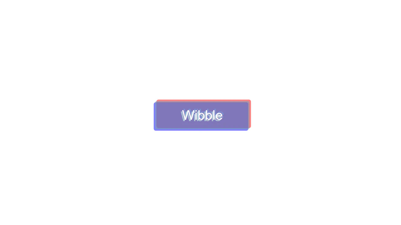
Wibble 3D Button
An offset chromatic aberration style frames this interactive text button. At rest, :before (red) and :after (blue) pseudo-elements load the card text via content: attr(data-title), sitting offset diagonally. On hover, the colored text layers smoothly transition to 0 coordinates, collapsing perfectly beneath the solid base card.
See the Pen Wibble 3D Button.

3D Button Element
A floating, 3D-angled card tilts and rises on hover, transforming its internal icon. The parent .perspective skews the button. On hover, the blue card rotates from rotateX(40deg) to rotateX(10deg) while sliding upwards. Simultaneously, nine internal dots slide in opposite directions, merging a 3x3 grid into compact nodes.
See the Pen 3D Button Element.
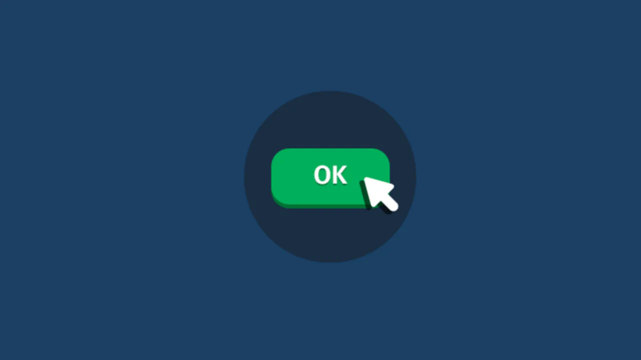
OK Button
An illustrated vector cursor descends to press a green 3D button inside this choreographed hover animation. Using a springy cubic-bezier timing curve, the main .ok-btn shifts downwards while its solid shadow collapses. Simultaneously, the .cursor and its offset :before shadow slide into place to mimic a mechanical click.
See the Pen OK Button.
3D Button
Chained box-shadow layers construct a solid, flat-extruded 3D button that collapses mechanically on click. At rest, twelve staggered gold offsets (1px to 12px) build a thick isometric depth wall. On :active, this shadow stack shrinks down to 5px depth, simulating a heavy, spring-bound physical keypress without changing layout coordinates.
See the Pen 3D Button.

3D Button
Complementary skewed pseudo-elements construct a solid, flat-extruded 3D button that collapses mechanically on click. The bottom :before face (skewed at skewX(45deg)) and the right :after face (skewed at skewY(45deg)) form the prism walls. On click, the button shifts down-right while both side faces shrink to simulate a physical push.
See the Pen 3D Button.

3D Button Effects
Pivoting coordinates on hover flip the 3D angle and shadows of this pill-shaped button. The .box is styled with a gold-orange gradient tilted on rotateY(-15deg) at rest. Hovering flips the rotation to 15deg, moves the text/box shadows to the opposite side, and slides a glossy linear-gradient glare across the card.
See the Pen 3D Button Effects.

3D Buttons
Hollow 3D wireframe buttons extrude into solid, shadowed blocks on hover using skewed pseudo-elements and inline SVG gradients. At rest, the skewed :before and :after sides are styled with transparent borders. Hovering shifts the card diagonally, while filling the side faces with solid vector gradients to complete the 3D volume.
See the Pen 3D Buttons.
Wiggle Button
A squishy, chewing-gum style morphing animation deforms this retro 3D button on hover. Alternating diagonal border-radius values in @keyframes morph create a fluid, jelly-like transition. Multi-layered, thick box-shadow offsets form an extruded pink frame that bends in sync with the corners, while the inner text rocks side-to-side.
See the Pen Wiggle Button.