70+ CSS 3D: Free Examples & Code Snippets
Adding three-dimensional depth to a web interface transforms static layouts into immersive digital environments. CSS 3D empowers developers to create realistic depth, perspective, and spatial storytelling without sacrificing performance or accessibility.
- These effects leverage transform and perspective properties to build a true 3D coordinate system, offloading matrix calculations to the GPU compositor thread and bypassing main-thread layout recalculations.
- Advanced patterns combine transform-style: preserve-3d with nested transforms to construct complex objects — cubes, galleries, and isometric scenes — while maintaining minimal rendering overhead and deterministic compositing behavior.
- Modern implementations use @property for custom 3D-linked CSS variables and container queries for adaptive depth scaling, ensuring spatial context adjusts naturally across viewports without hardcoded breakpoints.
Dive into these curated CSS 3D examples to master GPU-accelerated depth rendering and push the boundaries of your next layout without reaching for a full WebGL pipeline.
Table of Contents:
Examples
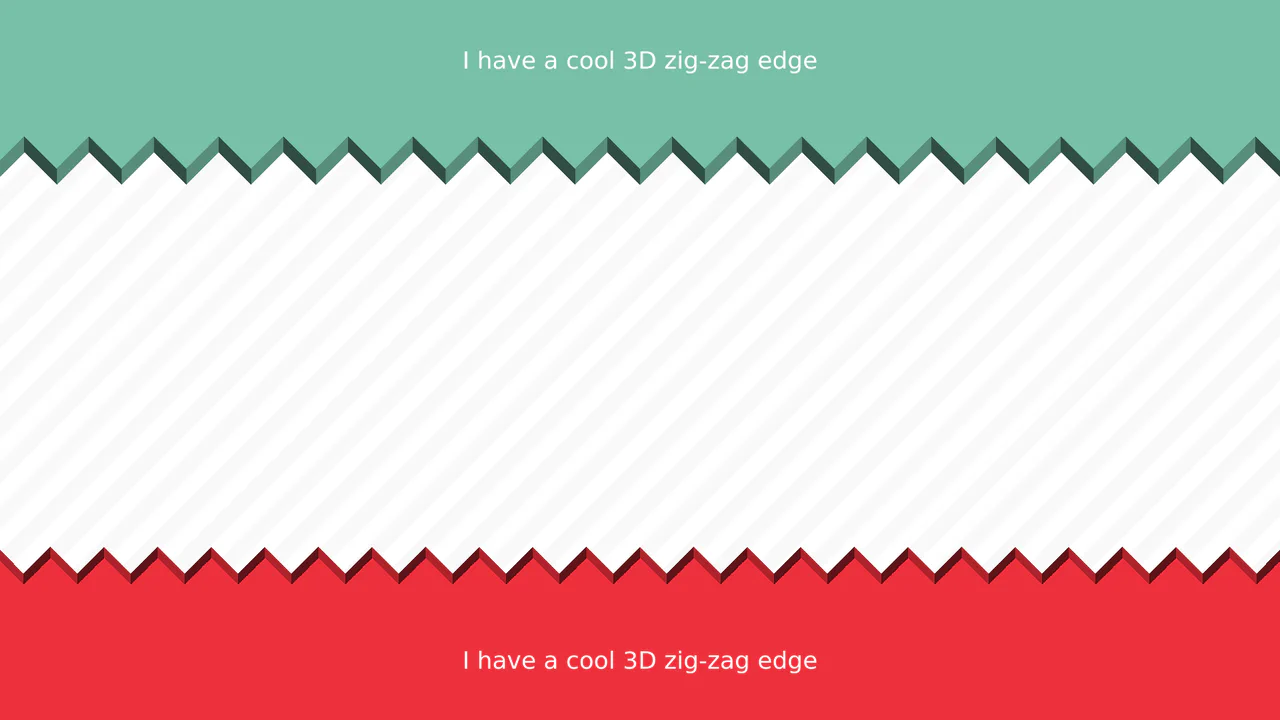
3D Zig-Zag Edge CSS Dividers
3D Zig-Zag Edge CSS Dividers creates a paper-cut illusion using only CSS. It relies on conic-gradient applied to both the background (for shading) and -webkit-mask (for the jagged shape). CSS variables control the size and depth of the teeth. This approach requires zero extra DOM elements or SVG files, making it a highly optimized solution for section transitions.
 Chrome 69+
 Edge 79+
 Firefox 83+
 Safari 12.1+
See the Pen 3D Zig-Zag Edge CSS Dividers.

CSS 3D Morphing Geometric Polyhedron
This is a 3D Morphing Geometric Polyhedron. It seamlessly transitions a six-sided cube into a twelve-sided rhombic dodecahedron through continuous spatial interpolation. Its function is to serve as a highly complex visual anchor or loading state, demonstrating advanced volumetric transformations without relying on WebGL or external physics engines.
Chrome 85+
Edge 85+
Safari 16.4+
See the Pen CSS 3D Morphing Geometric Polyhedron.

3D Neumorphic Pill Toggle Switch
This is a 3D Neumorphic Pill Toggle Switch. It replaces the default browser checkbox with a tactile, extruded slider mechanism. Its function is to govern binary states (on/off) while providing physical, hardware-like visual feedback to ground the digital interaction in reality.
Chrome 87+
Edge 87+
Firefox 66+
Safari 14.1+
See the Pen 3D Neumorphic Pill Toggle Switch.
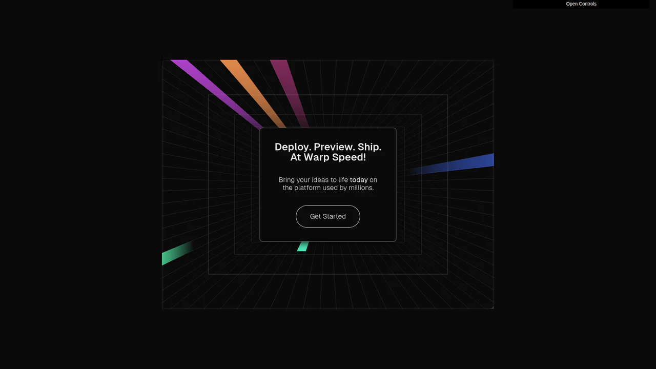
3D Warp Speed Tunnel
This is a 3D Warp Speed Tunnel. It renders a four-sided grid tunnel utilizing CSS 3D transforms, through which animated gradient “beams” travel infinitely. Its function is to provide an immersive, spatial background for hero sections or focal cards, establishing a strong sense of velocity and technological depth. (Requires: GSAP, dat.gui)
Chrome 105+
Edge 105+
Firefox 110+
Safari 16.0+
See the Pen 3D Warp Speed Tunnel.
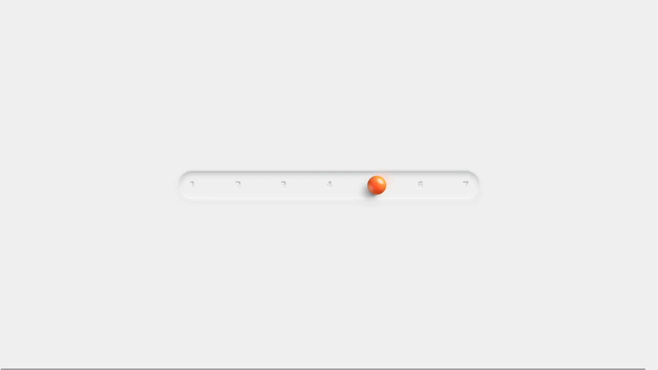
Neumorphic 3D Range Slider
This is a Neumorphic 3D Range Slider. It replaces the default browser input track with a recessed tactile trench and a volumetric, glassmorphic sphere. Its function is to provide highly physical, stepped input selection, making data entry feel like interacting with premium hardware.
Chrome 88+
Edge 88+
Firefox 80+
Safari 14+
See the Pen Neumorphic 3D Range Slider.
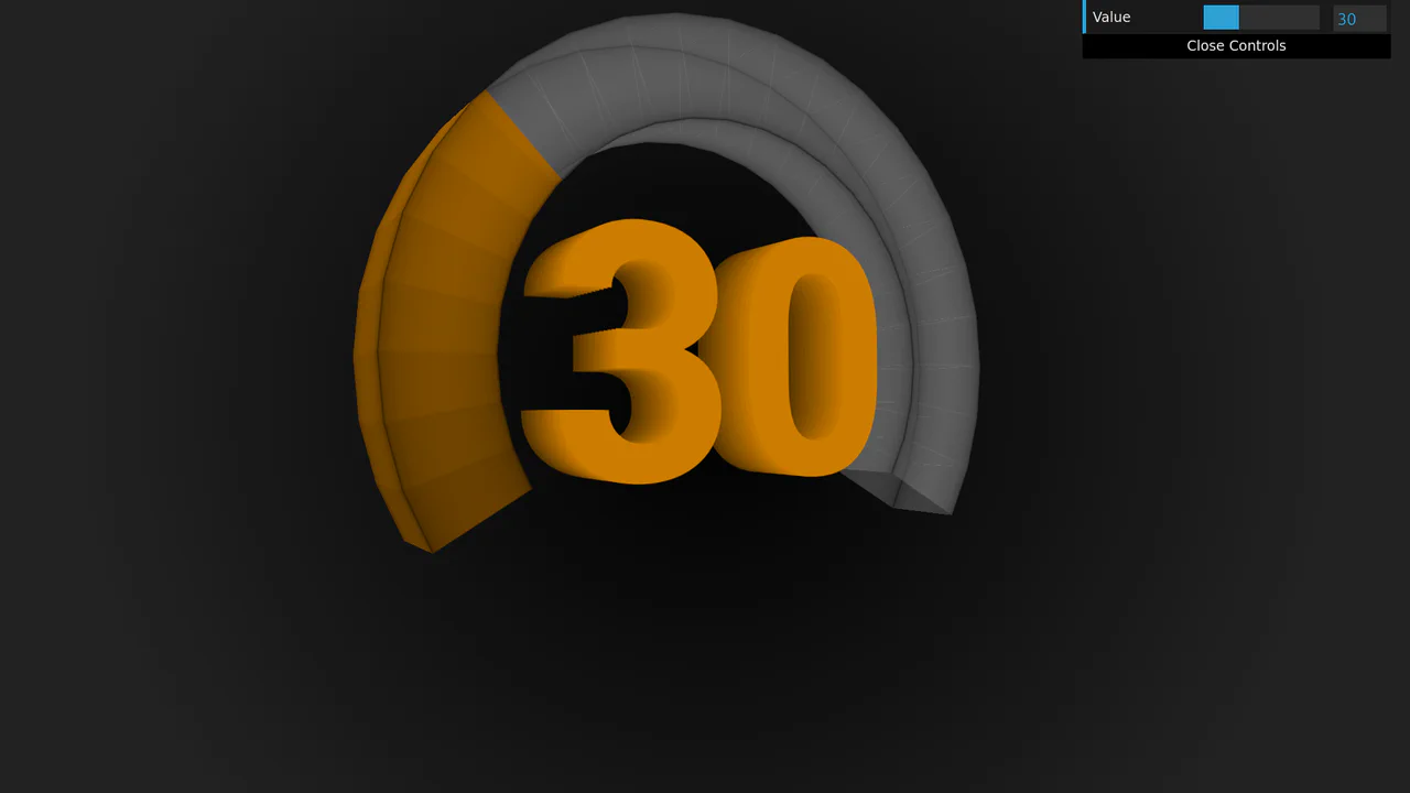
3D Rotating Value Dial
This is a 3D Rotating Value Dial. It visualizes continuous data through a spatial, cylindrical interface. Its function is to replace flat range indicators with a tactile, volumetric readout that dynamically shifts color hue based on value. (Requires: dat.gui)
Chrome 111+
Edge 111+
Firefox 108+
Safari 15.4+
See the Pen 3D Rotating Value Dial.

Skeuomorphic Egg Toggle Switch
This is a Skeuomorphic Egg Toggle Switch. It transforms a standard binary input into a playful, highly tactile 3D object resembling an egg sliding in a frying pan. Its function is to inject personality and physical weight into a micro-interaction, replacing flat state changes with an immersive, multi-layered physics simulation entirely rendered in CSS.
Chrome 105+
Edge 105+
Firefox 121+
Safari 15.4+
See the Pen Skeuomorphic Egg Toggle Switch.

Skeuomorphic Retro Casio F-91W Watch
This is a Skeuomorphic Retro Casio F-91W Watch. It is a hyper-realistic, digital-first recreation of the iconic 1989 timepiece. Its function is to demonstrate the power of modern CSS and vanilla JavaScript for high-fidelity modeling, combining 3D depth illusions, custom fonts, and a live clock to create a fully interactive desktop widget.
Chrome 60+
Edge 79+
Firefox 55+
Safari 11+
See the Pen Skeuomorphic Retro Casio F-91W Watch.

Skeuomorphic 3D Elastic Toggle Switch
This is a Skeuomorphic 3D Elastic Toggle Switch. It utilizes multi-layered shadowing and complex keyframe sequences to mimic a physical sliding component embedded in a technical grid. Its function is to transform a standard checkbox into a high-fidelity micro-interaction that emphasizes physical mass and momentum.
Chrome 43+
Edge 12+
Firefox 16+
Safari 9+See the Pen Skeuomorphic 3D Elastic Toggle Switch.

Skeuomorphic Lunar Desk Calendar
The Skeuomorphic Lunar Desk Calendar is a digital recreation of the traditional “Hardware Store Calendar”. It bridges the gap between physical paper textures and dynamic digital logic, providing users with both Gregorian and Lunar dates. Its function is to serve as a high-fidelity desktop widget that celebrates heritage design through modern CSS geometry.
Chrome 80+
Edge 80+
Firefox 75+
Safari 13.5+
See the Pen Skeuomorphic Lunar Desk Calendar.

Skeuomorphic Reversi Radio Buttons
This is a Skeuomorphic Reversi Radio Button component. It overrides standard browser inputs to create a tactile, three-dimensional interaction mechanism. Its function is to replace flat state changes with physical motion, animating the selection exactly like a two-sided piece flipping over on a board.
Chrome 43+
Edge 12+
Firefox 16+
Safari 9+See the Pen Skeuomorphic Reversi Radio Buttons.

Neon 3D Seven-Segment Digital Clock
This is a Neon 3D Seven-Segment Digital Clock. It procedurally generates a classic LCD/LED interface using pure CSS geometry. Its function is to provide a highly atmospheric, real-time clock that utilizes 3D space and realistic glowing floor reflections to enhance cyberpunk or dashboard aesthetics.
Chrome 60+
Edge 79+
Firefox 55+
Safari 11+
See the Pen Neon 3D Seven-Segment Digital Clock.

Tumbling 3D Cubes Animation
This is a Tumbling 3D Cubes Animation. It visualizes three interconnected, translucent cubes endlessly rolling across a grid floor in a synchronized sequence. Its function is to demonstrate complex spatial geometry and continuous kinetic motion using exclusively DOM nodes and stylesheets, replacing heavy WebGL libraries with pure CSS mathematics.
Chrome 36+
Edge 12+
Firefox 16+
Safari 9+See the Pen Tumbling 3D Cubes Animation.

Skeuomorphic Chess Pawn
This is a Skeuomorphic CSS Chess Pawn. It replaces static raster images with a resolution-independent, pure code illustration. Its function is to demonstrate high-fidelity rendering capabilities within the DOM, utilizing native styling properties to fake three-dimensional geometry, light, and mass.
Chrome 26+
Edge 12+
Firefox 16+
Safari 7+
See the Pen Skeuomorphic Chess Pawn.

Holographic 3D Interactive Card
This Holographic 3D Interactive Card is a premium UI component inspired by rare physical trading cards. It features a sophisticated depth effect where the logo floats independently from the iridescent background, reacting dynamically to mouse movements or touch input. The use of modern CSS APIs ensures high-performance rendering of complex gradients and masks, creating a truly immersive “collectible” feel for digital assets.
Chrome 85+
Edge 85+
Safari 16.4+
Firefox 128+
See the Pen Holographic 3D Interactive Card.

Draggable 3D Cube with Dynamic Lighting
This Draggable 3D Cube goes beyond standard CSS 3D transforms by implementing a custom “lighting engine” using JavaScript. As the user drags to rotate the carousel, the opacity of each face is dynamically calculated based on its angle relative to the viewport. This creates a realistic shading effect - faces facing the viewer are bright and fully opaque, while those turning away fade into the background, enhancing the perception of depth without using WebGL. (Requires: GSAP, GSAP Draggable)
Chrome 90+
Edge 90+
Safari 14+
Firefox 88+
See the Pen Draggable 3D Cube with Dynamic Lighting.

Interactive 3D Photo Cube
This Interactive 3D Photo Cube creates a spatial navigation experience where a user explores six images mapped onto a cube by moving their cursor. Unlike standard sliders, it utilizes CSS 3D transforms orchestrated by GSAP to create a seamless, physics-like rotation. The snippet also features a “window-pane” parallax effect where the background images shift slightly inside their frames, adding an extra layer of depth. (Requires: GSAP)
Chrome 90+
Edge 90+
Safari 14+
Firefox 88+See the Pen Interactive 3D Photo Cube.

Trigonometric 3D Orbit CSS Gallery
This Trigonometric 3D Orbit Gallery is a stunning example of “Code Art,” demonstrating the raw power of modern CSS mathematics. Instead of relying on rigid keyframes for positioning, it uses parametric equations to place and animate 32 images along a complex, fluid 3D curve in real-time, creating a perpetual motion machine effect purely with stylesheets.
Chrome 111+
Edge 111+
Safari 16.4+
Firefox 113+See the Pen Trigonometric 3D Orbit CSS Gallery.
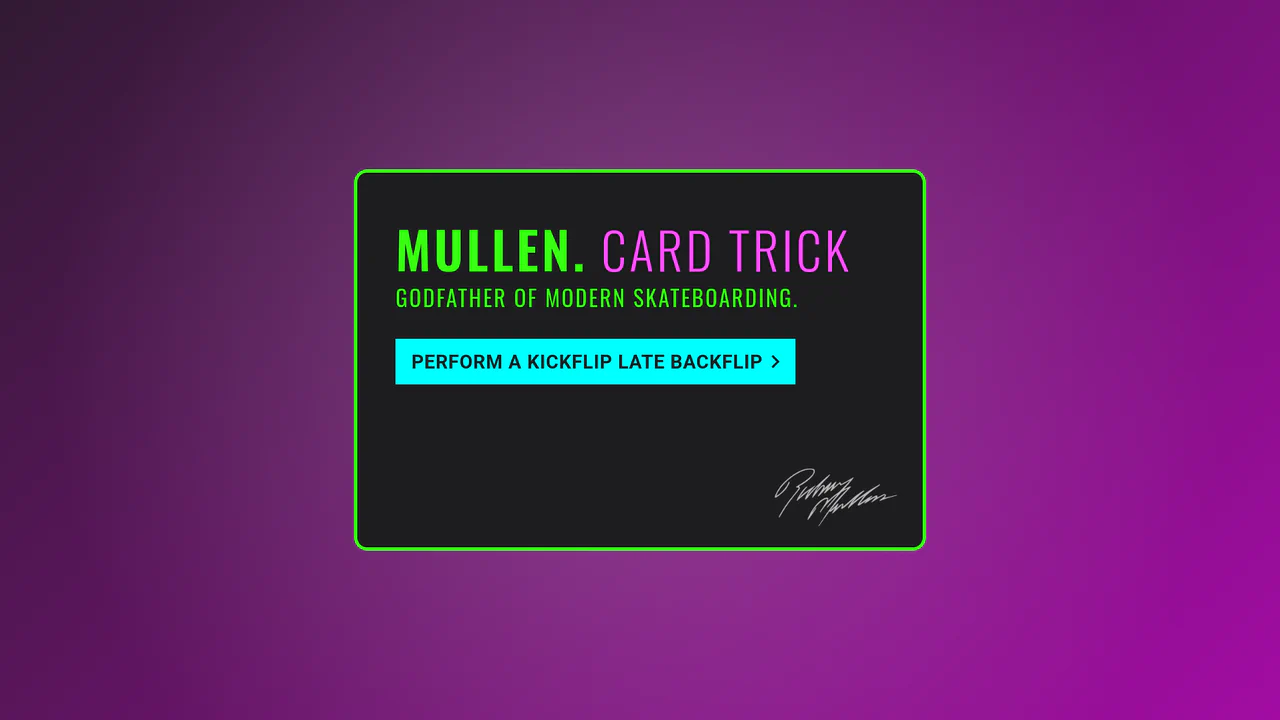
SlowMo Mullen Card Trick
An interactive 3D simulation of skateboarding tricks (Kickflip, Impossible, etc.) performed by a rotating card via CSS transforms and JavaScript.
See the Pen SlowMo Mullen Card Trick.

Blocky Digital Clock
A voxel-style 3D clock where digits morph physically via CSS transforms driven by sibling selectors, creating a floating, mechanical restructuring effect.
See the Pen Blocky Digital Clock.
3D Glowing Button with CSS
A futuristic 3D button constructed from CSS-transformed planes to form a cube. JavaScript tracks mouse movement to apply dynamic rotateX/Y transforms for a tilt effect, while CSS keyframes animate a neon gradient glow and blur that activates on hover.
See the Pen 3D Glowing Button with CSS.
Amateur Radio Badge 3D
A highly sophisticated holographic badge simulation utilizing CSS 3D transforms and layered mix-blend-mode effects. JavaScript tracks mouse movement to dynamically update CSS variables, driving complex parallax shifts, lighting gradients, and SVG-masked glares for a realistic, tactile depth experience.
See the Pen Amateur Radio Badge 3D.

Floating Headers
Impressive, weighty 3D typography that reacts to scrolling with a natural shift in perspective, reminiscent of volumetric signage or cinematic titles.
See the Pen Floating Headers.

Grow Up, They Said...
An interactive 3D todo list utilizing CSS perspective and rotateY transforms to create tangible, flipping card effects. JavaScript orchestrates a staggered entrance animation via setTimeout loops, while Sass mixins manage complex transition delays for the cascading sub-menu reveal.
See the Pen Grow Up, They Said....

Volumetric 3D CSS Toggle Switch
A volumetric 3D toggle switch orchestrated via the CSS Checkbox Hack and sibling combinators, requiring minimal JavaScript. The segmented background creates a cascading flip effect using rotateX and inline transition-delay, while keyframes drive two spheres in a complex orbital path through depth using translateZ and perspective to swap positions.
See the Pen Volumetric 3D CSS Toggle Switch.

Container Query Bookstore
Integration of Drag and Drop functionality using Dragula.js and Web Components. The Dragula script handles the drop event, dynamically changing the background color of the stage container via a CSS variable taken from the dragged element.
See the Pen Container Query Bookstore.

3D Text Spiral Animation with CSS
An elegant 3D scene where rotating text forms a spiral. The effect utilizes the perspective property for depth and HSL functions for procedurally generating the multi-layered color scheme.
See the Pen 3D Text Spiral Animation with CSS.

CSS-Only Image Tilt Towards Cursor
A 3D image tilt effect that mimics cursor movement, achieved purely with CSS by combining multiple invisible overlay zones, the general sibling combinator, and the transform: rotate3d() function with perspective on the parent container.
See the Pen CSS-Only Image Tilt Towards Cursor.

Pure CSS 3D Animated Cat Model
Complex yet high-performance 3D rendering in the browser: the model is built on CSS Box Model Hacking principles, where each polygon is positioned in space using translate and rotate for continuous 360-degree animation.
See the Pen Pure CSS 3D Animated Cat Model.
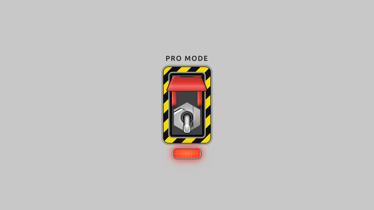
Pro-Mode Toggle Switch w/ Guard
Dual input[type="checkbox"] system for two-step activation, showcasing mastery in creating logic without JavaScript and detailed UI using a repeating-linear-gradient background and complex pseudo-elements."
See the Pen Pro-Mode Toggle Switch w/ Guard.