70+ CSS 3D: Free Examples & Code Snippets (Page 2)
Examples
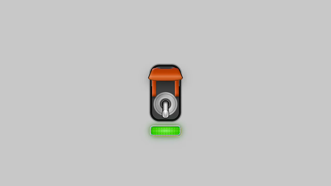
Pro-Mode Toggle Switch with Guard (Softer)
A technically complex stylized toggle switch utilizing advanced CSS capabilities: box-shadow for realistic depth, perspective for a 3D casing effect, and a dynamic glowing effect via the hue-rotate filter.
See the Pen Pro-Mode Toggle Switch with Guard (Softer).
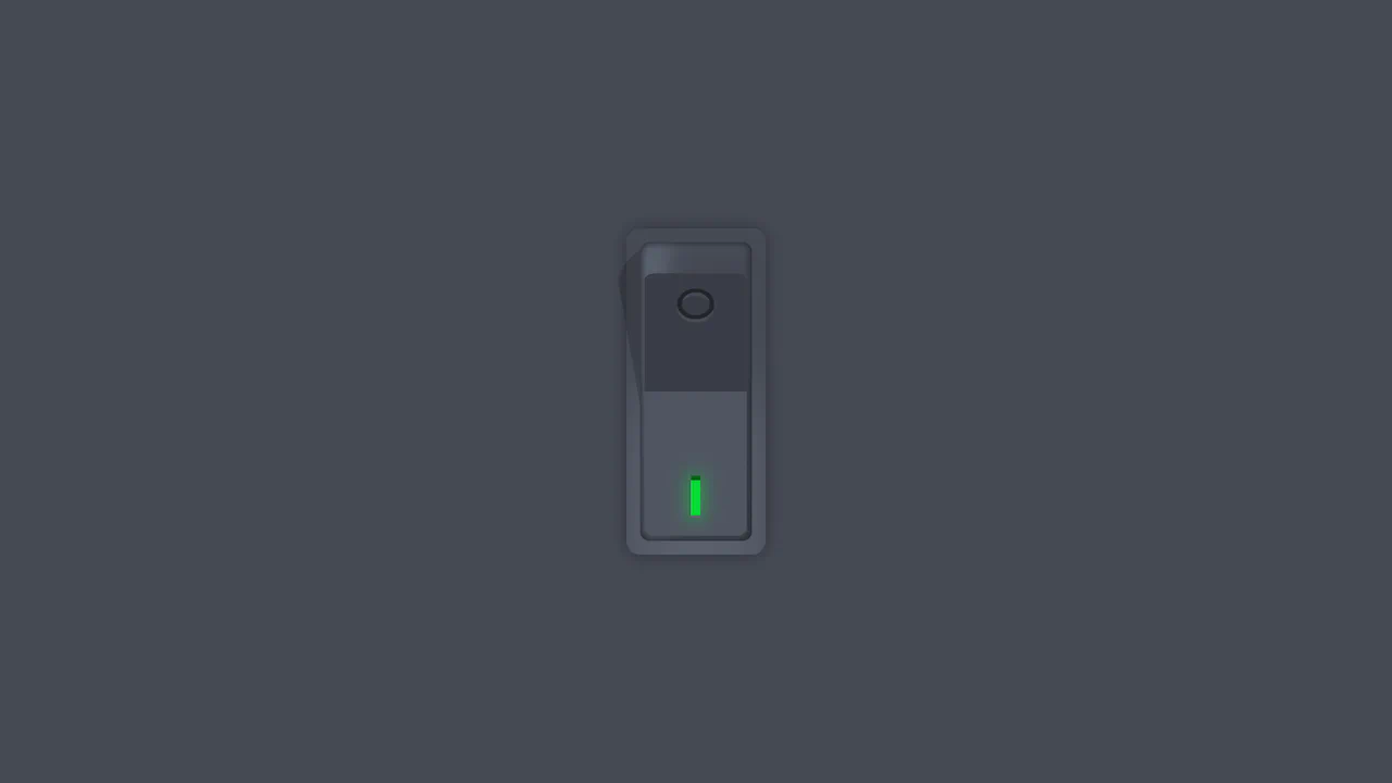
Vertical Rocker Switch
A tactilely realistic vertical toggle, created using advanced CSS variable techniques and multiple box-shadow layers to mimic three-dimensional depth, combined with smooth cubic-bezier animations.
See the Pen Vertical Rocker Switch.
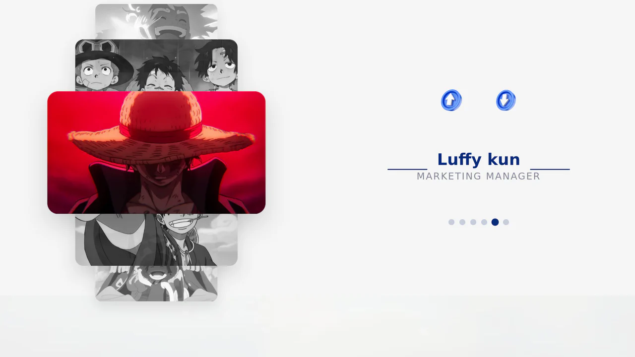
Vertical 3D Team Carousel
A slick vertical 3D carousel for a team section, implemented purely with CSS transform-style: preserve-3d for depth and controlled by JavaScript to dynamically apply class-based offsets for a smooth, cubic navigation experience, fully supporting keyboard and touch controls.
See the Pen Vertical 3D Team Carousel.

Cube Clock with CSS 3D
A demonstration of a styled digital clock rendered as an interactive 3D cube created purely using CSS transformations (transform-style: preserve-3d), which smoothly shifts its perspective on hover.
See the Pen Cube Clock with CSS 3D.

3D Sphere with Dynamic Shadow
This demo shows how to create a realistic 3D sphere effect using pure CSS, without SVG or 3D transformations. The effect is achieved through gradients (radial-gradient), shadows (box-shadow), pseudo-elements (::before, ::after) for highlights and shadows, and dynamic variables (@property) for animation.
See the Pen 3D Sphere with Dynamic Shadow.
Card with Illumination Effect
An example of how to achieve an impressive pseudo-3D interface using pseudo-elements (::before) and CSS transforms. The effect is built by layering elements (.light-layer, .darken) with different box-shadow and gradients to simulate the play of light and shadow on the surface.
See the Pen Card with Illumination Effect.
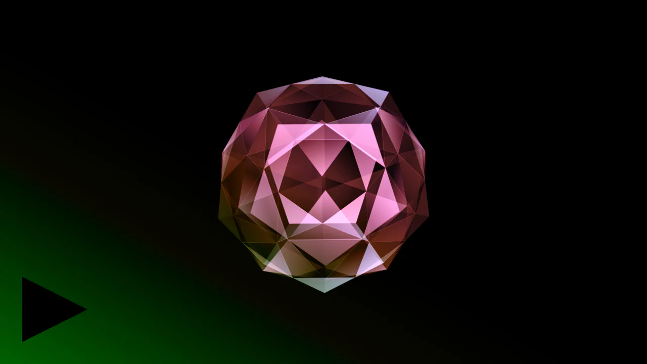
Shimmer 3D Dodecahedron
This demo illustrates how intricate 3D models can be built and animated in the browser using only CSS. Key features include using sin() and cos() functions for geometric calculations, and controlling animation and color effects (hue-rotate) through CSS variables and @keyframes.
See the Pen Shimmer 3D Dodecahedron.
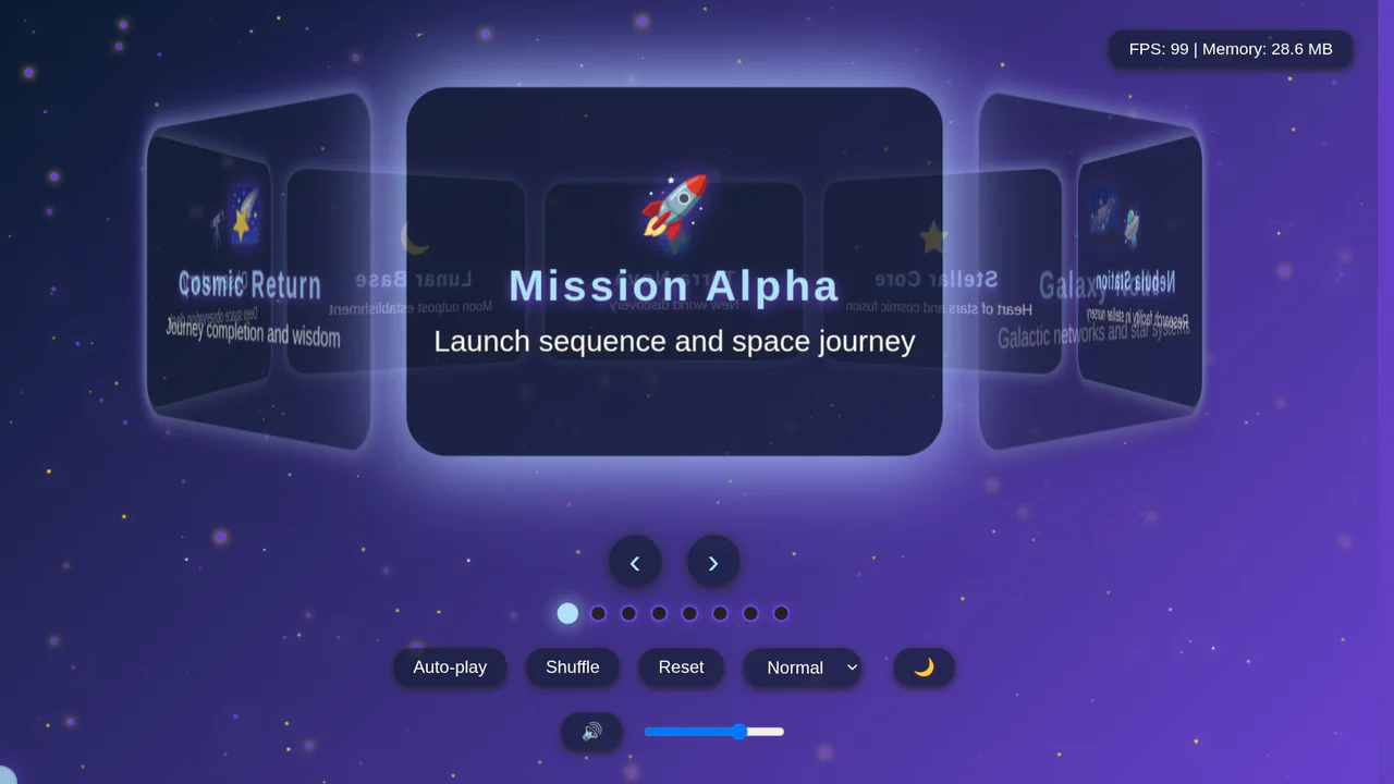
Stellar 3D Slide Navigator
A visually rich interactive carousel that uses a combination of CSS 3D transforms for a smooth parallax effect and the Web Audio API for custom soundscapes. The code is structured into dedicated classes for clean, scalable management.
See the Pen Stellar 3D Slide Navigator.

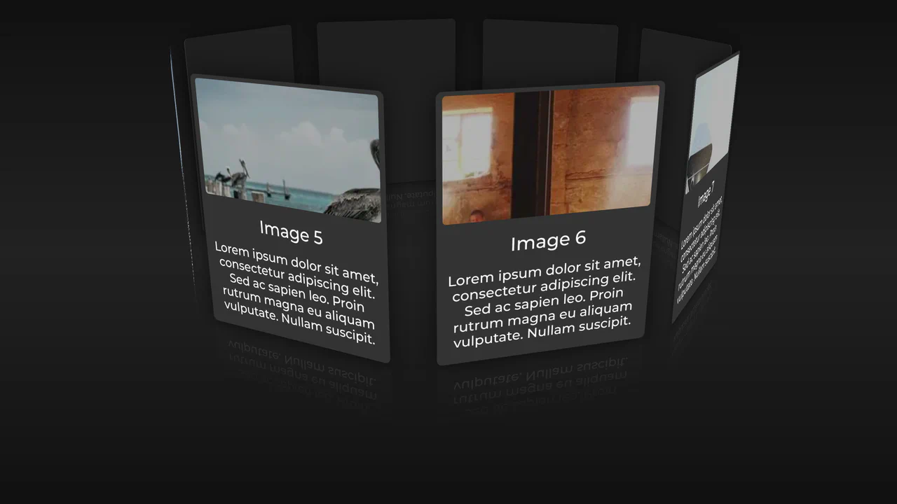
Orbital Photo Gallery
A stunning JavaScript and CSS 3D gallery with images placed on a sphere. Fluid transitions and inertia create a realistic tactile feel, while click-to-zoom provides an impressive focus on the selected content.
See the Pen Orbital Photo Gallery.

Pure CSS Linear Circular Motion
Witness the power of pure CSS with this mesmerizing 3D mechanical animation, built using advanced 3D transforms and intricately choreographed keyframes — no JavaScript required.
See the Pen Pure CSS Linear Circular Motion.

3D Cube Resume with CSS Transforms
A complex 3D navigation for a resume is achieved using pure CSS/JS, where each cube face is a section; this is a powerful display of UX/UI creativity and animation skills.
See the Pen 3D Cube Resume with CSS Transforms.

The Simplest Dots (CSS)
A pure CSS demo that generates a complex 3D animation with perspective and transform-style: preserve-3d. It leverages CSS variables (--i, --d) to parameterize and control animation timing and positioning, making it flexible and scalable.
See the Pen The Simplest Dots (CSS).
3D Glowing Bottle
This demo showcases advanced CSS techniques like synchronized transform: rotate() animations and the filter: drop-shadow() property to achieve a visually striking glowing liquid effect within a transparent container.
See the Pen 3D Glowing Bottle.
CSS 3D Sphere Animation
A 3D sphere where an SCSS @for loop calculates the transform for each ring, and the entire animation and structure, built on perspective and transform-style: preserve-3d, are fully configurable via variables.
See the Pen CSS 3D Sphere Animation.
Pure CSS Wobble-Rotating Sphere
3D sphere from meridians and parallels in CSS. 36 meridians — circles rotated on X-axis in 10° steps. Latitudes — concentric circles shifted on Z-axis. Two rotation axes. Whole structure rotates in 3D.
See the Pen Pure CSS Wobble-Rotating Sphere.
SVG Starry Cube
A complex SVG animation - the cube’s morphing is achieved by animating the d attribute of a <path> tag with a custom keySplines function. The efficient structure with <use> and <pattern> creates a “scene-in-a-scene” effect due to the nested animation of elements within the fill.
See the Pen SVG Starry Cube.
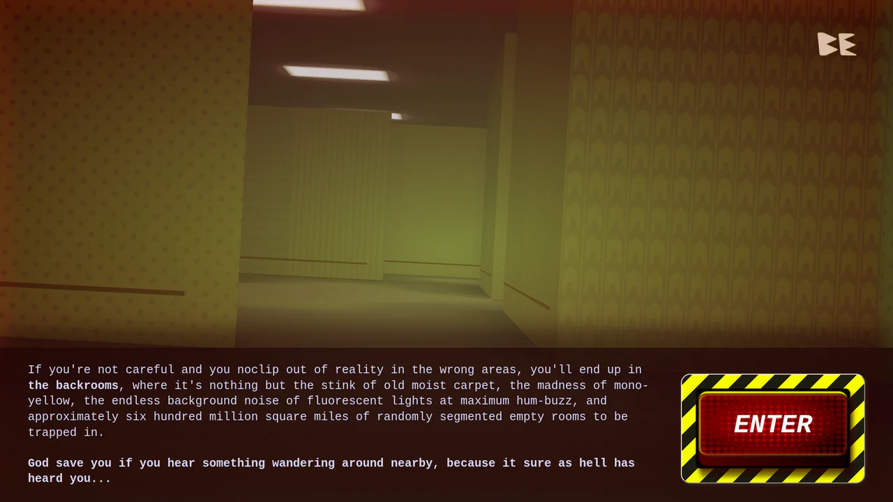
The Backrooms: CSS Edition
A fully playable first-person 3D horror game inspired by “The Backrooms”, built almost entirely with CSS.
See the Pen The Backrooms: CSS Edition.
CSS Light Sphere Animation #21
3D sphere from 21 concentric rings. Each ring — div with rotateX(90deg) and Z translation. Sizes and animation delays controlled via CSS variables. Rings pulse, changing color via hue-rotate. Rotation pauses on hover.
See the Pen CSS Light Sphere Animation #21.
Complete 3D Chicken in Pure CSS
CSS 3D Chicken is a pure 3D scene without JS. It uses a single .cube class. Faces are made of pseudo-elements, dimensions are set in HTML via --x, --y, --z variables. Colors are calculated using color-mix(). The whole volume is built with preserve-3d transforms. Shadows and light are pure markup. Clean, fast, no JS.
See the Pen Complete 3D Chicken in Pure CSS.
Icosphere of Spheres in Pure CSS
3D icosahedron from points in CSS. Pug generates polyhedron vertices and intermediate sphere points, each represented by .vx element. Points positioned via translate3d with CSS variables --v0, --v1, --v2. Radial gradients create glow effect.
See the Pen Icosphere of Spheres in Pure CSS.
CSS Math Globe Animation
3D globe from horizontal rings. Pug generates rings with varying vertical offset via CSS variable --dp. Ring width calculated via circle formula. flash animation travels through rings with delay, creating running light effect.
See the Pen CSS Math Globe Animation.
Pure CSS Animated FF Conf Logo
A futuristic 3D data block where scrolling digital “circuits” are simulated purely in CSS by animating the background-position of linear-gradient patterns.
See the Pen Pure CSS Animated FF Conf Logo.

Flying Through Hexagons
A large-scale 3D scene where Sass procedurally generates both the trajectory of 72 rings using trigonometry, and the @keyframes for its “fly-through” mode via a Sass map. Animation is switched without JS using the “checkbox hack”, and the entire composition is built upon perspective and transform-style: preserve-3d.
See the Pen Flying Through Hexagons.
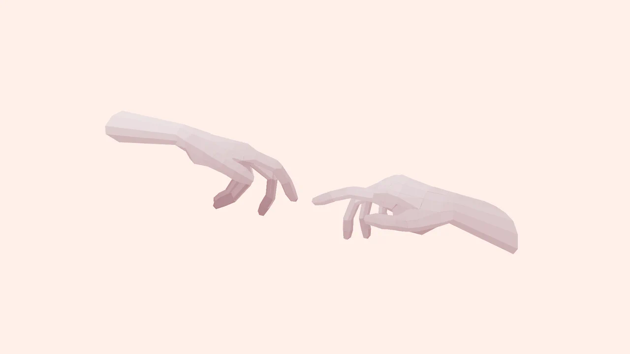
Pure CSS 3D: Creation of Adam
Creation of Adam is a skeletal 3D masterpiece without JS. The nested HTML acts as bones and joints for God and Adam. Muscle geometry is carved using CSS clip-path polygons positioned with preserve-3d. Volumetric lighting is calculated on the fly using color-mix() inside oklch space. Pure code anatomy at its finest.
See the Pen Pure CSS 3D: Creation of Adam.
Pure CSS 3D David Eye
The Creation of Adam is an advanced low-poly 3D scene built with pure CSS and highly nested HTML. By structuring divs into inverse-kinematics chains, it models anatomical skeletal joints. Flat polygons are folded via preserve-3d, while custom clip-path facets are styled with color-mix() to calculate shading. Global animations drive the smooth, interactive, kinetic sculpture movement.
See the Pen Pure CSS 3D David Eye.
Card Carousel (CSS Only)
JavaScript injects a fixed “Buy me a coffee” button with a spinning SVG ring. Below, an 8‑card carousel uses 3D transforms — each card is positioned around a circle with rotateZ and translateZ, then rotated upright. Hover pauses the rotation; background images cycle via Picsum. The markup is generated with a Ruby‑style loop (Pug/Slim) but rendered as static HTML.
See the Pen Card Carousel (CSS Only).
Cube Grid (Pure CSS)
Isometric cube grid with Z-axis compression animation. CSS variables control each cube’s position in grid and its color based on row. Pseudo-elements form visible faces through transforms and color-mix.
See the Pen Cube Grid (Pure CSS).
CSS Bookmark
A state-driven animation, controlled via the “checkbox hack,” showcases the power of CSS @property (Houdini) for smoothly animating gradients and mask properties. A complex multi-layered bookmark shape is created with an SVG mask, while the entire activation effect choreography is built on synchronized @keyframes.
See the Pen CSS Bookmark.
Vinyl Albums
This component builds an interactive, skeuomorphic vinyl record album cover using modular CSS gradients and lightweight JavaScript to synchronize sleeve and record label artwork. The structural logic leverages repeating-radial-gradient for physical vinyl grooves and dual conic-gradient layers to simulate realistic ambient light reflections, executing a sliding rotation transition on hover. Because the kinetic sliding and spinning animations rely entirely on GPU-composited transform properties, the interface maintains exceptional framerates while providing a highly tactile, physical user experience.
See the Pen Vinyl Albums.
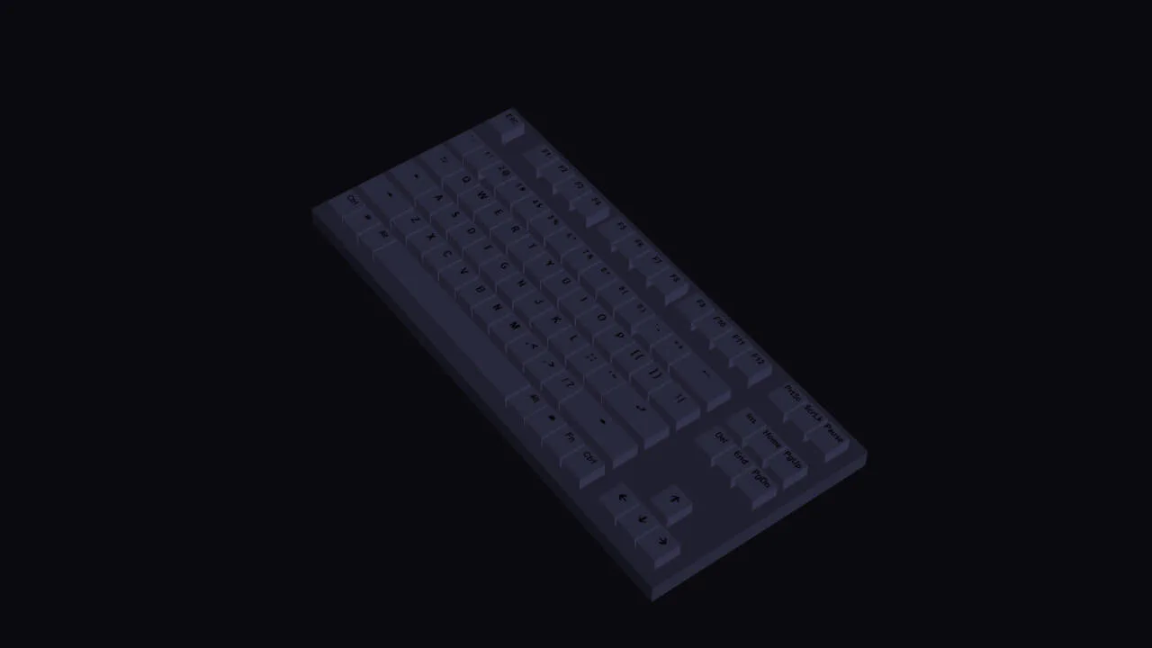
RGB Keyboard with Dark Mode
A detailed, volumetric, and animated keyboard model that smoothly changes its backlighting and reacts to user actions, demonstrating the power of CSS for creating 3D objects.
See the Pen RGB Keyboard with Dark Mode.