70+ CSS 3D: Free Examples & Code Snippets (Page 3)
Examples
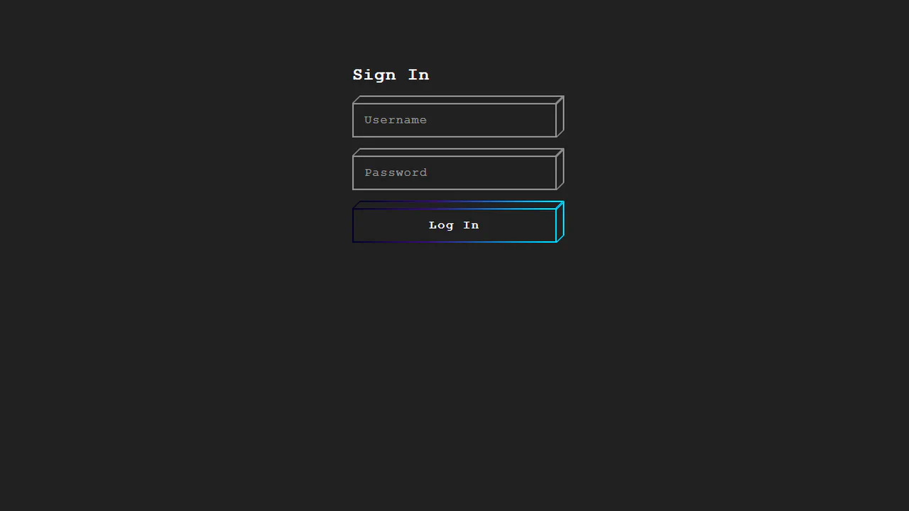
Cube Login Form
This demo showcases a pseudo-3D cube effect for form elements, architected in pure CSS using nested divs and transform: skew() to create a lightweight isometric perspective. The key micro-interaction is a satisfying “wipe” animation - triggered on :focus via the general sibling combinator - which transitions the top property of an inner element to reveal a vibrant gradient fill.
See the Pen Cube Login Form.
3D Flip Clock Counter in Pure CSS
A realistic mechanical counter animation where the top half of the digit flips down to reveal the next one, maintaining the rhythm (units change faster than tens).
See the Pen 3D Flip Clock Counter in Pure CSS.
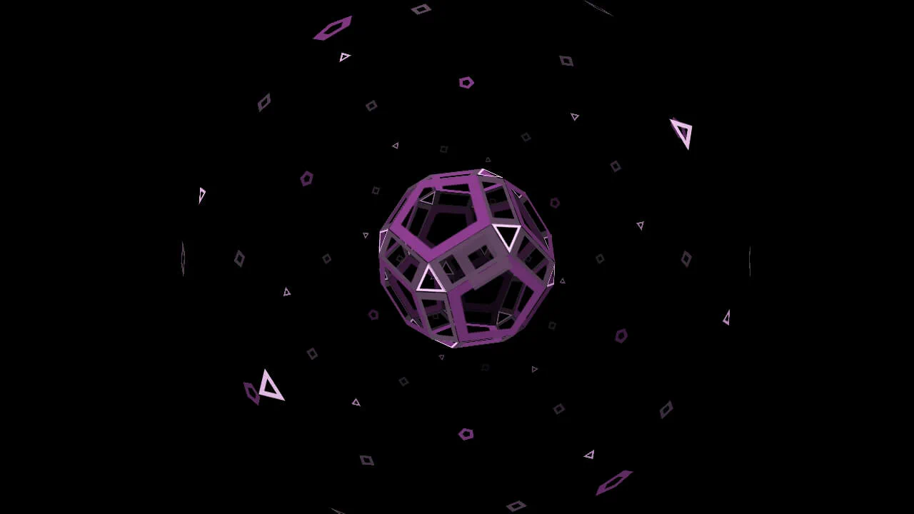
CSS 3D Sphere, Cubes, Intersection
Pure CSS 3D David Eye. Six wall layers, zero JavaScript. Real-time motion runs on CSS @property and cos() trigonometry. Masks dynamically punch out the holes, while linear gradients simulate neon depth. 3D transforms handle perspective as a ball flies through the loop. A clean, high-performance hack pushing modern CSS limits to its absolute edge.
See the Pen CSS 3D Sphere, Cubes, Intersection.
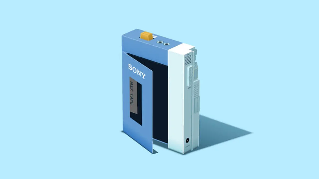
Pure CSS Art: 3D Walkman
Sony Walkman is an interactive retro cassette player built with pure CSS 3D elements. Dragging the scene updates the perspective rotation via a JS mouse tracker. Clicking the play button triggers a series of transitions: the cassette lid closes, the internal tape spindles rotate (.cr), and the audio element plays alongside a synchronized equalizer wave.
See the Pen Pure CSS Art: 3D Walkman.
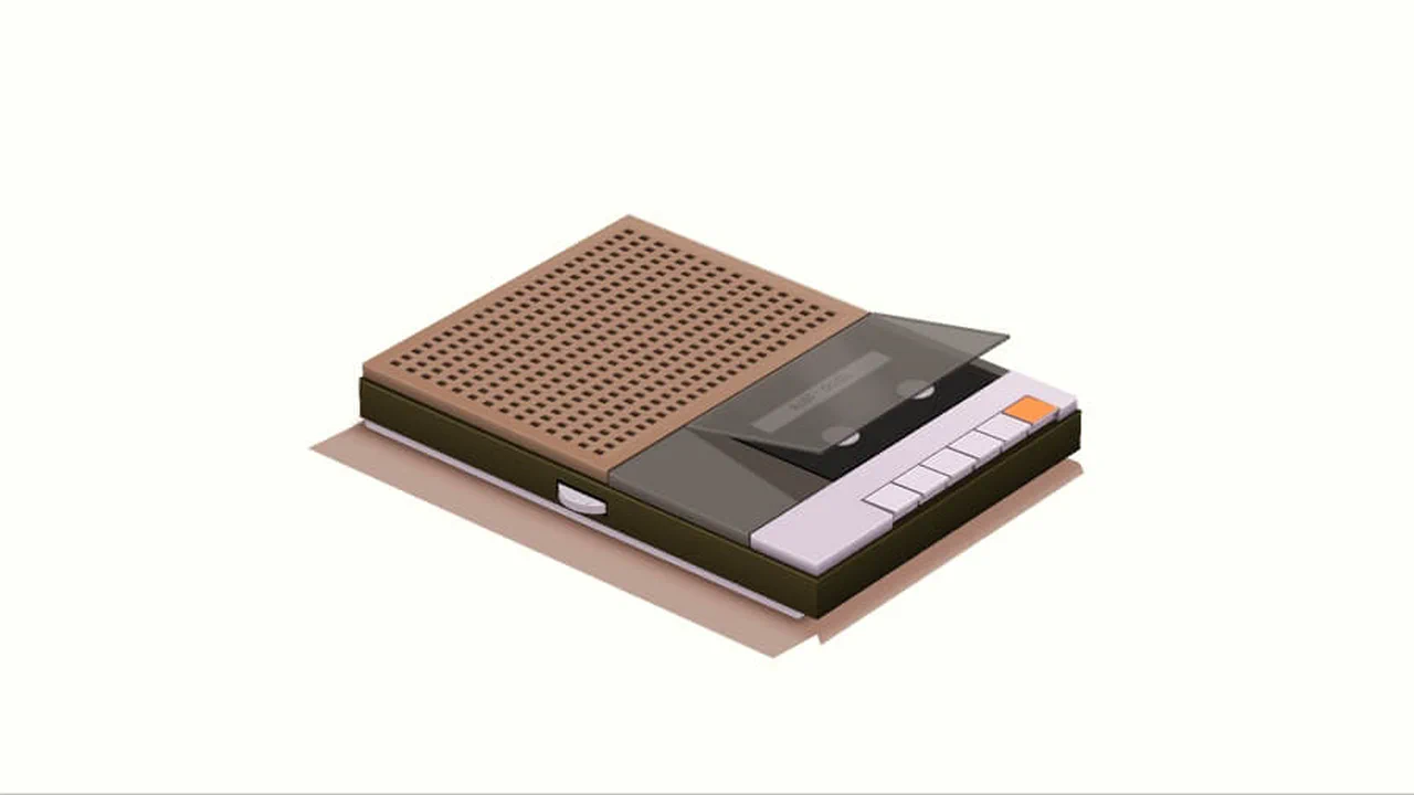
Pure CSS 3D Player/Recorder
3D Cassette Player is an interactive retro tape deck constructed using CSS 3D prisms. Dragging rotates the viewport by dynamically updating perspective and transform values via JS. Pressing the orange button triggers a sequence: the cassette compartment rotates closed, shadows shift, and the audio element plays alongside a synchronized CSS wave visualizer.
See the Pen Pure CSS 3D Player/Recorder.
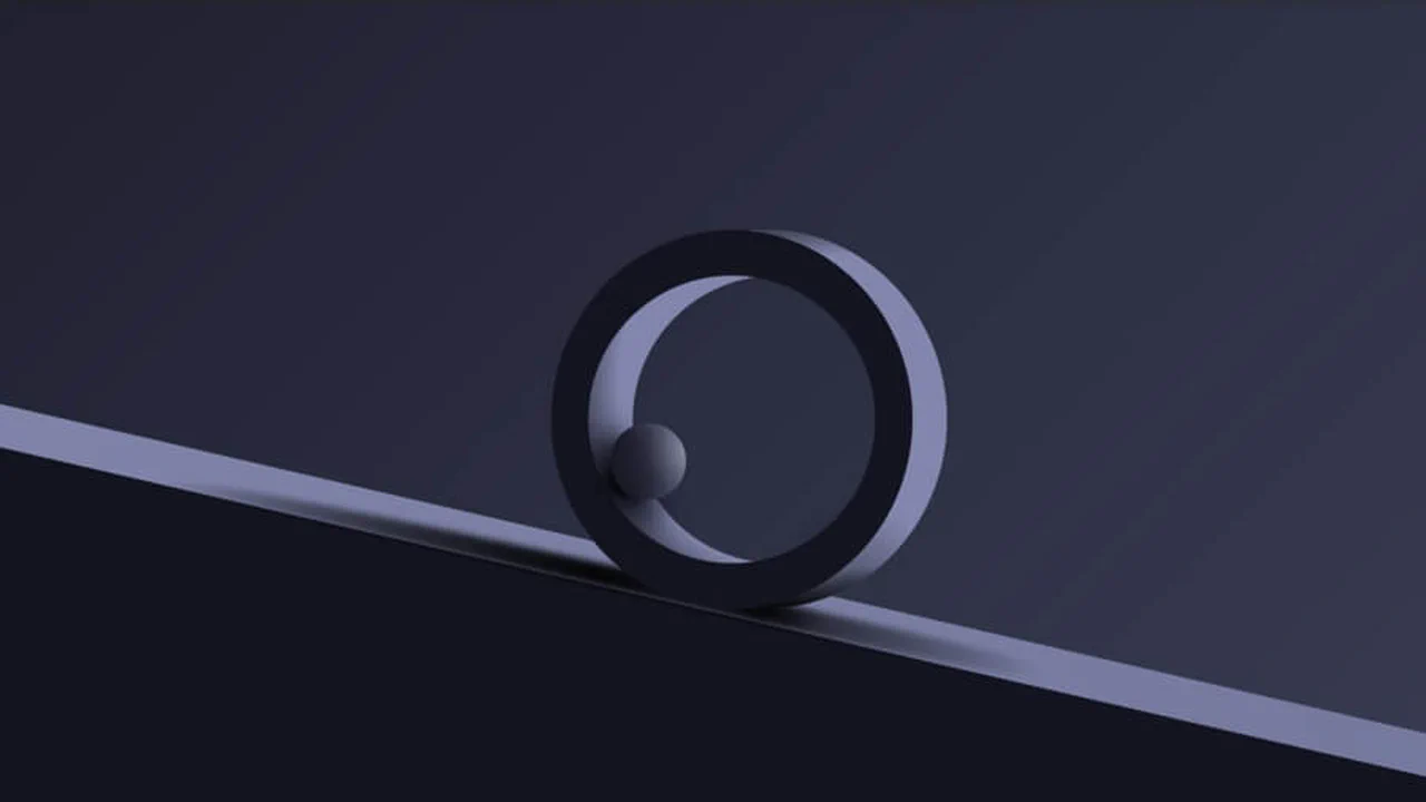
CSS Shapes & Lights
A metallic ring and reflective ball rendered entirely with CSS gradients and shadows. The ring is built from layered radial-gradient strokes on a circular element; the ball uses nested gradients for specular highlights and rim light. A slanted dark base with blur and gradient shadows grounds the scene. No JavaScript, no HTML beyond three divs.
See the Pen CSS Shapes & Lights.
Toast
A fully interactive 3D toaster built with CSS and a sprinkle of JS. Gradients, shadows, and skewed transforms construct every detail — chrome body, knob, timer lights, slots, even the bread crust. Click the side slider to start toasting; turn the knob to pick a level (1–4). Each level runs a timed burn animation with color-shifting glow, then shows a notification. Toast pops out and can be rotated in 3D. Feels like a real kitchen appliance.
See the Pen Toast.
Tower of Climbing Cubes
A circular tower of 72 cubes climbing in staggered 12-second loops. Twelve columns radiate from center at 30° increments, each containing six cubes that rotate, lift stepwise, and translate upward in sync. Neon blue wireframe edges glow against a black void. The whole scene rotates once per minute. Pure CSS preserve-3d.
See the Pen Tower of Climbing Cubes.
3D in CSS is Not Real
Eight isometric cubes orbiting in a synchronized 4-second loop, each following a unique @keyframes path through rotateX, rotateY, and rotateZ. Inside every cube, a hand-positioned sphere sits at center using nested translateZ and inverse rotations. The entire scene is powered by a single linear() easing curve applied via a custom property --animation. Minimal palette: warm beige background, teal and coral spheres.
See the Pen 3D in CSS is Not Real.
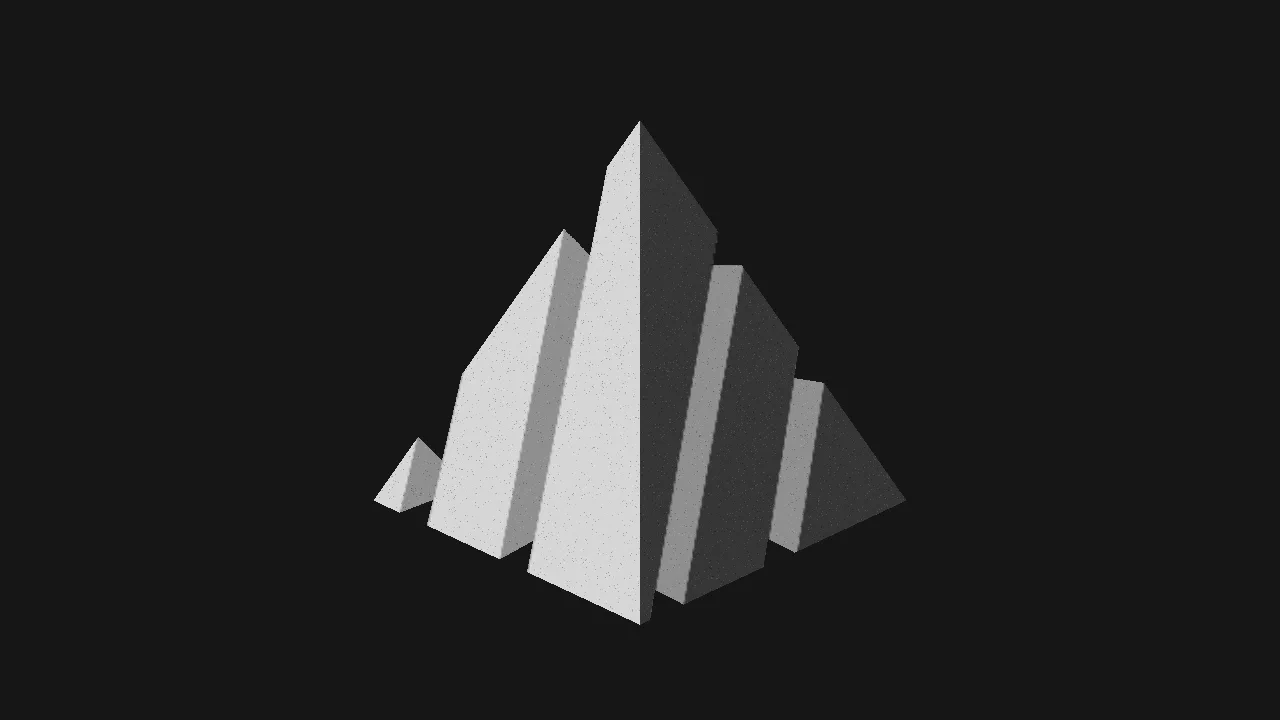
3D Fractured Pyramid
A fractured 3D pyramid drawn entirely with CSS gradients — no HTML elements, no pseudo-elements. Dozens of conic-gradient and linear-gradient layers fake four visible faces, broken corners, surface holes, and film grain on a single <html> background. Each fragment is positioned with calc() angle math; four custom properties control the grayscale palette. Inspired by a Pinterest reference. Zero markup.
See the Pen 3D Fractured Pyramid.
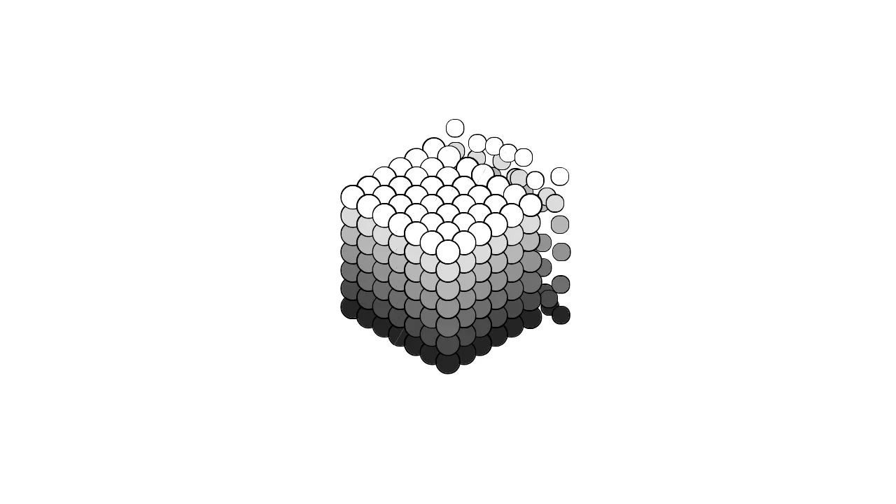
Bubbly
An isometric CSS grid of spherical nodes dispersing from a shared origin. Each ball receives its own --i, --j, --k index via nth-child math, mapped to 3D coordinates through custom properties and translate3d. A cubic-bezier animation alternately collapses all balls to a single point and expands them into a floating cloud, while box-shadow outlines each sphere against a gray-to-white luminance gradient. Zero JavaScript — pure CSS preserve-3d and transform-style.
See the Pen Bubbly.
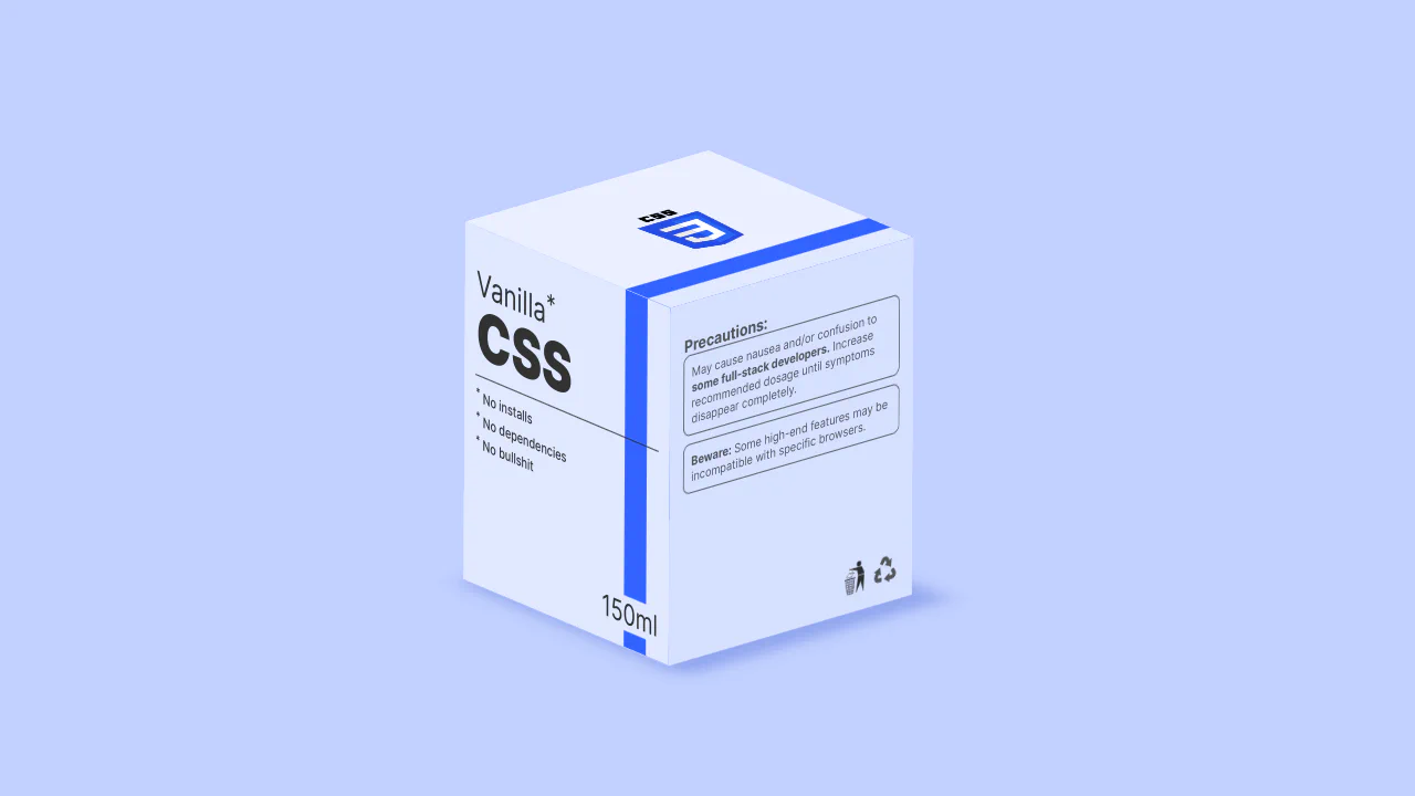
150ml of vanilla CSS
A stylized medicine box for full-stack developers. Built with preserve-3d, rotating in Z and X axes. High-contrast typography on rotateY panels. HTML-written SVG icons decorate the box sides. Layout uses CSS custom properties and clamp() for perfect responsiveness. No dependencies. No builds. Just pure vanilla CSS art.
See the Pen 150ml of vanilla CSS.
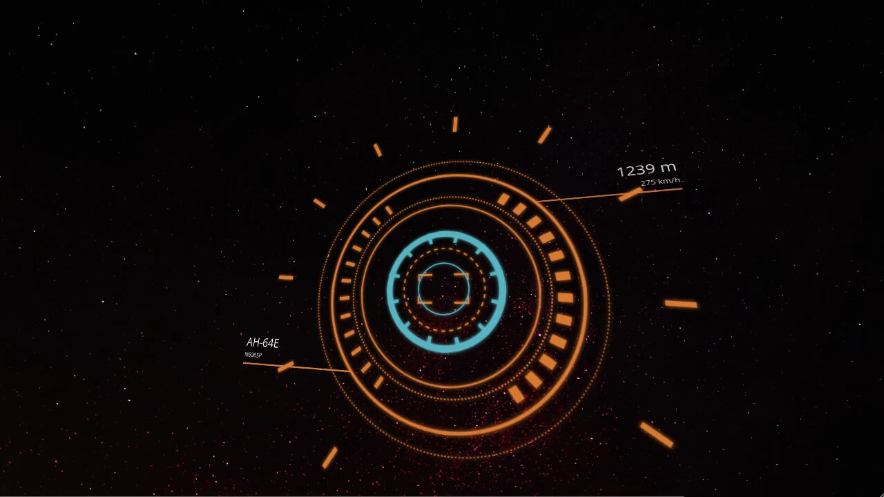
3D HUD in Space - Pure CSS
3D HUD in Space. An interactive sci-fi helicopter interface built with pure CSS. No JS used. Screen rotation triggers via perspective() and transform on hover zones, producing real parallax. Complex geometry of circles, notches, and AH-64E labels is fully animated with @keyframes in 3D. A clean, flawless show of modern stylesheet power.
See the Pen 3D HUD in Space - Pure CSS.
Pure CSS 3D
Morphing polyhedra by Ana Tudor. Twelve pentagons, twenty triangles, thirty squares — all pure CSS. Custom properties do the geometry: clip-path polygons, translateZ layers, scale3d expansion. @keyframes explode faces from a point, shuffle them through Z, then fade to a wireframe hole. No JavaScript. Only preserve-3d and trigonometry in variables. That’s it.
See the Pen Pure CSS 3D.
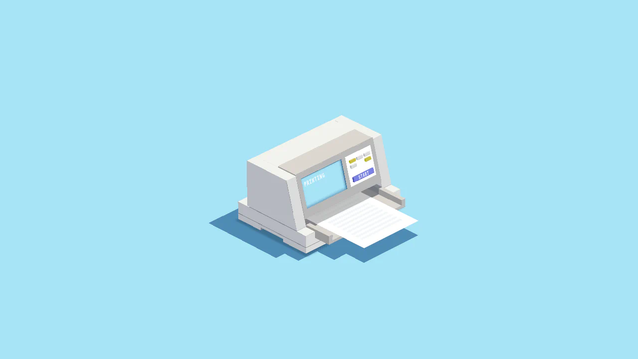
3D Printer
Isometric 3D printer, pure CSS. Click it — paper slides out, the body shakes, a screen reads “printing”. Every button, bezel, and paper sheet is a six-faced box with preserve-3d. @keyframes chain the motion: paper, printer, shadows, text. One click handler toggles animation and audio.
See the Pen 3D Printer.
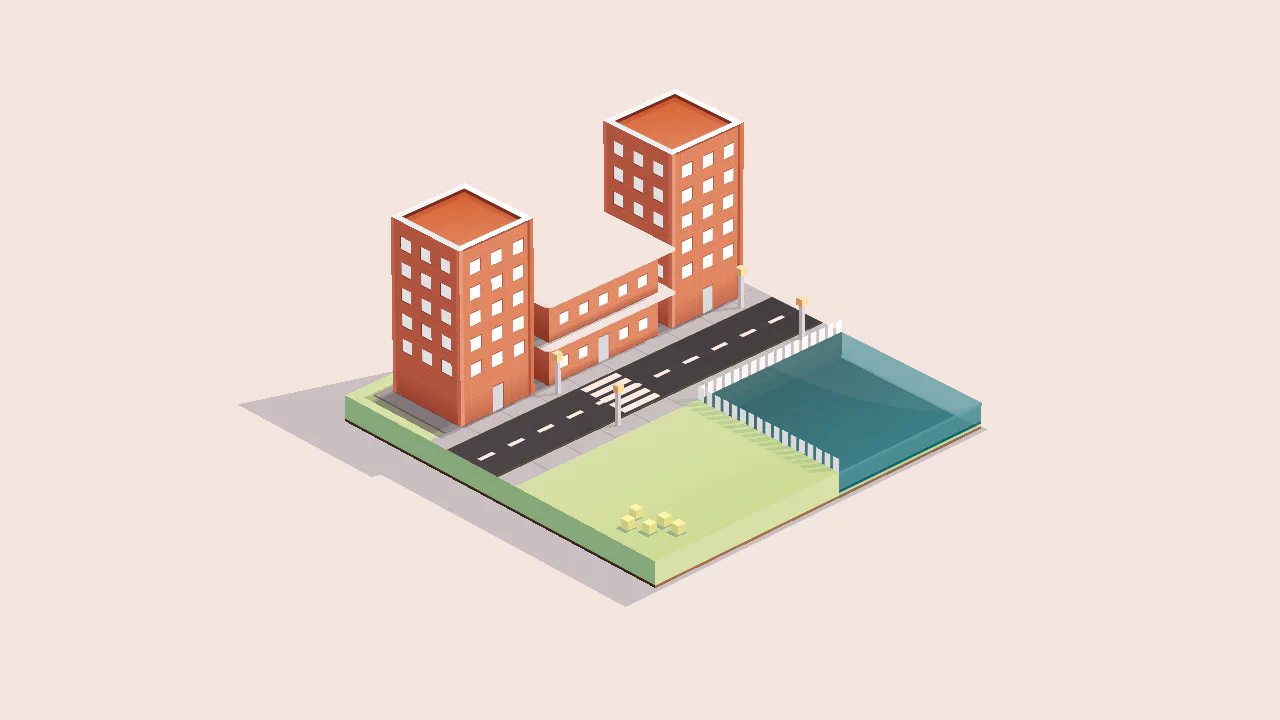
Town
Isometric town built from pure CSS. No canvas, no SVG — every building, road stripe, and tree is a six-faced box with preserve-3d. Four lampposts cast cube-shaped lights. Street markings are repeating-linear-gradient. A single pointermove event rotates the view. Zero JavaScript. Just voxels and patience.
See the Pen Town.
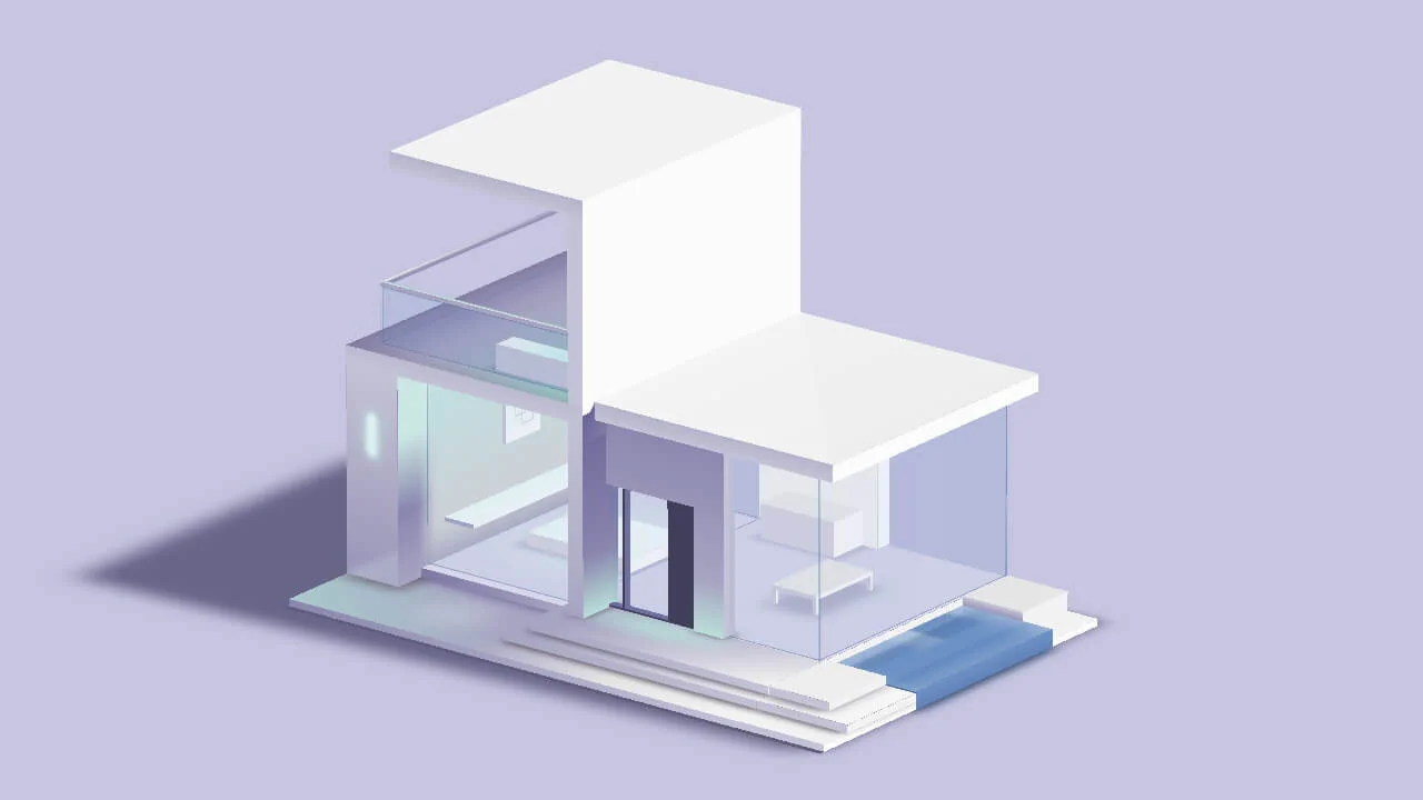
3D Modern House - Pure CSS
A pure-CSS isometric villa. ~30 blocks, each a six-faced cube. Walls, roof, furniture — all handmade boxes with preserve-3d. Gradients do lighting, filter: blur() shadows. One JS event: pointermove maps cursor to X and Z rotation. That’s the whole script. No canvas, no libraries. Voxel by hand.
See the Pen 3D Modern House - Pure CSS.