20+ CSS 3D Text Effects: Free Code Snippets & Examples
CSS 3D text effects transform flat typography into tactile, extruded geometric assets, projecting lettering along physical X, Y, and Z axes natively within the browser layout. By generating realistic depth using layered shadows or genuine spatial 3D rotations, this styling system elevates static headings into tangible interface anchors.
- Solid isometric extrusion is simulated by stacking multiple hard, incrementally shifting offsets within the text-shadow property.
- True perspective rotations leverage the parent perspective container while declaring
transform-style: preserve-3dto rotate text natively across 3D coordinates. - To preserve critical INP (Interaction to Next Paint) performance, dynamic cursor-tracking tilt loops are computed entirely in the GPU compositor.
Explore these dimensional typography layouts to integrate advanced, hardware-accelerated 3D text mechanics and tactile heading designs into your interfaces.
Table of Contents:
Examples
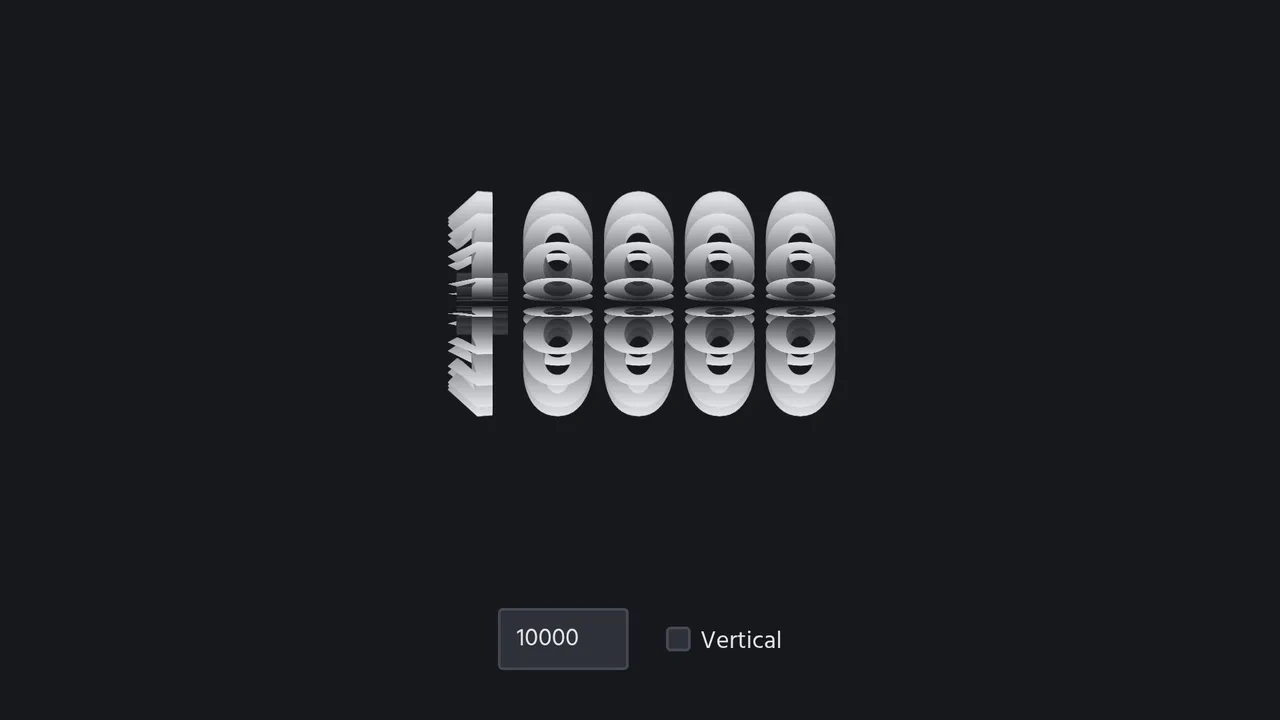
3D Spinning Typography Cylinder
An interactive 3D typography cylinder constructed using CSS preserve-3d and staggered keyframe animations. The cylinder is formed by 18 text sectors, each offset by a negative animation-delay to create a continuous spinning loop. The text features a background-clip gradient mask for a metallic sheen, while a checkbox dynamically rotates the entire assembly 90 degrees to toggle between horizontal and vertical orientations.
 Chrome 36+
 Edge 12+
 Firefox 16+ (partial)
 Safari 9+
See the Pen 3D Spinning Typography Cylinder.

Generative 3D Parallax Typography
This is a Generative 3D Parallax Typography component. It utilizes the css-doodle web component to automatically duplicate and stack text elements into a volumetric layout. Its function is to create a dynamic, mouse-reactive hero graphic without the need to write complex JavaScript event listeners or maintain heavy WebGL canvases. (Requires: css-doodle)
Chrome 61+
Edge 79+
Firefox 63+
Safari 10.1+
See the Pen Generative 3D Parallax Typography.

Neon 3D Seven-Segment Digital Clock
This is a Neon 3D Seven-Segment Digital Clock. It procedurally generates a classic LCD/LED interface using pure CSS geometry. Its function is to provide a highly atmospheric, real-time clock that utilizes 3D space and realistic glowing floor reflections to enhance cyberpunk or dashboard aesthetics.
Chrome 60+
Edge 79+
Firefox 55+
Safari 11+
See the Pen Neon 3D Seven-Segment Digital Clock.

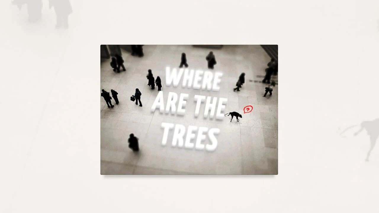
Interactive 3D Layered Text Wave Effect
This is an Interactive 3D Layered Text Wave Effect. It transforms a flat heading into a dynamic, multi-layered typographical stack that tracks cursor movement. Its function is to create immersive, interactive hero sections, replacing static typography with a playful spatial experience.
Chrome 36+
Edge 12+
Firefox 16+
Safari 9+
See the Pen Interactive 3D Layered Text Wave Effect.

CSS Cube
A pure CSS isometric text cube constructed via 3D transforms and trigonometry-based SCSS calculations. It features dynamic styling controlled by :has() and CSS variables, allowing for runtime theme switching (tritone/monotone/dim) and dark mode adaptation without JavaScript logic.
See the Pen CSS Cube.

Floating Headers
Impressive, weighty 3D typography that reacts to scrolling with a natural shift in perspective, reminiscent of volumetric signage or cinematic titles.
See the Pen Floating Headers.

3D Text Shadow
An example of a complex text-shadow where SCSS is used to create a multi-layered shadow with precise offsets for each layer - this gives the text a dimensional, “cartoonish” effect that is unachievable with standard tools.
See the Pen 3D Text Shadow.
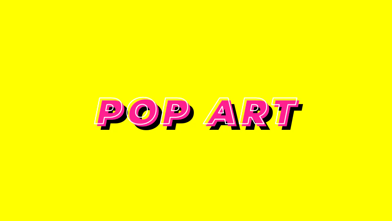
Typo Triple
Pop Art Typography uses standard CSS properties to mimic a classic comic book aesthetic. It relies on -webkit-text-stroke for the white outline and -webkit-text-fill-color: transparent to hollow the letters. The depth is simulated through a hard-edged, double text-shadow. No SVG or images needed. It is a clean, performant way to build bold, high-contrast hero text with minimal markup.
See the Pen Typo Triple.
CSS 3D Text Animation
High-performance 3D text animation where each character is independently controlled using transform: rotateX/translateY. The “running wave” effect is achieved via dynamic animation delay calculated using CSS variables per character.
See the Pen CSS 3D Text Animation.
80s Fonts Text Effect 4: Cyberspace Text
The ready-to-use 80s-style effect is achieved through the synergy of two key components: an SVG extrude filter for crafting the neon 3D text and a dynamic CSS starfield background animated along the Z-axis.
See the Pen 80s Fonts Text Effect 4: Cyberspace Text.
Megaman READY!
A sophisticated 3D kinetic typography animation powered by CSS Grid and Pug for dynamic block generation and positioning. This snippet showcases advanced CSS transforms, including preserve-3d and rotate3d, providing a high-performance visual experience with staggered assembly sequences for modern UI design.
See the Pen Megaman READY!.
3D Letters Sugar Sweet
A sophisticated CSS typography effect featuring layered depth created with the SCSS mix() function and multiple text-shadow properties. This snippet demonstrates fluid typography using vw units for seamless scaling, providing a high-performance, lightweight solution for modern web design.
See the Pen 3D Letters Sugar Sweet.
Flash Light
An interactive text effect simulating a flashlight using CSS 3D transforms and layered text-shadows. This snippet leverages perspective and rotateY properties to create a deep visual response on hover, ensuring high rendering performance and easy integration into any web project.
See the Pen Flash Light.
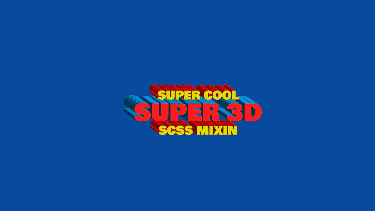
3D Text
Super 3D displays an isometric, mathematically generated striped text effect. The text-shadow property utilizes precise decimal offsets calculated via a Sass mixin. By alternating dark and light colors at a strict angle (such as dark and light blue for the red text), it creates a ribbed 3D extrusion wall. A transform: translate() offsets the base text to realign the layouts.
See the Pen 3D Text.
Tilt-Shift Text
A sophisticated CSS 3D typography effect that leverages perspective, rotateX, and complex text-shadow layers to achieve a tangible sense of depth. This interactive snippet features contenteditable support and smooth transitions, providing a high-performance solution for immersive UI/UX components.
See the Pen Tilt-Shift Text.
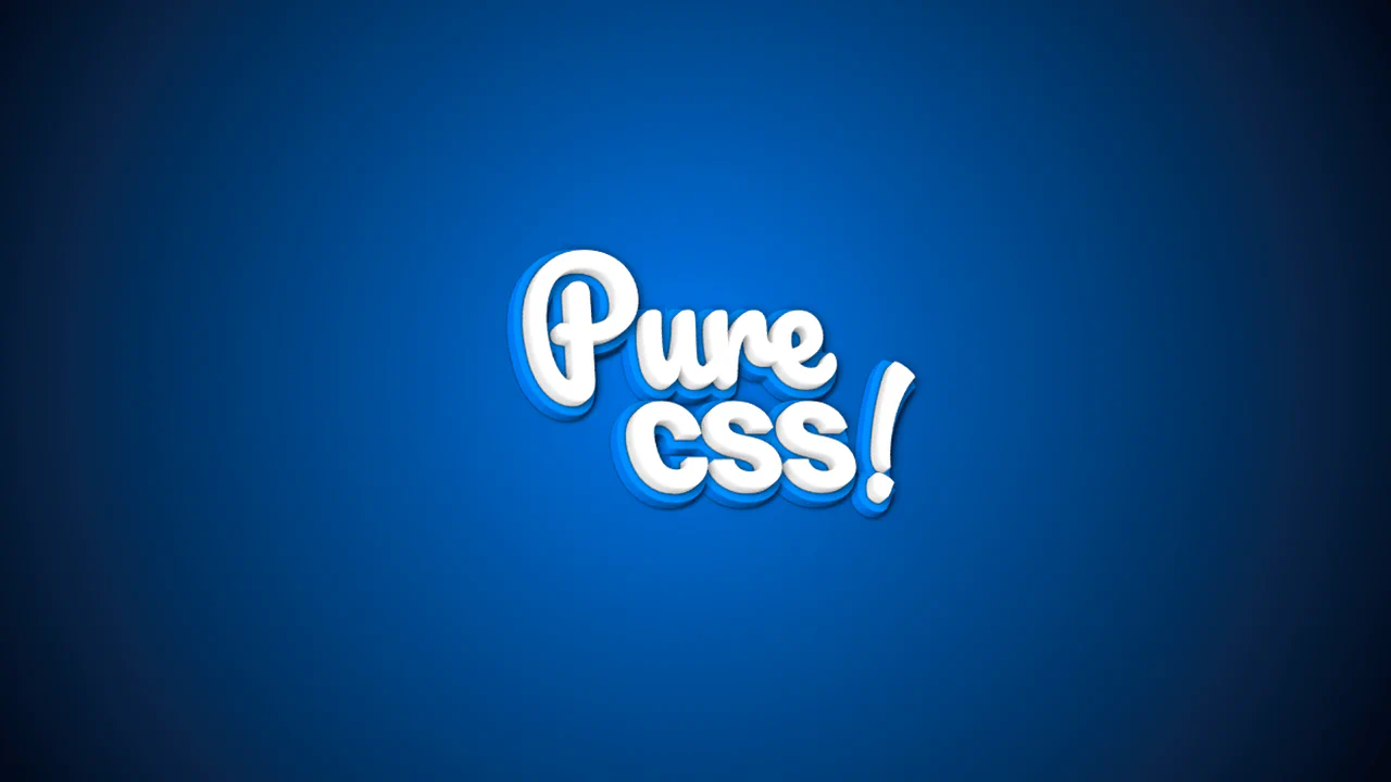
3D CSS Typography
Pure css! creates a true 3D text model by stacking 20 layered pseudo-elements along the Z-axis. Using translateZ() with small increments, the layers form a physical depth. Back layers utilize thick -webkit-text-stroke declarations in shades of blue to mimic lighting and a solid backplate. Rotating the parent via CSS keyframes reveals this physical 3D thickness from different angles.
See the Pen 3D CSS Typography.
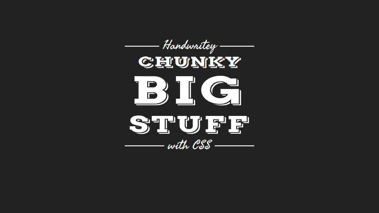
3D Text - CSS Only
plate combines heavy condensed slab-serif headers with retro-script accents to form a badge-style typographic layout. The chunky letters are compressed vertically using scaleY(0.7). To separate the text from its 3D extrusion, the text-shadow creates a 3px dark border (matching the background) before generating the white drop-shadow offsets. Cursive lines overlay a solid CSS rule.
See the Pen 3D Text - CSS Only.

3d Text Stroke
3d text stroke achieves a hollow 3D wireframe effect using only CSS. The text matches the background color, revealing only its white -webkit-text-stroke outline. The complex text-shadow is split into two systems: progressive gray layers that build the solid 3D extruded body, and strategically mapped white shadow layers that outline the corners to complete the hollow box look.
See the Pen 3d Text Stroke.
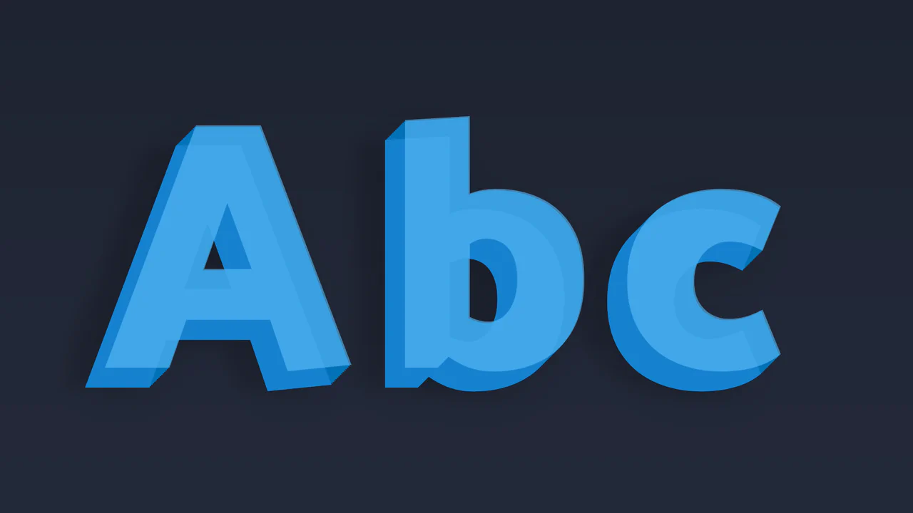
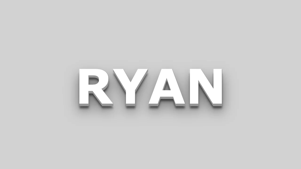
CSS 3D Text
ryan demonstrates a realistic 3D lettering effect created through dual-purpose text-shadow layers. The first ten sharp, consecutive shadows step down by 1px to simulate a solid, extruded block. The remaining four shadows use wider vertical offsets and large blur radiuses to cast soft, diffused drop shadows. This combination grounds the floating text into the 3D space.
See the Pen CSS 3D Text.

CSS Only 3D Paper Fold Text Effect
Folded uses opposing skew angles on split pseudo-elements to create a 3D creased-paper typography effect. The :before element renders the top half of the text, skewed at -13deg, while :after uses clip-path to render the bottom half, skewed at 13deg. A simple JS event listener updates the parent data-heading attribute, keeping editable text folded in real-time.
See the Pen CSS Only 3D Paper Fold Text Effect.
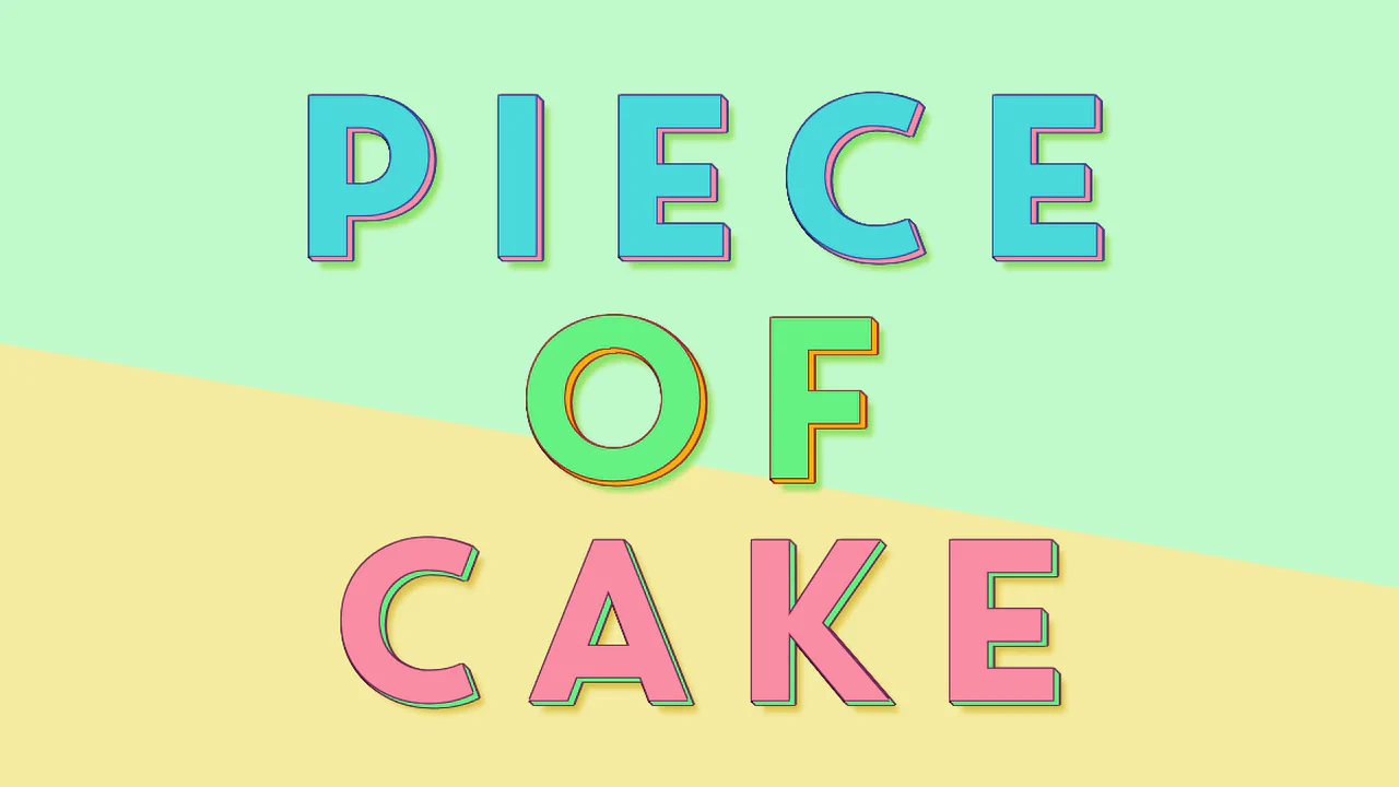
Multi Coloured 3D Text Effect
Piece of Cake creates a three-tiered, horizontal color-sliced text effect using clipped pseudo-elements. The parent h1 defines the base color and 3D shadow, while :before (height: 66%) and :after (height: 33%) slice and recolor the top segments. The text syncs in real-time using content: attr() alongside a short JS snippet that updates the attributes during active editing.
See the Pen Multi Coloured 3D Text Effect.
Animated 3D Text
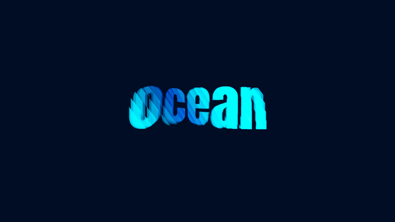
ocean creates a fluid 3D wave animation using pure CSS and duplicate DOM layers. By slicing 26 identical text divs into diagonal strips using clip-path, the snippet isolates different segments of the word. Staggered negative animation-delay offsets make each segment ripple independently in 3D space, mimicking a flowing holographic wave with color transitions.
See the Pen Animated 3D Text.
Layered Fonts in CSS
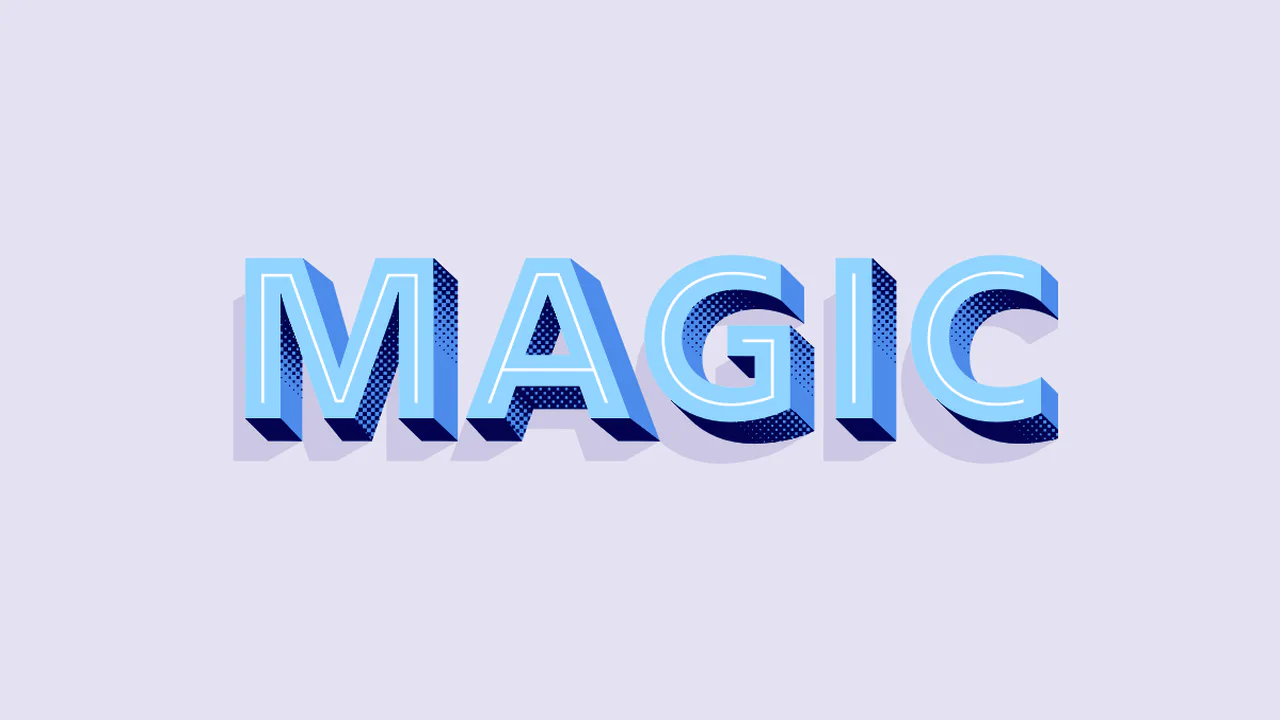
Magic layers specialized chromatic fonts to build an intricate, textured 3D text effect. By styling :before and :after on both h1 and span, it overlaps different font layers (Shadow, Extrude, Inline, Coarse) using content: attr(data-heading). A simple JS event listener synchronizes the data attributes as you type, keeping the editable typography perfectly aligned.
See the Pen Layered Fonts in CSS.

Simple 3D Text Effect
CHECK THIS OUT! creates a responsive retro-futuristic text layout. The geometric font is skewed and rotated via transform to give it an angled dynamic look. A flat, double-layered text-shadow in opposing directions (yellow-orange down-right and red up-left) creates a chromatic aberration effect. Using vmin units ensures the shadows scale with the viewport.
See the Pen Simple 3D Text Effect.
CSS 3D Text
ryan demonstrates a realistic 3D lettering effect created through dual-purpose text-shadow layers. The first ten sharp, consecutive shadows step down by 1px to simulate a solid, extruded block. The remaining four shadows use wider vertical offsets and large blur radiuses to cast soft, diffused drop shadows. This combination grounds the floating text into the 3D space.
See the Pen CSS 3D Text.
SCSS 3D Text Mixin
3D Staggered Extrusion Shadow creates a volumetric typography effect using only CSS. It chains 15 coordinate offsets within a single text-shadow property. The first eight layers are flat, solid, progressively darker pink offsets that simulate the text’s 3D side faces. The remaining layers are blurred, translucent shadows that render a soft ambient drop shadow on the background.
See the Pen SCSS 3D Text Mixin.