80+ CSS 3D Transforms: Free Code Examples & UI Snippets
Modern web interfaces leverage 3D space to add tangible depth and hierarchy, moving beyond flat design to create more engaging user journeys. Mastering spatial manipulation allows developers to transform standard elements into dynamic components that react naturally to user interaction.
- These effects utilize the perspective property to establish a 3D viewing context, defining how far elements appear from the user’s focal point.
- By applying transform-style: preserve-3d, developers can nest child elements within a shared coordinate system to create complex, rotatable structures.
- Performance is maintained by leveraging GPU acceleration through hardware-composed layers, effectively preventing expensive layout reflows during animation.
Dive into these geometric compositions to discover how high-performance spatial logic can define the next iteration of your design system.
Table of Contents:
Examples
3D Depth Parallax Pop-Out Cards
3D Depth Parallax Pop-Out Cards uses a mathematical approach combining value remapping and linear interpolation (lerp) to calculate fluid, lagged cursor coordinates inside a 60 FPS animation loop. This script alters custom CSS properties --rotateX and --rotateY, projecting individual layer transforms across multiple translated depths—namely a blurred .shadow, background scene, golden borders, and a foreground .cutout. While visually convincing, utilizing setInterval at a hardcoded 1000/60 rate can cause micro-stuttering on high-refresh-rate displays, making requestAnimationFrame a far more performant choice.
 Chrome 88+
 Edge 88+
 Firefox 89+
 Safari 15+
See the Pen 3D Depth Parallax Pop-Out Cards.

3D Star Wars Lightsaber Theme Toggle
3D Star Wars Lightsaber Theme Toggle relies on trigonometric CSS functions sin() and cos() to rotate vector elements along a 3D spherical path as the toggle slides. Custom numeric transitions are facilitated by redefining modern @property rules inside a @layer properties block, animating the --progress variable dynamically across state-driven keyframes. While providing a deeply thematic visual experience, performing continuous trigonometric transformations and animating complex CSS masks can trigger layout rasterization strain on standard devices, requiring GPU acceleration layers to preserve smooth 3D motion.
Chrome 111+
Edge 111+
Firefox 128+
Safari 16.4+
See the Pen 3D Star Wars Lightsaber Theme Toggle.

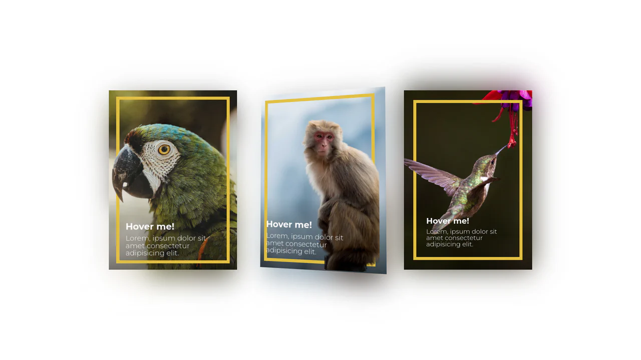
Direction Aware 3D Cube Gallery
This is a Direction Aware 3D Cube Gallery. It tracks the exact angle at which a cursor enters or leaves an image tile, applying a responsive 3D cube rotation that follows the mouse’s trajectory. Its function is to provide highly contextual, physical feedback during interaction, making a flat image grid feel like an array of tangible, rotatable blocks.
Chrome 60+
Edge 79+
Firefox 55+
Safari 11+
See the Pen Direction Aware 3D Cube Gallery.

CSS 3D Morphing Geometric Polyhedron
This is a 3D Morphing Geometric Polyhedron. It seamlessly transitions a six-sided cube into a twelve-sided rhombic dodecahedron through continuous spatial interpolation. Its function is to serve as a highly complex visual anchor or loading state, demonstrating advanced volumetric transformations without relying on WebGL or external physics engines.
Chrome 85+
Edge 85+
Safari 16.4+
See the Pen CSS 3D Morphing Geometric Polyhedron.
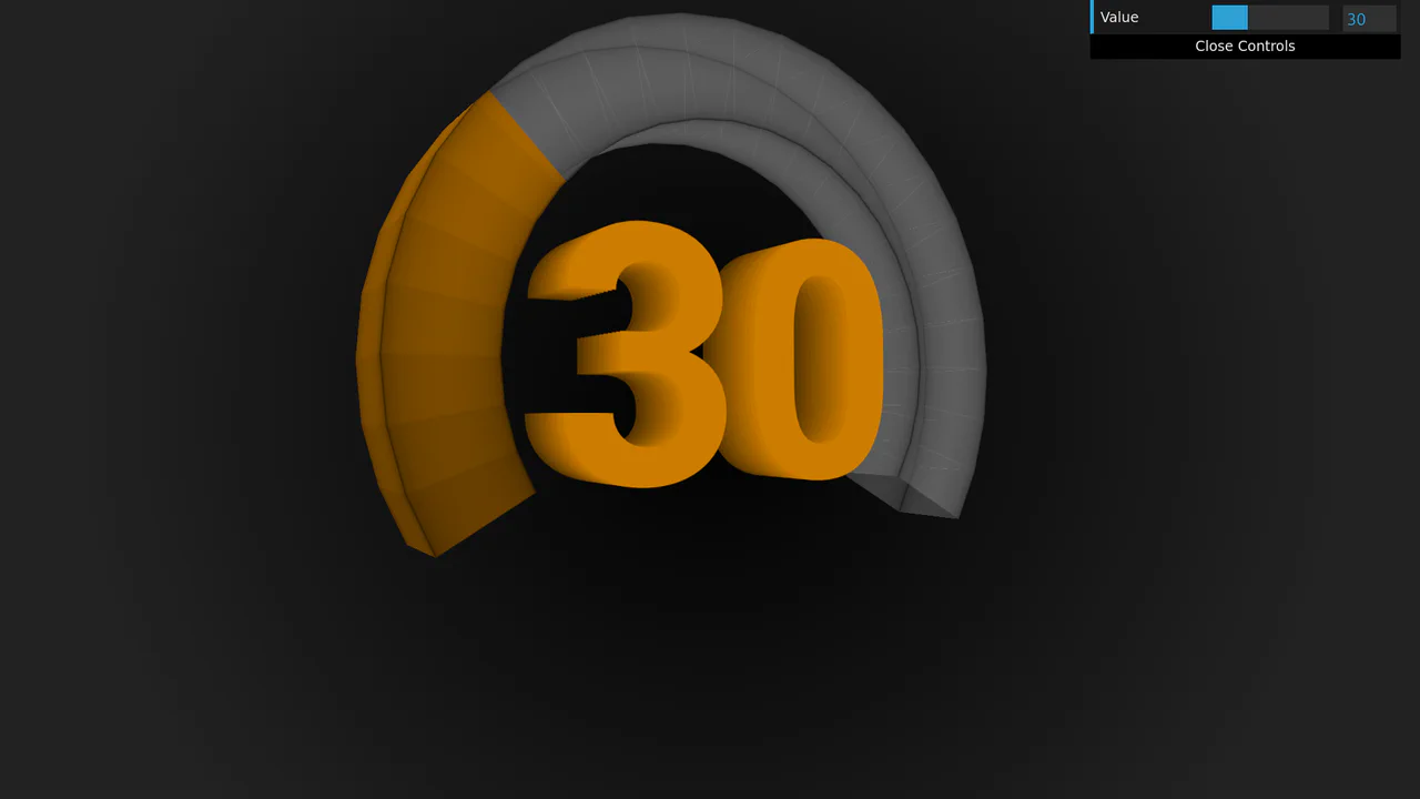
3D Rotating Value Dial
This is a 3D Rotating Value Dial. It visualizes continuous data through a spatial, cylindrical interface. Its function is to replace flat range indicators with a tactile, volumetric readout that dynamically shifts color hue based on value. (Requires: dat.gui)
Chrome 111+
Edge 111+
Firefox 108+
Safari 15.4+
See the Pen 3D Rotating Value Dial.

Tilting Diamond Range Slider Effect
This is a Tilting Diamond Range Slider Effect. It tracks user input through a hidden native range element, overlaying a custom graphical interface. Its primary function is to inject physical inertia into a standard digital control. The tooltip mimics mass, lagging behind rapid movements and tilting in the direction of travel.
Chrome 80+
Edge 80+
Firefox 75+
Safari 13+
See the Pen Tilting Diamond Range Slider Effect.

Interactive 3D Flip Book Gallery
This is an Interactive 3D Flip Book Gallery. It simulates a physical book structure where each element acts as a double-sided page. Its function is to showcase images through spatial depth, replacing standard flat carousels with a tactile flipping mechanic.
Chrome 85+
Edge 85+
Safari 16.4+
Firefox 128+
See the Pen Interactive 3D Flip Book Gallery.

Interactive 3D Coverflow Gallery
This is an Interactive 3D Coverflow Gallery. It organizes visual media into a spatial environment. Its function is to replace flat grids with depth-based navigation, using mathematical inverse transformations to zoom into selected items seamlessly.
Chrome 60+
Edge 79+
Firefox 55+
Safari 11+
See the Pen Interactive 3D Coverflow Gallery.

Smooth 3D Scroll-Driven Reveal
This is a Smooth 3D Scroll-Driven Reveal. It replaces the native scroll behavior with a custom, momentum-based scrolling engine that orchestrates complex 3D transforms. Its function is to create a gallery experience where images feel weightless, tilting and translating in 3D space based on their velocity and position relative to the viewport. (Requires: imagesloaded.js)
Chrome 60+
Edge 79+
Firefox 55+
Safari 11.1+
See the Pen Smooth 3D Scroll-Driven Reveal.

Liquid Filling Heart Interaction
This is a Liquid Filling Heart Interaction. It visualizes a “pumping” effect by animating a fluid level inside a heart-shaped container. Its function is to serve as a playful, interactive state indicator — like a “like” button or health bar — that responds to user clicks with a simulated hydraulic fill and a 3D perspective jolt. (Requires: gsap.js)
Chrome 80+
Edge 80+
Firefox 75+
Safari 13+
See the Pen Liquid Filling Heart Interaction.
Immersive 3D Tilt Card Modal
We accept flatness in web interfaces as a constraint, but it is merely a habit. This component breaks the fourth wall, transforming a static modal into a tangible, digital artifact. By coupling mouse physics with deep perspective, we create an interaction that feels less like clicking a link and more like holding a rare collectable. (Requires: gsap)
Chrome 80+
Edge 80+
Firefox 75+
Safari 13+
See the Pen Immersive 3D Tilt Card Modal.

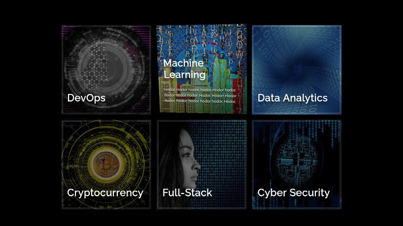
Pure CSS Isometric Floating Layers Diagram
This Isometric Floating Layers Diagram is a visually striking React component designed to represent architectural stacks or multi-tiered systems. By combining SVG geometry with CSS animations, it creates a lightweight 3D isometric illusion. Each layer floats rhythmically, enhanced by vibrant gradients and drop shadows, making it perfect for landing pages explaining software infrastructure or service tiers. (Requires: react, react-dom)
Chrome 50+
Edge 79+
Firefox 50+
Safari 10+
See the Pen Pure CSS Isometric Floating Layers Diagram.

3D Parallax Card Slider
This 3D Parallax Card Slider brings a tangible, high-fidelity feel to web galleries. It goes beyond simple sliding by implementing a physics-based tilt effect that reacts to mouse movement, giving each card weight and depth. The background adapts seamlessly to the active slide, creating an immersive atmosphere perfect for luxury travel sites or premium portfolios. (Requires: imagesLoaded)
Chrome 60+
Edge 79+
Firefox 55+
Safari 11+
See the Pen 3D Parallax Card Slider.

CSS Flip-Disc Mechanical Checkbox
This Flip-Disc Mechanical Checkbox brings the satisfying, tactile physics of old-school airport information boards to the web. Instead of a simple tick, selecting an item triggers a 3D rotation of a mechanical disc, flipping it from a dark, inactive side to a glowing orange active side. This creates a high-contrast, industrial aesthetic perfect for system dashboards or retro-themed interfaces.
Chrome 36+
Edge 12+
Firefox 16+
Safari 9+
See the Pen CSS Flip-Disc Mechanical Checkbox .

3D Rotating iOS Time Picker
This 3D Rotating iOS Time Picker recreates the tactile feel of native mobile controls on the web. It features three independently rotating wheels (Hours, Minutes, Meridiem) that snap into place with satisfying physics. The component leverages the cutting-edge Scroll-driven Animations API for buttery-smooth performance on supported browsers, while seamlessly falling back to GSAP for others. The 3D perspective creates a “drum” effect where numbers fade and rotate away as they leave the center view. (Requires: GSAP, Draggable, InertiaPlugin, Tweakpane)
Chrome 115+
Edge 115+
Safari 26+
Firefox (support via GSAP Fallback)
See the Pen 3D Rotating iOS Time Picker.

3D Tilt Mobile Navigation
This 3D Tilt Mobile Navigation concept adds a tactile, physical feel to mobile app menus. Unlike standard flat navigations, this component utilizes CSS perspective to “tilt” the entire menu bar towards the user’s touch point, simulating a floating surface. It pairs this effect with delightful SVG icon micro-interactions and a “fly-out” card transition for the content area, creating a highly polished, app-like experience on the web.
Chrome 86+
Edge 86+
Firefox 85+
Safari 15.4+
See the Pen 3D Tilt Mobile Navigation.
3D Parallax Hover Card
This 3D Parallax Hover Card creates a premium, tactile feel by mimicking physical depth on a flat screen. As the user moves their cursor over the card, it tilts along the X and Y axes to face the mouse, while the background image shifts in the opposite direction. This compound movement creates a convincing “window” effect, making the content appear to float above the background. (Requires: Vue.js)
Chrome 80+
Edge 80+
Safari 13+
Firefox 75+
See the Pen 3D Parallax Hover Card.

Draggable 3D Cube with Dynamic Lighting
This Draggable 3D Cube goes beyond standard CSS 3D transforms by implementing a custom “lighting engine” using JavaScript. As the user drags to rotate the carousel, the opacity of each face is dynamically calculated based on its angle relative to the viewport. This creates a realistic shading effect - faces facing the viewer are bright and fully opaque, while those turning away fade into the background, enhancing the perception of depth without using WebGL. (Requires: GSAP, GSAP Draggable)
Chrome 90+
Edge 90+
Safari 14+
Firefox 88+
See the Pen Draggable 3D Cube with Dynamic Lighting.

Draggable 3D Parallax Image Ring
This Draggable 3D Parallax Image Ring creates a high-end, immersive gallery experience often associated with WebGL, but built entirely with DOM elements and GSAP. It arranges images in a 3D circle that users can spin with a swipe or mouse drag. The standout feature is the calculated parallax effect: as the ring rotates, the background position of each image shifts in the opposite direction, creating a convincing illusion of depth and window-like transparency. (Requires: GSAP, GSAP Draggable)
Chrome 90+
Edge 90+
Safari 14+
Firefox 88+See the Pen Draggable 3D Parallax Image Ring.

Interactive 3D Photo Cube
This Interactive 3D Photo Cube creates a spatial navigation experience where a user explores six images mapped onto a cube by moving their cursor. Unlike standard sliders, it utilizes CSS 3D transforms orchestrated by GSAP to create a seamless, physics-like rotation. The snippet also features a “window-pane” parallax effect where the background images shift slightly inside their frames, adding an extra layer of depth. (Requires: GSAP)
Chrome 90+
Edge 90+
Safari 14+
Firefox 88+See the Pen Interactive 3D Photo Cube.

Trigonometric 3D Orbit CSS Gallery
This Trigonometric 3D Orbit Gallery is a stunning example of “Code Art,” demonstrating the raw power of modern CSS mathematics. Instead of relying on rigid keyframes for positioning, it uses parametric equations to place and animate 32 images along a complex, fluid 3D curve in real-time, creating a perpetual motion machine effect purely with stylesheets.
Chrome 111+
Edge 111+
Safari 16.4+
Firefox 113+See the Pen Trigonometric 3D Orbit CSS Gallery.

CSS 3D Stacking Card List Effect
This 3D Stacking Card List Effect transforms a standard vertical list into an immersive, layered user interface. By leveraging CSS 3D transforms and focal blur filters, it simulates a physical deck of cards where background items appear distant and out of focus, settling into a clear layout only upon interaction.
Chrome 84+
Edge 84+
Firefox 63+
Safari 14.1+
See the Pen CSS 3D Stacking Card List Effect.
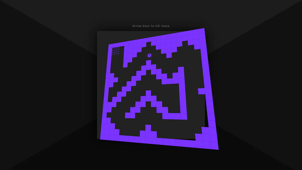
3D Tilt Maze Game
This 3D Tilt Maze Game recreates the classic wooden labyrinth toy using web technologies. By combining CSS perspective with JavaScript keyboard events, it simulates a physical board that tilts to roll a ball. The game includes a rudimentary physics engine for ball movement and wall collision, complete with multiple levels generated from array maps.
Chrome 36+
Edge 12+
Firefox 16+
Safari 9+
See the Pen 3D Tilt Maze Game.
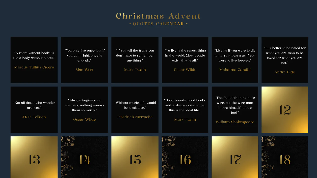
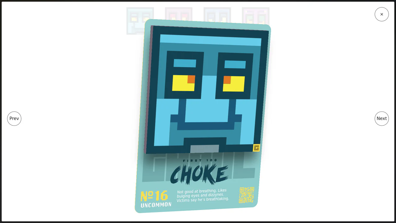
Advent Calendar with Quotes
An interactive Advent Calendar featuring 25 flip-cards generated via JavaScript.
See the Pen Advent Calendar with Quotes.

Interactive 3D Parallax Landscape
This volumetric 2.5D landscape utilizes spatial depth and layered parallax to create a tactile, multi-planar environment. While CSS preserve-3d handles the heavy lifting of perspective rendering, JavaScript orchestrates the state by mapping input to parametric rotation. By delegating logic to a hidden hit-area grid and leveraging GPU-accelerated transforms, the component ensures performance-optimized motion. This physical feedback minimizes cognitive load through intuitive spatial orientation for an immersive feel.
See the Pen Interactive 3D Parallax Landscape.

Moiré Psy-Dance Party VIP Access Card (CSS Only)
A psychedelic 3D VIP card animation powered by pure CSS.
See the Pen Moiré Psy-Dance Party VIP Access Card (CSS Only).

Can :has() Connect 4?
A fully functional Connect 4 game implemented entirely in CSS, utilizing the :has() selector to manage complex game state, enforce turn-taking via CSS counters, and detect win conditions (vertical, horizontal, diagonal).
See the Pen Can :has() Connect 4?.

CSS Cube
A pure CSS isometric text cube constructed via 3D transforms and trigonometry-based SCSS calculations. It features dynamic styling controlled by :has() and CSS variables, allowing for runtime theme switching (tritone/monotone/dim) and dark mode adaptation without JavaScript logic.
See the Pen CSS Cube.

GSAP Animate Text
A showcase of 7 kinetic typography effects powered by GSAP.
See the Pen GSAP Animate Text.

Blocky Digital Clock
A voxel-style 3D clock where digits morph physically via CSS transforms driven by sibling selectors, creating a floating, mechanical restructuring effect.
See the Pen Blocky Digital Clock.