80+ CSS 3D Transforms: Free Code Examples & UI Snippets (Page 2)
Examples

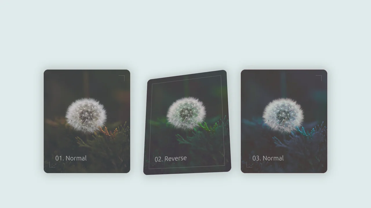
Original vs. Negative Card (Hover and Drag)
A tactile 3D comparison card where the slider reveals image states via blend modes, with smart label occlusion logic.
See the Pen Original vs. Negative Card (Hover and Drag).
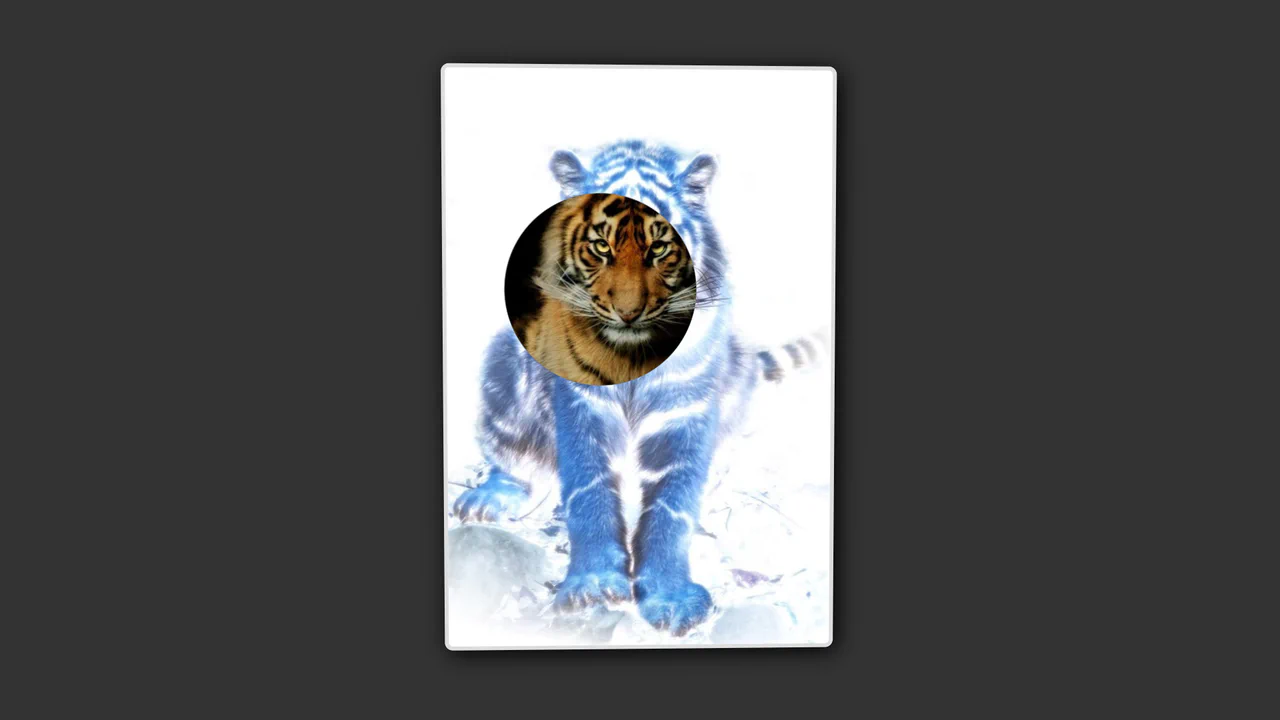
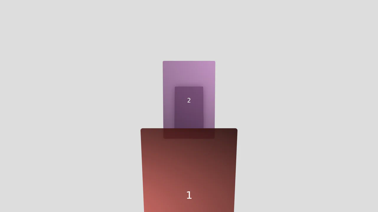
Uninvert Kitty
An interactive spotlight reveal where the cursor controls a negative mask and a physical 3D tilt effect.
See the Pen Uninvert Kitty.

Holographic Name Card with Hover Effects
An interactive 3D holographic card where JavaScript maps pointer coordinates to scoped CSS Custom Properties like --pointer-x. The physical lighting simulation relies on complex gradient layering, mask-image, and mix-blend-mode, all dynamically driven by these calculated values to create realistic depth and glare.
See the Pen Holographic Name Card with Hover Effects.

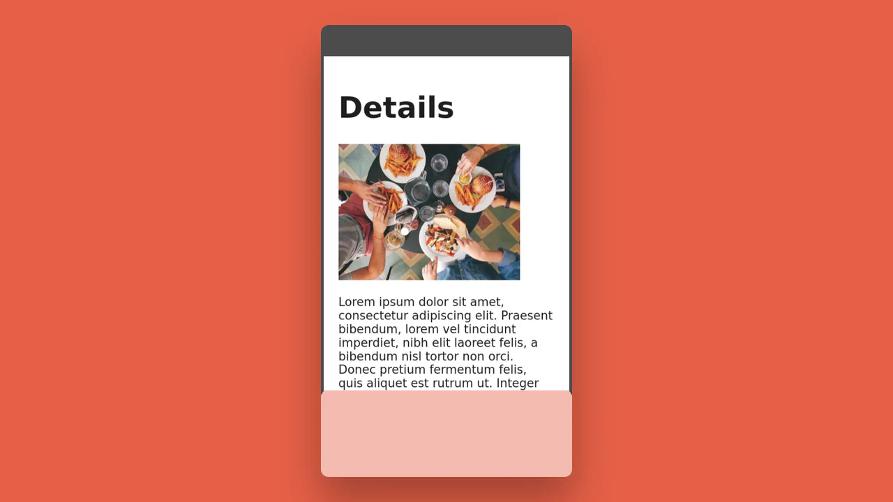
Entry Ticket
A detailed event ticket simulation constructed with CSS Grid, featuring authentic textures and typography (barcodes, holograms).
See the Pen Entry Ticket.

Floating Headers
Impressive, weighty 3D typography that reacts to scrolling with a natural shift in perspective, reminiscent of volumetric signage or cinematic titles.
See the Pen Floating Headers.
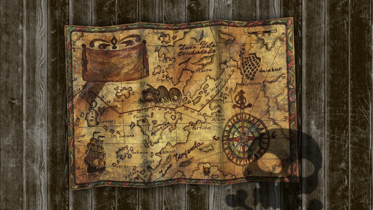
Treasure Map
The map looks like a real sheet of paper that can be virtually “crumpled” or folded with a mouse/finger, complete with realistic shadows and physics.
See the Pen Treasure Map.
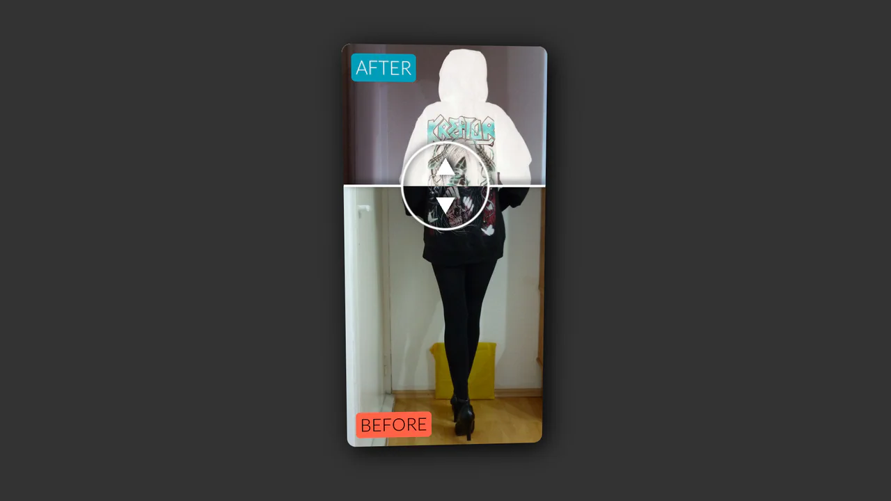
Vertical Original vs. Negative Card (Hover and Drag)
An interactive card that reveals a negative version of the image on hover, with a draggable slider to compare the two versions, utilizing CSS blend modes and 3D transforms.
See the Pen Vertical Original vs. Negative Card (Hover and Drag).

Music Player
The user receives a tactile, responsive interface that visually reacts to mouse “pressure,” simulating the operation of physical mechanical buttons, accompanied by seamless audio playback and album art transitions.
See the Pen Music Player.

Inertial Scroll Gallery with 3D Transforms
A sophisticated scroll-hijacking gallery that emulates inertia using a virtual scroll container and requestAnimationFrame. JavaScript orchestrates complex 3D transforms - calculating rotation and translation based on intersection ratios - while the layout relies on a fixed CSS grid.
See the Pen Inertial Scroll Gallery with 3D Transforms.

Turbulence Effect with Blend Modes
Live demo showcasing dynamic mix-blend-mode and background-blend-mode combinations. Interactive 3D tilt and SVG turbulence distortion trigger on hover.
See the Pen Turbulence Effect with Blend Modes.

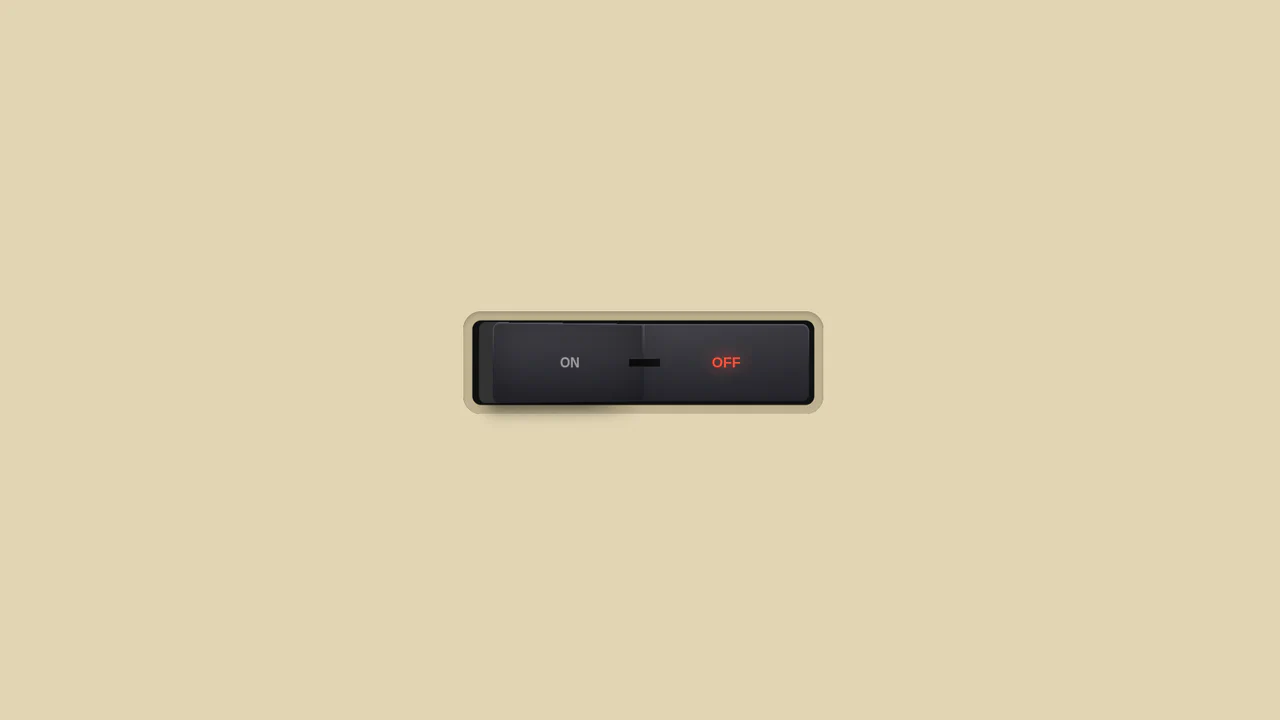
3D Neon Toggle On/Off Switch
An advanced 3D toggle switch simulating a physical button with a neon glow. The effect is implemented in pure CSS using an <input type="checkbox">, and the state transition (ON/OFF) is achieved through a complex interplay of box-shadow and 3D transforms.
See the Pen 3D Neon Toggle On/Off Switch.
3D Toggle On/Off Switch v2
The use of gradients to create a realistic metallic effect and highlights on the button. Various types of linear-gradient and radial-gradient are applied to create a multi-layered background, and clip-path precisely clips the shapes of the pseudo-elements.
See the Pen 3D Toggle On/Off Switch v2.

Interactive Card Glow Effect
A modular React card component where a single pointermove listener updates CSS variables, powering a customizable, multi-layer glow and spotlight effect.
See the Pen Interactive Card Glow Effect.

Image Displacement with Three.js
A texture morphing effect with 3D rotation on hover, implemented using Three.js and shaders (GLSL). The fragment shader uses the snoise3 function (simplex noise) to create an organic mixing mask for blending two images.
See the Pen Image Displacement with Three.js.

3D Capsule Slider Button
A combination of the ‘checkbox hack’ and 3D transforms to create an interactive neumorphism-style switcher. JavaScript only adds classes, while the entire transform: rotateX() animation and complex box-shadow are controlled by CSS.
See the Pen 3D Capsule Slider Button.

3D Text Spiral Animation with CSS
An elegant 3D scene where rotating text forms a spiral. The effect utilizes the perspective property for depth and HSL functions for procedurally generating the multi-layered color scheme.
See the Pen 3D Text Spiral Animation with CSS.

CSS-Only Image Tilt Towards Cursor
A 3D image tilt effect that mimics cursor movement, achieved purely with CSS by combining multiple invisible overlay zones, the general sibling combinator, and the transform: rotate3d() function with perspective on the parent container.
See the Pen CSS-Only Image Tilt Towards Cursor.

Pure CSS 3D Animated Cat Model
Complex yet high-performance 3D rendering in the browser: the model is built on CSS Box Model Hacking principles, where each polygon is positioned in space using translate and rotate for continuous 360-degree animation.
See the Pen Pure CSS 3D Animated Cat Model.
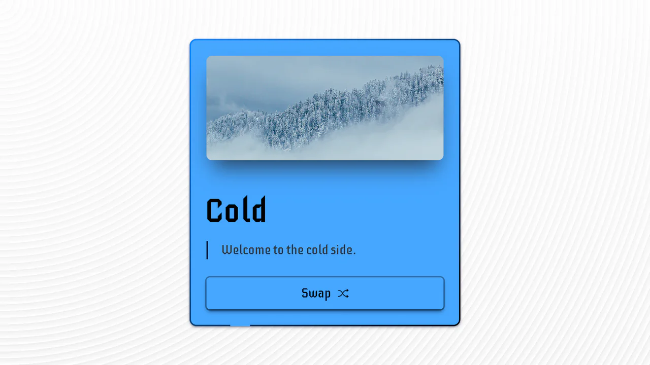
Hot & Cold Swap Card
An advanced UI component demonstrating pure CSS capabilities to create a complex 3D flip effect, with the added use of animated SVG strokes and CSS variables for an instant change of color scheme and media content.
See the Pen Hot & Cold Swap Card.
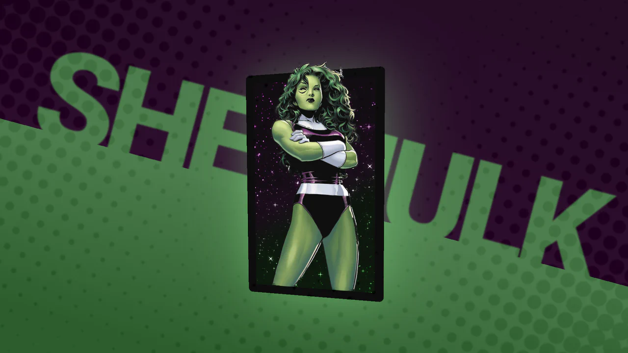
Marvel Snap Card Pseudo-3D Effect
A pseudo-3D card effect that mimics the “split parallax” technique using multiple image layers and the key transform-style: preserve-3d property; the card’s dynamic tilt (rotateY/rotateX) is driven by vanilla JavaScript based on cursor/touch position.
See the Pen Marvel Snap Card Pseudo-3D Effect.
Cards with Parallax Tilt Effect
Dive into a stunning card effect utilizing CSS 3D transforms and precise mouse tracking to create a realistic, multi-layered depth and parallax illusion on hover.
See the Pen Cards with Parallax Tilt Effect.

GSAP Homepage Demo 4
An advanced interactive gallery showcasing the power of GreenSock: it utilizes custom Timelines to manage complex, multi-stage animations and x, y, scale transformations upon clicking the elements.
See the Pen GSAP Homepage Demo 4.
3D Page Fold Transition (FLIP Principle)
An elegant implementation of the FLIP animation principle to create a stunning shared element transition between two views, where JS calculates the positions and CSS performs the inverse transform for a smooth change.
See the Pen 3D Page Fold Transition (FLIP Principle).

Feedback Reactions (Pure CSS)
Pure CSS custom properties and SVG for a neat, interactive feedback rating; see how variable-driven styling creates smooth state transitions and subtle 3D transforms.
See the Pen Feedback Reactions (Pure CSS).

Playing Card 3D Preloader
An intricate infinite 3D stacking animation achieved purely with CSS transform-style: preserve-3d and complex @keyframes, leveraging translateZ for depth and precise animation-timing-function steps to smoothly cycle three cards in a continuous loop.
See the Pen Playing Card 3D Preloader.
Scrolling 3D Card Carousel
An impressive, fully controlled 3D carousel effect where the entire animation sequence - card rotation, stacking, and perspective transition - is synchronized to the user’s scroll depth via GSAP ScrollTrigger, showcasing high-performance transform: rotateX manipulation for engaging visual depth.
See the Pen Scrolling 3D Card Carousel.

GSAP 3 Animation Deck with 3D Transforms
A demo of multi-step animations using keyframes within GSAP, plus subtle work with CSS filters (brightness) to simulate 3D object lighting.
See the Pen GSAP 3 Animation Deck with 3D Transforms.

Rotating Cuboid Form with CSS 3D Animation
A multi-step 3D form featuring a block flip effect is implemented by changing CSS classes and using 3D transformations. The JavaScript logic handles input validation and smooth step switching, enhancing the UX of a complex form.
See the Pen Rotating Cuboid Form with CSS 3D Animation.

3D Slider Cards Carousel
An immersive 3D Circular Slider using GSAP for smooth, complex transform animations and rotations, creating a perspective-driven carousel where card properties are dynamically mapped and updated upon rotation.
See the Pen 3D Slider Cards Carousel.

Futuristic Interactive Dropdown
This striking Sci-Fi dropdown leverages SCSS @for loops and conditional logic to dynamically stagger menu items in their hidden state. The dramatic reveal animation is achieved using complex CSS 3D transforms and skewing activated entirely by a single parent hover state.
See the Pen Futuristic Interactive Dropdown.