80+ CSS 3D Transforms: Free Code Examples & UI Snippets (Page 3)
Examples
A 3D sphere where an SCSS @for loop calculates the transform for each ring, and the entire animation and structure, built on perspective and transform-style: preserve-3d, are fully configurable via variables.
A futuristic 3D data block where scrolling digital “circuits” are simulated purely in CSS by animating the background-position of linear-gradient patterns.

Flying Through Hexagons
A large-scale 3D scene where Sass procedurally generates both the trajectory of 72 rings using trigonometry, and the @keyframes for its “fly-through” mode via a Sass map. Animation is switched without JS using the “checkbox hack”, and the entire composition is built upon perspective and transform-style: preserve-3d.
See the Pen Flying Through Hexagons.
A cutting-edge image comparison slider powered by CSS scroll-driven animations, using view-timeline to link range input scrolling directly to the image masking logic.
CSS Sprite-Based Flip Carousel Using Scroll-Timeline
A modern implementation of interactive page flipping where the sprite animation (background-position) is fully synchronized with page scrolling using the new CSS scroll-timeline feature, eliminating JavaScript for timing control.
See the Pen CSS Sprite-Based Flip Carousel Using Scroll-Timeline.
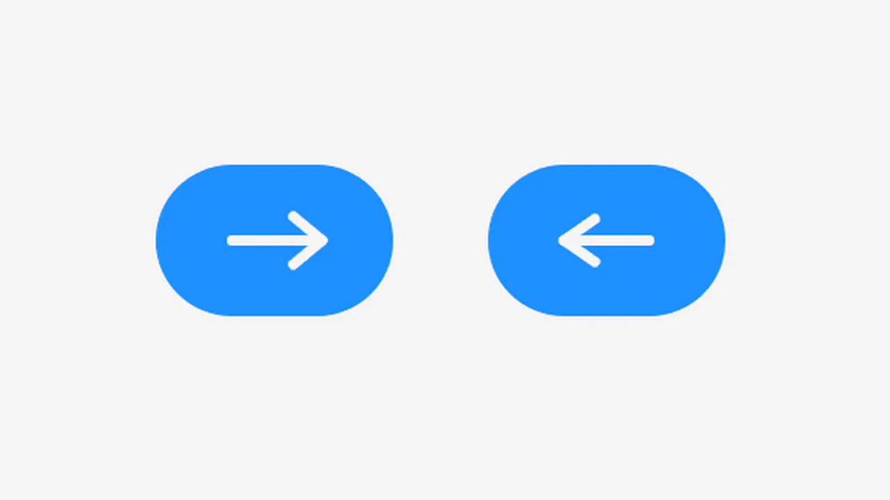
Arrow Icon Animation
A technically advanced use of ::before and ::after pseudo-elements to create an arrow. jQuery toggles the .right class, and CSS animates the left and transform: rotate() properties of the pseudo-elements, creating a “switch” or 3D flip effect.
See the Pen Arrow Icon Animation.
3D Textbox
This UI component is a masterclass in CSS 3D transforms, using transform-style: preserve-3d to create a fully three-dimensional, interactive textbox. The 3D effect is achieved by rotating and positioning pseudo-elements with rotateY(90deg) and rotateX(90deg), demonstrating a sophisticated, purely decorative use of 3D space.
See the Pen 3D Textbox.
A realistic mechanical counter animation where the top half of the digit flips down to reveal the next one, maintaining the rhythm (units change faster than tens).

Dual Sliding Panels
An adaptive split-screen layout where panels unfold in 3D - along the Y-axis on desktop and the X-axis on mobile. A JS controller manages the state via classes, while all the complex animation, optimized with will-change and perspective, is written in Stylus.
See the Pen Dual Sliding Panels.
A 3D isometric business card grid powered by a virtual scroll mechanism. JavaScript maps the window’s scroll position to a CSS custom property, driving the vertical translation of a fixed, tilted container.
3D Flip Card
A practical approach where a spectacular 3D flip is implemented in pure CSS, complemented by a small jQuery script for dynamically substituting background images from data-image attributes.
See the Pen 3D Flip Card.

3D Flipping Cards
A classic 3D card flip on :hover within a perspective container, plus an elegant solution for auto-numbering items using CSS counters.
See the Pen 3D Flipping Cards.
A spectacular 3D card flip on click, implemented through a combination of jQuery’s toggleClass and CSS transforms - the animation is enhanced with hover effects and a delayed content reveal on the back using transition-delay, while backface-visibility: hidden ensures a clean execution.

CSS3 Business Card
A demonstration of SCSS power, where a 3D card flip on hover is combined with the procedural generation of a “long shadow” via a @function and @for loop, while a custom @keyframes animation adds a wobble effect to the button.
See the Pen CSS3 Business Card.

Bouncing Play Button
An interactive SVG Play button featuring a complex bouncing animation generated with Bounce.js. The component’s state is managed by a JavaScript click listener that toggles CSS classes, triggering advanced keyframe animations powered by matrix3d for a highly dynamic UI effect.
See the Pen Bouncing Play Button.
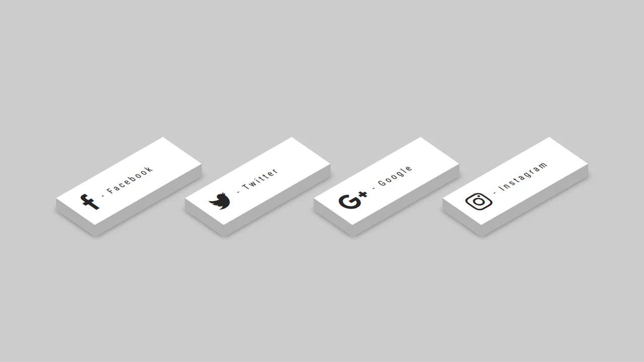
3D - CSS Social Tiles
A set of isometric social media buttons created purely with CSS transforms.
See the Pen 3D - CSS Social Tiles.
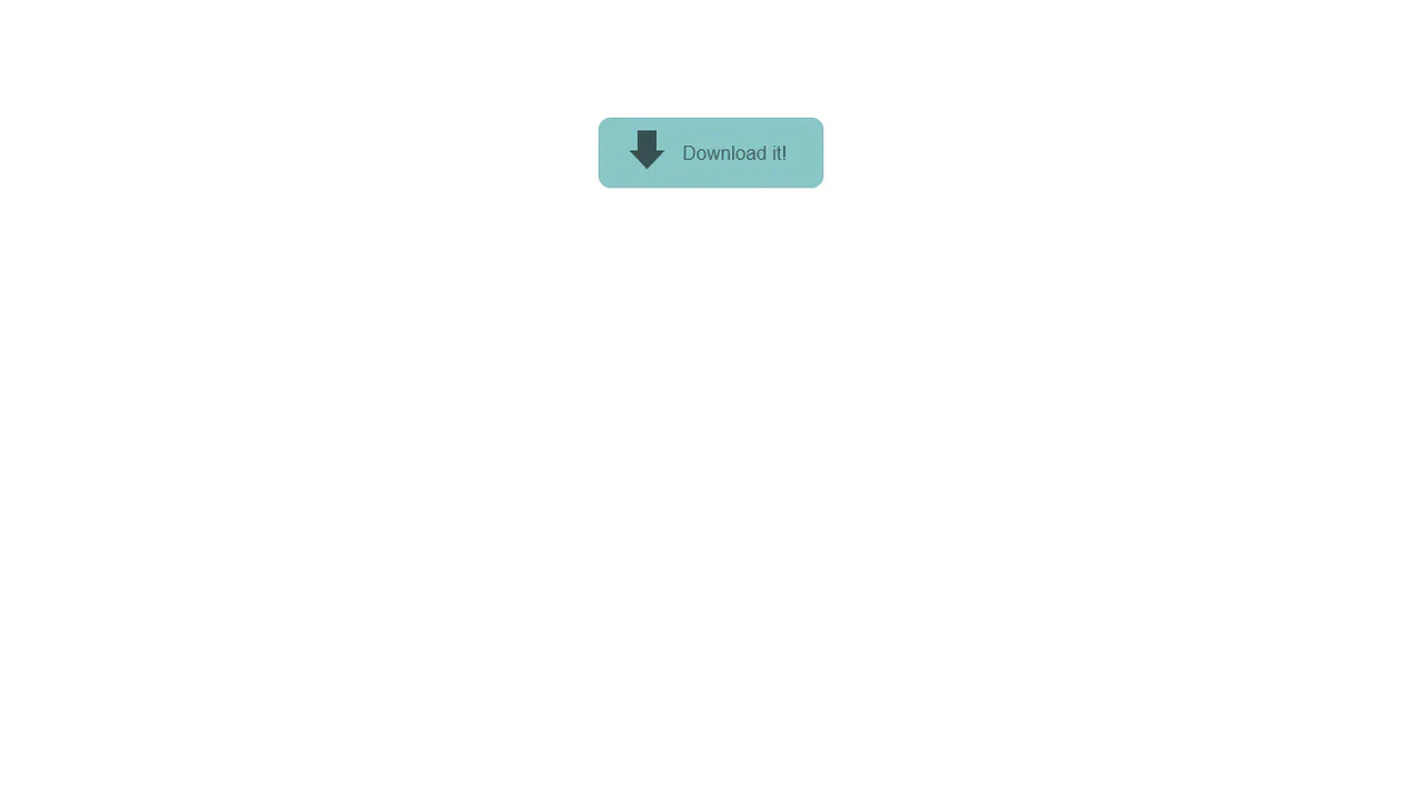
A 3D “Download” button animation where a stylized 3D “down arrow” icon begins to orbit the button on hover. The 3D scene is created using transform-style: preserve-3d, and the rotation is handled by transform: rotateY().
The button features a complex, non-linear hover effect powered by a cubic-bezier transition curve and CSS transform: translate3d applied to the inner .mask element, creating a sweeping diagonal light wipe effect.
An interactive hover animation that separates elements in 3D space. On container hover, one element animates with transform: rotateX(70deg), while another gets a grow animation, creating an effect of depth and dynamism.
Particle Orb CSS
Creation of a 3D particle sphere using a single global @keyframes for container rotation and individual @keyframes, procedurally generated in a SCSS @for loop for each particle.
See the Pen Particle Orb CSS.
Quantum Project x Eedi
A 3D dot cube where each face is a separate div and the dots are nested divs. The 3D effect is achieved using transform-style: preserve-3d and perspective, with each face offset along the Z-axis by a different distance.
See the Pen Quantum Project x Eedi.
Water Drop
A pure CSS water drop animation featuring realistic ripples, utilizing a key technical feature: 3D transformation rotateX(75deg) on pseudo-elements to simulate the perspective of expanding concentric circles.
See the Pen Water Drop.
CSS 3D Text Animation
High-performance 3D text animation where each character is independently controlled using transform: rotateX/translateY. The “running wave” effect is achieved via dynamic animation delay calculated using CSS variables per character.
See the Pen CSS 3D Text Animation.
3D CSS Typography
Dive into pure CSS 3D typography: the effect of impressive depth is achieved by leveraging transform-style: preserve-3d and dozens of stacked pseudo-elements with incremental translateZ values.
See the Pen 3D CSS Typography.
George Orwell 1984 Book Cover
A stylish 3D book effect with a realistic cover, created purely with CSS. Interactive page-flipping (rotateY) is activated on hover, demonstrating a masterful use of transform-style: preserve-3d and shadows.
See the Pen George Orwell 1984 Book Cover.
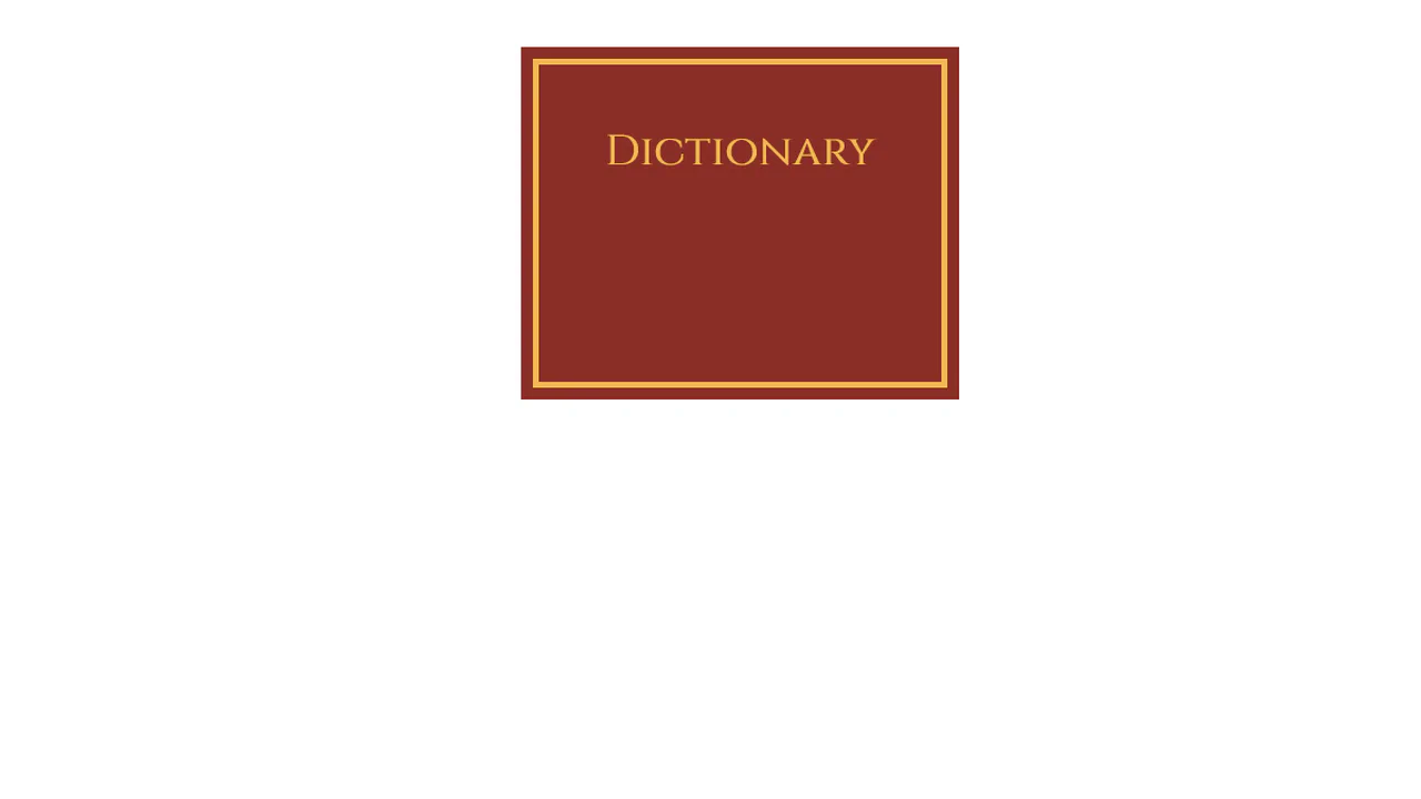
Dictionary Book
This demo achieves a striking 3D page-flipping effect by masterfully employing perspective and transform-style: preserve-3d on the book container. Crucially, the animation uses rotateY(-180deg) with a fixed transform-origin: left center to simulate a physical book spine opening via a smooth transition.
See the Pen Dictionary Book.