50+ CSS @property Examples
Variable manipulation dictates systemic flexibility. The CSS @property examples in this collection remove the barrier of static custom properties, enabling dynamic, native transitions for modern UI design. Utilizing these curated snippets allows raw logic to animate previously un-animatable values like gradients and angles directly in the stylesheet. No script bloat. No friction.
Technically, the syntax registers custom properties with strict type checking, explicit default values, and inheritance rules. The code utilizes hardware acceleration by linking typed variables to transform where applicable, or by enabling smooth interpolation for complex conic-gradient backgrounds. This strict typing ensures absolute layout stability on the rendering thread. The HTML structure remains strictly semantic, preventing expensive browser repaints during complex visual shifts.
Every free demo is fully responsive and cross-browser compatible. Users can instantly download the raw code or fork an updated interaction on CodePen. These assets are strictly optimized for performance and accessibility, delivering a fast, transparent experience across all modern devices.
Examples
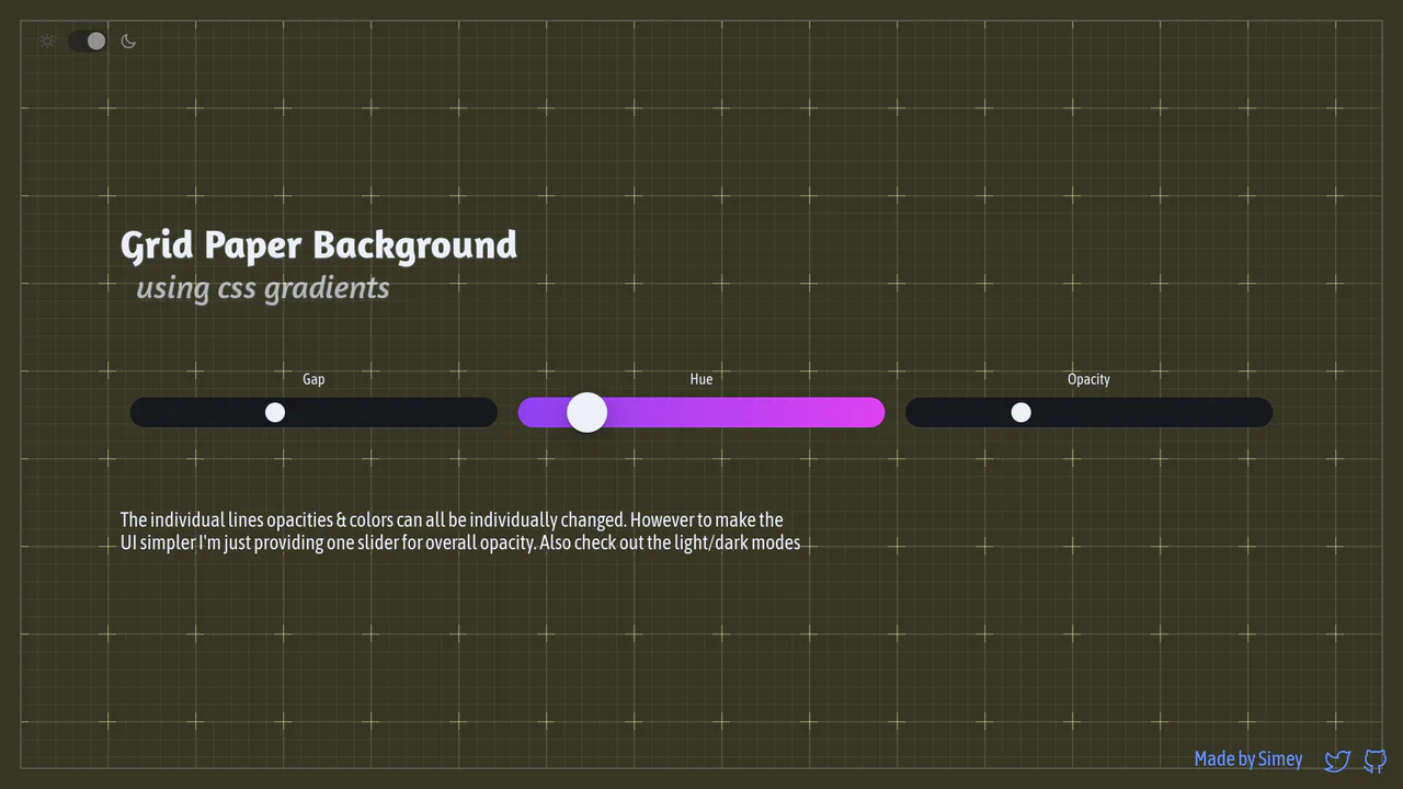
Procedural CSS Gradient Grid Background
An interactive graph notebook paper pattern drawn entirely via stacked, layered CSS gradients. By combining major and minor linear grid lines, radial cross masks, and corner border offsets, it forms a fully customizable procedural background. It utilizes CSS @property Houdini variables to smoothly transition gap sizing updates, alongside dynamic theme and color hue tuning.
 Chrome 110+
 Edge 110+
 Firefox 128+
 Safari 16.4+
See the Pen Procedural CSS Gradient Grid Background.
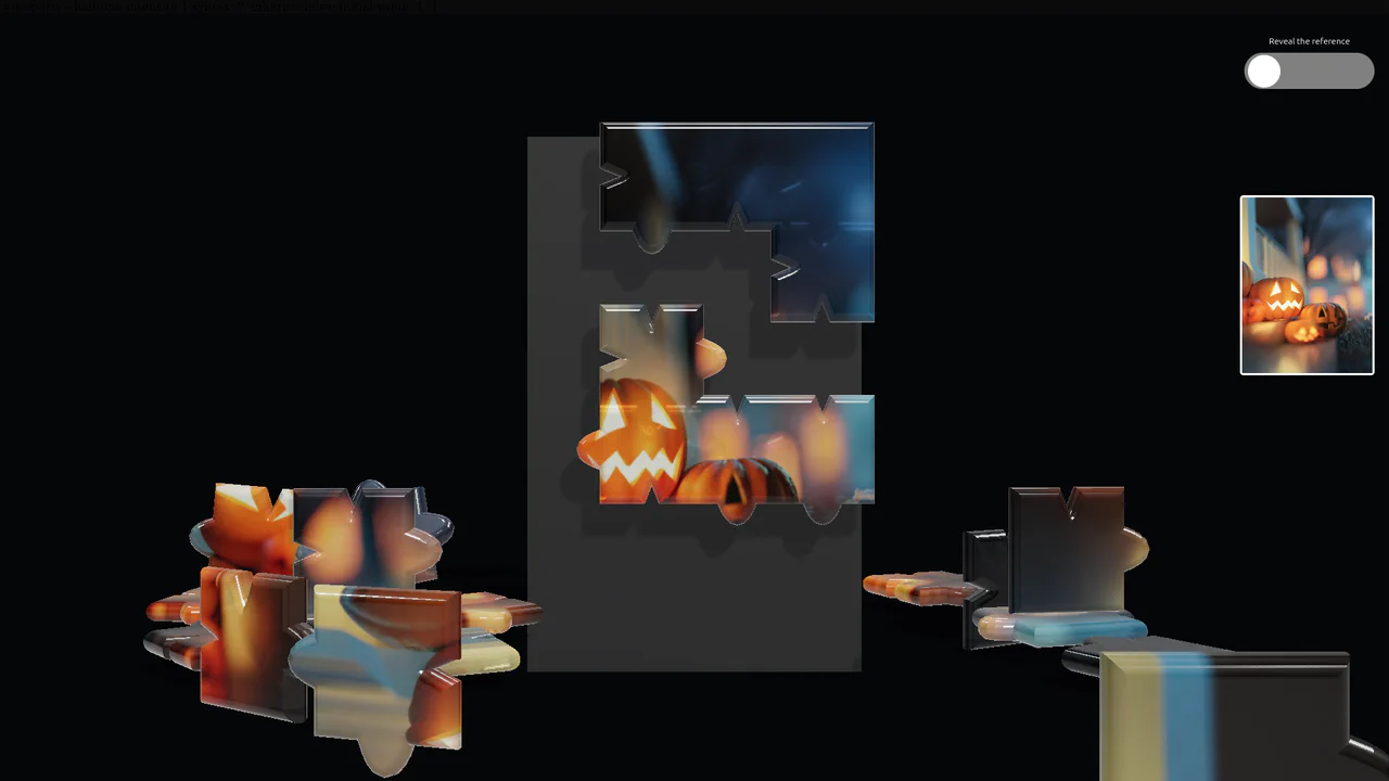
Glass Physics 3D Jigsaw Puzzle
An advanced WebGL jigsaw puzzle simulation featuring realistic glass-like pieces powered by Three.js and Cannon.js. Each puzzle shape combines extruded spline geometries with compound rigid-body collision shapes to precisely model the jigsaw tabs and gravity. It includes an interactive preview container styled with a complex SVG halftone dot filter that fades dynamically using CSS @property transitions. (Requires: three.js, cannon.js)
Chrome 85+
Edge 85+
Firefox 128+
Safari 16.4+
See the Pen Glass Physics 3D Jigsaw Puzzle.
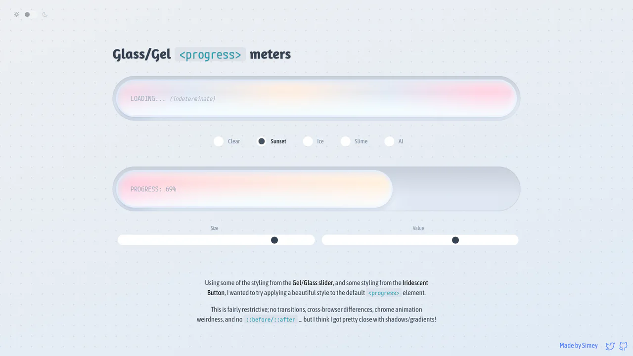
Glossy Glassmorphic Native Progress Meters
An advanced styling demonstration showing how to convert native <progress> elements into gorgeous glassmorphic ‘gel’ meters. Using native webkit and gecko pseudo-elements combined with oklch gradients, radial lighting masks, and @property Houdini variables, it builds high-performance indeterminate loading animations and responsive color themes with completely clean, semantic markup.
Chrome 111+
Edge 111+
Firefox 128+
Safari 16.4+See the Pen Glossy Glassmorphic Native Progress Meters.
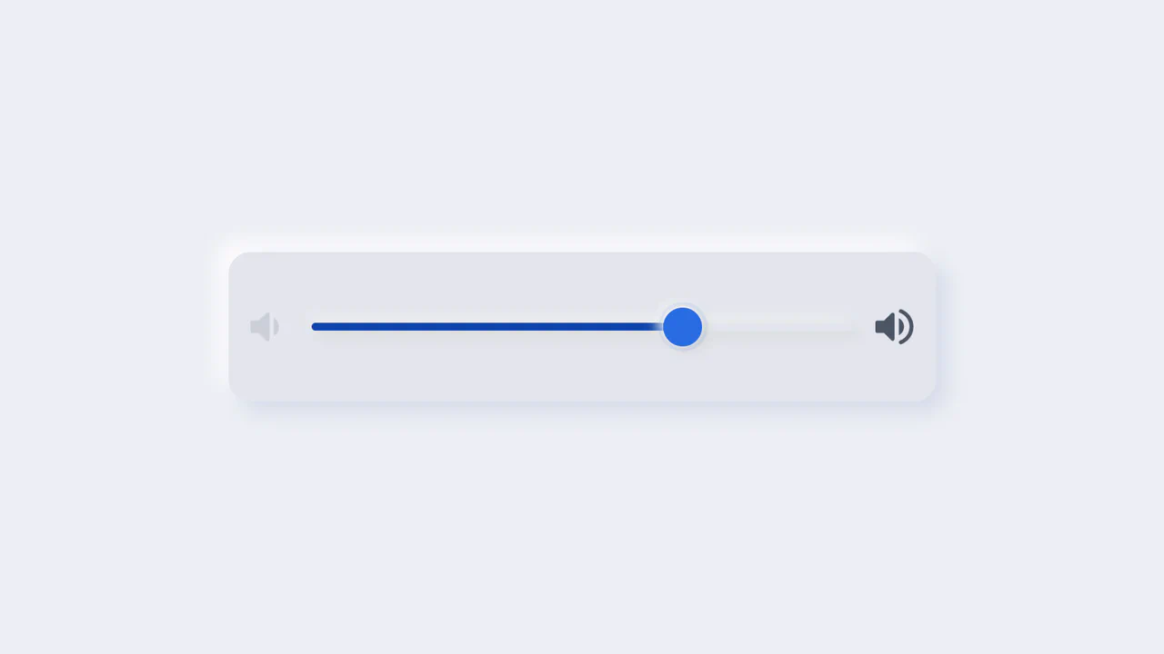
Neumorphic Volume Slider with Ripple Glow
An elegant neumorphic volume slider featuring an active thumb focus glow and directional icon highlights. Built with a single native range input and styled with modern CSS Custom Properties, it implements the Houdini @property API to transition colors smoothly across sliding states. Dragging shifts opacity focus to the corresponding volume icon based on directional vector calculations in pure CSS.
Chrome 85+
Edge 85+
Firefox 128+
Safari 16.4+
See the Pen Neumorphic Volume Slider with Ripple Glow.
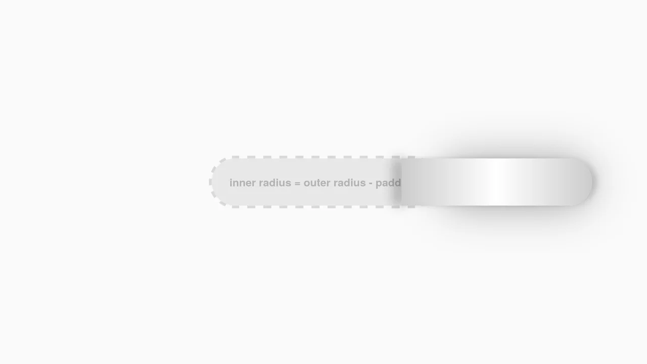
Interactive CSS Tear Strip Animation
Interactive CSS Tear Strip Animation simulates the satisfying physical action of tearing open a cardboard package. It cleverly uses an invisible <input type="range"> linked to the CSS Scroll-Driven Animations API (animation-timeline: --thumb). As the user drags the slider, CSS variables dynamically update clip-path, box-shadow, and transform properties to reveal the content beneath while curling the torn strip. A JavaScript fallback ensures compatibility for browsers without native scroll-timeline support.
Chrome 115+
Edge 115+
Firefox 110+
Safari 16.4+
See the Pen Interactive CSS Tear Strip Animation.
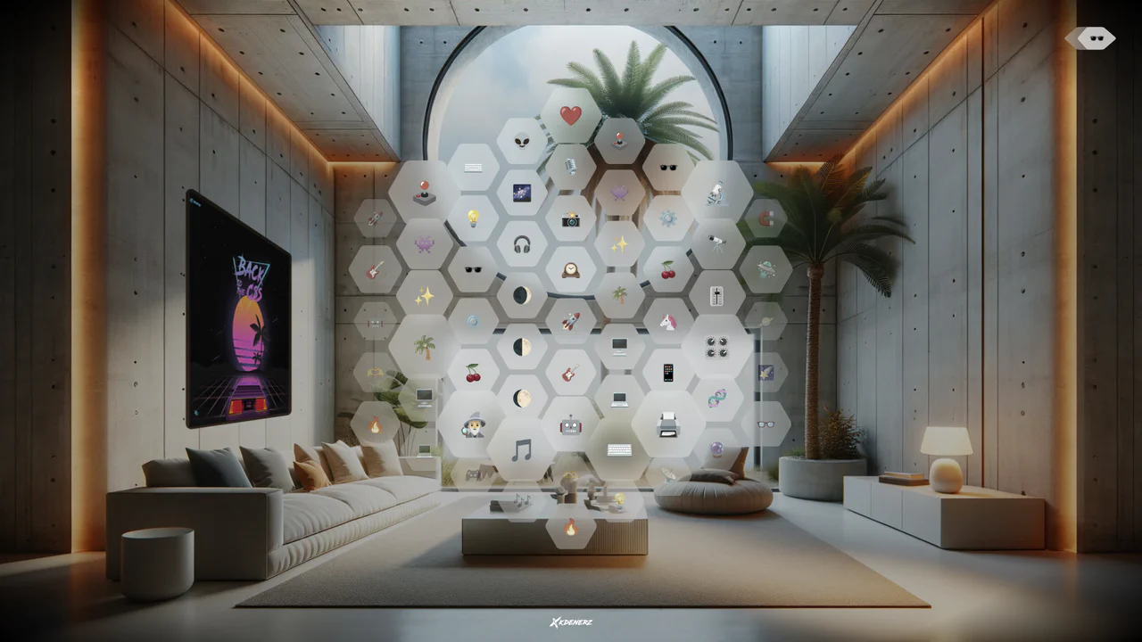
VisionOS Hexagonal App Grid Ripple
VisionOS Hexagonal App Grid Ripple recreates the spatial UI aesthetic of Apple VisionOS. It uses complex clip-path polygons to form the hexagons and backdrop-filter for the glassmorphism effect. The standout feature is the JavaScript-calculated ripple animation: on click, JS measures the distance from the target to every other hexagon, updating a CSS custom property (--ripple-factor) to stagger the CSS @keyframes delay radially.
Chrome 111+
Edge 111+
Firefox 113+
Safari 16.2+
See the Pen VisionOS Hexagonal App Grid Ripple.

3D Star Wars Lightsaber Theme Toggle
3D Star Wars Lightsaber Theme Toggle relies on trigonometric CSS functions sin() and cos() to rotate vector elements along a 3D spherical path as the toggle slides. Custom numeric transitions are facilitated by redefining modern @property rules inside a @layer properties block, animating the --progress variable dynamically across state-driven keyframes. While providing a deeply thematic visual experience, performing continuous trigonometric transformations and animating complex CSS masks can trigger layout rasterization strain on standard devices, requiring GPU acceleration layers to preserve smooth 3D motion.
Chrome 111+
Edge 111+
Firefox 128+
Safari 16.4+See the Pen 3D Star Wars Lightsaber Theme Toggle.
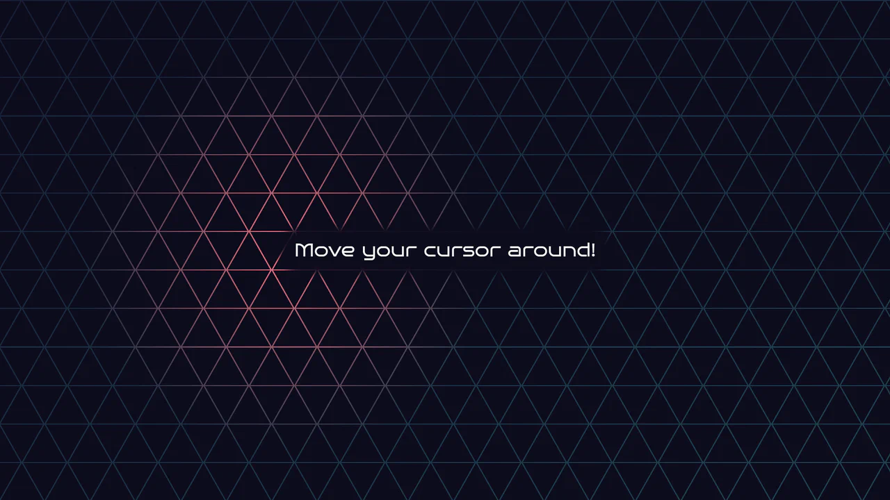
Geometric Glowing Triangle Mask Grid
Geometric Glowing Triangle Mask Grid creates an interactive mesh overlay by dynamically calculating and appending CSS border triangles to mask a neon background. The layout binds a mouse-tracking #glow radial gradient to the cursor, while modern CSS @property interpolates color shifts directly in keyframe animations. However, running heavy JS-based DOM recalculations on window.onresize combined with moving massive layout-disrupting absolute positions like top/left on every mousemove can cause paint pipeline bottlenecks, which are easily alleviated by transforming with hardware-accelerated translate3d instead.
Chrome 85+
Edge 85+
Firefox 128+
Safari 16.4+
See the Pen Geometric Glowing Triangle Mask Grid.

CSS 3D Morphing Geometric Polyhedron
This is a 3D Morphing Geometric Polyhedron. It seamlessly transitions a six-sided cube into a twelve-sided rhombic dodecahedron through continuous spatial interpolation. Its function is to serve as a highly complex visual anchor or loading state, demonstrating advanced volumetric transformations without relying on WebGL or external physics engines.
Chrome 85+
Edge 85+
Safari 16.4+See the Pen CSS 3D Morphing Geometric Polyhedron.
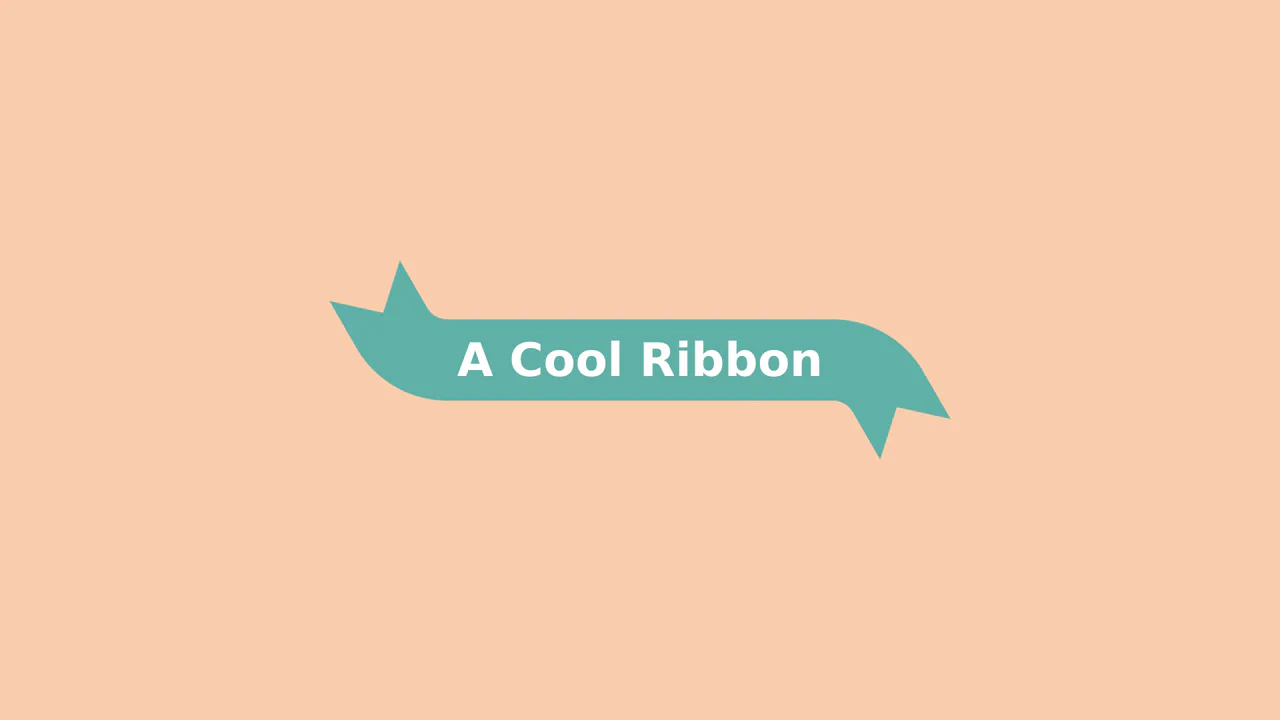
Animated 3D Folding Ribbon
This is an Animated 3D Folding Ribbon. It decorates standard heading text with pseudo-element tails that dynamically fold backward in 3D space upon interaction. Its function is to elevate standard static title banners or badge elements into interactive, spatially-aware UI focal points.
Chrome 111+
Edge 111+
Firefox 117+
Safari 16.4+
See the Pen Animated 3D Folding Ribbon.

Dynamic Neon Glow Range Slider
This is a Dynamic Neon Glow Range Slider. It re-imagines a standard HTML range input as a high-fidelity, skeuomorphic control with interactive lighting. Its function is to provide an immersive user experience where the slider’s track illuminates with a neon glow that intensifies, and its drop shadow physically shifts, based on the thumb’s position.
Chrome 111+
Edge 111+
Firefox 113+
Safari 16.4+
See the Pen Dynamic Neon Glow Range Slider.

Neon Glow Toggle Switch
This is a Neon Glow Toggle Switch. It replaces a standard HTML checkbox with a highly tactile, skeuomorphic control. Its function is to provide satisfying visual feedback for state changes, utilizing a “filling” neon border and a sliding, textured handle to make binary selections feel like engaging physical hardware.
Chrome 85+
Edge 85+
Firefox 128+
Safari 16.4+See the Pen Neon Glow Toggle Switch.

Generative Glitch Cube Art
This is Generative Glitch Cube Art. It is a piece of procedural digital art created entirely with CSS. Its function is to demonstrate how complex, three-dimensional geometry and dynamic lighting effects can be simulated without JavaScript or SVG, relying solely on multi-layered conic-gradient backgrounds and CSS custom property animation.
Chrome 85+
Edge 85+
Safari 16.4+
Firefox 128+See the Pen Generative Glitch Cube Art.

Mouse-Reactive Iridescent Button
This is a Mouse-Reactive Iridescent Button. It uses a sophisticated layering of CSS conic gradients and JavaScript pointer tracking to create a button with a vibrant, shimmering border that physically follows the user’s cursor. Its function is to provide a high-end, tactile micro-interaction that makes a standard call-to-action feel like a premium, light-sensitive object.
Chrome 122+
Edge 122+
Firefox 128+
Safari 16.4+
See the Pen Mouse-Reactive Iridescent Button.

Interactive 3D Flip Book Gallery
This is an Interactive 3D Flip Book Gallery. It simulates a physical book structure where each element acts as a double-sided page. Its function is to showcase images through spatial depth, replacing standard flat carousels with a tactile flipping mechanic.
Chrome 85+
Edge 85+
Safari 16.4+
Firefox 128+
See the Pen Interactive 3D Flip Book Gallery.

Modern Container Query Product Cards
This snippet showcases Modern Container Query Product Cards. It represents the bleeding edge of CSS architecture, utilizing @scope, @layer, and @property to create highly encapsulated, fluid components. Its function is to provide a robust e-commerce card layout that automatically adjusts its internal styling and grid distribution based on the physical size of its container, not the viewport. (Requires: kiso.css)
Chrome 118+
Edge 118+
Firefox 128+
Safari 17.4+
See the Pen Modern Container Query Product Cards.

Stepping Feet Optical Illusion
This is the Stepping Feet Optical Illusion. It demonstrates how high-contrast patterns interfere with human motion perception. Two colored blocks move at identical, constant speeds, yet appear to stagger and “step” like feet. A hover interaction removes the background grid to expose the mathematical reality of their parallel movement.
Chrome 105+
Edge 105+
Firefox 121+
Safari 16.4+See the Pen Stepping Feet Optical Illusion.

CSS Scroll-Driven Circular Typographic Scramble
This is a Scroll-Driven Circular Typographic Scramble. It utilizes experimental CSS animation-timeline to bind complex trigonometric and geometric transitions directly to the user’s scrollbar. Its function is to create a highly engaging, interactive hero section where chaotic, scattered letters perfectly align into a readable circular sentence as the user scrolls down.
Chrome 115+
Edge 115+
See the Pen CSS Scroll-Driven Circular Typographic Scramble.

Dynamic Circular Avatar Gallery
This is a Dynamic Circular Avatar Gallery. It arranges a series of profile images into a perfect circle that smoothly expands when interacted with. Its function is to showcase user groups or team members in a compact, engaging format, using cutting-edge CSS math instead of JavaScript to handle complex radial positioning and dynamic item counting.
Chrome 119+
Edge 119+See the Pen Dynamic Circular Avatar Gallery.
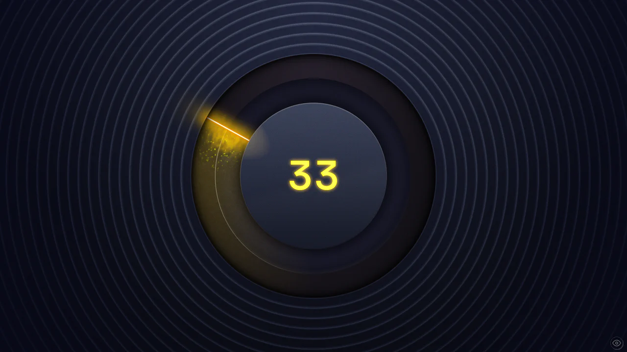
Cinematic Black Magic Volume Knob
This Cinematic Black Magic Volume Knob pushes the boundaries of modern CSS, creating a tangible, high-fidelity control element. It combines a standard range input with advanced CSS Houdini features like @property and wide-gamut P3 colors. The result is a glowing, liquid-like interface where turning the dial triggers a cascade of particles and dynamic lighting effects, perfect for premium audio applications or dashboards.
Chrome 118+
Edge 118+
Firefox 120+
Safari 17.4+ (Partial)See the Pen Cinematic Black Magic Volume Knob.

Holographic 3D Interactive Card
This Holographic 3D Interactive Card is a premium UI component inspired by rare physical trading cards. It features a sophisticated depth effect where the logo floats independently from the iridescent background, reacting dynamically to mouse movements or touch input. The use of modern CSS APIs ensures high-performance rendering of complex gradients and masks, creating a truly immersive “collectible” feel for digital assets.
Chrome 85+
Edge 85+
Safari 16.4+
Firefox 128+See the Pen Holographic 3D Interactive Card.
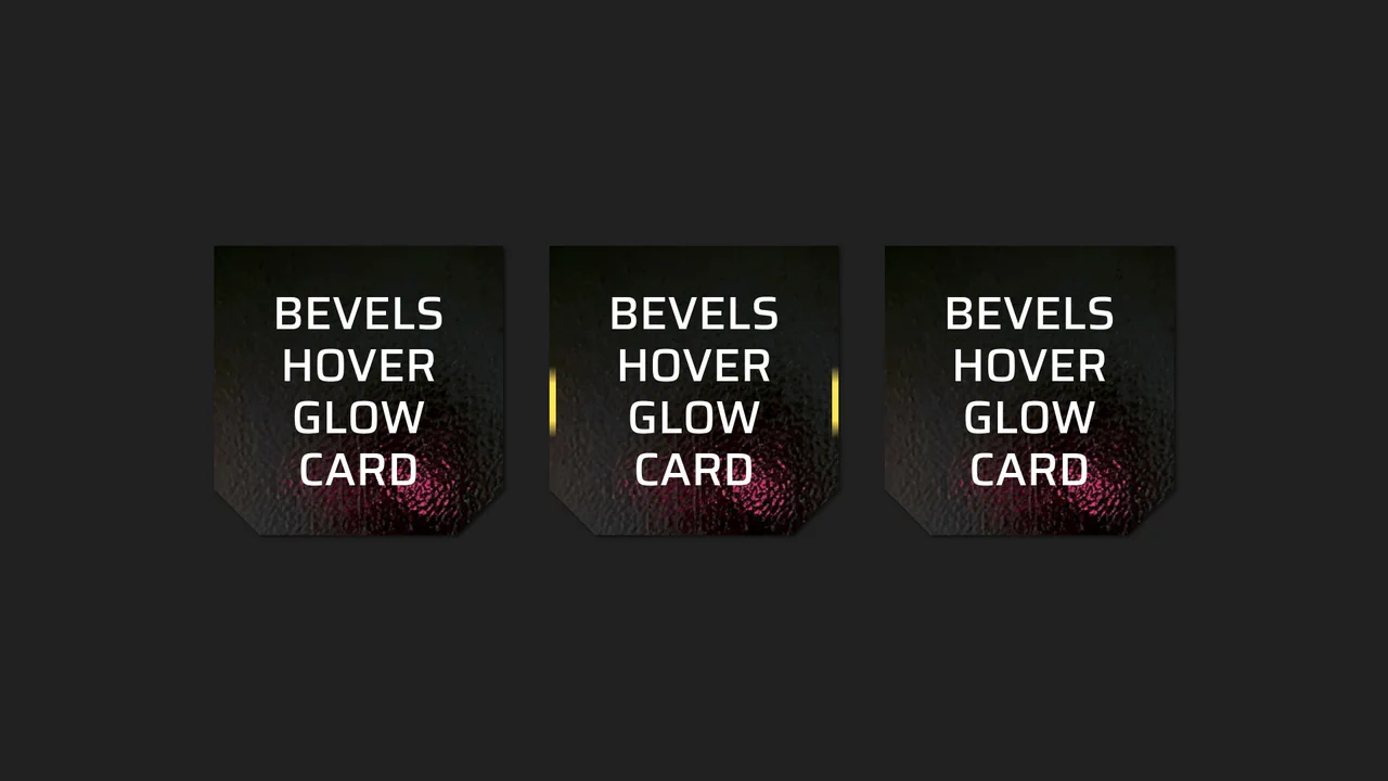
Beveled Corner Glow Cards
This Beveled Corner Glow Card component demonstrates the bleeding edge of CSS UI styling. It primarily utilizes the new corner-shape property to create chamfered (angled) edges without complex clip-paths, while implementing a sophisticated CSS Mask fallback for older engines. The interaction features a “scanning” light beam effect on the border, powered by CSS Houdini for buttery smooth interpolation.
Chrome 120+
Edge 120+
Firefox 120+
Safari 17+See the Pen Beveled Corner Glow Cards.

Trigonometric 3D Orbit CSS Gallery
This Trigonometric 3D Orbit Gallery is a stunning example of “Code Art,” demonstrating the raw power of modern CSS mathematics. Instead of relying on rigid keyframes for positioning, it uses parametric equations to place and animate 32 images along a complex, fluid 3D curve in real-time, creating a perpetual motion machine effect purely with stylesheets.
Chrome 111+
Edge 111+
Safari 16.4+
Firefox 113+See the Pen Trigonometric 3D Orbit CSS Gallery.

Synchronized Pure CSS Skeleton Loader
This Synchronized Pure CSS Skeleton Loader pushes the boundaries of modern CSS by creating a unified “shimmer” effect that sweeps across multiple disparate elements simultaneously. Unlike standard skeleton loaders that animate each block independently, this implementation ensures a single, globally aligned gradient flow using advanced CSS math and Houdini properties.
Chrome 111+
Edge 111+
Safari 16.4+
Firefox 128+See the Pen Synchronized Pure CSS Skeleton Loader.

Pure CSS Synthwave 80s Animation
This Pure CSS Synthwave 80s Animation captures the nostalgic aesthetic of the 1980s retrowave genre. It features a complete animated scene: an infinite neon grid, a setting sun with scanlines, shaking palm trees, and a DeLorean driving into the distance. The scene is brought to life with a driving synthwave audio track and intricate CSS-only motion.
Chrome 60+
Edge 79+
Firefox 55+
Safari 11+See the Pen Pure CSS Synthwave 80s Animation.
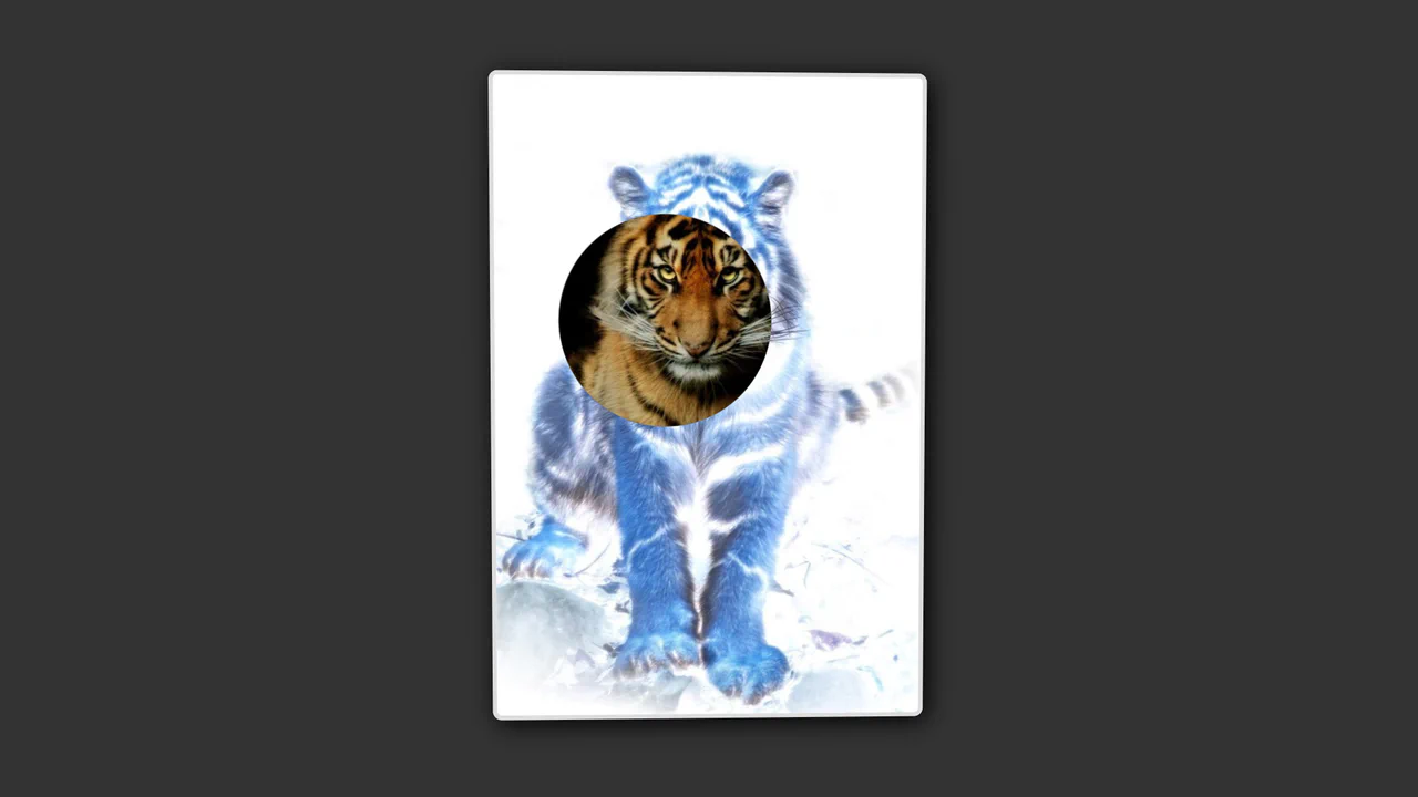
Uninvert Kitty
An interactive spotlight reveal where the cursor controls a negative mask and a physical 3D tilt effect.
See the Pen Uninvert Kitty.

Invert Radius Shape with Cool Hover Effect
A sophisticated hover effect utilizing CSS Houdini to animate a complex image mask.
See the Pen Invert Radius Shape with Cool Hover Effect.
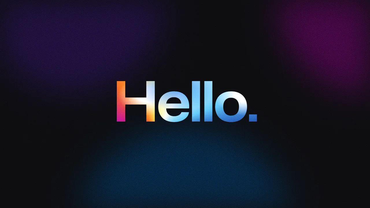
Grainy Gradient Text with CSS Houdini
A holographic typography effect achieved through CSS Houdini properties to animate complex gradient coordinates. The text features a grainy texture generated by SVG noise filters and blended with conic and radial gradients using background-blend-mode: color-burn, creating a shimmering, fluid color movement clipped directly to the character shapes.
See the Pen Grainy Gradient Text with CSS Houdini.

Minimalist CSS Toggle Switch
This is a pure CSS toggle switch, utilizing :before and :after pseudo-elements to render the track and thumb. It demonstrates effective state management via the :checked pseudo-selector and smooth transitions on all elements for a highly responsive and clean effect.
See the Pen Minimalist CSS Toggle Switch.
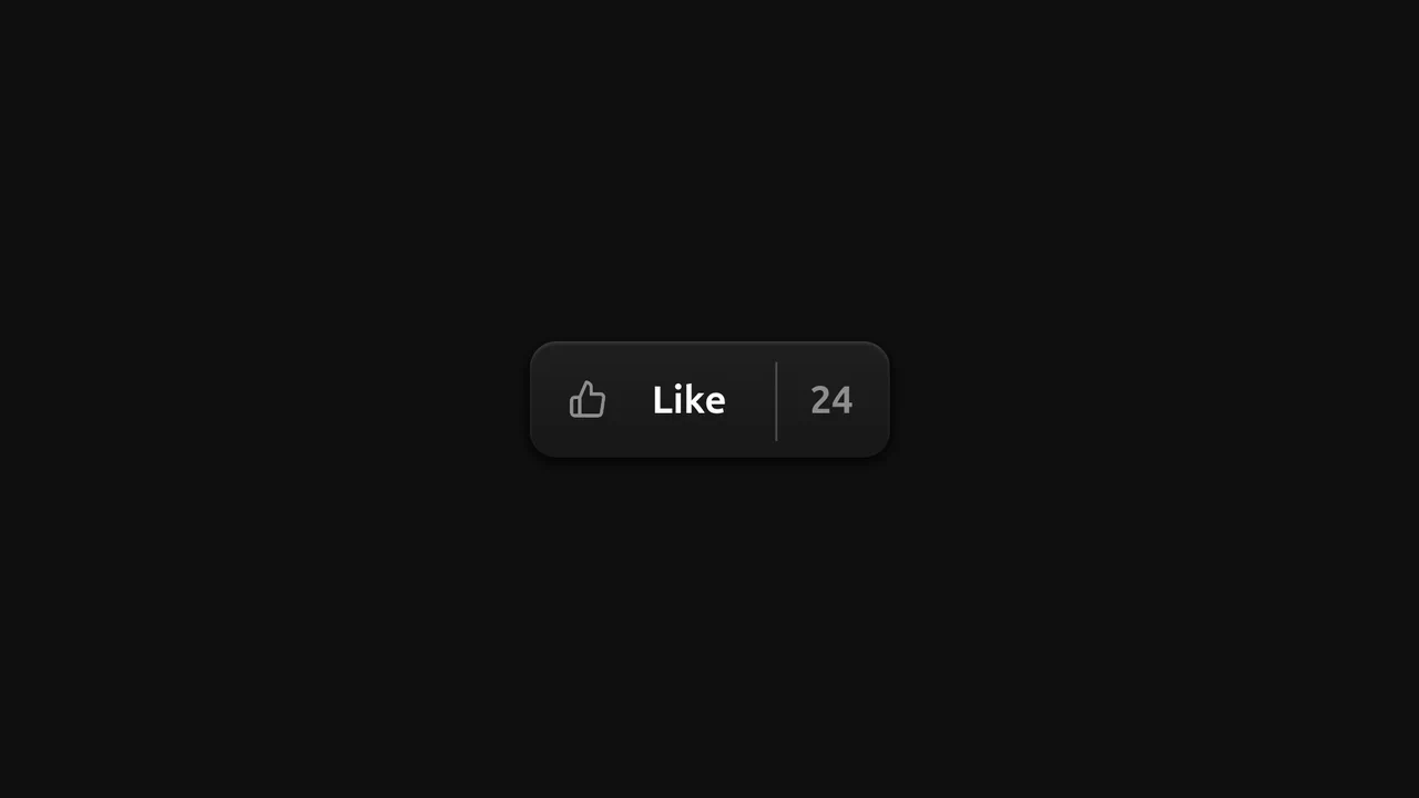
Skeuomorphic Like Button
An advanced “Like” button micro-animation based on CSS @property, where custom variables are used to animate the numbers and the icon.
See the Pen Skeuomorphic Like Button.