50+ CSS @property Examples (Page 2)
Examples

Cursor Following Halftone Rings with CSS @property
A cursor effect creating dynamic halftone rings is implemented using CSS Custom Properties and transition properties for smooth mouse-following, requiring minimal JavaScript to update coordinates.
See the Pen Cursor Following Halftone Rings with CSS @property.

High-Performance CSS Countdown
A high-performance, CSS-driven countdown showcasing variable-based theming and complex keyframe animations, where a small JS utility only activates the final celebratory effect.
See the Pen High-Performance CSS Countdown.

Noisy Image Gallery Navigation with Custom JS
An interactive horizontal gallery featuring non-standard click-based navigation on side images. The main feature is Vanilla JS tracking clicks and mousemove to dynamically calculate and apply CSS transformations for centering the selected element.
See the Pen Noisy Image Gallery Navigation with Custom JS.
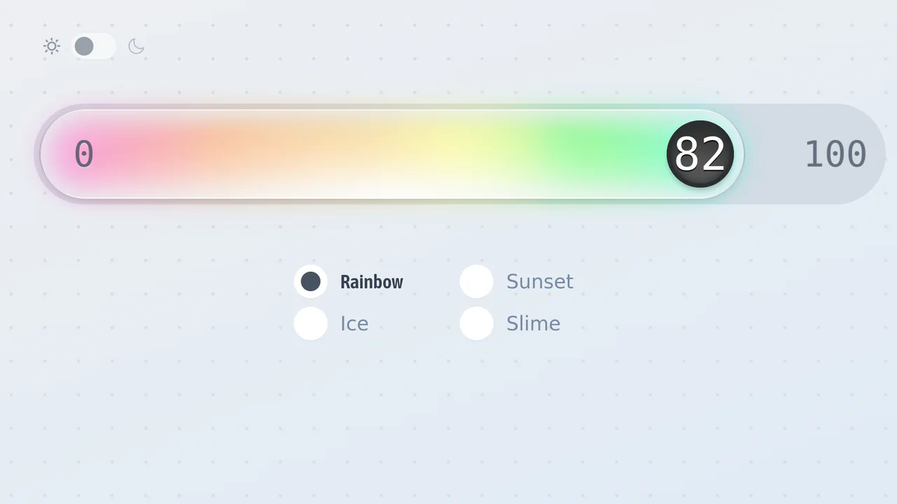
Glass / Gel Style Range Slider
Experience a fluid, animated Range Slider with four vibrant, themeable styles (Rainbow, Ice, Sunset, Slime), powered by Svelte and cutting-edge CSS-only effects.
See the Pen Glass / Gel Style Range Slider.

Multiple Popovers with Anchor Positioning and @property
An advanced UI flow demonstrating the power of the native HTML Popover API for sequential dialogs, utilizing the toggle event and hidePopover() in Vanilla JS to create smooth, zero-dependency popover chaining with custom spring and fade CSS animations.

Pure CSS Loader #10/2020 - No SVG Arcs
An elegant loader built purely with CSS/SASS that leverages CSS Houdini’s @property to define and smoothly animate custom numeric properties, enabling a high-performance rotation and hue-shifting loop.
See the Pen Pure CSS Loader #10/2020 - No SVG Arcs.
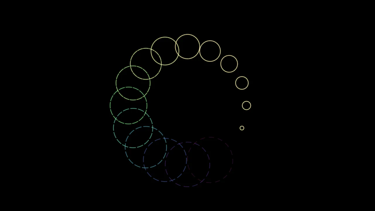
Pure CSS Loader #11/2020 - Ripples
Spectacular animated ring loader built on the advanced capabilities of CSS Houdini to define and smoothly transition custom properties, enabling complex and dynamically changing geometry via conic and radial gradients.
See the Pen Pure CSS Loader #11/2020 - Ripples.
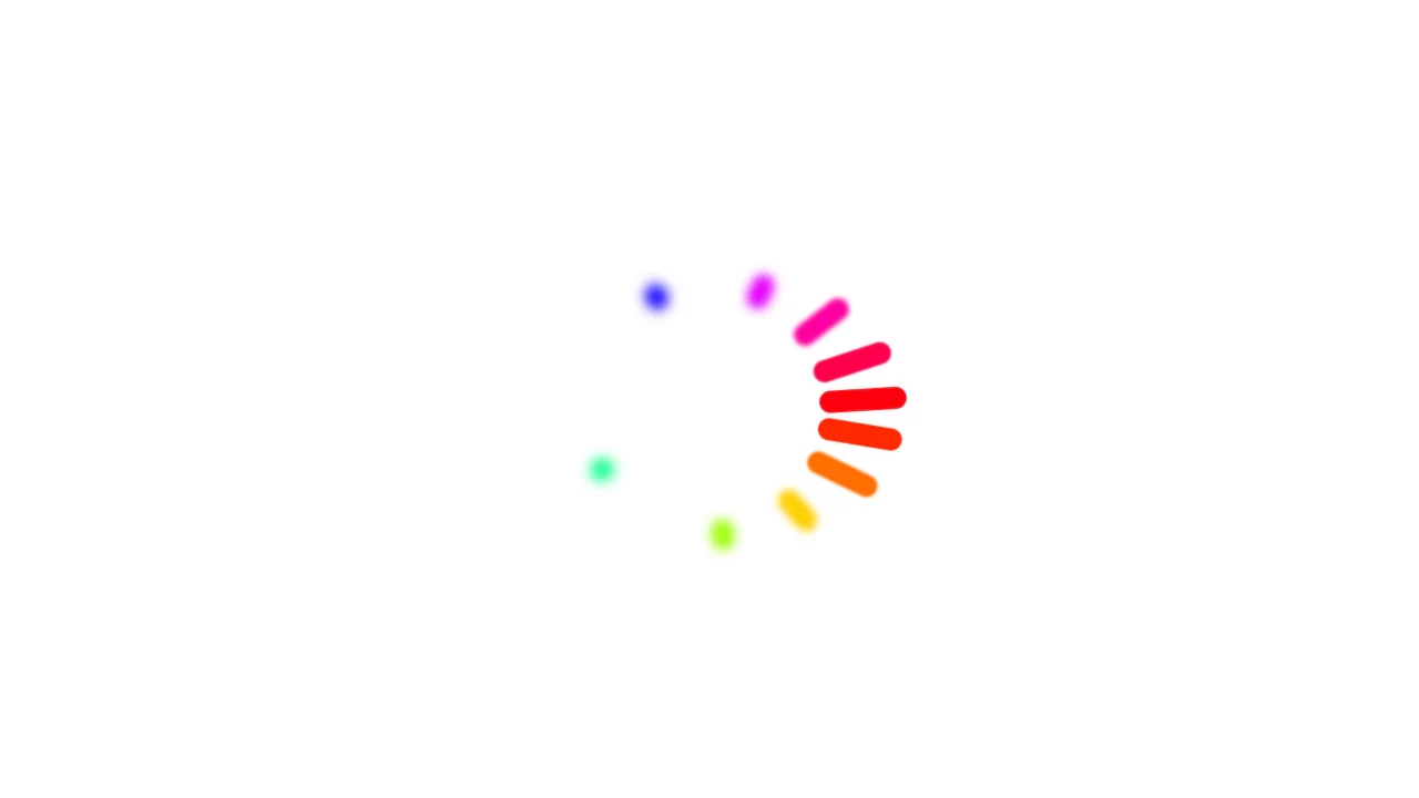
Color Wheel Loader using Animated Custom Properties
Advanced CSS animation utilizing ten-point delays (nth-child) to create a ripple effect and showcasing CSS Houdini capabilities for animating length and angle values.
See the Pen Color Wheel Loader using Animated Custom Properties.
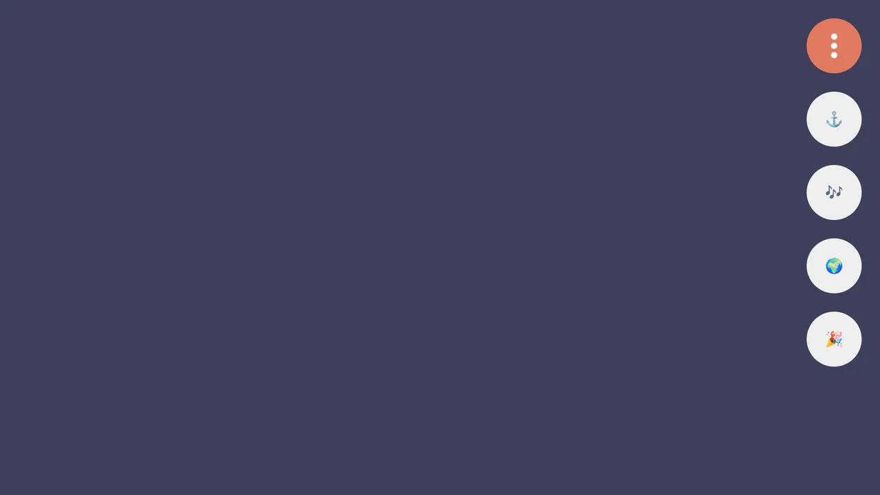
Damped Menu Bar using CSS @property
A superb demonstration of physically accurate damped oscillation animation, achieved using a registered CSS property (@property --progress) that controls trigonometric functions within calc() to drive the elements’ 3D movement.
See the Pen Damped Menu Bar using CSS @property.

3D Sphere with Dynamic Shadow
This demo shows how to create a realistic 3D sphere effect using pure CSS, without SVG or 3D transformations. The effect is achieved through gradients (radial-gradient), shadows (box-shadow), pseudo-elements (::before, ::after) for highlights and shadows, and dynamic variables (@property) for animation.
See the Pen 3D Sphere with Dynamic Shadow.
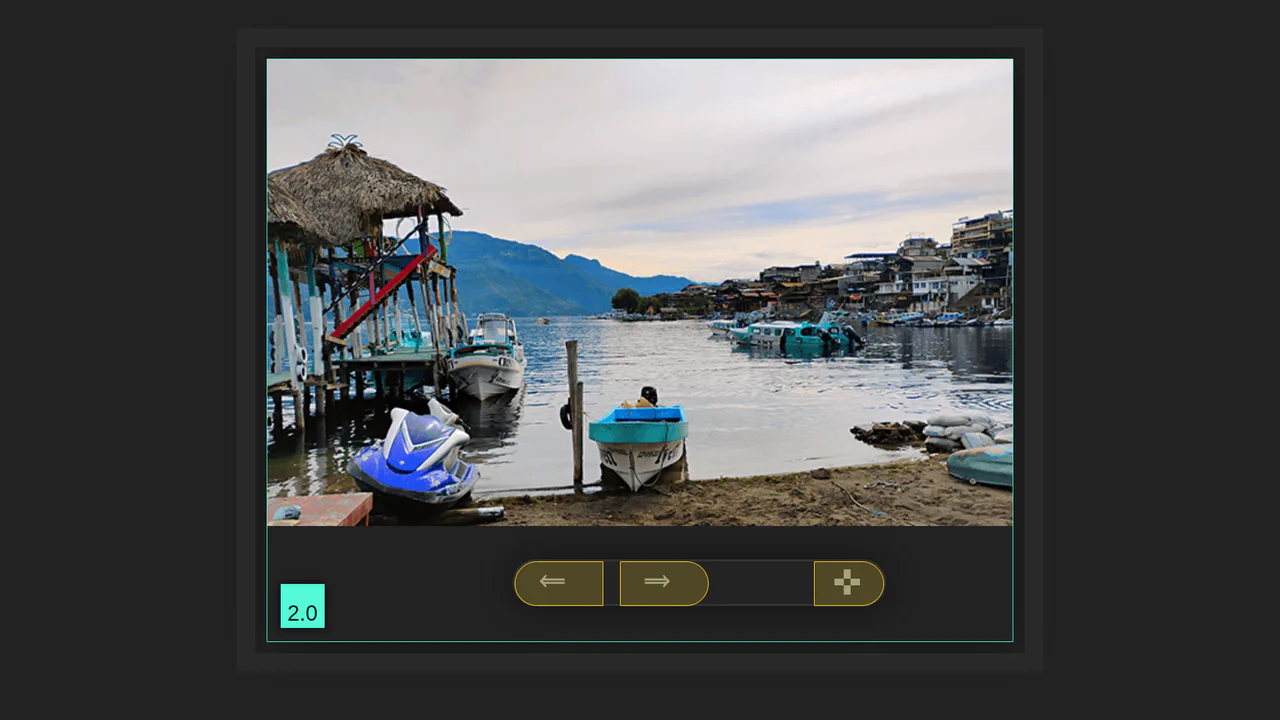
Pure CSS Slideshow
A unique CSS-only image slider that uses advanced CSS properties like @property and :has() to control image transitions and UI elements. The background-position and nested radio buttons simulate a complex, fragmented image reveal effect without any JavaScript.
See the Pen Pure CSS Slideshow.

CSS Var Only Sidebar Toggle
This animated sidebar is built entirely with pure CSS using modern features. The key is @property for a smooth width transition and the :has() selector to track a checkbox’s state, enabling animation control without a single line of JavaScript.
See the Pen CSS Var Only Sidebar Toggle.
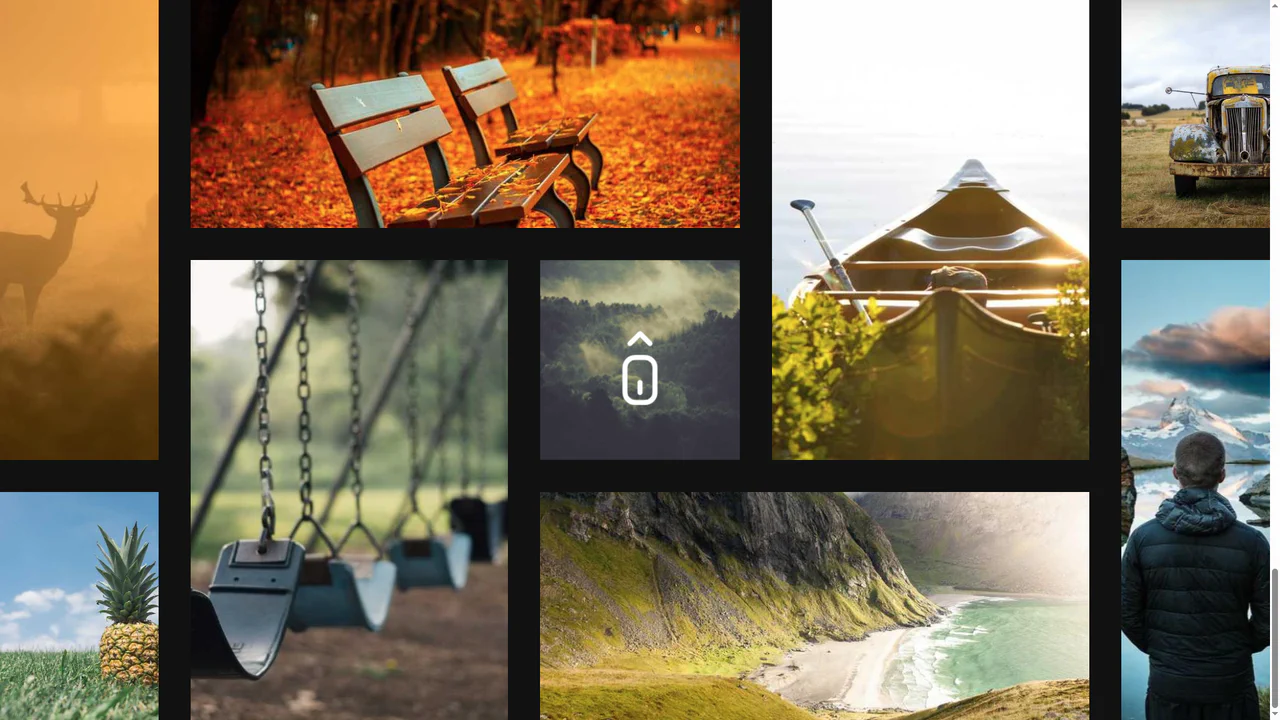
Sliding Images Using Animation-timeline
This scroll-driven animation effect is built entirely with CSS Scroll-Driven Animations, using animation-timeline: scroll(). It smoothly translates and transforms elements based on scroll position, creating a dynamic and high-performance parallax effect without JavaScript.
See the Pen Sliding Images Using Animation-timeline.

CSS Art Panda
An elegant example of semantic markup, where every element is styled and animated using CSS. The technical foundation includes clip-path, CSS custom properties, and animated pseudo-elements for each visual layer.
See the Pen CSS Art Panda.
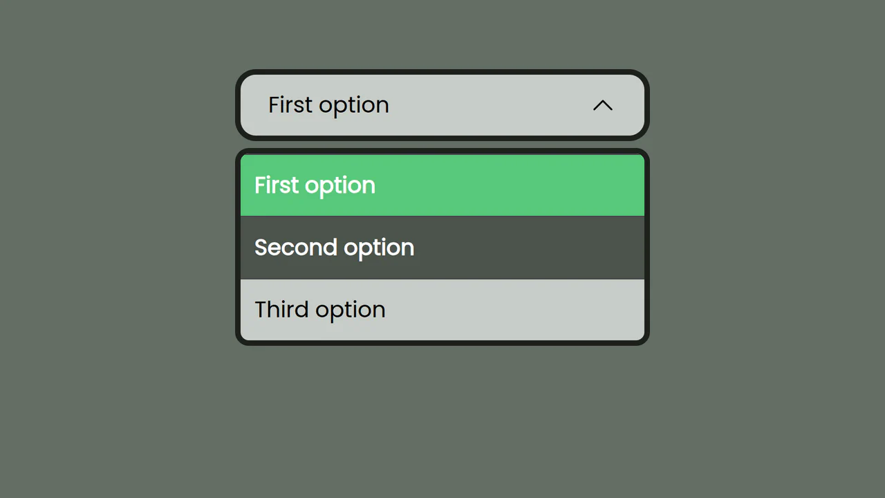
Customizable HTML and CSS Select
Dive deep into modern CSS form control by styling a <select> element’s internal parts like ::picker and ::picker-icon, enhanced with a dynamic hue-rotating border animated via @property.
See the Pen Customizable HTML and CSS Select.

Earth with Pure CSS
A showcase of advanced CSS capabilities for creating stunning 2D animations. It uses CSS @property for smooth property transitions, allowing you to animate box-shadow and other elements without compromising performance.
See the Pen Earth with Pure CSS.

A pure CSS number counter leveraging CSS Houdini’s @property to animate an integer custom property.
Pure CSS Animated FF Conf Logo
A futuristic 3D data block where scrolling digital “circuits” are simulated purely in CSS by animating the background-position of linear-gradient patterns.
See the Pen Pure CSS Animated FF Conf Logo.
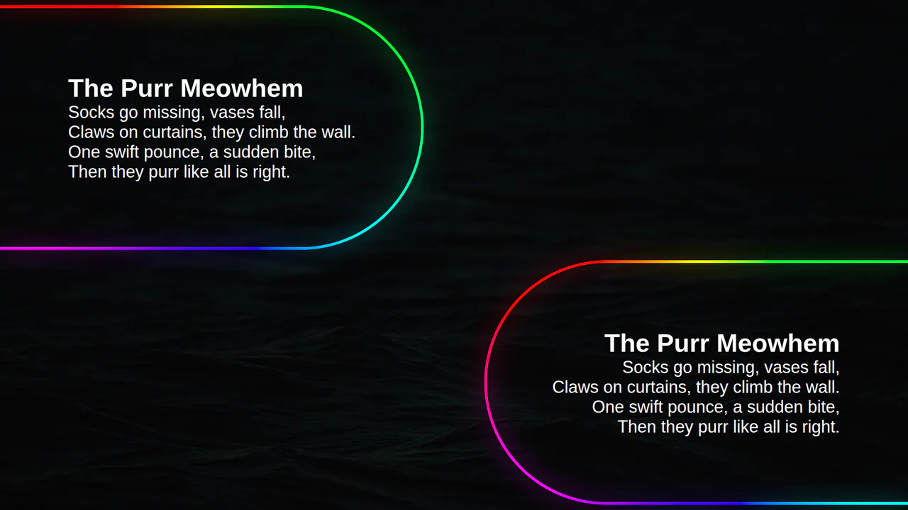
Animated Border Gradient Glow
An animated rainbow border effect with a neon glow, implemented using @property, conic-gradient, and SVG filters. The @keyframes animation smoothly changes the --a CSS variable, which controls the hue in the conic-gradient, creating a continuous color transition.
See the Pen Animated Border Gradient Glow.
Scroll Mask Indicators
A modern and clean way to indicate scrollability: the “fade-to-mist” effect is implemented using mask-image and linear-gradient, while key parameters of the fade phase are precisely tuned using @property.
See the Pen Scroll Mask Indicators.
Custom property --k animates between 0 and 1, driving a clip‑path defined by a non‑standard shape() function — likely a placeholder or experimental syntax. The path appears to morph the image edges, creating a wave‑like distortion.
Pure CSS Responsive Hex Grid
An adaptive hexagonal grid without media queries, built on Container Queries, where the column count and the position of each element are calculated in CSS via complex calc() functions. The code demonstrates progressive enhancement - with a fallback to @property and a tan(atan2()) math trick to emulate division in older browsers.
See the Pen Pure CSS Responsive Hex Grid.
Character Choose with Preview Card Animation (CSS Sprites)
A sophisticated CSS-only character selector and sprite animator inspired by Minecraft. It leverages CSS Houdini and advanced math functions to drive complex frame-by-frame sprite animations, while :has() selectors manage state changes for character selection, direction toggling, and dynamic FPS adjustment, complete with real-time stats via CSS counters.
CSS Image Stack Cycle
An exceptionally complex image slider/stack UI component, fully implemented via CSS custom properties and CSS Houdini to allow the animation of abstract numerical values; the system uses complex mathematics to control the 3D stacking order, the “fly-out” effect, and random rotation, creating a looping, cascading stack with smooth transitions.
See the Pen CSS Image Stack Cycle.
Shuffling Effect in Pure CSS
Efficient layout using CSS Grid to stack cards on top of each other, with dynamic layer control via z-index and the :has() selector to determine the position of the next element; the image animation includes movement and straightening of the rotation upon selection.
See the Pen Shuffling Effect in Pure CSS.
CSS Bookmark
A state-driven animation, controlled via the “checkbox hack,” showcases the power of CSS @property (Houdini) for smoothly animating gradients and mask properties. A complex multi-layered bookmark shape is created with an SVG mask, while the entire activation effect choreography is built on synchronized @keyframes.
See the Pen CSS Bookmark.
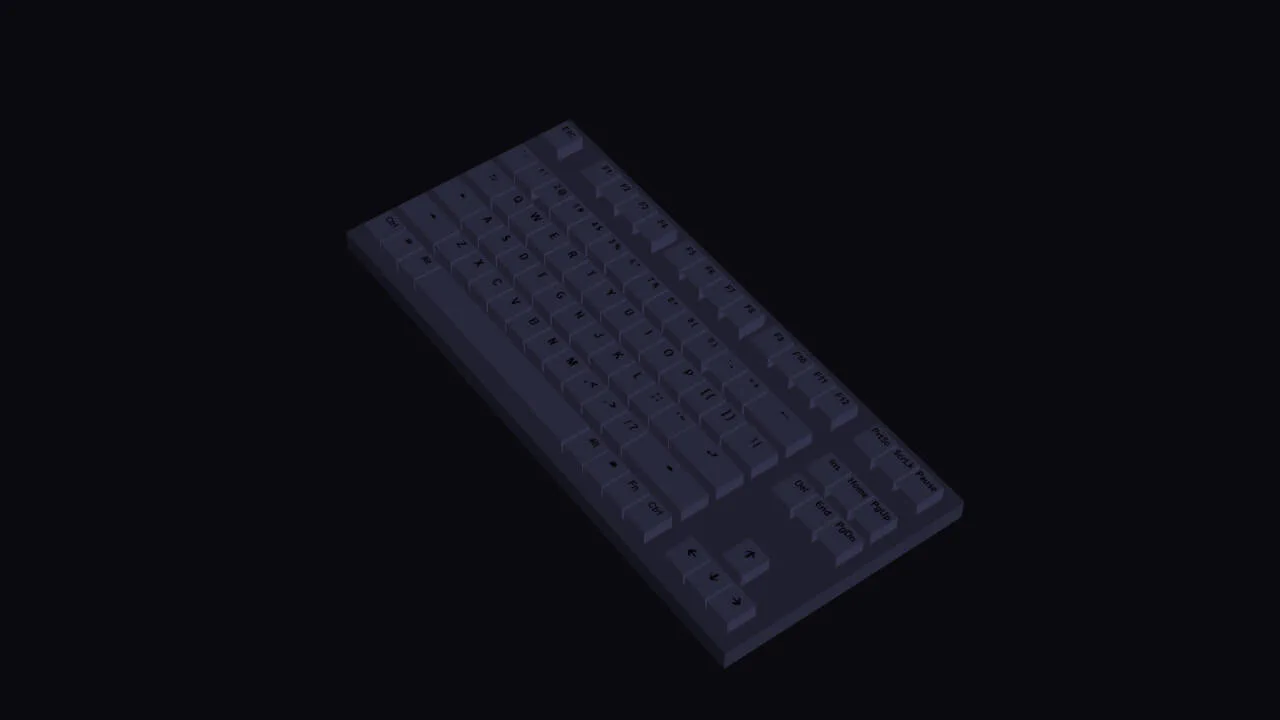
RGB Keyboard with Dark Mode
A detailed, volumetric, and animated keyboard model that smoothly changes its backlighting and reacts to user actions, demonstrating the power of CSS for creating 3D objects.
See the Pen RGB Keyboard with Dark Mode.
Animate Single img Gradient Glow Border With CSS + SVG Filter Enhancement
An animated rainbow border with a neon glow, created using @property, repeating-conic-gradient, and SVG filters. The @keyframes CSS animation continuously changes the --a CSS variable, which controls the angle of the conic-gradient, creating a rotating rainbow effect.