7 CSS @starting-style Examples
Elements entering the DOM require visual context. The CSS @starting-style examples in this updated collection remove the friction of JavaScript initialization hacks for entrance transitions. Modern UI design demands seamless appearance. Utilizing curated snippets replaces complex scripting with raw, native browser logic, establishing direct visual communication instantly. No layout jumps. No friction.
Technically, the @starting-style at-rule enables transitions on elements shifting from display: none to a visible state. The code combines this with the transition-behavior: allow-discrete property to manage DOM insertion smoothly. Transitions leverage hardware acceleration, animating properties like opacity and transform to ensure 60fps performance on the rendering thread. This pure CSS approach maintains absolute layout stability while keeping the HTML structure strictly semantic and lightweight.
Every free demo is fully responsive and cross-browser compatible. Users can instantly download the raw code or fork a specific entrance transition on CodePen. These assets are optimized for accessibility, delivering a fast, performant experience across all modern devices.
Examples
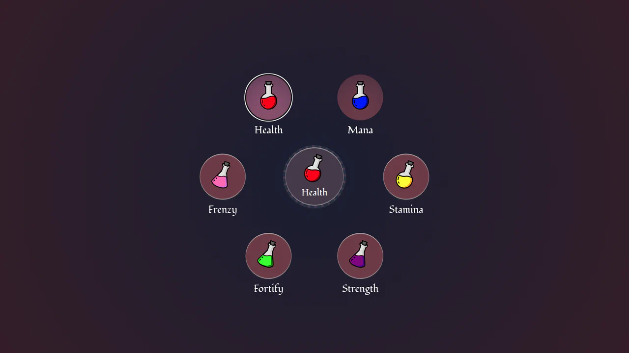
Circular Popover Potion Dropdown Menu
An experimental, zero-JavaScript custom select dropdown leveraging cutting-edge HTML customizable select specifications. When opened, the custom picker formats standard <option> tags into an interactive circular radial layout using native CSS Anchor Positioning, @starting-style entry transitions, and mathematical sibling-index() and sibling-count() functions. Includes gorgeous vector potion SVG assets mapped with variable custom properties.
 Chrome 130+
 Edge 130+
See the Pen Circular Popover Potion Dropdown Menu.
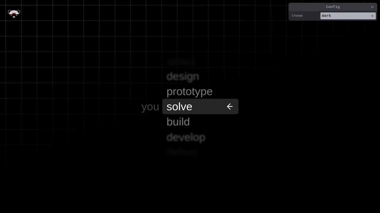
Scroll-Snapping Popover Select Dropdown Menu
An experimental custom select dropdown menu built on native HTML5 base-select specifications. The picker popover displays options in a vertically scroll-snapped viewport that fades and blurs adjacent values based on scroll proximity. A lightweight GSAP scrolling script automatically centers and aligns selected items in real time, while modern @starting-style manages discrete popover overlay entry transitions. (Requires: gsap.js, tweakpane.js)
Chrome 130+
Edge 130+
See the Pen Scroll-Snapping Popover Select Dropdown Menu.

Accessibility Contrast Controller Popover
The Accessibility Contrast Controller Popover is a cutting-edge implementation of user-centric accessibility settings. It provides a non-invasive, floating interface that allows users to adjust the global contrast of a web application in real-time. By leveraging the native Popover API and the new CSS Anchor Positioning specification, this component achieves a highly polished look and feel with minimal JavaScript for layout. (Requires: svelte-range-slider-pips)
Chrome 125+
Edge 125+
 Safari 26+
 Firefox 147+
See the Pen Accessibility Contrast Controller Popover.

Multiple Popovers with Anchor Positioning and @property
An advanced UI flow demonstrating the power of the native HTML Popover API for sequential dialogs, utilizing the toggle event and hidePopover() in Vanilla JS to create smooth, zero-dependency popover chaining with custom spring and fade CSS animations.
Custom Select Menu with Optgroups
This custom select menu is a showcase of cutting-edge CSS, built on a robust stylesheet architecture using Cascade Layers. It leverages the experimental appearance: base-select property to deeply customize the native picker UI via the ::picker(select) pseudo-element. This enables advanced, JS-free interactions, using :has(select:open) to manage page overflow and @starting-style to create a smooth, declarative slide-up entry animation.
See the Pen Custom Select Menu with Optgroups.
CyberPopover 2025
A complex cyberpunk UI using the latest web APIs - native [popover] and View Transitions. Its intricate glitch animation and transition are controlled via JavaScript, while the clean, state-driven logic is built upon @layer and @starting-style.
See the Pen CyberPopover 2025.
Custom Picker for Hover Devices Only
This demo is a masterclass in progressive enhancement, applying advanced styling only on hover-capable devices that support appearance: base-select. The fluid dropdown animation is powered by @starting-style and transition-behavior: allow-discrete, enabling transitions on previously non-animatable properties.
See the Pen Custom Picker for Hover Devices Only.