10+ CSS Anchor Positioning Examples
Contextual overlays demand exact placement. The CSS Anchor Positioning examples in this collection remove the friction of complex JavaScript coordinate calculations. Modern UI design requires direct connections between trigger elements and floating content. Utilizing these curated snippets guarantees a transparent, reliable interface where raw logic dictates spatial relationships instantly.
The architecture relies entirely on the native anchor() function and the popover API to tether elements dynamically. By linking coordinates directly within the stylesheet, the code leverages hardware acceleration to maintain 60fps performance during scroll or resize events. The HTML structure remains strictly semantic, ensuring absolute layout stability without blocking the Main Thread with costly repositioning scripts.
Every free demo is fully responsive and cross-browser compatible. Users can instantly download the raw code or fork an updated overlay on CodePen. These assets are strictly optimized for accessibility, delivering a fast, frictionless experience across all modern mobile and desktop devices.
Examples
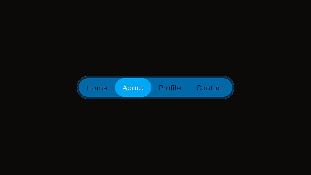
Elastic Anchor-Positioned Slider Navigation
An elegant, zero-JavaScript navigation bar powered entirely by CSS Anchor Positioning. Hover and active indicator bubbles are mapped dynamically to target links using pseudo-elements that reference custom --hovered-option and --active-option anchors. The sliding animations utilize a complex CSS linear() timing function to generate organic, elastic bouncing transitions.
 Chrome 125+
 Edge 125+
See the Pen Elastic Anchor-Positioned Slider Navigation.
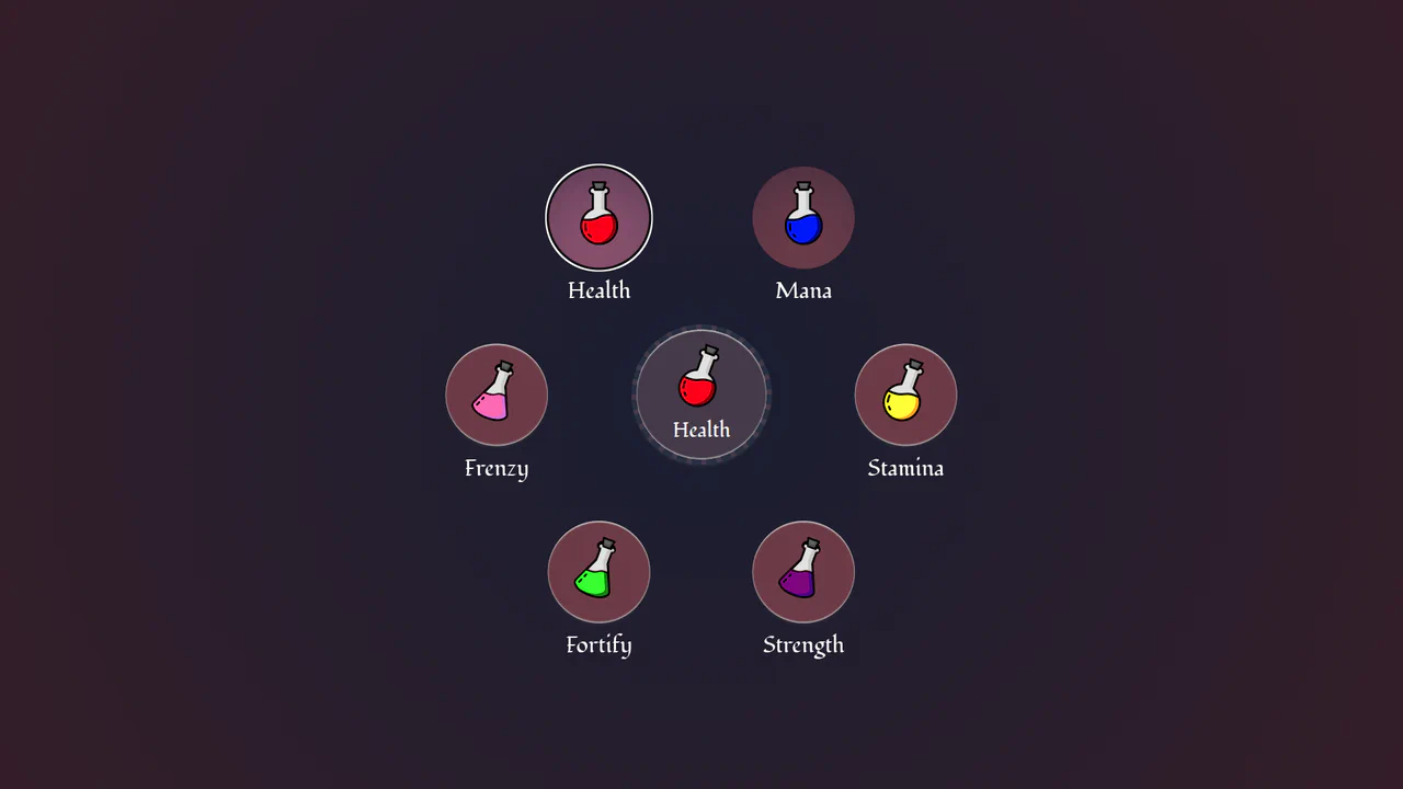
Circular Popover Potion Dropdown Menu
An experimental, zero-JavaScript custom select dropdown leveraging cutting-edge HTML customizable select specifications. When opened, the custom picker formats standard <option> tags into an interactive circular radial layout using native CSS Anchor Positioning, @starting-style entry transitions, and mathematical sibling-index() and sibling-count() functions. Includes gorgeous vector potion SVG assets mapped with variable custom properties.
Chrome 130+
Edge 130+
See the Pen Circular Popover Potion Dropdown Menu.
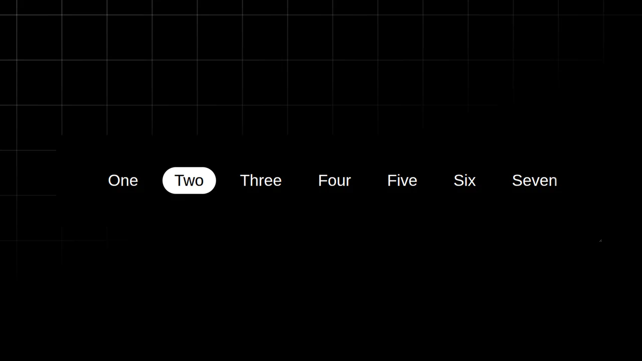
Resizing Tab Bar with Anchor Positioning
This is a Resizing Tab Bar with Anchor Positioning. It demonstrates a modern approach to building a horizontally scrollable navigation menu with a sliding “active” indicator. Its function is to provide a highly fluid, decoupled visual highlighter that perfectly tracks the currently selected tab — even when the container is resized or scrolled — without relying on heavy JavaScript coordinate calculations. (Requires: Normalize.css)
Chrome 125+
Edge 125+
See the Pen Resizing Tab Bar with Anchor Positioning.

Auto-Generated Anchor Positioned TOC
This is an Auto-Generated Anchor Positioned TOC. It parses an article’s heading structure on the fly and constructs a sticky navigation menu. Its primary function is to replace heavy JavaScript scroll-spies (Intersection Observers) with native CSS Anchor Positioning and Scroll Targeting, moving an animated highlight alongside the active content section. (Requires: Tweakpane, GSAP)
Chrome 125+
Edge 125+See the Pen Auto-Generated Anchor Positioned TOC.

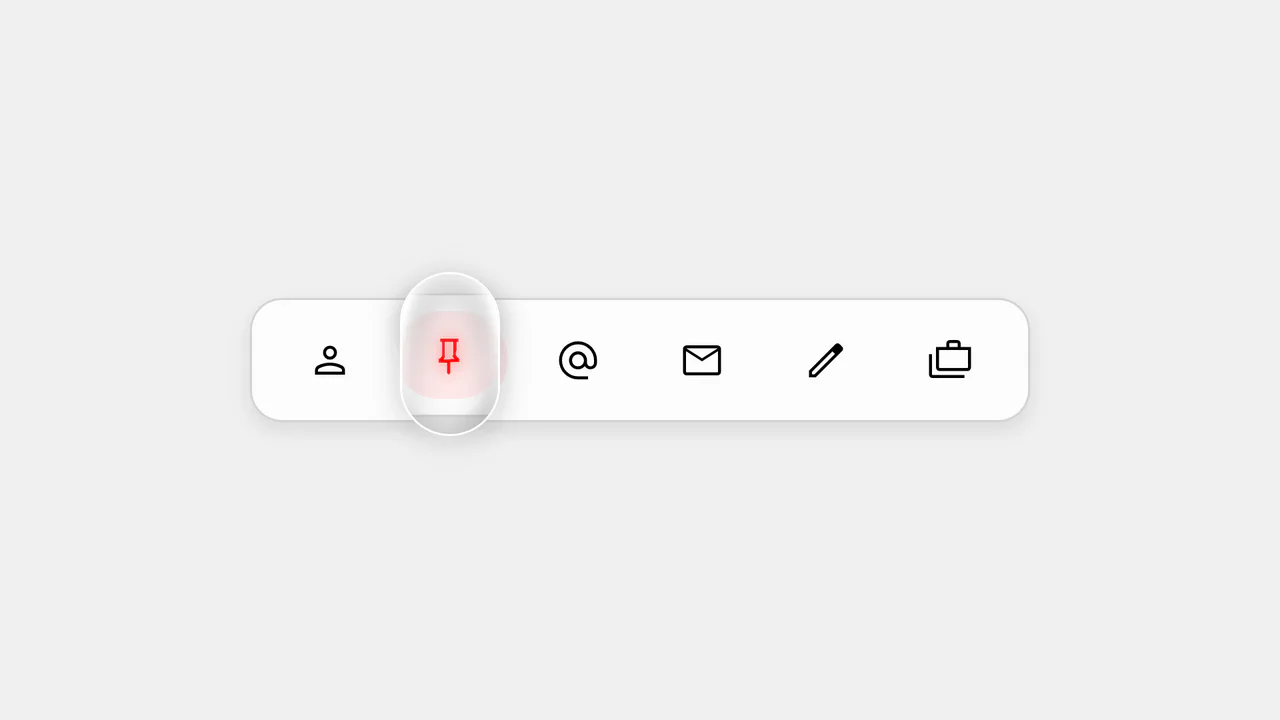
Anchored Glassmorphic Tab Indicator
This is an Anchored Glassmorphic Tab Indicator. It utilizes the cutting-edge CSS Anchor Positioning API to physically tether a floating visual highlight to the currently active or hovered navigation button. Its function is to provide highly fluid, magnetic feedback without relying on complex JavaScript bounding-box calculations.
Chrome 125+
Edge 125+
 Firefox (partial)
 Safari (partial)
See the Pen Anchored Glassmorphic Tab Indicator.

Smart CSS Anchored Selection Pills
This Smart CSS Anchored Selection Pills component demonstrates the bleeding edge of CSS layout capabilities. It uses the new CSS Anchor Positioning API to tether a visual “pill” indicator to the currently selected radio button without JavaScript calculations for position. The demo includes a robust fallback system that calculates positions via ResizeObserver for browsers that don’t yet support anchors, ensuring a consistent experience across the board. It also features advanced masking techniques (SVG and CSS Filters) to create “knockout” text effects where the selected text changes color inversely to the pill background. (Requires: GSAP, Tweakpane)
Chrome 125+
Edge 125+
Safari 26+
Firefox 147+See the Pen Smart CSS Anchored Selection Pills.

Accessibility Contrast Controller Popover
The Accessibility Contrast Controller Popover is a cutting-edge implementation of user-centric accessibility settings. It provides a non-invasive, floating interface that allows users to adjust the global contrast of a web application in real-time. By leveraging the native Popover API and the new CSS Anchor Positioning specification, this component achieves a highly polished look and feel with minimal JavaScript for layout. (Requires: svelte-range-slider-pips)
Chrome 125+
Edge 125+
Safari 26+
Firefox 147+
See the Pen Accessibility Contrast Controller Popover.

CSS Anchor Positioning Navigation Effect
This CSS Anchor Positioning Navigation Effect is a masterclass in modern web standards, achieving a complex “sliding highlight” interaction entirely without JavaScript. By leveraging the new Anchor Positioning API alongside the :has() selector, the component allows a single background element to tether itself to whichever menu item is currently hovered, creating a premium, app-like feel with minimal code overhead.
Chrome 125+
Edge 125+
See the Pen CSS Anchor Positioning Navigation Effect.

CSS in 2024 (Experimental Features)
Using experimental CSS features to build an advanced UI component, showcasing CSS Anchoring to attach the tooltip to the slider and Scroll-Driven Animations to drive the slider’s value and color change.
See the Pen CSS in 2024 (Experimental Features).

Multiple Popovers with Anchor Positioning and @property
An advanced UI flow demonstrating the power of the native HTML Popover API for sequential dialogs, utilizing the toggle event and hidePopover() in Vanilla JS to create smooth, zero-dependency popover chaining with custom spring and fade CSS animations.

Progressive Anchor Pagination Component
A demo of a customizable pagination component, utilizing CSS Anchoring for seamless active state transitions and the View Transitions API for flicker-free theme switching.
See the Pen Progressive Anchor Pagination Component.

Animated Segmented Control in Plain CSS
A pristine Segmented Control built entirely with CSS, leveraging the power of experimental position-anchor and anchor-name to dynamically position and animate the active and hover indicator backgrounds without needing any JavaScript.
See the Pen Animated Segmented Control in Plain CSS.

CSS-Only Testimonials Using Scroll Snap
A powerful demonstration of building a full-featured carousel entirely with CSS, leveraging experimental ::scroll-button, ::scroll-marker, and position-anchor for navigation, indicators, and positional layout without any JavaScript.
See the Pen CSS-Only Testimonials Using Scroll Snap.
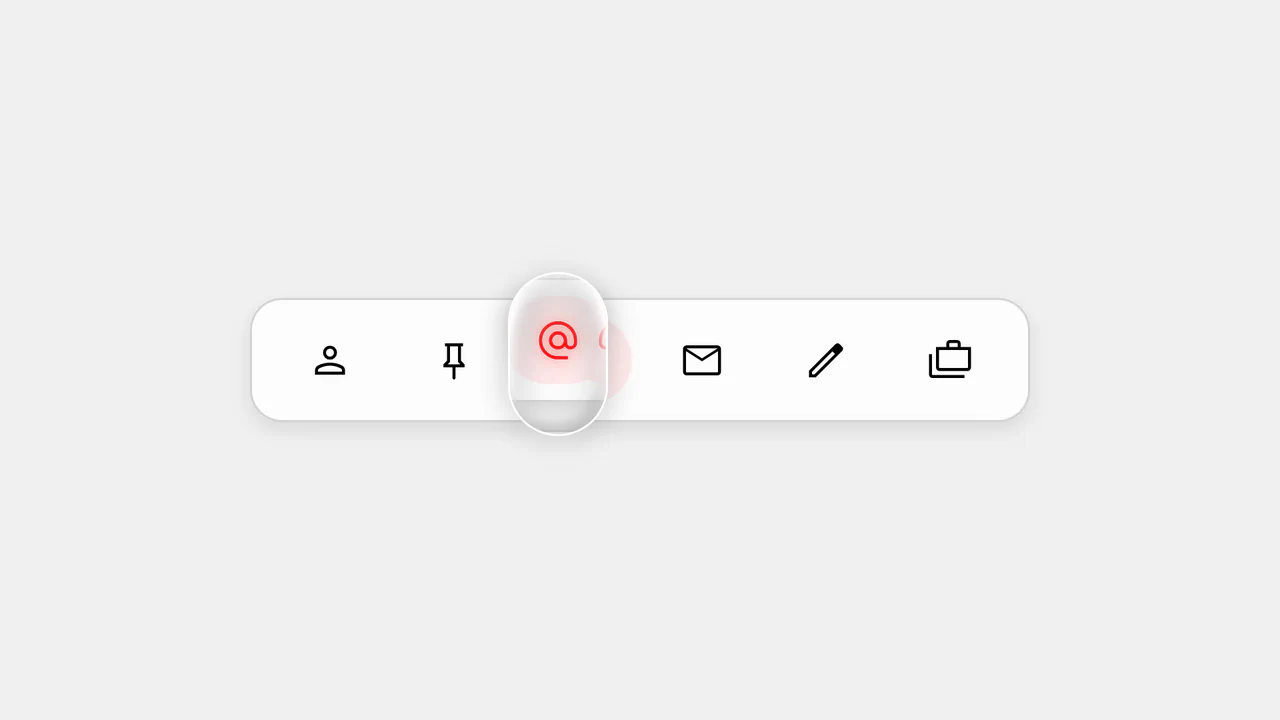
Action Bar - 'Follow the Leader' Dynamic Indicator
The key feature is the use of modern CSS positioning to create a dynamic indicator. User interaction, including hover and focus effects, is managed by JavaScript, which sets CSS variables for adaptive and visually appealing behavior.
See the Pen Action Bar - 'Follow the Leader' Dynamic Indicator.
Action Bar - 'Follow the Leader' Magnifying Lens
This is not just a demo, but a practical example of using CSS Anchor Positioning to create an interface. JavaScript efficiently toggles classes and attributes, while CSS handles all the positioning and animation logic, making the code clean, separated, and easy to maintain.
See the Pen Action Bar - 'Follow the Leader' Magnifying Lens.
The demo uses the new CSS position-anchor with the popover attribute for native and flexible positioning of hover cards relative to text links. The code applies minimal Vanilla JS solely to invoke the native popover.showPopover() method, showcasing the shift to declarative UI.