20+ CSS Animated Backgrounds: Free Examples & Code Snippets
Animated backgrounds transform static page sections into immersive visual environments, adding depth and motion without sacrificing content readability. CSS-powered background animations allow developers to create living, breathing interfaces using only native browser rendering.
- These effects leverage transform and opacity properties on pseudo-elements and layered backgrounds, offloading all animation work to the GPU compositor thread and bypassing main-thread layout recalculations.
- Advanced patterns use @keyframes with animation-timeline for scroll-driven background parallax, combined with will-change to pre-allocate GPU layers and minimize repaint costs during motion.
- Modern implementations apply Container Queries to scale background animation parameters relative to the parent section, ensuring proportional motion across viewports without hardcoded breakpoints.
Browse this collection of CSS animated backgrounds to master GPU-accelerated visual effects that elevate your hero sections and landing pages without adding JavaScript overhead.
Table of Contents:
Examples
CSS Rain Effect
Experience a realistic, interactive rain simulation built entirely with pure CSS/SCSS. The core technical feature is the use of CSS Custom Properties to dynamically change wind direction via hover and trigger a lightning effect using a simple :active state.
See the Pen CSS Rain Effect.
Animated Flashlight Pattern Background
A unique Pure CSS implementation of a spotlight animation achieved without any JavaScript. The effect relies on controlling the clip-path position via CSS animation, alongside color change and element blinking managed by multiple stops within the detailed @keyframes.
See the Pen Animated Flashlight Pattern Background.
CSS Particle Style Animation
Creating a depth of field effect in pure CSS - different animation speeds and filter: blur() values for each element create the illusion of a multi-layered space.
See the Pen CSS Particle Style Animation.
Animated Wavy Pattern
A dynamic animated pattern built with pure CSS using complex radial gradients and custom properties for easy customization. This snippet demonstrates background-position manipulation within @keyframes to create a fluid, seamless motion effect, offering a high-performance and JavaScript-free solution for modern web backgrounds.
See the Pen Animated Wavy Pattern.
CSS Only Animated Angled Pattern
A hypnotic pure CSS geometric pattern built using a clever combination of conic gradients and masks to achieve a seamless infinite motion effect. This snippet leverages CSS Variables for easy customization of scale and color, providing a high-performance frontend solution without the need for JavaScript or heavy assets.
See the Pen CSS Only Animated Angled Pattern.
Eyes
A unique pure CSS animated pattern leveraging radial gradients and extreme cubic-bezier values to produce a high-energy vibration effect. This snippet provides a performant, JavaScript-free solution for dynamic backgrounds, making it ideal for modern frontend development projects.
See the Pen Eyes.
Square Vs Octagon
A sophisticated pure CSS geometric pattern leveraging the Houdini API (@property) to smoothly animate gradient angles, percentages, and colors. This snippet features complex multi-layered conic gradients and keyframe transitions, providing a high-performance, JavaScript-free solution for dynamic and modern UI backgrounds.
See the Pen Square Vs Octagon.
Foil Stamping Effect
A stunning CSS foil stamping effect that combines background-clip: text with animated textures to create a realistic shimmering metallic finish. This performant snippet uses CSS keyframes and Unicode symbols to generate a dynamic, responsive background, perfect for adding a premium feel to modern frontend projects.
See the Pen Foil Stamping Effect.
No-divs Background Pattern Animation
A mesmerizing pure CSS background pattern built with multiple gradient layers and SCSS-driven keyframe animations. This performance-oriented snippet manipulates background-position to create a complex shifting grid effect, providing a lightweight and scalable solution for modern UI design.
See the Pen No-divs Background Pattern Animation.
Starfall CSS
An atmospheric falling stars background built with pure CSS keyframes and 3D transforms for enhanced performance. This responsive snippet delivers a smooth, low-overhead animation effect, perfect for creating immersive frontend hero sections.
See the Pen Starfall CSS.
Dynamic Animated Gradient Effects With CSS: Particles, Cells, Jelly, Blobs, and Chase
A collection of interactive CSS patterns built with radial gradients and background-size animations. These lightweight effects provide high performance and create a tactile feel during hover interactions, offering a unique UI experience without external assets.
Perlin Noise Composite Mask Animated Backdrop
A sophisticated CSS animation snippet leveraging conic-gradient and multi-layered masking to create a dynamic grainy noise texture. By utilizing mask-composite and mix-blend-mode, it achieves a complex visual depth, providing a high-performance solution for cutting-edge frontend UI components.
See the Pen Perlin Noise Composite Mask Animated Backdrop.
VHS Retro Style
A stunning VHS retro CRT effect built with pure CSS, featuring dynamic scanlines and realistic noise textures. This snippet leverages advanced text-shadow animations to simulate chromatic aberration and signal glitches, providing a high-performance and lightweight solution for creative frontend UI components.
See the Pen VHS Retro Style.
Matrix Grid Background
A futuristic pure CSS 3D background leveraging perspective and preserve-3d transforms to create an immersive infinite space effect. This snippet showcases a clever use of repeating-linear-gradient for grid rendering and smooth motion animations, providing a high-performance, JavaScript-free solution for high-end digital interfaces.
See the Pen Matrix Grid Background.
Pattern Animation (Infinite)
A lightweight pure CSS background animation that creates a seamless scrolling effect by animating the background-position property. Optimized for high frontend performance, this snippet includes prefers-reduced-motion support for enhanced accessibility, making it an ideal choice for modern web design.
See the Pen Pattern Animation (Infinite).
Pure CSS Rainbow Background
A stunning rainbow light animation built with pure CSS, utilizing SCSS loops to dynamically generate layers and stagger keyframe delays. This lightweight snippet leverages box-shadow for the glowing effect, ensuring a high-performance, JavaScript-free solution for modern web design.
See the Pen Pure CSS Rainbow Background.
Bubble Float
A dynamic animated bubbles effect created with pure CSS, leveraging SCSS loops and random() functions for unique randomized trajectories. This snippet utilizes CSS variables to manage each element’s animation properties, providing a high-performance, JavaScript-free solution for modern and interactive UI backgrounds.
See the Pen Bubble Float.
Falling Leaves CSS Animation
An atmospheric falling leaves animation built with pure CSS, utilizing translateX and rotate transforms to simulate realistic motion. This snippet features multi-layered keyframe animations with staggered delays, providing a high-performance and immersive UI experience without any JavaScript dependencies.
See the Pen Falling Leaves CSS Animation.
CSS linear-gradient Animations
A mesmerizing seamless background pattern built with CSS linear gradients and custom properties. This snippet features a synchronized color and position animation loop using cubic-bezier easing, complete with accessibility support for reduced motion preferences.
See the Pen CSS linear-gradient Animations.
Bubble Background Animation
Floating translucent bubbles rising through the viewport. Each bubble is a radial-gradient circle with varying size, position, and animation duration — creating a natural, stochastic underwater effect. Pure CSS keyframes, no JavaScript.
See the Pen Bubble Background Animation.
ColorDrops
Colorful droplet shapes falling and stacking against a dark background. Each drop uses a distinct hue, with staggered animation delays to create a cascading rain effect. Pure CSS, animated via @keyframes with translateY and opacity shifts.
See the Pen ColorDrops.
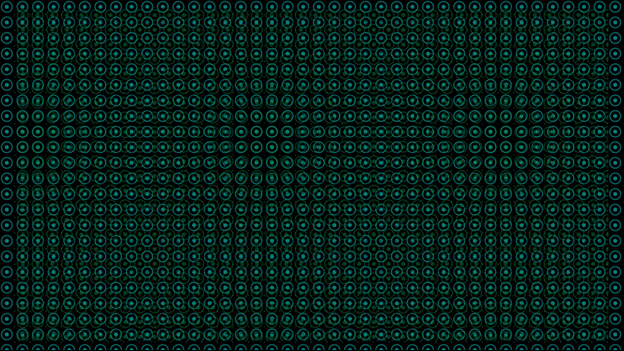
CSS Only Pattern Animation
A multi-layered conic gradient pattern animated entirely through background-position. Four gradient layers — two per color — slide diagonally in a repeating 4-step cycle. The result is a seamless, shifting textile-like texture. Zero HTML, zero JS, just background and @keyframes on <html>.
See the Pen CSS Only Pattern Animation.
Animated Background
Two layered divs with identical radial-gradient patterns — green, black, and white dots on a black field. The background layer hue-shifts through 30°-90° on a 1s loop. A full-viewport foreground layer fades in and out every 3s. Simple pattern, two animations, psychedelic result.
See the Pen Animated Background.
CSS Background Fireflies
Fifteen firefly particles drifting across a forest background. Each uses ::before for a shadow and ::after for a yellow glow that flashes intermittently. Every firefly gets a unique @keyframes path with ~20 waypoints — randomized translation and scale over 200 seconds. Pure CSS, 15 individually crafted animation timelines, no JavaScript.
See the Pen CSS Background Fireflies.
Animated Ripples Background
Five white circles anchored to the bottom-left corner, layered by size with decreasing opacity. Each scales between 0.8 and 1.2 on a 15s infinite loop — creating a water ripple effect that radiates outward. Blue background, white rings, one @keyframes rule. Nothing else.
See the Pen Animated Ripples Background.
Cool Mountain Background
Four absolute-positioned divs, each showing a different crop of the same mountain photo, stacked with staggered z-index. On animation start, .d1 expands from 15vw to 95vw while .d2–.d4 slide their background-position leftward. Feels like a camera dolly zoom — purely CSS, no JS involved.
See the Pen Cool Mountain Background.