20+ CSS Animated Buttons: Free Examples & Code Snippets
Animated buttons transform static interaction points into responsive feedback systems — hover lifts, click ripples, loading spinners, and entrance sequences that guide user attention. These micro-interactions communicate state changes without cluttering the interface.
- State transitions use transform: scale() and opacity exclusively, keeping hover, active, and loading animations entirely on the compositor thread without main-thread repaints.
- Loading states replace button content with a border-based spinner on a pseudo-element, toggled via a CSS class that swaps opacity — both layers transition without triggering layout recalculations.
- Staggered entrance animations use CSS Custom Properties with calc-based animation-delay values, creating sequential button reveals from a single keyframe definition without JavaScript timing logic.
Browse this collection of CSS animated buttons to master compositor-thread micro-interactions that make every button state feel responsive and intentional.
Table of Contents:
Examples
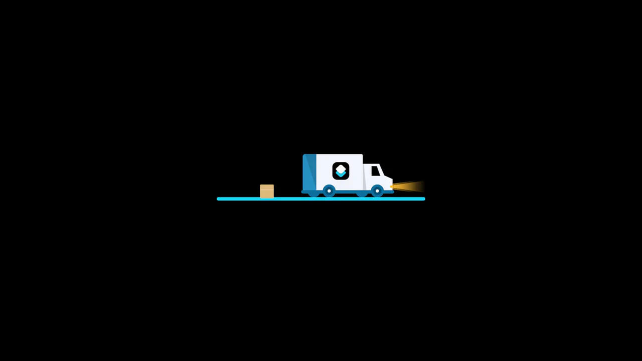
3D Truck Delivery Download Button
An advanced interactive download button featuring a complex 3D truck delivery animation. Powered by GSAP and SCSS, clicking the button triggers a 90-degree backward flip using CSS preserve-3d to convert the top edge into a flat road. A styled vector truck drives in from the left, catches a falling cargo box, departs off-screen, and flips back to reveal a success checkmark. (Requires: gsap.js)
 Chrome 55+
 Edge 79+
 Firefox 54+
 Safari 9.1+
See the Pen 3D Truck Delivery Download Button.

Cosmic 3D Galaxy Button
This is a Cosmic 3D Galaxy Button. It replaces a standard solid color hover state with a dynamic, multi-layered particle system. Its function is to serve as a high-impact primary call-to-action, using spatial depth and global page illumination to draw maximum user focus.
Chrome 105+
Edge 105+
Firefox 121+
Safari 15.4+
See the Pen Cosmic 3D Galaxy Button.

Animated Futuristic State Button
This Animated Futuristic State Button is more than just a clickable element; it’s a self-contained micro-interaction. Designed for actions like “Generate” or “Processing,” it features a idle flicker animation that transitions into an intense, glowing state upon focus. The text cleverly swaps from a call-to-action to a continuous verb (“Generate” → “Generating”) using purely CSS animations, providing immediate visual feedback without JavaScript.
Chrome 80+
Edge 80+
Firefox 75+
Safari 13+
See the Pen Animated Futuristic State Button.

Sparkle Generate Button
This Sparkle Generate Button adds a touch of delight to AI or creative tools. When hovered, the button doesn’t just change color - it emits a cloud of floating “sparkles” (particles) that drift and rotate. The effect is powered by CSS variables for performance, with a lightweight JavaScript snippet to randomize the particle paths, ensuring the animation feels organic and magical every time.
Chrome 60+
Edge 79+
Firefox 55+
Safari 11+See the Pen Sparkle Generate Button.
Shine Gradient Buttons
An example of modern UI/UX design implemented with pure CSS. The demo shows how to use linear-gradient, box-shadow, and transform to create buttons with gradient fills and a 3D-like effect, while the @keyframes animation adds a dynamic shine, making the interactive element more engaging.
See the Pen Shine Gradient Buttons.
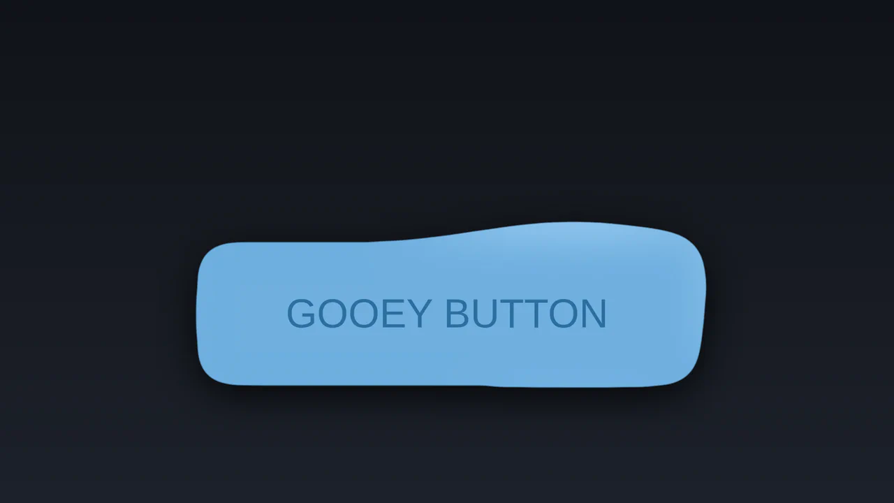
Gooey SVG Filter Button
An interactive “liquid” effect button crafted using SVG feGaussianBlur and feComponentTransfer filters. Cursor movement is tracked with JavaScript and passed to CSS to control a radial gradient.
See the Pen Gooey SVG Filter Button.

Neomorphic Button
A striking button with a neomorphic design and a pulsating element, built using pure CSS variables and pseudo-elements. The hover and active state animations provide a smooth UX, making it perfect for drawing attention to key CTAs.
See the Pen Neomorphic Button.
Button
The main button has a semi-transparent background, the ::before pseudo-element contains the animated gradient, and ::after has a solid dark background that “cuts out” the inner part, leaving only the border visible.
See the Pen Button.
Button Animation Experiment
A modern CSS/SCSS button animation featuring a rotating frame effect achieved through pseudo-elements and hardware-accelerated transforms. This performant snippet delivers a smooth UI micro-interaction, providing a lightweight and visually striking solution for creative frontend projects.
See the Pen Button Animation Experiment.
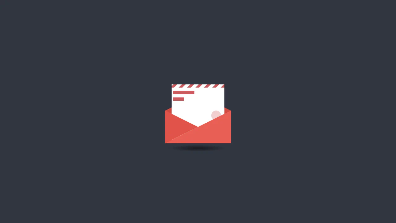
Animated CSS Mail Button
An interactive pure CSS mail animation that leverages 3D rotateX transforms and transform-origin to simulate a realistic envelope opening sequence. This lightweight snippet features geometric shapes and repeating gradients, providing a high-performance UI component perfect for contact sections or notification prompts.
See the Pen Animated CSS Mail Button.
Buttons With Stroke
A creative button component featuring a hand-drawn underline effect powered by SVG stroke animations. This snippet leverages stroke-dashoffset and vector-effect: non-scaling-stroke to ensure the decorative line scales perfectly with text length, providing a high-performance and lightweight UI micro-interaction.
See the Pen Buttons With Stroke.
Fancy Button
An elegant pure CSS button featuring an interactive shifting frame effect on hover. This snippet leverages the ::after pseudo-element and calc() function for dynamic resizing, providing a high-performance and fully responsive animation that automatically adjusts to the text length.
See the Pen Fancy Button.
Arrow Button
A high-performance CSS button animation featuring SVG symbols and smooth label shifting on hover. This snippet leverages cubic-bezier transitions and transform-origin manipulation to create a polished UI micro-interaction, providing a lightweight and scalable solution for modern frontend projects.
See the Pen Arrow Button.
Button Emoji Animation
A creative pure CSS/SCSS button that utilizes invisible hover listeners to dynamically trigger different emoji states. This performance-driven snippet showcases advanced use of Unicode content and sibling combinators, providing a lightweight and engaging UI interaction with zero JavaScript overhead.
See the Pen Button Emoji Animation.
Mouse Hover Effect On Button Using CSS
A sleek pure CSS button featuring a creative hover effect where an arrow pointer morphs into a full background. This snippet leverages hardware-accelerated transform and transition properties, delivering high frontend performance and polished UI micro-interactions without using JavaScript.
See the Pen Mouse Hover Effect On Button Using CSS.
Continue Application Hover
Choreographed, CSS-only micro-animations transform an interactive document folder icon on hover. The button’s left tab holds a multi-layered folder. Hovering triggers a series of transitions: the folder flap rotates open via rotateY(-60deg), the inner paper slides up-right, and a hidden pencil slides into view onto the sheet.
See the Pen Continue Application Hover.
CTA Buttons
Playful micro-animations and emoji overlays bring these eight interactive CSS buttons to life on hover. Each module utilizes dedicated @keyframes to trigger custom feedback loops, including an elastic typing ribbon, expanding concentric waves (pulsing), bouncing rating scores, and rotating rainbow decorations.
See the Pen CTA Buttons.
Video Button Animation
A masked video portal scales up from a play-bullet to a full-screen background using pure CSS sibling selectors. On hover, the clip-path circle expands, revealing a moving video loop and inverting the text color with an overlapping masked duplicate layer.
See the Pen Video Button Animation.
Transaction Button with Hover Animation
Choreographed CSS animations mimic a transaction swipe when this container is hovered. The parent box collapses, while the green .card rises, rotates vertical, and inserts into an emerging card terminal (.post). Once docked, a delayed fade-in-fwd keyframe shows the success of the transfer as a green $ icon.
See the Pen Transaction Button with Hover Animation.
Flush Button
Rising bubble streams and an interactive, cursor-following mask animate this card on hover. A repeating radial-gradient on ::before continuously loops upward. On hover, the .left and .right target zones trigger adjacent sibling selectors (~) to slide and tilt a dark mask layer, dynamically tracking the mouse coordinate.
See the Pen Flush Button.
Animated Striped Gradient Button
This interactive button creates a spinning barber-pole border animation using layered pseudo-elements. A multicolored diagonal gradient is continually offset on :before. Above it, a shrunken, centered :after layer acts as a solid mask. This obscures the center, revealing only a thin, rotating outer stripe rim. Hovering alters the mask colors.
See the Pen Animated Striped Gradient Button.
Animated Button 3
This stylesheet animates a continuous neon light running along a button’s border. By positioning four absolute span elements around the container edges, it maps the four boundaries. Each line uses a color-to-background gradient and staggered keyframe delays (translate) to create a smooth, cascading circular chase light.
See the Pen Animated Button 3.
An Animated Blobby Gooey Button
This vector-morphing component uses SVG path interpolation to create a living, breathing container that reacts to subtle hover states. Technical implementation relies on declarative CSS keyframes to toggle coordinate data, while mask definitions carve typography out of the geometry to ensure visual depth. The interaction distills complex motion into a focused, fluid reveal that prioritizes performant, high-fidelity rendering.
See the Pen An Animated Blobby Gooey Button.