100+ CSS Animations: Free Examples & Code Snippets (Page 3)
Examples

CSS-Only Dots World Map
A technical demo of geodata visualization using pure CSS/Sass to create a grid-based world map. The core feature is the animation control of numerous cells using @each and individual animation-delay: random(...), which makes the pulsing unique to each continent.
See the Pen CSS-Only Dots World Map.

Cyberpunk Glitch Slideshow
A pure-CSS masterpiece that uses advanced perspective and @keyframes to create a striking 3D-like parallax and an automatic slideshow. The demo highlights the power of modern CSS to achieve sophisticated interactive and animated interfaces without a single line of JS.
See the Pen Cyberpunk Glitch Slideshow.

Image Orbit Animation with CSS
This carousel effect demonstrates a modern approach to CSS animations, using the offset-path property for circular motion. The complex scaling and highlighting effects on hover are achieved purely with CSS transitions and the :has() selector, eliminating the need for JavaScript.
See the Pen Image Orbit Animation with CSS.

Pure CSS Linear Circular Motion
Witness the power of pure CSS with this mesmerizing 3D mechanical animation, built using advanced 3D transforms and intricately choreographed keyframes — no JavaScript required.
See the Pen Pure CSS Linear Circular Motion.

Earth with Pure CSS
A showcase of advanced CSS capabilities for creating stunning 2D animations. It uses CSS @property for smooth property transitions, allowing you to animate box-shadow and other elements without compromising performance.
See the Pen Earth with Pure CSS.
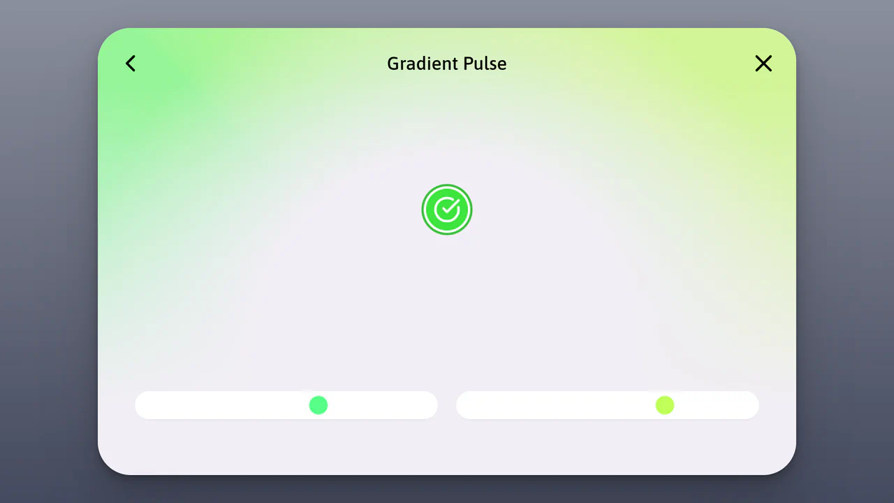
Gradient Pulse Animation with CSS
This mini-project leverages CSS custom properties (@property) to create an animated gradient and interactive effects, while using requestAnimationFrame for optimized animation performance.
See the Pen Gradient Pulse Animation with CSS.

Hot Ones Neon Sign Animation
A neon sign effect built with SVG and CSS filters. The addition of a flickering animation using @keyframes and a jQuery class toggle makes the component both realistic and interactive.
See the Pen Hot Ones Neon Sign Animation.

The Simplest Dots (CSS)
A pure CSS demo that generates a complex 3D animation with perspective and transform-style: preserve-3d. It leverages CSS variables (--i, --d) to parameterize and control animation timing and positioning, making it flexible and scalable.
See the Pen The Simplest Dots (CSS).

Animated Text Ribbon with SVG and CSS
Explore an SVG-powered animated text ribbon, showcasing complex path animations and efficient CSS for a visually striking, scalable effect.
See the Pen Animated Text Ribbon with SVG and CSS.

Simple CSS Text Loading Animation
See how subtle animation-delay and pseudo-selectors like nth-child can animate individual letters, creating an engaging and scalable text loader powered entirely by CSS.
See the Pen Simple CSS Text Loading Animation.
3D Glowing Bottle
This demo showcases advanced CSS techniques like synchronized transform: rotate() animations and the filter: drop-shadow() property to achieve a visually striking glowing liquid effect within a transparent container.
See the Pen 3D Glowing Bottle.
CSS 3D Sphere Animation
A 3D sphere where an SCSS @for loop calculates the transform for each ring, and the entire animation and structure, built on perspective and transform-style: preserve-3d, are fully configurable via variables.
See the Pen CSS 3D Sphere Animation.
CSS Light Sphere Animation #21
3D sphere from 21 concentric rings. Each ring — div with rotateX(90deg) and Z translation. Sizes and animation delays controlled via CSS variables. Rings pulse, changing color via hue-rotate. Rotation pauses on hover.
See the Pen CSS Light Sphere Animation #21.
CSS Math Globe Animation
3D globe from horizontal rings. Pug generates rings with varying vertical offset via CSS variable --dp. Ring width calculated via circle formula. flash animation travels through rings with delay, creating running light effect.
See the Pen CSS Math Globe Animation.
Generative aquatic animation utilizing the offset-path property to define complex, non-linear movement trajectories. The fluid, wave-like motion is achieved through cascading animation-delay values for each body segment, mimicking natural swimming dynamics. Element geometry and scale are governed by CSS variables, providing procedural flexibility for the entire composition without JavaScript.

Flying Through Hexagons
A large-scale 3D scene where Sass procedurally generates both the trajectory of 72 rings using trigonometry, and the @keyframes for its “fly-through” mode via a Sass map. Animation is switched without JS using the “checkbox hack”, and the entire composition is built upon perspective and transform-style: preserve-3d.
See the Pen Flying Through Hexagons.
Climbing Cube
An illusion of an endlessly rolling 3D cube, achieved by synchronizing two @keyframes animations for rotation and sliding with an offset transform-origin. The complex rotation animation uses intermediate steps for a “bounce” effect, while a neon glow and -webkit-box-reflect complete the futuristic look.
See the Pen Climbing Cube.
Animated Flashlight Pattern Background
A unique Pure CSS implementation of a spotlight animation achieved without any JavaScript. The effect relies on controlling the clip-path position via CSS animation, alongside color change and element blinking managed by multiple stops within the detailed @keyframes.
See the Pen Animated Flashlight Pattern Background.
Metal Gear Solid Soliton Radar States
Atmospheric, lively interface elements mimicking high-tech equipment screens with interference, scrolling data, and a countdown.
See the Pen Metal Gear Solid Soliton Radar States.
Interactive character controller utilizing CSS steps() animations and sprite sheets. JavaScript handles input logic, switching states via dynamic background positioning. A clean implementation of frame-by-frame animation for web interfaces.
Character Choose with Preview Card Animation (CSS Sprites)
A sophisticated CSS-only character selector and sprite animator inspired by Minecraft. It leverages CSS Houdini and advanced math functions to drive complex frame-by-frame sprite animations, while :has() selectors manage state changes for character selection, direction toggling, and dynamic FPS adjustment, complete with real-time stats via CSS counters.
Battery Charging Animation With Liquid
A compact battery icon created with a .battery container and a terminal pseudo-element , featuring a high-contrast design and a bright green .liquid fill that uses a repeating 2.25s animation cycle for continuous charging feedback.
See the Pen Battery Charging Animation With Liquid.
Striking hero image and heading reveal animation, controlled by CSS Custom Properties for timings and a custom easing function, delivering a smooth and precise UX.