30+ CSS Arrows: Free Examples & Code Snippets
CSS arrows are foundational UI primitives used in tooltips, popovers, navigation menus, and scroll indicators to provide clear directional context. Building them with pure CSS instead of image assets ensures they remain scalable, themeable, and free of HTTP requests.
- Modern implementations use clip-path: polygon() on pseudo-elements to render precise arrow shapes on the compositor thread without allocating extra DOM nodes or box geometry.
- The legacy border hack creates arrows through thick transparent borders with a colored edge — it carries paint overhead but provides universal support down to legacy rendering engines.
- Both approaches leverage ::before and ::after pseudo-elements with CSS Custom Properties for dimensions and colors, keeping the DOM semantic while enabling system-wide theming through variable overrides.
Browse this collection of CSS arrows to master lightweight, scalable directional indicators that integrate seamlessly into tooltips, menus, and navigation systems.
Table of Contents:
Examples

Stylish Highlighter Link Hover Animation
This Highlighter Link Hover Effect provides a sophisticated micro-interaction for inline text links, moving beyond the standard static underline. By default, the link is covered by a soft, semi-transparent background fill; upon hovering, this “highlighter” block collapses into a thin underline while a directional arrow slides in from the right.
 Chrome 36+
 Edge 12+
 Firefox 16+
 Safari 9+
See the Pen Stylish Highlighter Link Hover Animation.
Arrow Animations (CSS-Only Icon)
This highly reusable CSS-only icon features complex bidirectional animation and a ripple effect, achieved by leveraging CSS Custom Properties for state and using a minimal JavaScript cloning trick to instantly restart the animation on click.
See the Pen Arrow Animations (CSS-Only Icon).
Arrow Icon Animation
A technically advanced use of ::before and ::after pseudo-elements to create an arrow. jQuery toggles the .right class, and CSS animates the left and transform: rotate() properties of the pseudo-elements, creating a “switch” or 3D flip effect.
See the Pen Arrow Icon Animation.
Arrow Keyframes Animation
A “snake” arrow style loader animation where each circle smoothly changes color using @keyframes, and animation-delay sets an offset for each element, creating a running wave effect.
See the Pen Arrow Keyframes Animation.
A minimalist “back to top” button featuring a color-swipe fill effect and smooth arrow reshaping using pure CSS. This high-performance solution for frontend interfaces utilizes overflow: hidden and CSS transitions to create a polished and responsive visual feedback.
A modern interactive link featuring a dynamic SVG arrow icon with a sophisticated circular stroke animation on hover. This snippet leverages pure CSS transitions and the stroke-dashoffset property to create a smooth “drawing” effect, providing a lightweight and high-performance micro-interaction for your frontend projects.
Triple Arrow Animation
A creative SVG arrow animation built with pure CSS transforms and smooth transitions. This snippet showcases an interactive hover effect where multiple polygon elements collapse toward the center, offering a high-performance and lightweight micro-interaction for scroll indicators or “read more” buttons.
See the Pen Triple Arrow Animation.
A minimalist CSS arrow animation built using pseudo-elements and hardware-accelerated transforms for smooth state transitions. This snippet provides a clean, performance-oriented approach to interactive UI design, allowing for easy customization of color and geometry with zero extra HTML markup.
A versatile set of interactive buttons with CSS arrow animations, featuring horizontal slides and continuous rotation effects. This snippet utilizes lightweight @keyframes for a dynamic visual response, providing a high-performance and scalable solution for modern web UI design.
An elegant animated arrow button powered by SCSS variables and CSS transforms for a sophisticated hover interaction. This snippet features a dynamic shaft expansion and staggered transition delays, providing a high-performance and visually polished solution for modern CTA elements.
A versatile set of interactive CSS arrow animations powered by the checkbox hack and sophisticated @keyframes for smooth shape morphing. This snippet showcases state-driven transitions and complex path animations without JavaScript, delivering high-performance UI micro-interactions for modern web projects.
A creative CSS hover effect featuring an infinite sliding arrow loop within a dynamic circular border. This snippet leverages @keyframes and cubic-bezier easing to provide a high-performance, lightweight solution for interactive UI elements and navigational cues.
Dashed Animated Arrow
SVG path animation with a dashed guide line and a moving arrow.
See the Pen Dashed Animated Arrow.
Flipping Arrows
CSS-doodle grid (1×25) of arrow-shaped elements with a flip animation. Each arrow uses clip-path: polygon(40% 71%, 50% 0, 64% 0, 64% 71%, 73% 71%, 48% 100%, 24% 71%) to form an upward-pointing arrow. Background colors cycle randomly among four values (#FDFFFC, #2EC4B6, #E71D36, #FF9F1C). The @keyframes flip animates height from 0% to 100vh and rotateX (±360deg) with random duration (3s-7s).
See the Pen Flipping Arrows.
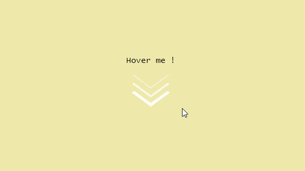
Smooth Arrow Animation
Three stacked <span> chevrons, each built from border-bottom and border-right with rotate(45deg).
See the Pen Smooth Arrow Animation.
The Arrow
Ten different arrow animations from Temani Afif, each using a distinct CSS technique — clip-path for the chevron shape, conic-gradient for the arrowhead, flex and grid layouts, and creative use of ::before/::after. Animations vary: flex-grow expansion, horizontal/vertical translation, scale flips, background-position shifts, and width morphing. All arrows share the same basic chevron silhouette but move differently.
See the Pen The Arrow.
A Traffic Thing
A CSS grid of 13×5 dark circles on a grey panel. Each circle lights up orange at different phases via staggered @keyframes — creating a moving arrow that sweeps upward through the grid like a traffic light sequence. The stem lights pulse in a delayed wave, the arrowhead flashes in three phases. Gradient background, rounded container.
See the Pen A Traffic Thing.
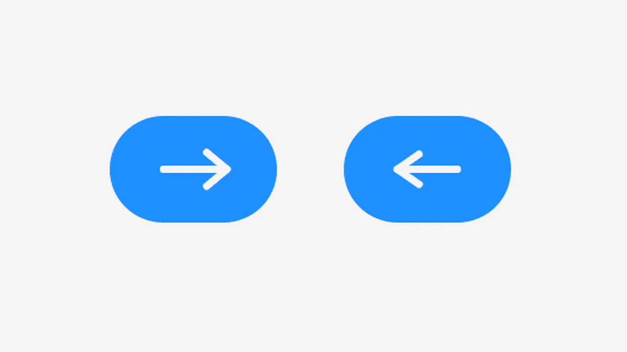
Arrow Button
A right-pointing arrow made of 28 small blue dots (6px, #3da9fc) arranged in 7 rows of 4. Each row is offset horizontally via translateX to form the arrow silhouette. On hover, the entire button slides right 20px and back over 2s with ease timing. Pure CSS, no JS, no images — just dots and transforms.
See the Pen Arrow Button.
Arrow Unbend Animation
An SVG arrow that unbends on hover. Three white path elements form the arrowhead and shaft. On hover, the arrow tip path straightens via d: attribute change, the middle path shifts 4px right, and the tail follows — creating a smooth unbending motion. CSS transition: 0.25s ease on all paths. Minimal SVG + CSS, no JS.
See the Pen Arrow Unbend Animation.
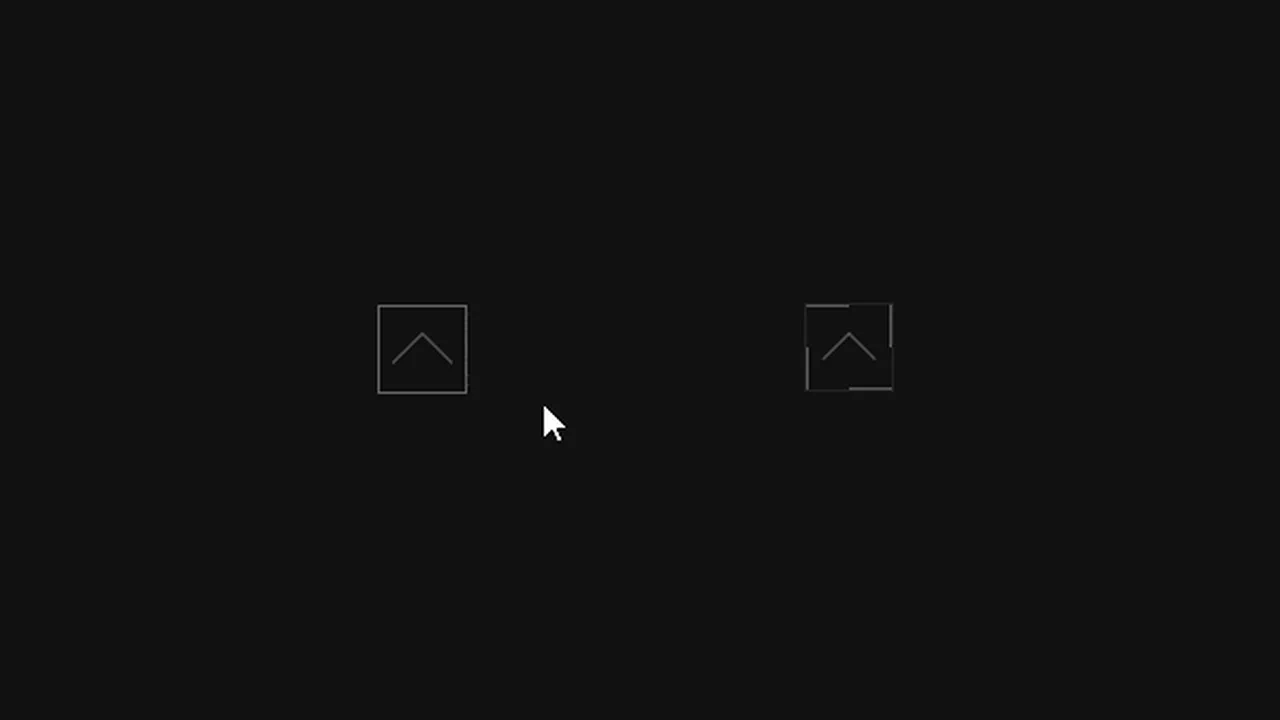
CSS Arrows Without Images
Four directional buttons (left, right, up, down) built from a single <button> element. Each uses border-left and border-bottom with groove style to form a chevron, rotated 45° increments for direction. A ::before pseudo-element adds the arrow shaft via clip-path and a rotated border-top. All dimensions controlled by CSS custom properties (size, stroke, color, style). Pure CSS, zero images.
See the Pen CSS Arrows Without Images.
Pagination Arrows
Left and right pagination arrows built from two <i> bars each, rotated ±40° to form a chevron. On hover, the angle tightens to ±30°; on click, to ±25°. A [data-state=disabled] state collapses the bars into a flat line and reduces opacity. The JS updates a counter and toggles the disabled state at boundaries.
See the Pen Pagination Arrows.
Animated Arrow
A hover-animated link with a dual-arrow mechanism. On the left, an arrow shaft extends from 0→64px while its tip flaps open (0→8px, rotating 40°). On the right, the arrow retracts to 0 and the text slides 80px right — creating the illusion of an arrow passing through the text. Built with ::before/::after shafts, transform, and staggered transition-delay. Minimal, dark theme.
See the Pen Animated Arrow.
10 Scroll Down Arrows
Ten full-viewport sections, each with a different scroll-down indicator — from a simple -45deg rotated chevron to a 3D spinning arrow and a mouse-shaped icon with an animated dot. Arrows bounce, fade, ripple via box-shadow, or stagger in threes. One rotates 720° on the Y-axis. Each section pairs its arrow with a background photo and smooth jQuery scroll.
See the Pen 10 Scroll Down Arrows.
CSS Falling Arrow
Five nested <span> chevrons inside a 45° rotated container. Each span uses border-bottom and border-right to form a square corner. They’re stacked diagonally with staggered positions (-30px to +30px) and delays (0s to 0.8s). On each cycle, they shift 15px diagonally while turning from white to yellow — a cascading falling arrow. Dark background, pure CSS, no JS.
See the Pen CSS Falling Arrow.
Arrow Animate
A hover-triggered link with three parts: an arrow (two stacked <span> chevrons), a horizontal line, and the text “Projects”. The whole link is rotated -90° and offset vertically. On hover, the line’s red ::after slides left (80px → 0) over 1.5s, then the arrow tip fills with red via width: 0 → 100% with a 1s delay. Clean, sequential red reveal animation.
See the Pen Arrow Animate.
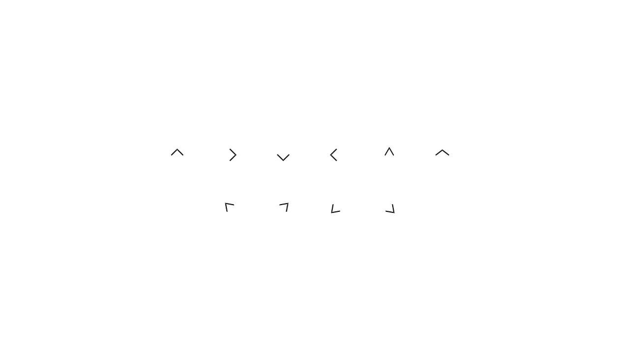
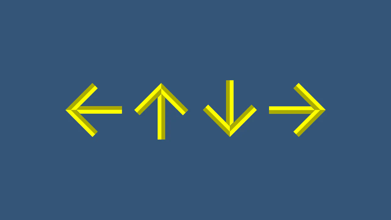
CSS Arrows
Ten arrow variants built from a single .arrow base: a 15×15px square with border-top and border-right. Direction is set by rotate() — 45° increments for the four cardinal directions. Narrow and wide versions use skew() to pinch or flare the angle. Diagonal arrows (top-left, top-right, etc.) combine rotation with skew for angled pointers. Pure CSS, one element, zero pseudo-elements.
See the Pen CSS Arrows.
Arrow Animation
A circular scroll-down button with a pulsing SVG arrow. The <a> link and its ::before/::after pseudo-elements each duplicate the same arrow SVG, staggered at 0s, 0.25s, and 0.5s delays. The @keyframes pulse animates background-size from 0 → 75% → 0 while fading in and out and shifting background-position from top to bottom. Three layers create a cascading ripple effect.
See the Pen Arrow Animation.
Bouncing Arrow Animation
A bouncing scroll-down indicator: a blue-bordered circle with a FontAwesome down arrow inside. The circle stretches vertically (120px → 150px → 120px) while the arrow moves upward relative to its container (bottom 0 → 90px → 0) — creating a spring-loaded bounce. A second concentric ring pulses outward via scale(0 → 1.5) with a delay. Three coordinated @keyframes, no JS.
See the Pen Bouncing Arrow Animation.
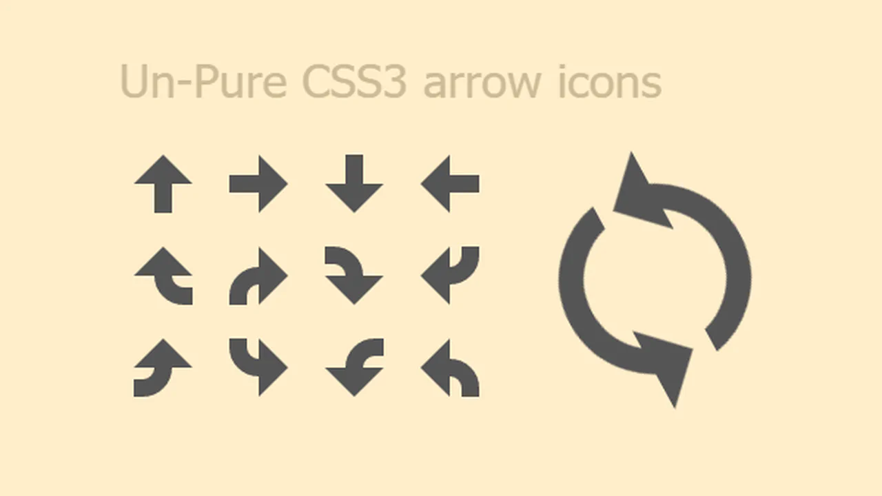
CSS3 Arrow Icons
Four direction arrows (up, right, down, left) built entirely from ::before and ::after pseudo-elements — a rectangle via background-color and a triangle via border-width. Each gets a curved variant using a nested <span class="curve"> with border-radius: 2000px to round the shaft. An animated spinning arrow combines two arrow halves with curves, rotating 360° continuously. Pure CSS, reusable classes.
See the Pen CSS3 Arrow Icons.
Gooey Scroll Arrow
A gooey blob arrow with a 3D rotation entrance and exit. Two white circles above and below the arrow stretch and squash via cubic-bezier keyframes — creating a liquid blob effect through an SVG feGaussianBlur + feColorMatrix goo filter. The SVG arrow path animates in from a 90° X-rotation, pauses, then flips out. Three animations, one <div>, pure CSS goo.
See the Pen Gooey Scroll Arrow.