4 CSS aspect-ratio Examples
Maintaining consistent proportions for media and containers is vital for visual harmony and layout stability. This updated collection provides professional solutions for handling dimensions across different screen sizes without the risk of distorted content. By using these curated snippets, developers can ensure that elements like video players, image galleries, and profile cards preserve their intended design regardless of the parent container’s width.
Technically, these examples focus on the native aspect-ratio property, which has largely replaced the legacy “padding-bottom” hack. We explore how to combine it with object-fit: cover and object-position to ensure HTML media elements fill their boxes perfectly. These snippets are optimized for hardware acceleration and help minimize Cumulative Layout Shift (CLS), which is critical for Core Web Vitals. The code demonstrates how to use CSS variables to create flexible, maintainable aspect-ratio systems.
Every free demo in this library is fully responsive and cross-browser compatible. You can easily download the source code or fork a specific project on CodePen to test different ratios like 16:9, 4:3, or 1:1.
Examples
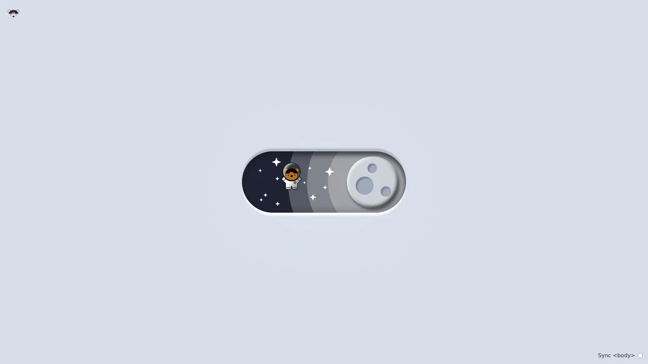
Bouncy Bear Theme Toggle Switch
Bouncy Bear Theme Toggle Switch relies on a clean, accessible HTML <button> to toggle an aria-pressed state, initiating a complex visual narrative that shifts between an aviator bear in light mode and an astronaut bear in dark mode. The animation utilizes modern CSS layout techniques including container-type queries, separate translate declarations, and a heavy-backwards cubic-bezier(.4,-0.3,.6,1.3) curve to achieve physical bounce. While structurally robust, the sheer volume of concurrently transitioning inline SVG paths and scaling stars can generate intensive layout recalculation spikes unless elements are actively isolated via hardware-promoted layers.
 Chrome 105+
 Edge 105+
 Firefox 110+
 Safari 16+
See the Pen Bouncy Bear Theme Toggle Switch.
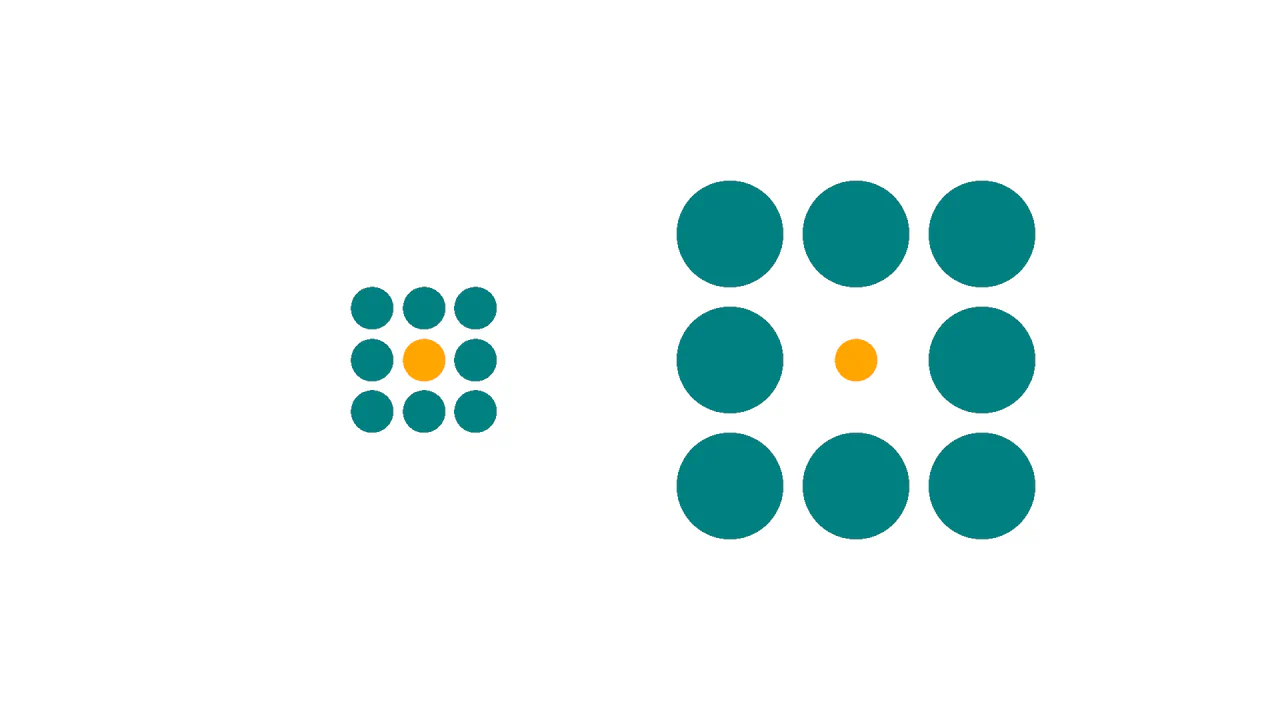
Ebbinghaus Illusion
This is a Pure CSS Ebbinghaus Optical Illusion. It uses mathematically sized radial gradients on a single element to trick the brain into perceiving two identical circles as different sizes. Its function is to provide an interactive, visual “gotcha” moment, demonstrating how relative scale affects human perception, revealed instantly via a smooth hover transition.
Chrome 112+
Edge 112+
Firefox 112+
Safari 16.5+
See the Pen Ebbinghaus Illusion.

Morphing Rounded Triangle Image Mask
This is a Morphing Rounded Triangle Image Mask. It relies on advanced CSS mathematics and masking to clip raster graphics into smooth, interlocking geometric shapes. Its function is to replace standard grid layouts with organic, tessellating image tiles that physically react to user interaction.
Chrome 111+
Edge 111+
Firefox 117+
Safari 16.4+
See the Pen Morphing Rounded Triangle Image Mask.
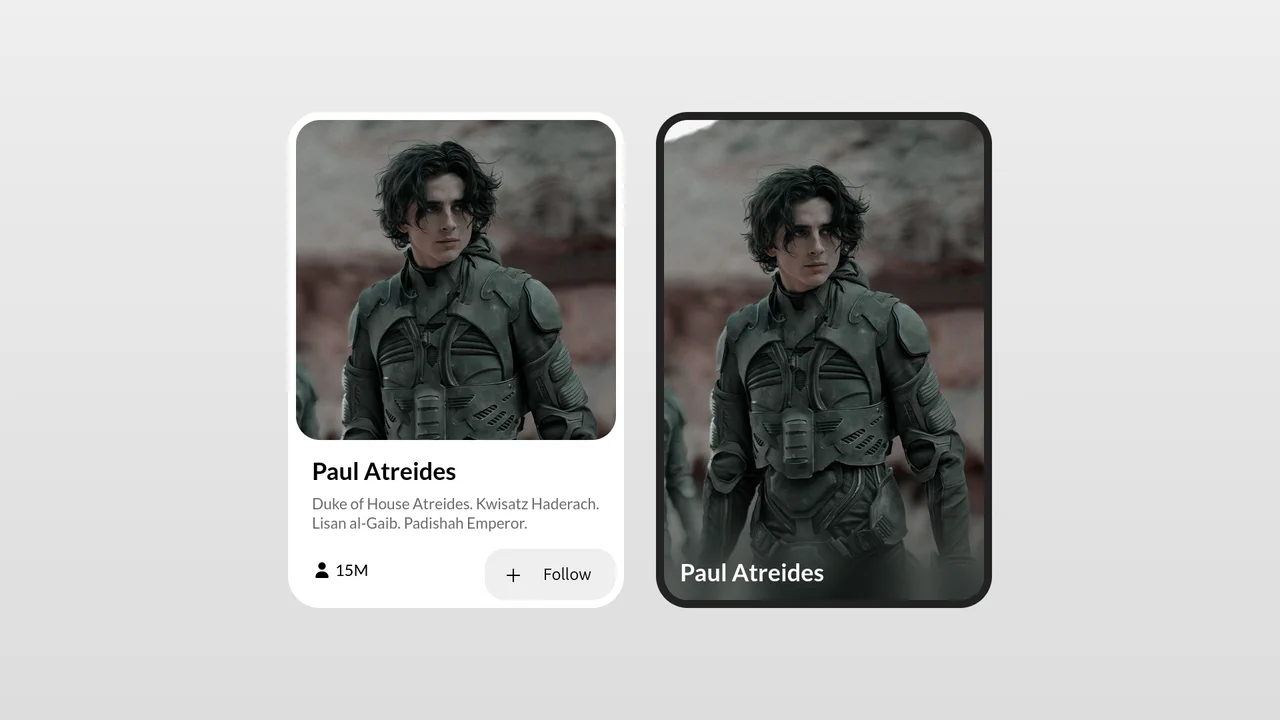
Morphing Profile Card Interaction
This Morphing Profile Card is a sleek UI component perfect for social platforms or team pages. Initially, it presents a large, immersive portrait. Upon interaction (hover or focus), the image smoothly transitions from a portrait ratio to a square, sliding up to reveal detailed profile information and action buttons hidden below. The animation is fluid and adds a layer of discovery to the interface. (Requires: Font Awesome, Google Fonts)
Chrome 88+
Edge 88+
Firefox 87+
Safari 15+See the Pen Morphing Profile Card Interaction.