20+ Pure CSS Avatar Examples: Best Free UI Templates
Pure CSS avatar examples establish highly polished, cohesive visual anchors for user profile segments, presenting team rosters, user accounts, and overlapping group stacks natively in the stylesheet. By integrating dynamic status indicators, hover transitions, and automatic fallback initials without scripting dependencies, these layouts define crisp personal contexts on dashboard feeds.
- Dynamic text fallback avatars with initials are rendered natively by pairing pseudo-elements with the content: attr() function, reading data directly from the DOM markup.
- Non-circular profile frames and responsive clipping paths leverage the native clip-path property, scaling vectors smoothly on GPU layers.
- To preserve critical INP (Interaction to Next Paint) performance during group stack hovers, card-spreading transformations transition compositor properties.
Explore these zero-dependency profile layouts to master the integration of native text fallbacks and highly polished, responsive avatar stacks into your projects.
Table of Contents:
Examples

Dynamic Circular Avatar Gallery
This is a Dynamic Circular Avatar Gallery. It arranges a series of profile images into a perfect circle that smoothly expands when interacted with. Its function is to showcase user groups or team members in a compact, engaging format, using cutting-edge CSS math instead of JavaScript to handle complex radial positioning and dynamic item counting.
 Chrome 119+
 Edge 119+
See the Pen Dynamic Circular Avatar Gallery.
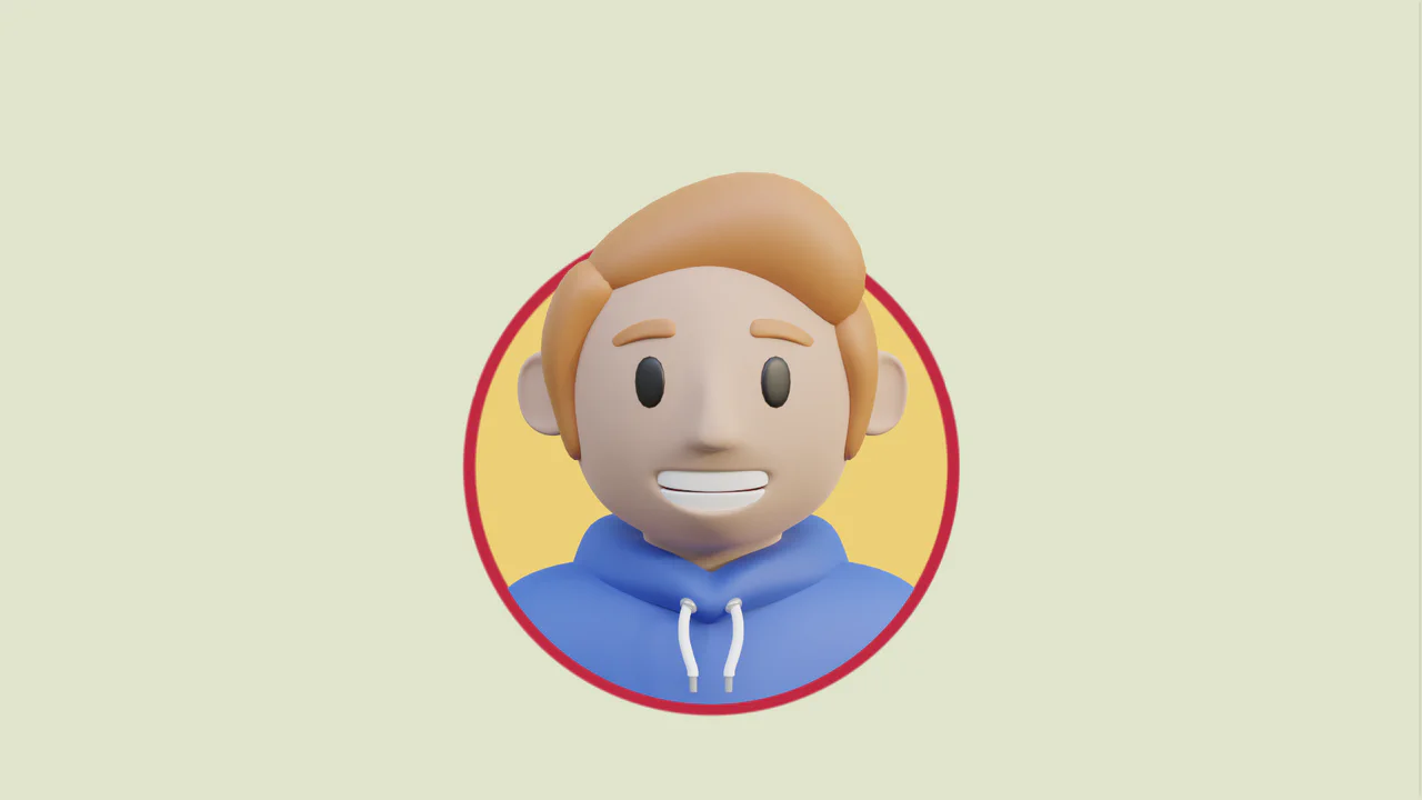
Fancy Hover Effect on Avatar
A pure CSS “pop-out” avatar effect utilizing CSS variables to orchestrate a scale transition.
See the Pen Fancy Hover Effect on Avatar.
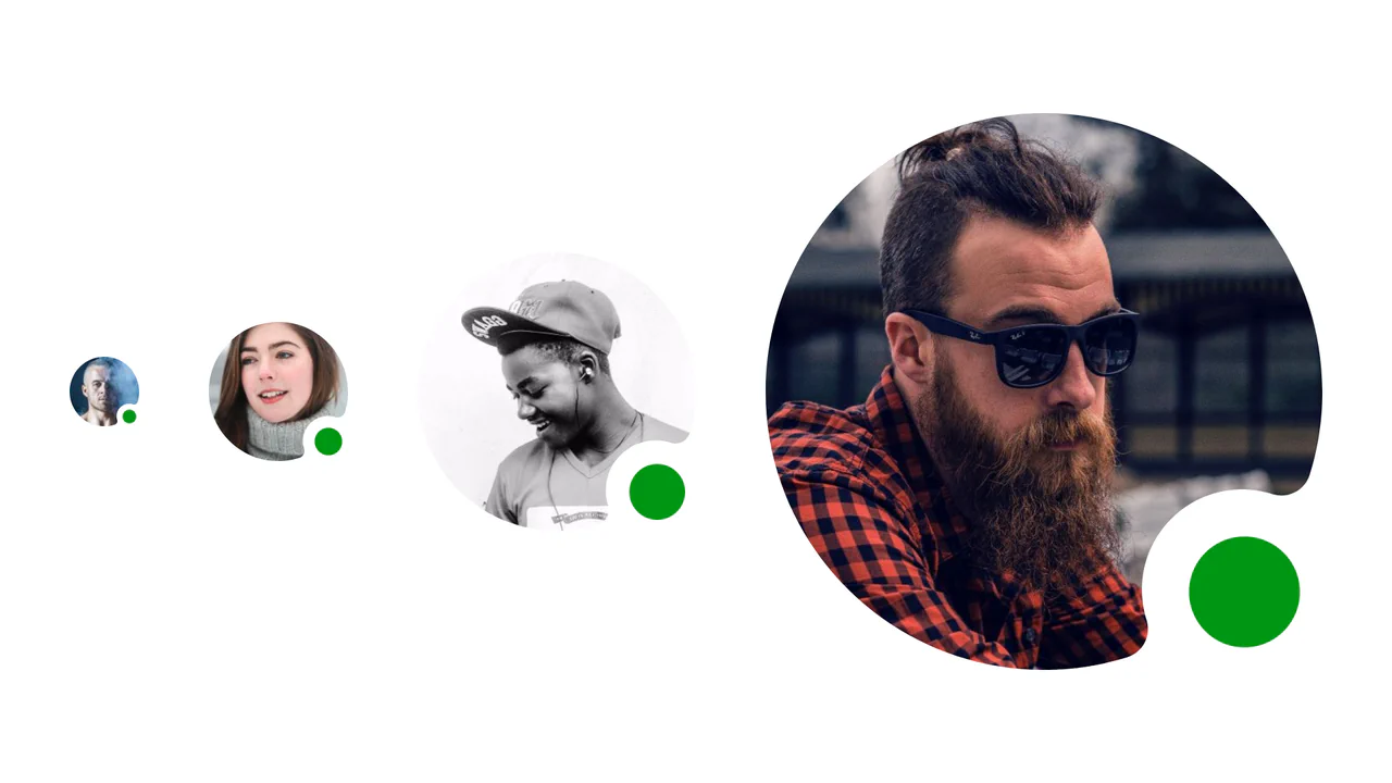
Resizable Masked CSS Avatar with Status Indicator
A clean, professional profile UI element where the status indicator looks integrated into the avatar’s shape rather than just tacked on top, adding polish to the interface.
See the Pen Resizable Masked CSS Avatar with Status Indicator.

Squircle Image Crop
A sleek squircle avatar implementation using CSS clip-path referencing an inline SVG definition. The technique applies a superellipse mask to a background image, creating a modern, iOS-style rounded shape that scales responsively while maintaining its geometry.
See the Pen Squircle Image Crop.
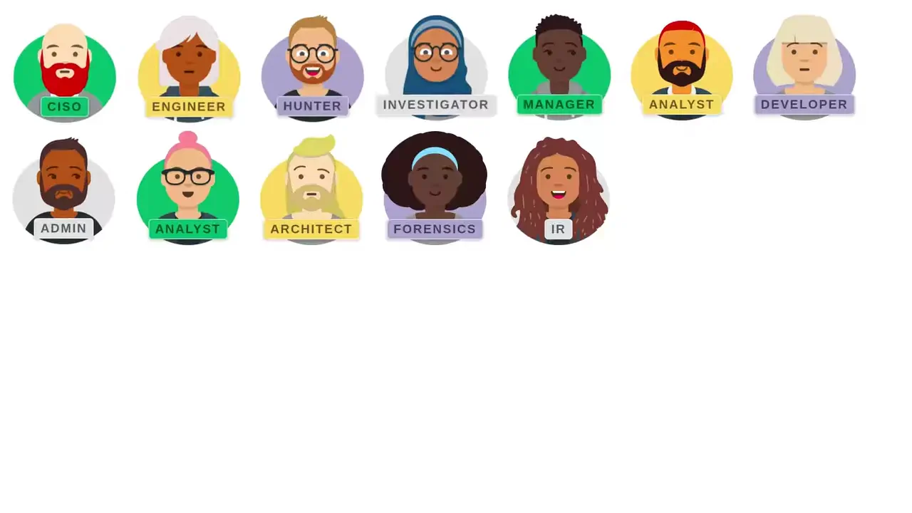
Floating Personas
A fun, “breathing” grid of characters that responds to user interaction, emphasizing the selected element.
See the Pen Floating Personas.
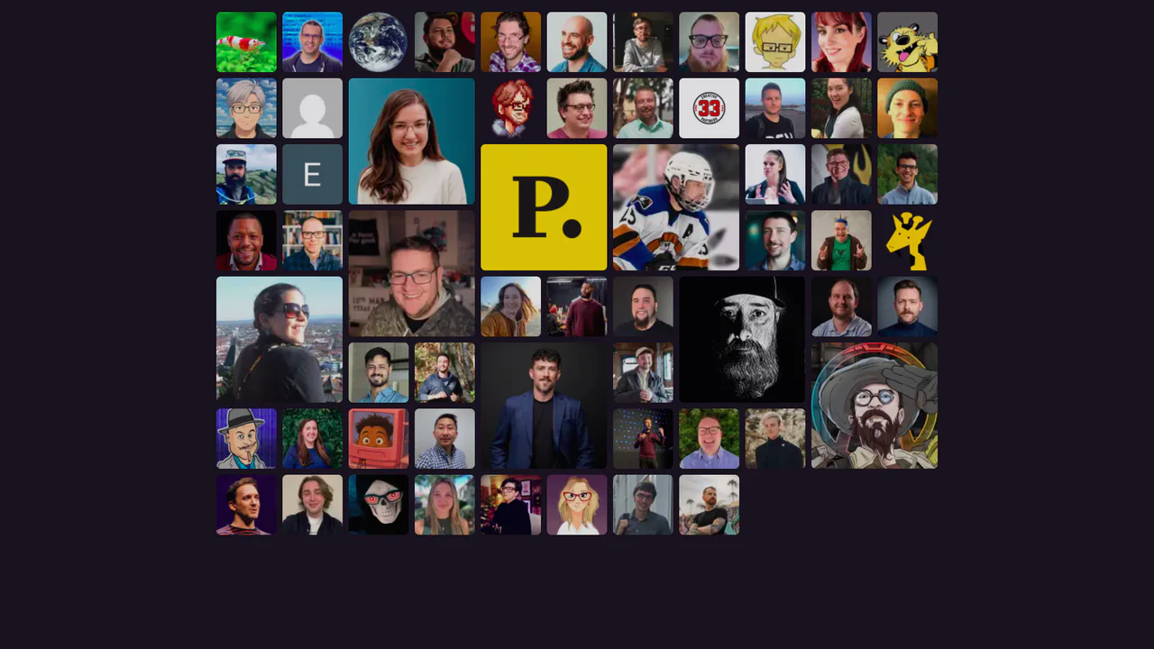
CSS Grid for Multi-Sized Avatars
A responsive mosaic grid of user avatars utilizing CSS Grid’s dense auto-flow algorithm to seamlessly pack items of varying sizes. Special ‘gold’ supporters span multiple rows and columns, creating visual hierarchy, while :has() pseudo-class selectors enable a focused hover state that subtly dims non-active elements.
See the Pen CSS Grid for Multi-Sized Avatars.
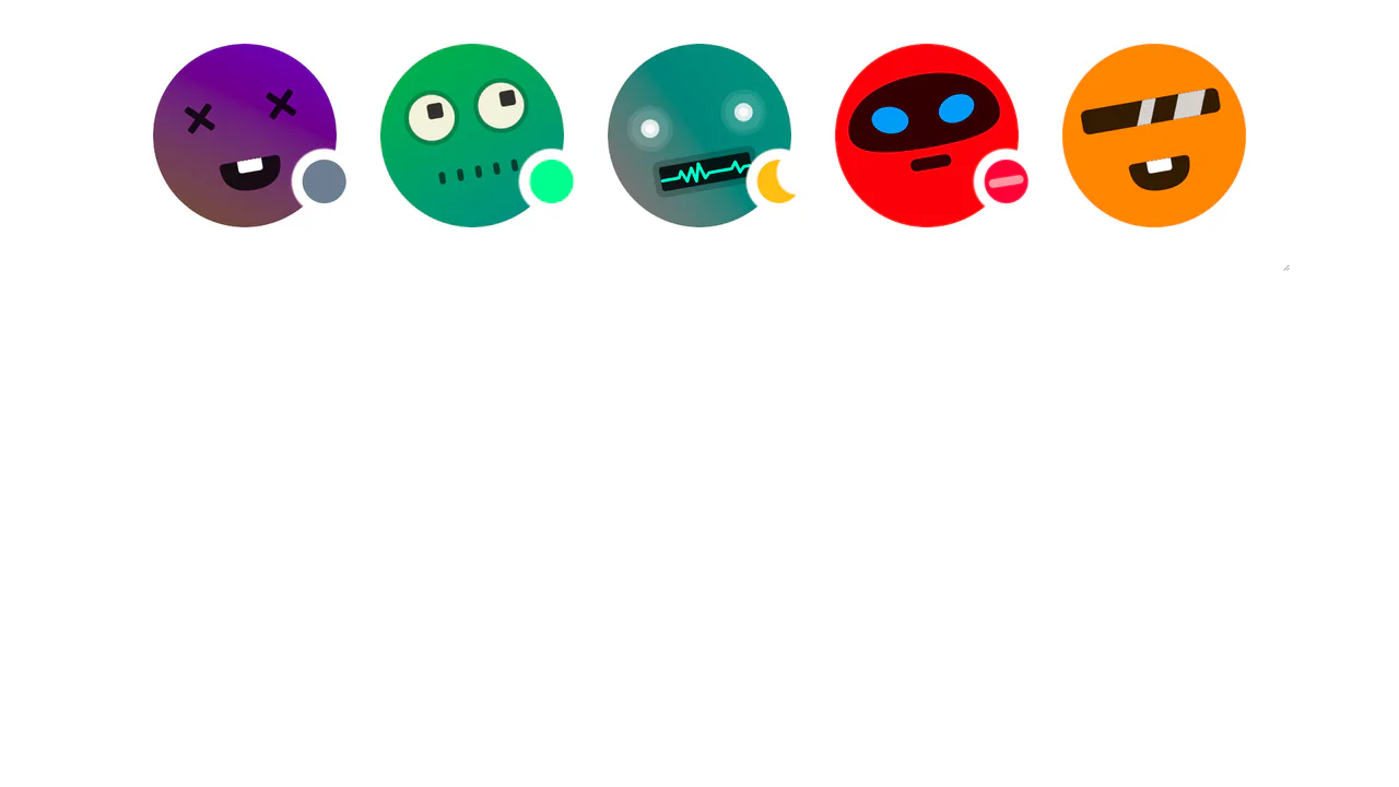
Avatar Indicators Using CSS Mask and Trigonometry
Avatar status indicators positioned with CSS masks and trigonometry (cos, sin). Custom properties --status-angle, --status-size, --status-offset control the dot’s position along the circumference; a radial‑gradient mask cuts a hole for the indicator to peek through. JavaScript only tweaks the variables — the logic itself is pure CSS.
See the Pen Avatar Indicators Using CSS Mask and Trigonometry.
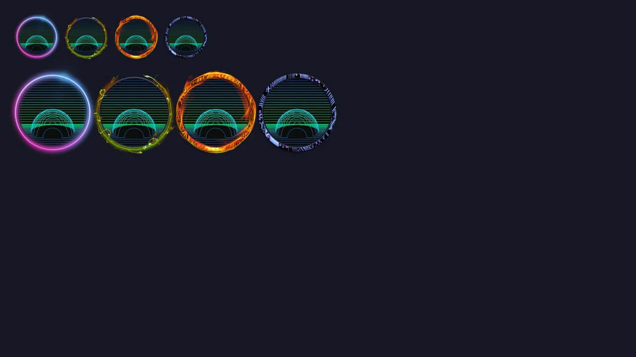
Avatar Frame
Avatar with an absolutely positioned rotating frame. Two animations: infinite spin and cyclic hue‑rotate. Frame size and offsets adapt via modifier classes, creating a versatile decorative effect.
See the Pen Avatar Frame.
Twitch Avatar Spin
Interactive avatar with a spinning gradient background and a “Live” badge. JavaScript toggles border‑radius, reshaping all elements simultaneously. The button controls icon state and classes, while CSS animation keeps the background spinning.
See the Pen Twitch Avatar Spin.
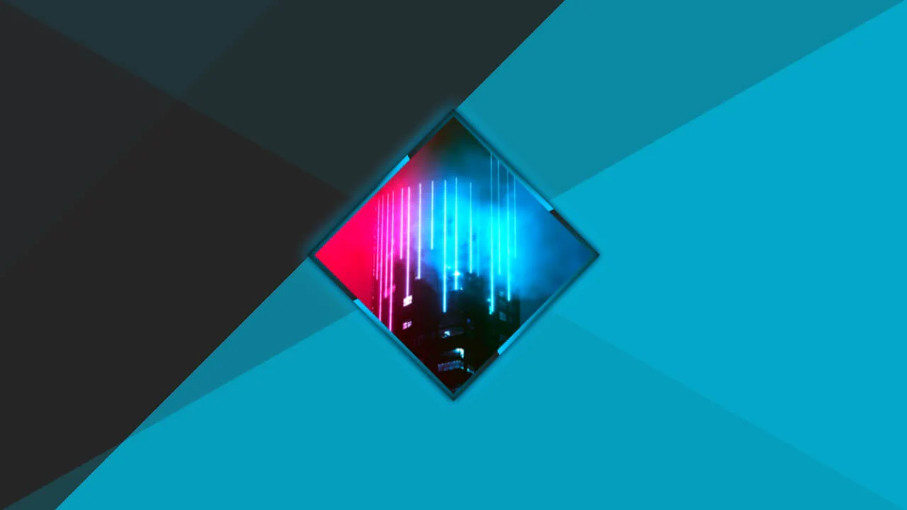
Avatar
Rotated square container with an animated conic gradient on its pseudo‑element. The inner image counter‑rotates and scales to stay upright. The page background is built from layered linear gradients.
See the Pen Avatar.
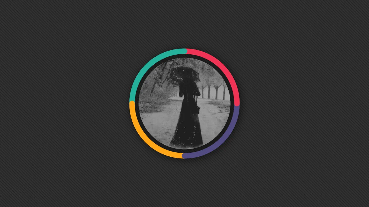
Avatar Border Effect
SCSS mixin that generates a multi‑colour ring around an image. Conical and radial gradients, positioned with trigonometric calculations, place colour spots along the circumference, creating a glowing 3D effect. Masks cut out the centre, leaving the ring around the picture.
See the Pen Avatar Border Effect.
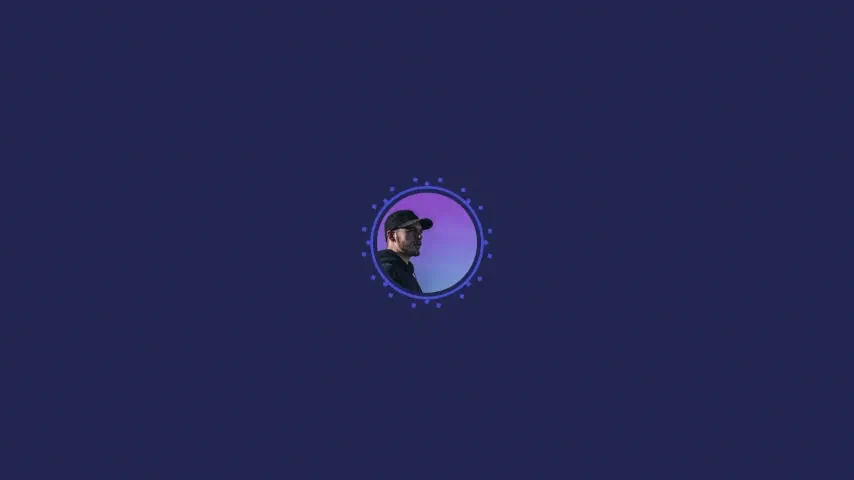
Profile Avatar Animation
Animated glow around an avatar created with multiple box-shadow layers. SCSS function createShadow generates points on a circle via trigonometry (cos, sin). Two layers of 8 and 16 shadows pulse, changing radius to simulate a spinning neon ring.
See the Pen Profile Avatar Animation.
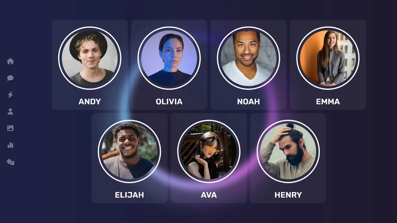
The Circle (Netflix) UI
Interface with an animated rotating conic gradient in the background and a grid of profile cards. Cards use a blur effect and smooth transparency change on hover. Side navigation with icons adapts to screen size.
See the Pen The Circle (Netflix) UI.
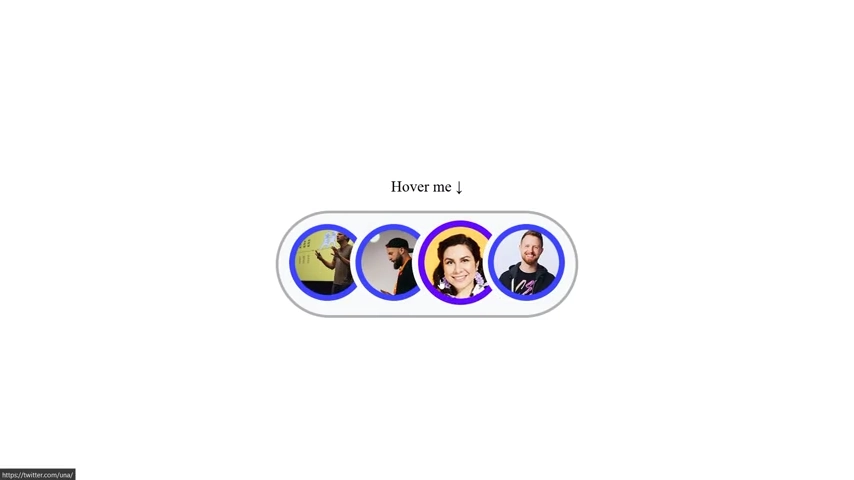
Animated CSS Grid
Overlapping avatar list that expands on hover. CSS custom properties and the :has() selector dynamically count items and control container width. Smooth transitions create interactivity, and the border changes colour on focus or hover.
See the Pen Animated CSS Grid.
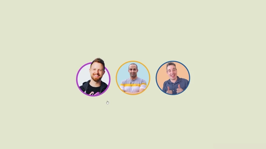
Pop-up Hover Effect
A single-element pop-out avatar effect coded directly on img tags. It harnesses advanced CSS math to recalculate outline-offset and mask structures on hover. A combined radial-gradient background and -webkit-mask let the subject break out of the circle boundary during scaling. Sleek, mathematical, and JS-free.
See the Pen Pop-up Hover Effect.
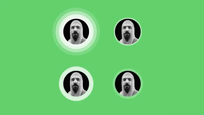
SVG Voice UI Animations
Four responsive SVG avatar widgets showcasing native SMIL animation techniques. Instead of CSS keyframes, inline <animate> and <animateTransform> tags drive the ripple, bloom, and pulsing states. It uses SVG <clipPath> for circular masking, positioned globally inside an orientation-aware CSS Grid.
See the Pen SVG Voice UI Animations.
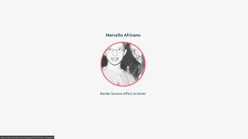
Bounce On Hover
A clean avatar hover effect that simulates a bouncing border. Instead of a standard border, it animates the spread radius of a box-shadow via a linear @keyframes sequence. Hovering triggers a rapid, elastic contraction and expansion of the shadow edge over .4s. Lightweight, semantic, and completely JS-free.
See the Pen Bounce On Hover.
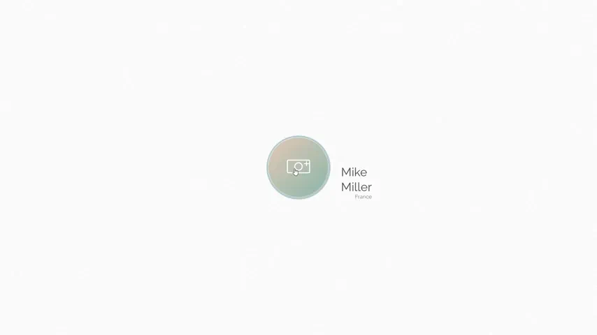
Change Avatar Image
An interactive avatar uploader featuring smart inline SVG animations. Hovering over the profile circle triggers a smooth reveal of the camera icon via stroke-dashoffset. Clicking injects an .open class using jQuery, scaling up a clean modal overlay for file selection while safely closing on outside clicks. Minimalist and functional.
See the Pen Change Avatar Image.
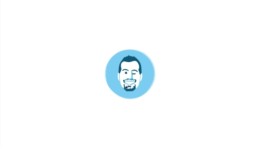
;-D (Tap or Hover)
An interactive vector portrait featuring a playful winking animation powered by GSAP (TweenMax). It utilizes the morphSVG plugin to smoothly transition the eye path from open to closed states, while concurrently rotating the backdrop circle. Triggers on hover or touch events. Flat, engaging, and highly performant.
See the Pen ;-D (Tap or Hover).
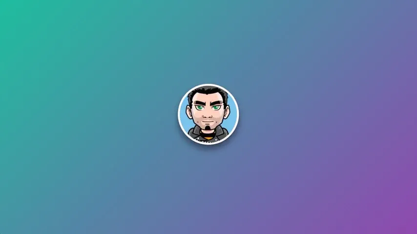
CSS Floating Animation
A smooth floating CSS avatar effect that couples vertical translation with dynamic shadow scaling. Using @keyframes float, the round profile card glides along the Y-axis over 6s while its box-shadow concurrently shifts blur and opacity to mimic realistic ground-distance depth. Clean, lightweight, and JS-free.
See the Pen CSS Floating Animation.
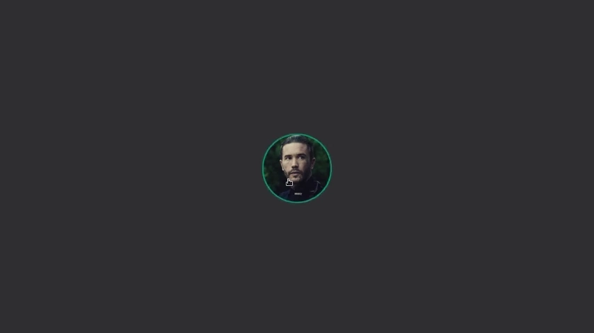
Pulse Avatar
An interactive avatar animation orchestrated by GSAP (TimelineLite). On load or click, the profile card undergoes a squash-and-stretch bounce effect. This triggers staggered, fading radial ripple waves on background .pulse layers. Includes logic checks to prevent click spamming during animation runtimes. Responsive and highly dynamic.
See the Pen Pulse Avatar.
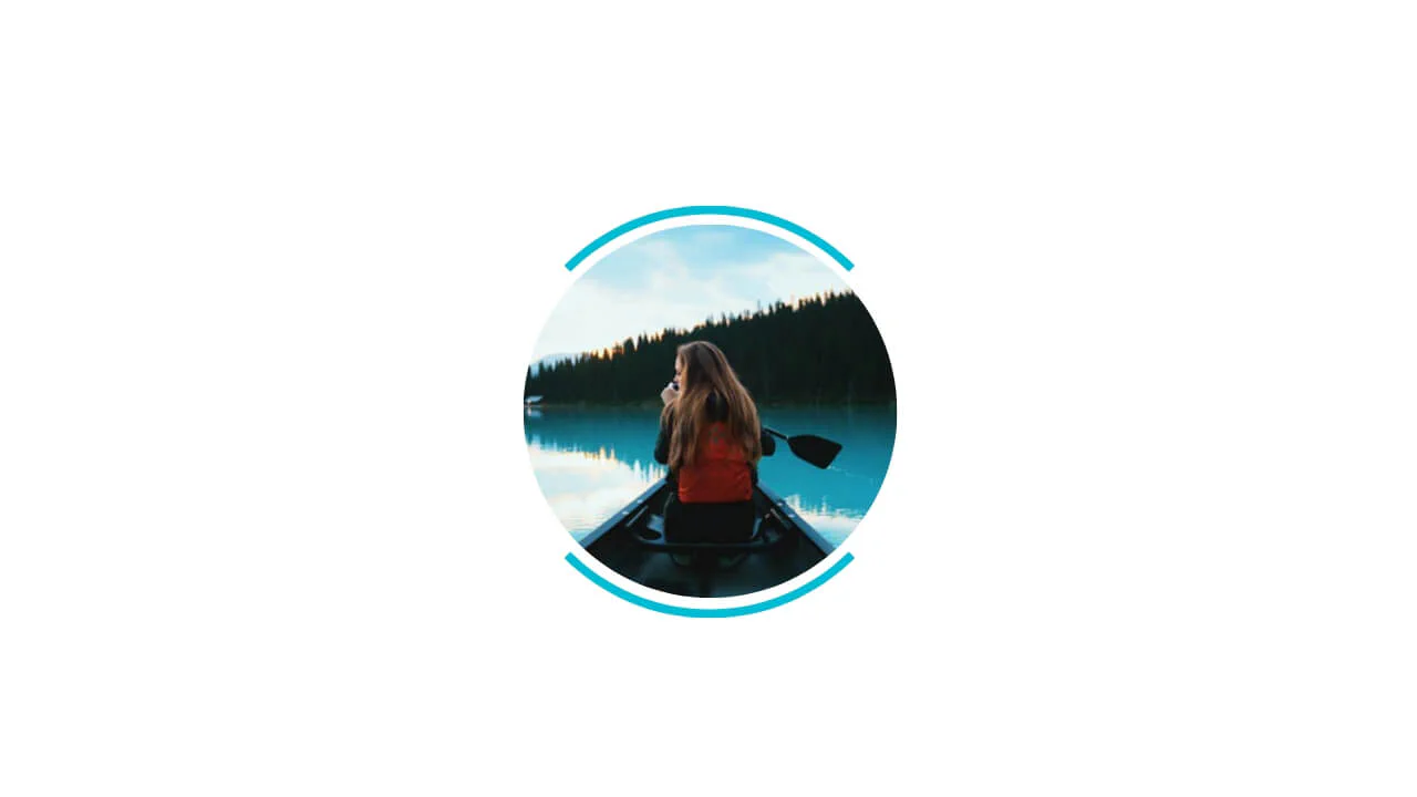
Avatar with Cut-Off Border
An elegant circular avatar cradled by opposing colored arcs. The split-border effect is achieved natively using ::before and ::after pseudoelements set with calc(100% + 10px) sizes. Setting transparent borders alongside a solid border-top renders clean partial arcs without extra HTML markup. Clean, lightweight, and JS-free.
See the Pen Avatar with Cut-Off Border.

Avatar with HTML and CSS
A cartoon portrait constructed entirely with HTML shapes and CSS. It creates a clean character illustration using layers of overlapping border-radius containers, border strokes, and rotation transforms. Pseudoelements handle detailed facial components like pupils, cheeks, and collar shading.
See the Pen Avatar with HTML and CSS.
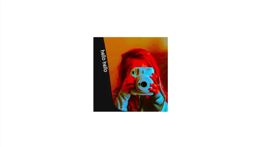
Avatar
An experimental SVG composition leveraging native SMIL animations to morph path vectors, slide a <textPath> label, and shift image saturation via <feColorMatrix>. It uses a <clipPath> mask alongside CSS keyframes to seamlessly morph the entire viewport outline from a circle into a full square. Lightweight and JS-free.
See the Pen Avatar.

Pure CSS Avatar
A vector flat-art portrait illustrated strictly via HTML and CSS. It builds detailed organic shapes — including sunglasses, a hat, and hair layers — using nested elements skewed with CSS transform properties. Variables structure the vibrant palette, while a circular parent masks the composited layers.
See the Pen Pure CSS Avatar.
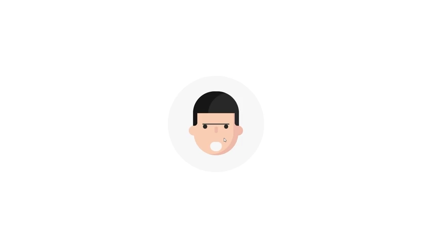
Qavatar
An interactive, procedurally animated flat avatar. It leverages Vanilla JS to continuously randomize mouth shapes, eyebrow heights, and gaze offsets. CSS @keyframes handle periodic eye blinks by rotating elements along the X-axis, while cubic-bezier transitions animate the zoom on hover. Quirky, lightweight, and responsive.
See the Pen Qavatar.
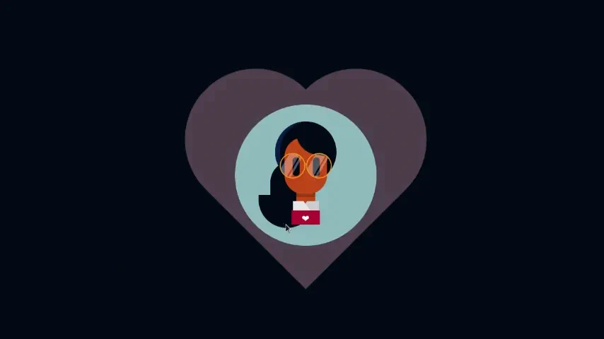
Self Portrait (Interactive)
An interactive vector portrait built with HTML shapes and CSS. Hovering over the round container morphs the background to pink and initiates an elastic heart-pulse animation. Periodic eye-blinking is achieved via custom CSS @keyframes that cycle vertically. Clean, lightweight, and completely JS-free.
See the Pen Self Portrait (Interactive).
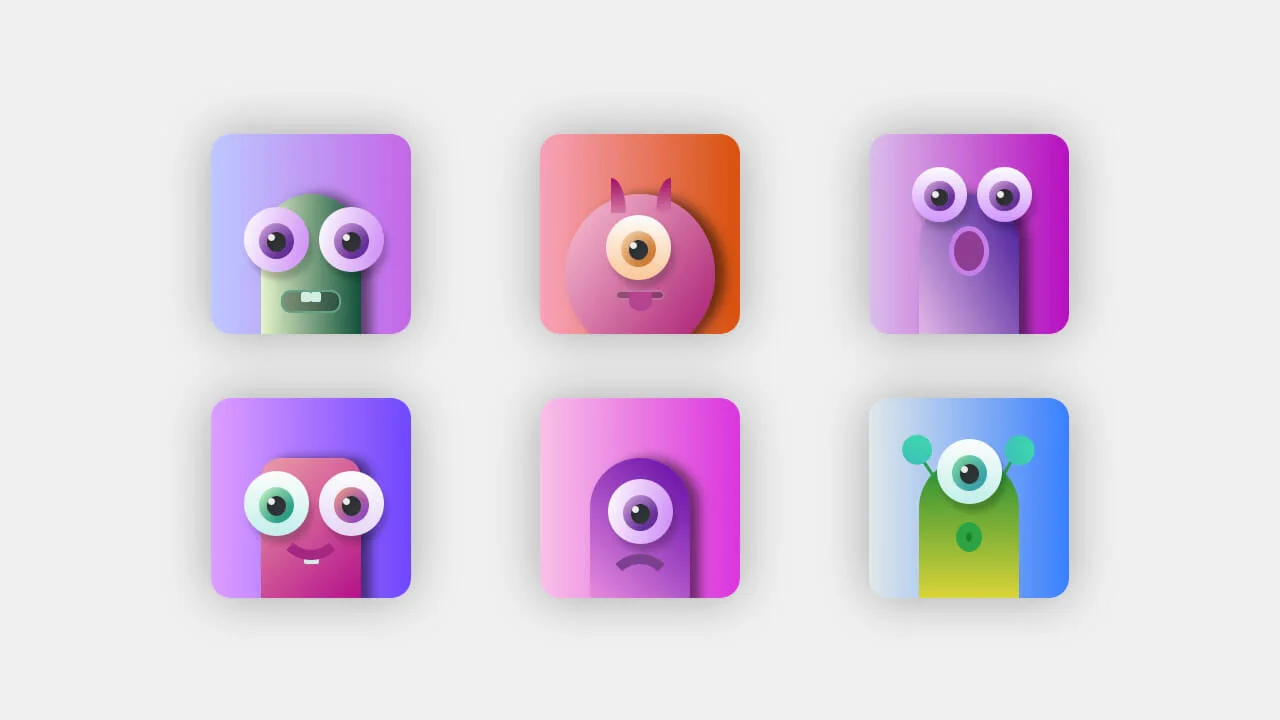
Pure CSS Avatars
A vibrant set of cartoon monster avatars crafted entirely with HTML and CSS. It creates a rich 3D feel using multi-layered linear gradients, inset shadows, and light reflections on the eyeballs. Monsters feature custom antennas, horns, tongues, and teeth aligned cleanly inside a responsive, flex-based card grid. Purely visual and JS-free.
See the Pen Pure CSS Avatars.
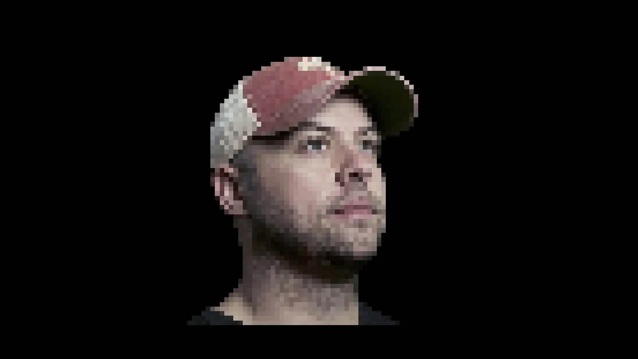
Pure CSS Responsive Chris Coyier Pixel Avatar
An intricate pixel-art portrait rendered with nearly 4,000 individual colored div elements. It is structured within a 63-column CSS Grid (repeat(63, 1fr)) where each block is mapped to a dedicated hex background color. It scales responsively using relative vmin dimensions. A pure HTML/CSS build with zero JS.
See the Pen Pure CSS Responsive Chris Coyier Pixel Avatar.