10+ CSS background-blend-mode Examples
Visual composition requires precise layering. The CSS background-blend-mode examples in this updated collection remove the friction of editing static images externally. Modern UI design demands dynamic texture and color adjustments directly in the browser natively. Utilizing these curated snippets guarantees a transparent, logic-driven approach where raw code dictates the visual output, eliminating redundant asset loading.
The architecture relies strictly on merging multiple background layers — combining gradients, URLs, and solid colors — using mathematical modes like multiply, screen, or overlay. The code utilizes hardware acceleration to handle pixel interpolation on the GPU, maintaining a locked 60fps performance during state changes. The HTML structure remains semantic and lightweight, ensuring absolute layout stability without triggering costly browser repaints or layout shifts.
Every free demo is fully responsive and cross-browser compatible. Users can instantly download the raw code or fork a specific composition on CodePen. These assets are strictly optimized for accessibility, delivering a fast, frictionless experience across all modern mobile and desktop devices.
Examples
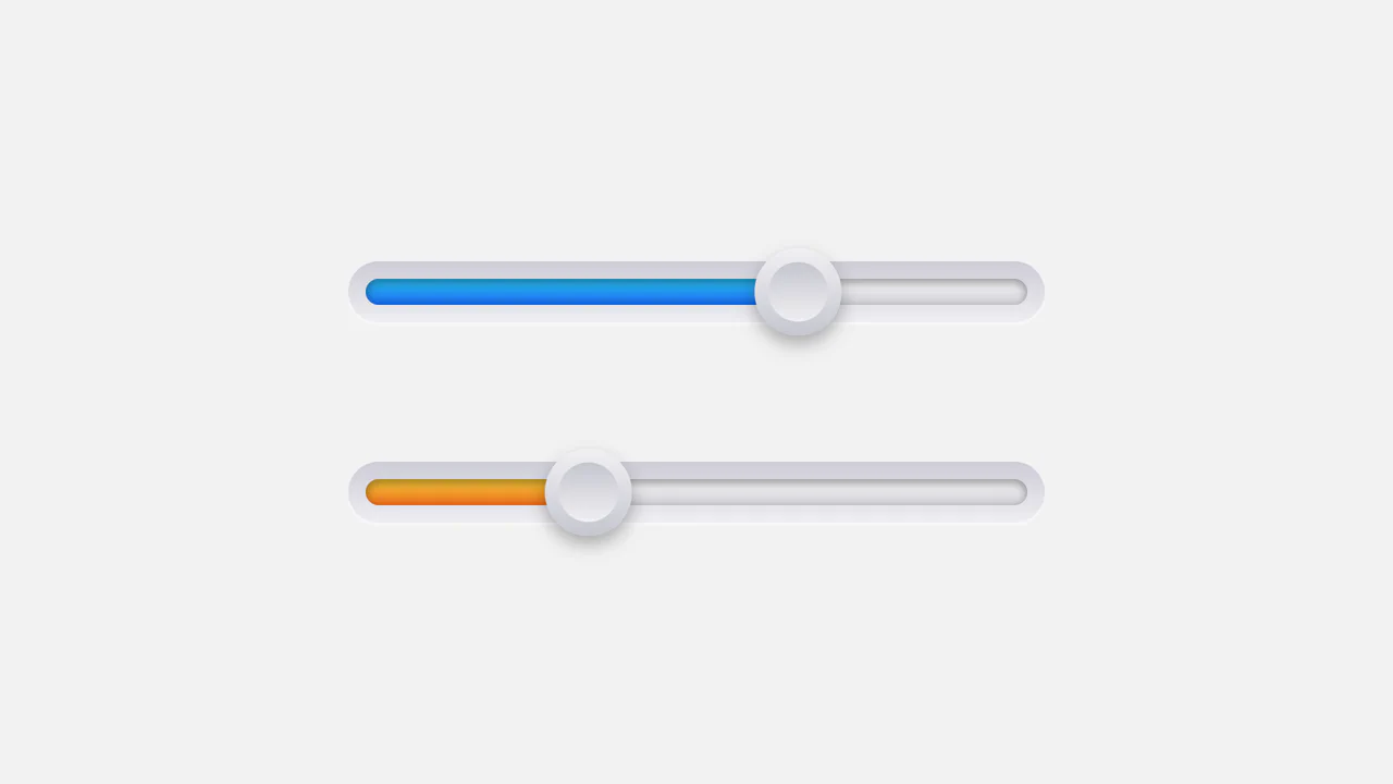
Tactile CSS Variable Range Slider
This clean interactive range selector combines standard native inputs with a beautifully modeled plastic interface. The lightweight JavaScript companion reads standard input updates and translates them into a parent-scoped --slider-value CSS custom property. A combination of CSS math calculations and overlay blend-modes handles the fluid thumb positioning and track highlight filling completely inside stylesheets.
 Chrome 49+
 Edge 15+
 Firefox 49+
 Safari 10+
See the Pen Tactile CSS Variable Range Slider.
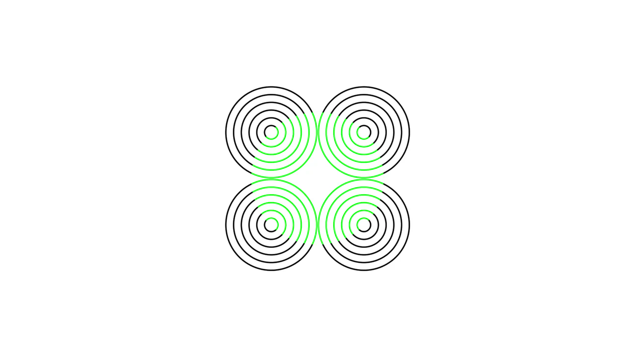
Neon Color Spreading CSS Optical Illusion
An elegant pure-CSS demonstration of the neon color spreading optical illusion. Operating with zero HTML markup, the stylesheet overlays concentric repeating radial ring quadrants and a central green circle, combining them via background-blend-mode: lighten. This causes the green pigment to visually bleed into the black gaps, tricking the brain into perceiving a glowing lime-colored sphere.
Chrome 35+
Edge 79+
Firefox 30+
Safari 8+
See the Pen Neon Color Spreading CSS Optical Illusion.
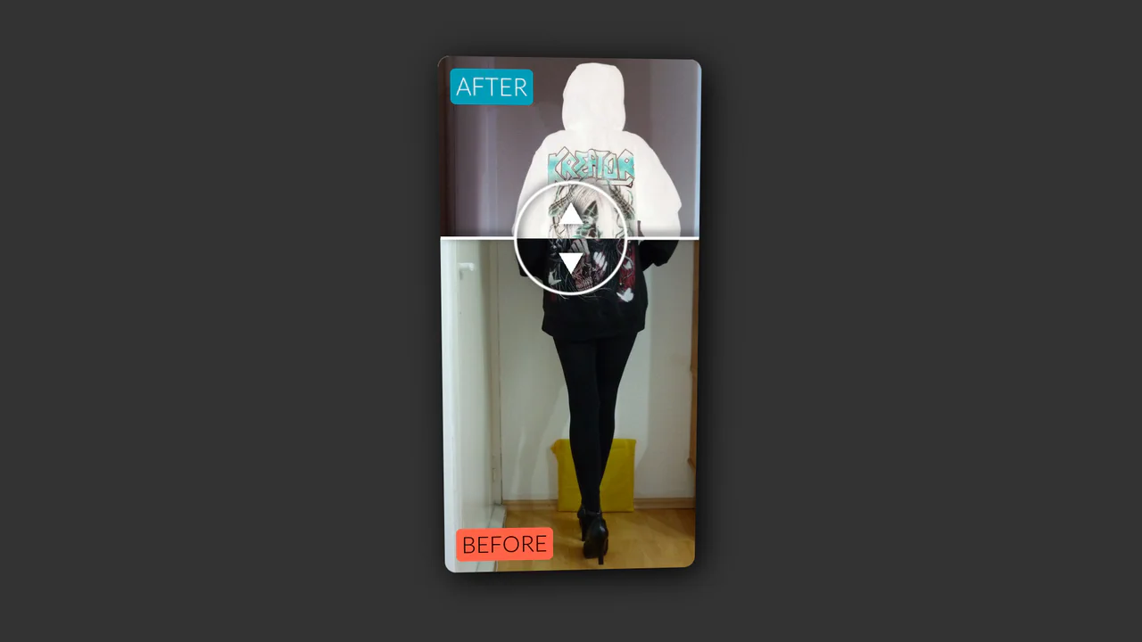
Vertical Original vs. Negative Card (Hover and Drag)
An interactive card that reveals a negative version of the image on hover, with a draggable slider to compare the two versions, utilizing CSS blend modes and 3D transforms.
See the Pen Vertical Original vs. Negative Card (Hover and Drag).

Turbulence Effect with Blend Modes
Live demo showcasing dynamic mix-blend-mode and background-blend-mode combinations. Interactive 3D tilt and SVG turbulence distortion trigger on hover.
See the Pen Turbulence Effect with Blend Modes.

Cursor Following Halftone Rings with CSS @property
A cursor effect creating dynamic halftone rings is implemented using CSS Custom Properties and transition properties for smooth mouse-following, requiring minimal JavaScript to update coordinates.
See the Pen Cursor Following Halftone Rings with CSS @property.

Interactive background-blend-mode visualization with dynamic color control. Cursor coordinates are mapped in real-time to HSL values, updating CSS styles for each image segment. Clicking triggers scaling, showcasing the impact of various blending algorithms across different color spaces.
Parallax effect implemented via background-attachment: fixed. Fixed background positioning creates an illusion of depth during page scrolling. A minimalist solution requiring no JavaScript to achieve visual dynamics.

Abstract generative visualization powered by SASS. A complex layered gradient composition is generated algorithmically through loops and color lists. background-blend-mode layering establishes depth and textural variance with zero overhead on the main DOM thread.
Interactive laboratory for exploring background-blend-mode properties. The system dynamically overlays CSS gradients (national flags) and external Unsplash images, using JavaScript to manipulate background properties in real-time. The interface allows control over opacity, color saturation, and blending algorithms, showcasing the capabilities of modern front-end styling.

Generative tartan pattern created by overlaying two intersecting repeating-linear-gradient declarations. The complex color weaving effect is achieved using background-blend-mode: multiply, allowing palette blending at gradient intersections without external graphical assets.
Interactive laboratory for background-blend-mode exploration. The application dynamically regenerates stylesheet rules for an input[type='range'] element, layering a linear gradient over a background image in real-time. The JavaScript logic ensures seamless updates to blending parameters and color values, transforming a standard range input into a fully functional graphical filter.

Using one or more newer CSS properties (background-blend-mode, mix-blend-mode, or filter) gives us a surprising amount of possibilities to manipulate a single source image.

Visual reference table for background-blend-mode properties. A grid of elements demonstrates how a linear gradient interacts with a raster image under various mathematical blending algorithms. A minimalist Flexbox-based interface provides a clear comparative view of these effects in a unified context.

Synthetic texture formed by overlaying two distinct gradients. The hard-light combination blends a fine diagonal pattern with a smooth vertical transition, generating a deep, structured background effect without external media assets.
Generative organoid pattern created via contrast and blur filter manipulation. An array of radial gradients generated by SASS loops transforms into “liquid” forms when subjected to contrast(9) and blur(5px). The blending of lighten and multiply modes provides smooth transitions and depth to the visual interplay without JavaScript overhead.
Gradient Hover Animated Ghost Button
The button animation uses SVG rect elements and CSS stroke-dasharray and stroke-dashoffset properties to create a sophisticated, drawing border effect that transitions smoothly on hover, highlighting the call-to-action.
See the Pen Gradient Hover Animated Ghost Button.