230+ CSS Background Patterns: Free Examples & Code Snippets
CSS background patterns replace heavy image files with infinitely scalable, pure-CSS textures built entirely from gradient functions. They allow developers to create complex geometric designs — stripes, checkerboards, polka dots, and woven textures — using only native browser rendering without external assets.
- These patterns stack multiple linear-gradient, radial-gradient, and conic-gradient functions within a single background-image property, controlling repetition through precise background-size and background-position values.
- Advanced techniques use repeating-linear-gradient for concise pattern units and CSS Custom Properties to expose color and scale knobs, enabling real-time theming without revisiting the gradient logic.
- Modern implementations leverage @property for animatable gradient variables and Houdini Paint API to offload computationally expensive pattern generation off the main thread entirely.
Browse this collection of CSS background patterns to master zero-image texture rendering and build visually rich interfaces that remain lightweight and themable.
Table of Contents:
Examples
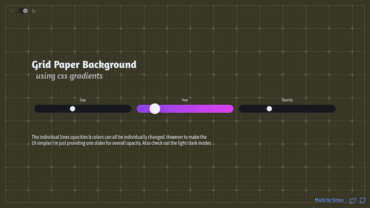
Procedural CSS Gradient Grid Background
An interactive graph notebook paper pattern drawn entirely via stacked, layered CSS gradients. By combining major and minor linear grid lines, radial cross masks, and corner border offsets, it forms a fully customizable procedural background. It utilizes CSS @property Houdini variables to smoothly transition gap sizing updates, alongside dynamic theme and color hue tuning.
 Chrome 110+
 Edge 110+
 Firefox 128+
 Safari 16.4+
See the Pen Procedural CSS Gradient Grid Background.
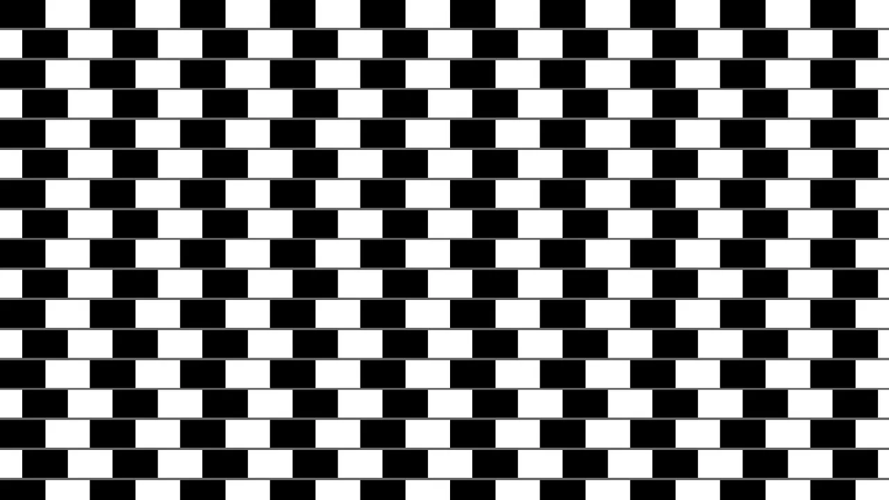
Pure CSS Café Wall Optical Illusion
An interactive pure-CSS representation of the classic Café Wall optical illusion. Built with zero HTML markup, the layout layers gray linear separators and offset black-and-white conic gradients to create a pattern where perfectly parallel lines appear tilted. Hovering over the page realigns the checkerboard columns to immediately debunk the cognitive illusion.
Chrome 69+
Edge 79+
Firefox 83+
Safari 12.1+
See the Pen Pure CSS Café Wall Optical Illusion.
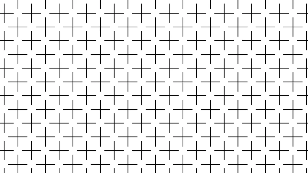
Pure CSS Ehrenstein Optical Illusion
An elegant pure-CSS implementation of the classic Ehrenstein optical illusion. Requiring zero HTML, the stylesheet utilizes offset conic-gradient() coordinates to render a repeating grid of vertical and horizontal lines. When looking at the resulting pattern, the human visual system automatically completes the missing intersections, perceiving non-existent bright white discs.
Chrome 69+
Edge 79+
Firefox 83+
Safari 12.1+See the Pen Pure CSS Ehrenstein Optical Illusion.

Retro Airmail Envelope Border
This is a Retro Airmail Envelope Border. It wraps a container with continuous diagonal red and blue stripes. Its function is to provide a nostalgic, thematic framing for content without relying on external raster image assets.
Chrome 108+
Edge 108+
Firefox 101+
Safari 15.4+
See the Pen Retro Airmail Envelope Border.
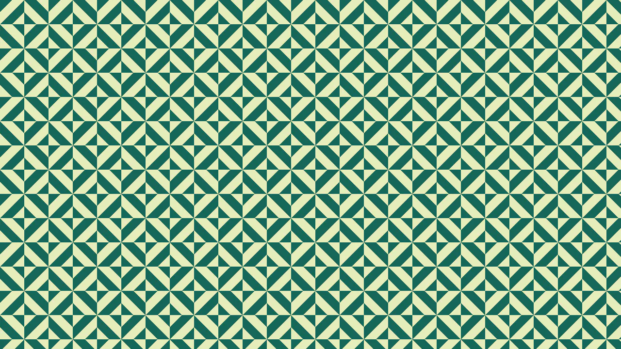
Optical Illusion CSS Background Pattern
This is an Optical Illusion CSS Background Pattern. It generates a complex, interlocking geometric tessellation using only mathematical gradient overlays. Its function is to provide a visually striking, lightweight background texture without requiring external image assets.
Chrome 69+
Edge 79+
Firefox 83+
Safari 12.1+See the Pen Optical Illusion CSS Background Pattern.

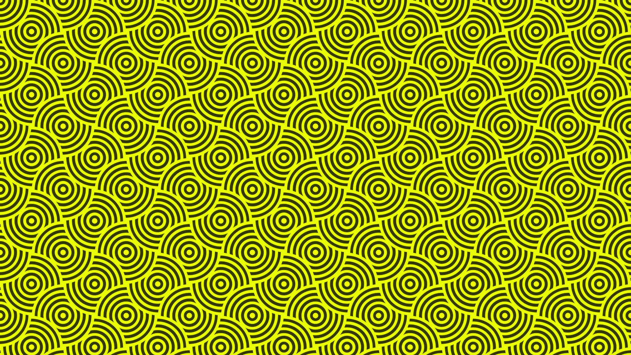
Pulsing Circle Optical Illusion
This is a Pulsing Circle Optical Illusion. It generates a static, high-contrast geometric pattern that exploits peripheral vision to create a false sense of motion. Its function is to serve as a lightweight, visually arresting background or artistic centerpiece using only a handful of CSS properties and zero JavaScript.
Chrome 69+
Edge 79+
Firefox 83+
Safari 12.1+See the Pen Pulsing Circle Optical Illusion.

Stepping Feet Optical Illusion
This is the Stepping Feet Optical Illusion. It demonstrates how high-contrast patterns interfere with human motion perception. Two colored blocks move at identical, constant speeds, yet appear to stagger and “step” like feet. A hover interaction removes the background grid to expose the mathematical reality of their parallel movement.
Chrome 105+
Edge 105+
Firefox 121+
Safari 16.4+See the Pen Stepping Feet Optical Illusion.

Cinematic Parallax Reactive Navigation Menu
This is a Cinematic Parallax Reactive Navigation Menu. It synchronizes large-scale typographical navigation with multi-layered background shifts. Its function is to transform a standard menu into a high-end atmospheric gateway for editorial or premium portfolio websites, using user interaction to drive the visual narrative.
Chrome 80+
Edge 80+
Firefox 75+
Safari 13.1+
See the Pen Cinematic Parallax Reactive Navigation Menu.
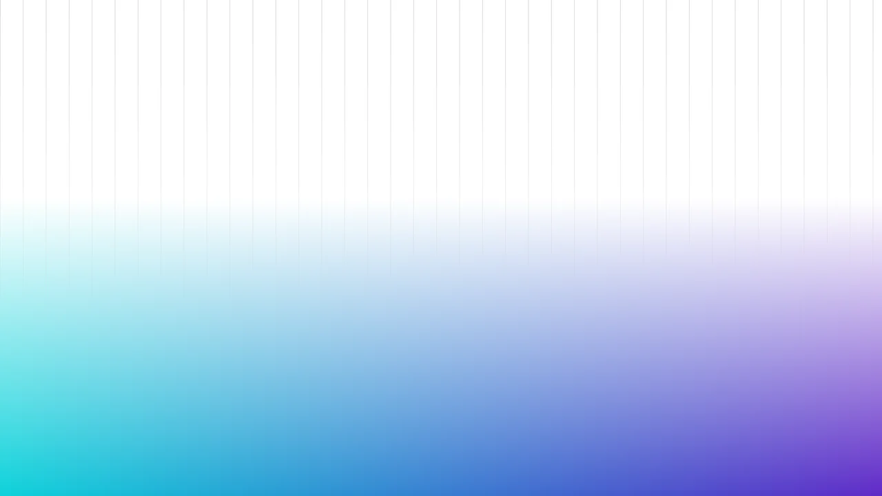
Fading Grid Gradient Background
This Fading Grid Gradient Background creates a clean, architectural aesthetic suitable for SaaS landing pages or documentation sites. It features a technical vertical grid pattern that gently dissolves into a vibrant teal-and-purple gradient at the bottom. The effect mimics a “horizon” line, adding depth and structure to an otherwise flat page without using any images.
Chrome 80+
Edge 80+
Firefox 53+
Safari 15.4+
See the Pen Fading Grid Gradient Background.

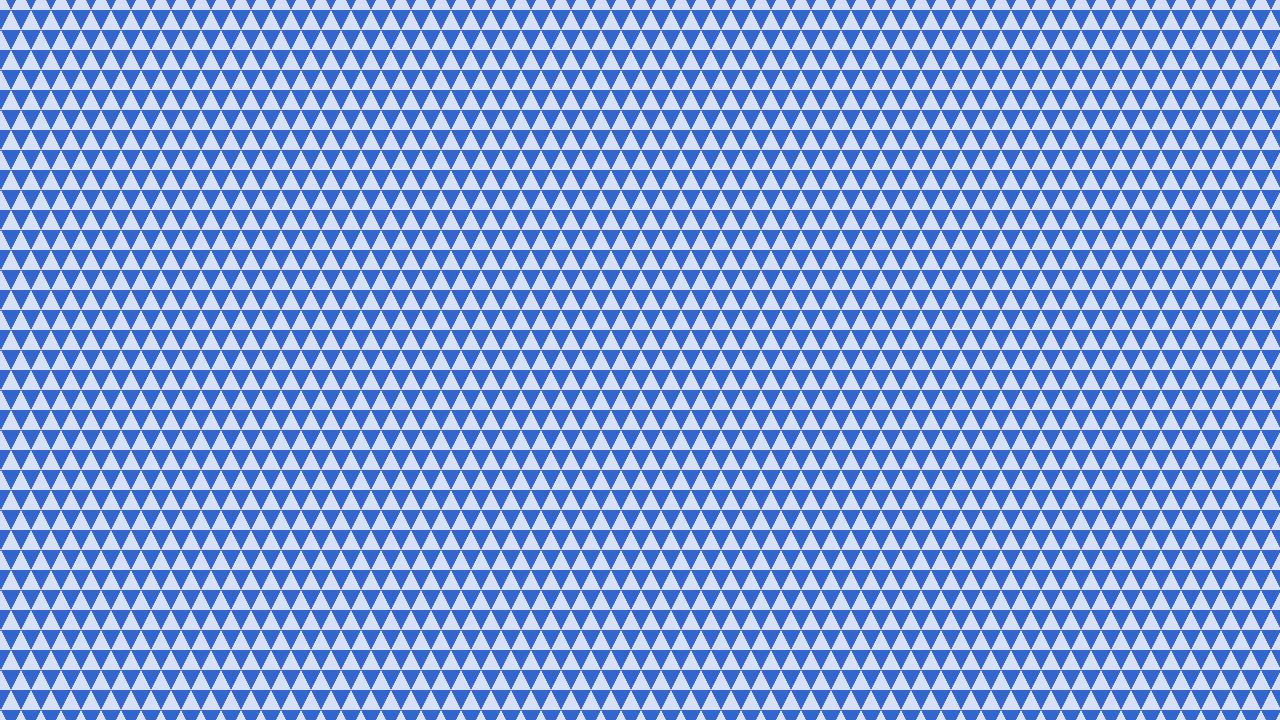
CSS-Only Pattern: Circles
An elegant, geometrically complex background in blue tones that looks like a vector illustration but weighs only a few bytes and scales easily.
See the Pen CSS-Only Pattern: Circles.

CSS-Only Pattern: Squares in Squares
A tartan plaid pattern generated entirely with CSS.
See the Pen CSS-Only Pattern: Squares in Squares.
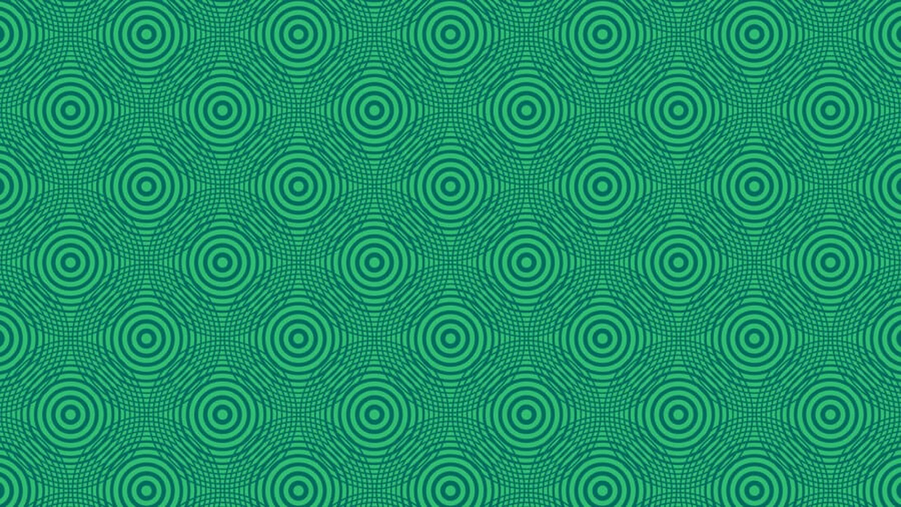
Scalable CSS Radial Gradient Pattern
A pure CSS pattern created by overlaying five radial-gradient declarations on a single element. The main feature is that all ring sizes and their count depend on a couple of CSS variables, making the pattern fully scalable using calc().
See the Pen Scalable CSS Radial Gradient Pattern.
Intersecting Diagonals Pattern
A pattern generated with just one background property, showcasing advanced use of CSS gradients and background-size to create a complex, repeating texture, with flexible customization via custom CSS properties.
See the Pen Intersecting Diagonals Pattern.
CSS-Only Pattern - Waves
A lightweight and effective demo showcasing a complex background pattern created entirely with pure CSS gradients. The result is a dynamic, scalable background without the need for any image files or JavaScript.
See the Pen CSS-Only Pattern - Waves.
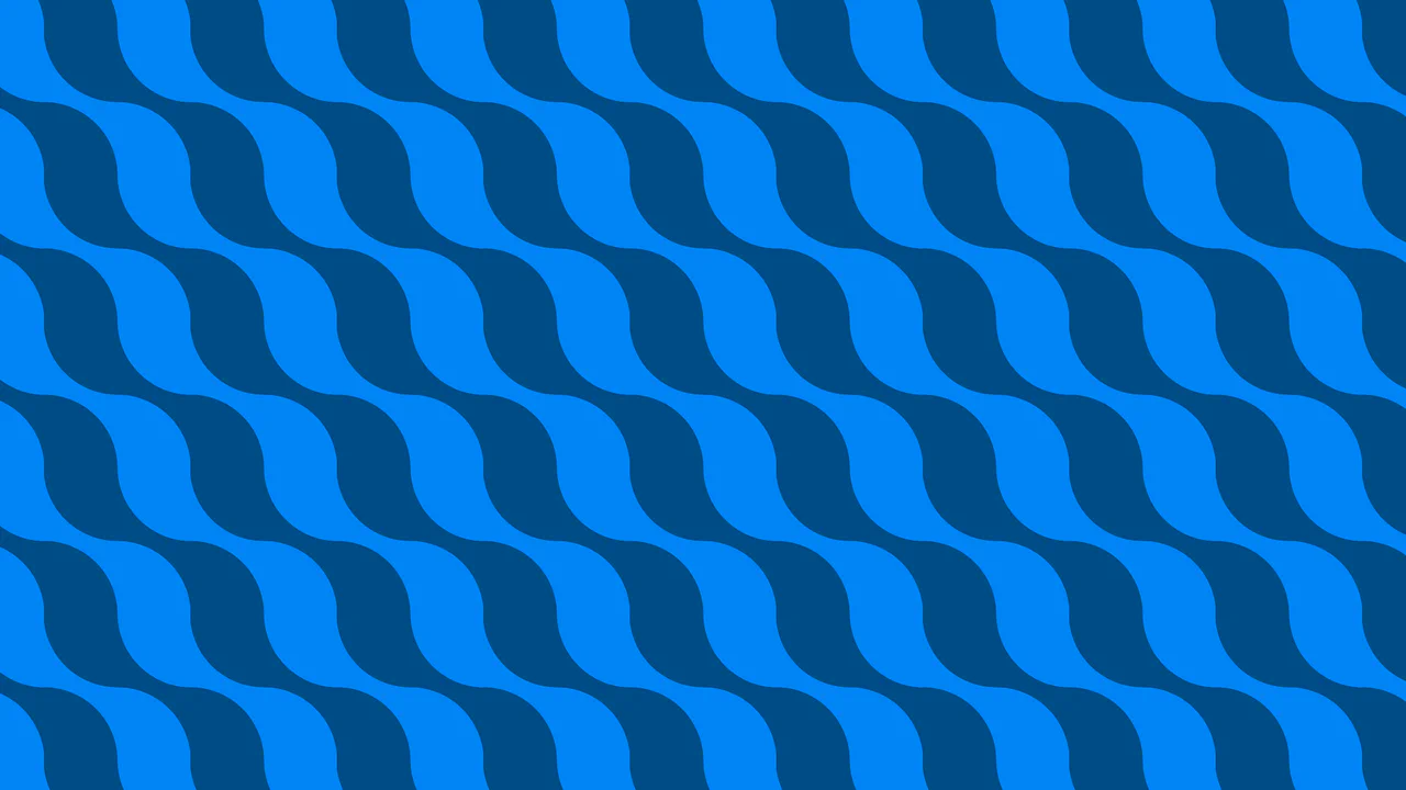
Squiggle Waves Tessellated Pattern – Pure CSS
A complex geometric CSS pattern constructed from multiple layers of conic-gradient and radial-gradient. This seamless background offers a scalable, vector-quality tessellation design that is fully controllable via CSS variables for easy customization.
See the Pen Squiggle Waves Tessellated Pattern – Pure CSS.
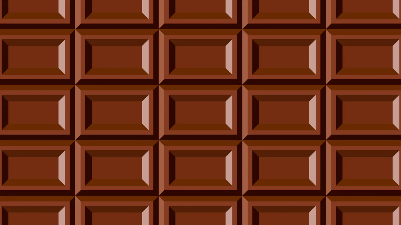
3D Chocolate Bar Tessellated Pattern – No Div – Pure CSS
A sophisticated geometric CSS background created with layered conic gradients and custom properties for seamless styling. This performant pattern is fully scalable and provides a lightweight, code-based alternative to images for modern UI/UX design.

Chocolate Wafer CSS Background
A sophisticated striped background pattern built with pure CSS using the linear-gradient hard-stop technique. This lightweight snippet offers a high-performance, responsive UI solution that mimics complex textures without the need for external image assets.
See the Pen Chocolate Wafer CSS Background.
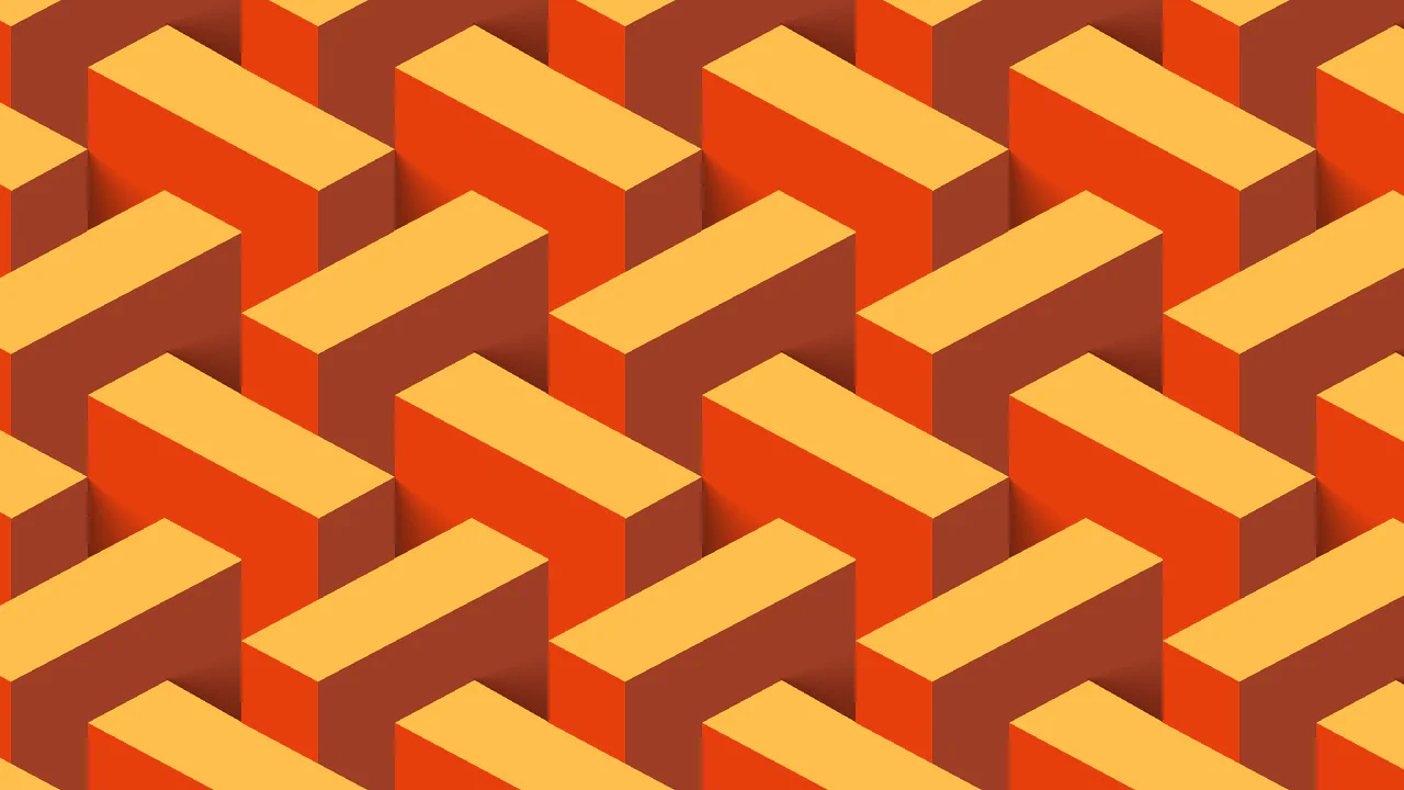
Abstract CSS Pattern
A sophisticated geometric CSS pattern built with layered repeating-conic-gradient to create a complex, seamless background texture. This performant snippet leverages CSS variables for easy customization of scale and color hue, offering a modern and lightweight UI/UX solution.
See the Pen Abstract CSS Pattern.
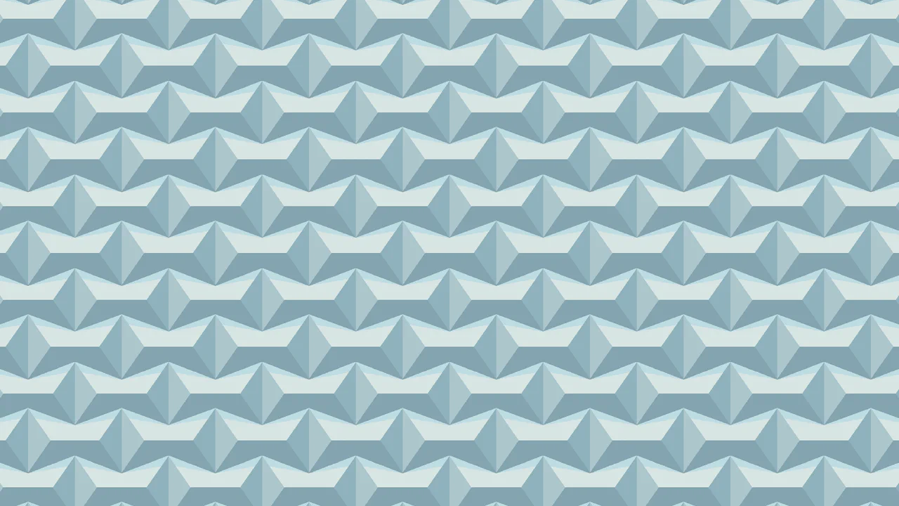
3D Shadowed Diamonds Tessellated Pattern – Pure CSS, No Divs
A sophisticated geometric CSS pattern crafted with layered conic gradients and precise hard-stops. This snippet leverages CSS custom properties for effortless scaling and theme customization, providing a high-performance, lightweight background solution with a zero-asset footprint.
The Half-Rombes Pattern
The use of the atan() function in SCSS to calculate the angles for a conic-gradient, which allows for the creation of a complex geometric pattern. The entire page background is set with a single background property, demonstrating the power and conciseness of modern CSS.
See the Pen The Half-Rombes Pattern.
Pure CSS Concentric Rings Tessellated Pattern
An intricate pure CSS circular pattern built with multi-layered radial gradients and hard-stops defined via custom properties. This technique delivers a seamless, image-free vector texture, ensuring high rendering performance and easy customization for modern web design.
See the Pen Pure CSS Concentric Rings Tessellated Pattern.
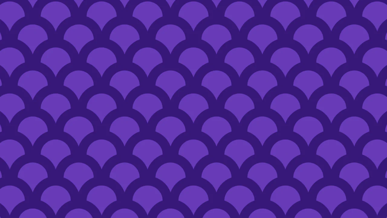
Pure CSS Purple Scales Tessellated Pattern
A scalable geometric CSS pattern created with layered radial gradients and custom properties for dynamic control over size and color. This lightweight, image-free solution provides a high-performance background ideal for modern and responsive UI/UX design.
See the Pen Pure CSS Purple Scales Tessellated Pattern.
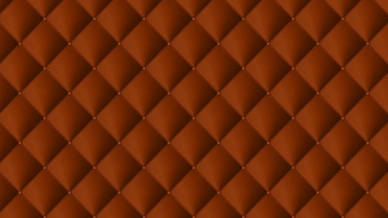
Pure CSS Leather Sofa Tessellated Pattern
A complex geometric CSS pattern built with layered conic, radial, and linear gradients for a sophisticated tiling effect. This performant snippet leverages CSS variables and the calc() function, providing a lightweight, fully customizable solution for modern and scalable UI design.
See the Pen Pure CSS Leather Sofa Tessellated Pattern.
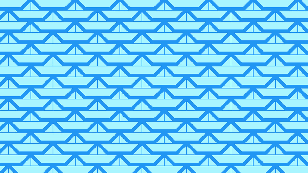
Pure CSS Paper Boat Tessellated Pattern
An intricate geometric pattern built with layered conic gradients and modern CSS custom properties. This snippet showcases a seamless tiling technique that provides a scalable, vector-quality background, ensuring high frontend performance and easy customization.
See the Pen Pure CSS Paper Boat Tessellated Pattern.
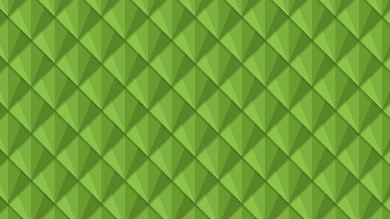
Pure CSS Reptile Scales Tessellated Pattern
A complex geometric CSS pattern built with layered conic, radial, and linear gradients for a sophisticated tiling effect. This performant snippet leverages CSS variables and the calc() function, providing a lightweight, fully customizable solution for modern and scalable UI design.
See the Pen Pure CSS Reptile Scales Tessellated Pattern.
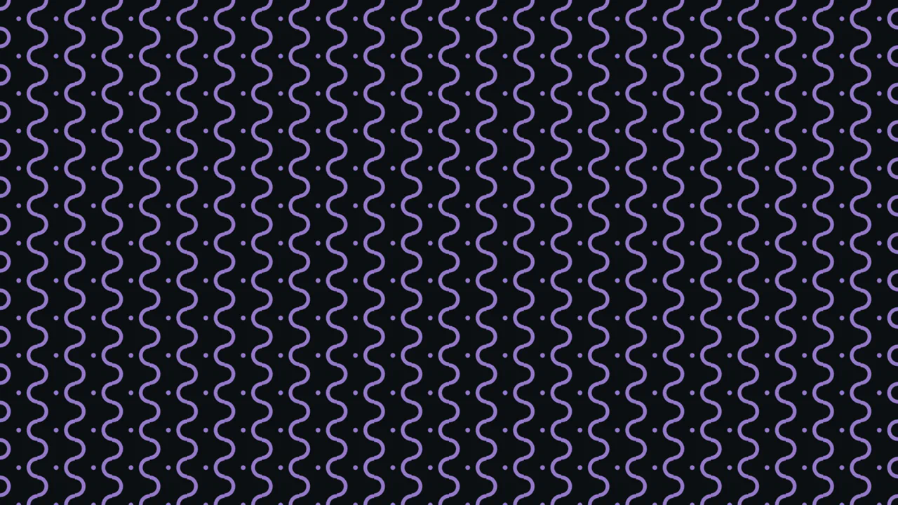
CSS Only Intersecting Wavy Pattern
A high-performance radial gradient CSS pattern that creates complex concentric visual effects with minimal code. This lightweight, image-free background is fully customizable via CSS variables, making it perfect for modern and scalable web projects.
See the Pen CSS Only Intersecting Wavy Pattern.
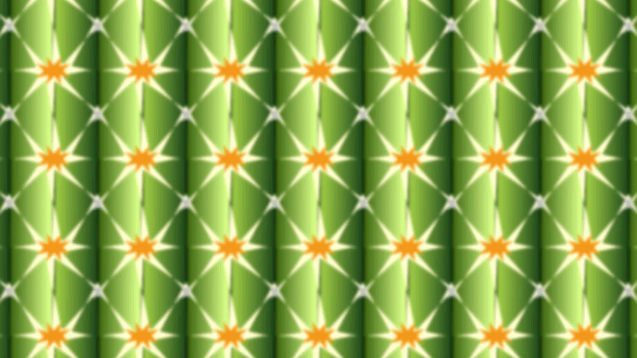
Pure CSS Cactus Texture Tessellated Pattern
Twenty-plus stacked repeating-conic-gradient layers on a single background property, plus a linear-gradient base — all tiling at 100px × 100px. Gradients are clipped to narrow angle arcs (2deg–31deg), creating leaf-like shapes that repeat across the viewport. A subtle blur and contrast filter ties the layers together into a tessellated cactus landscape texture. Zero elements, zero JS.
See the Pen Pure CSS Cactus Texture Tessellated Pattern.
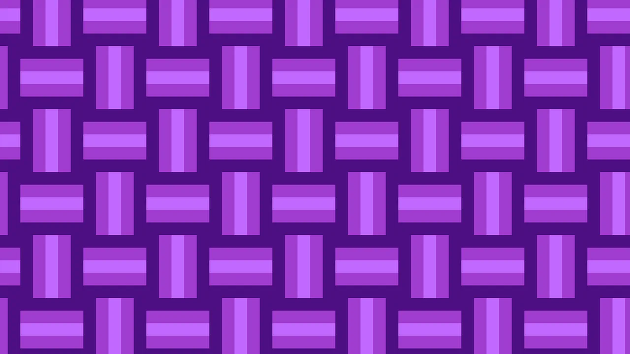
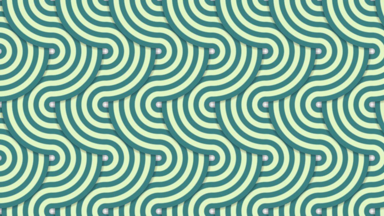
Pure CSS Weave Quilt Tessellated Pattern
A woven quilt texture built from conic gradients positioned at incremental vertical offsets (50% through 90%), creating diamond-shaped weave intersections. Three purple tones cycle through a repeating-linear-gradient base. “Hide” layers mask the top and bottom halves so only the interlocking center section is visible. Zero elements, pure background math.
See the Pen Pure CSS Weave Quilt Tessellated Pattern.
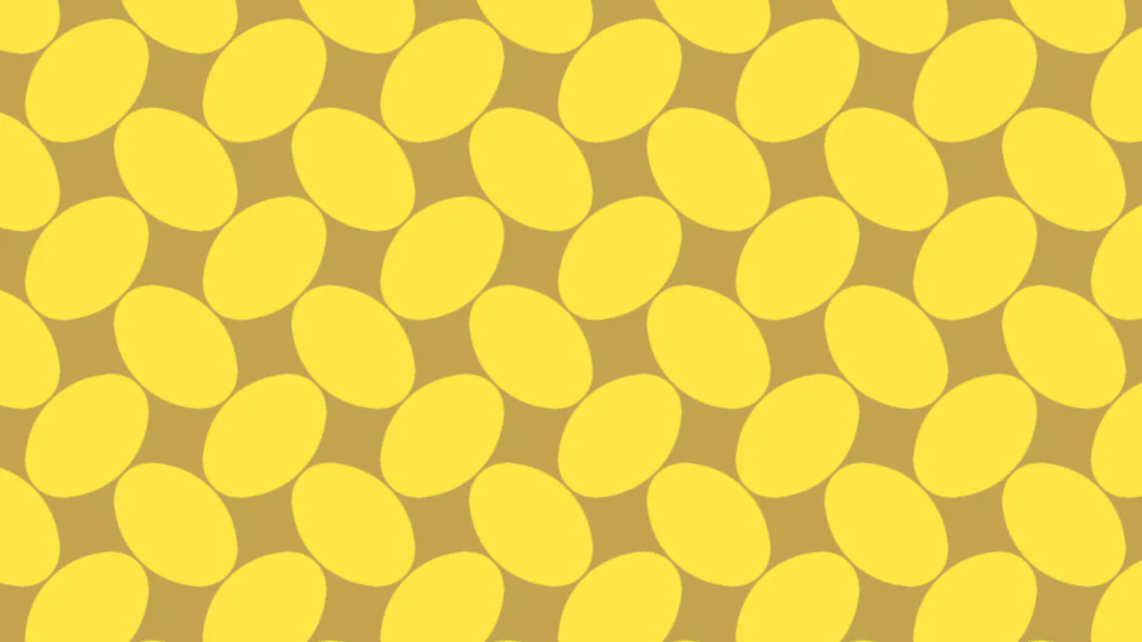
CSS-only Oval Pattern
A tileable pattern of nested oval shapes built from conic gradients at precise positions — 25%, 50%, and 75% — creating interlocking blue and orange curved forms. Thin grid lines separate each 160×80px tile. A horizontal linear gradient splits the base into blue top, orange bottom. Zero HTML elements, pure background composition.
See the Pen CSS-only Oval Pattern.

Pure CSS 3D Wavy Rect Lines Tessellated Pattern
Conic gradients positioned at 25%, 50%, and 75% of each 160×80px tile create nested rectangular arcs in alternating blue and orange. A horizontal linear grid overlay adds 1px separator lines. The base blue-to-orange gradient fills the background. The result looks like a 3D wavy rectilinear pattern — zero HTML, pure background layering.
See the Pen Pure CSS 3D Wavy Rect Lines Tessellated Pattern.