230+ CSS Background Patterns: Free Examples & Code Snippets (Page 2)
Examples
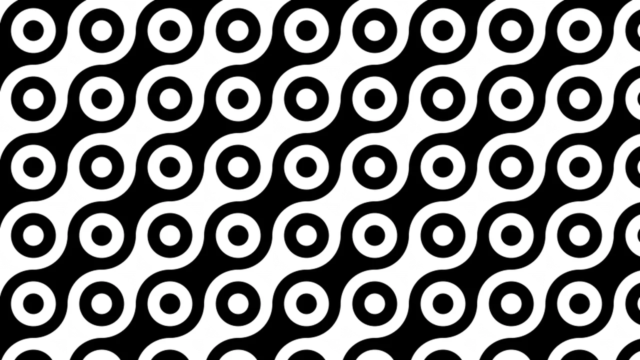
Pure CSS Pattern
Three gradients stacked on <html>: a repeating-conic checkerboard (12em), a diagonal linear gradient (6em), and a radial gradient of concentric rings with a grey stroke (6em). Combined via difference and overlay blend modes, they produce a connector-like grid of interlocking circles. Ana Tudor’s signature minimal-gradient approach.
See the Pen Pure CSS Pattern.
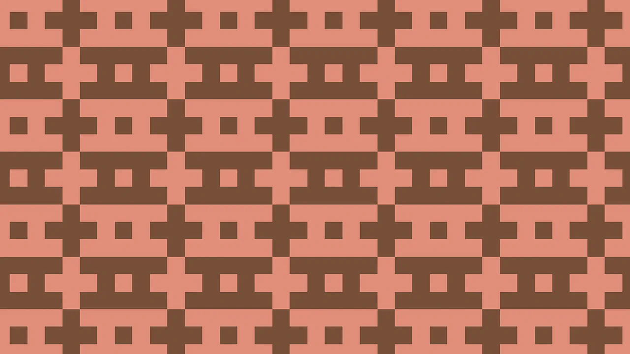
A Strange CSS Only Pattern
Two conic gradients, same color stops (peach, brown, transparent), different angles and sizes. A base 50px tile with from 180deg sits under a 150px repeating layer with from 90deg. The mismatch between the two grids creates an unexpected moiré-like geometric pattern. Temani Afif’s signature — minimal code, surprising output.
See the Pen A Strange CSS Only Pattern.
They Are Looking at You!
A 100px tile of three radial gradients. Two opposing corner gradients — top-right and bottom-left — use alternating red and dark-red bands to form curved pupil-like shapes. A small centered circle completes each “eye”. The result is a grid of staring faces. Temani Afif at his most playful.
See the Pen They Are Looking at You!.
CSS Only Circular Pattern
A 100px tile of radial-gradient circles — transparent center, brown ring, green-yellow outer — laid over a 200px diagonal repeating-linear-grid in the same colors. The rings sit at each tile corner, creating a polka-dot grid with a woven diagonal backdrop. Two layers, two gradients.
See the Pen CSS Only Circular Pattern.
Folded Zig Zag Pattern
Four conic gradients at from -30deg, each with a 240deg arc of a different color — white, green, transparent, dark blue — tiling at 126×84px. A semi-transparent black linear gradient overlays the bottom half, adding a folded shadow effect. The alternating diagonal segments create a continuous zigzag ribbon. Four layers, one tile.
See the Pen Folded Zig Zag Pattern.
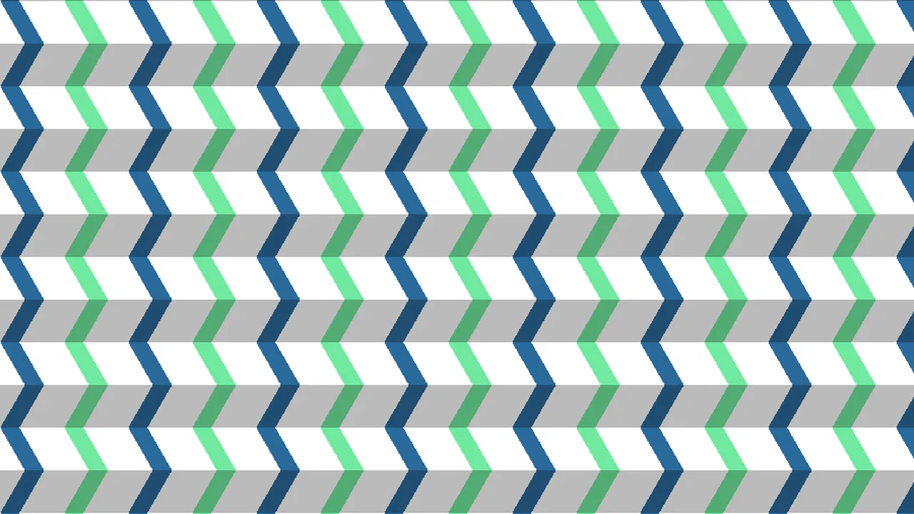
A Zig Zag 3D CSS-Only Pattern
Five conic gradients with precise fractional positions (250%/3, 50%/3, 200%/3, etc.) create a repeating 3D zigzag tile in black, grey, and white. The pattern uses tan(30deg) for hexagonal geometry calculations, with a @supports fallback for older browsers. Multiple staggered copies of each gradient layer produce an isometric folded ribbon effect.
See the Pen A Zig Zag 3D CSS-Only Pattern.
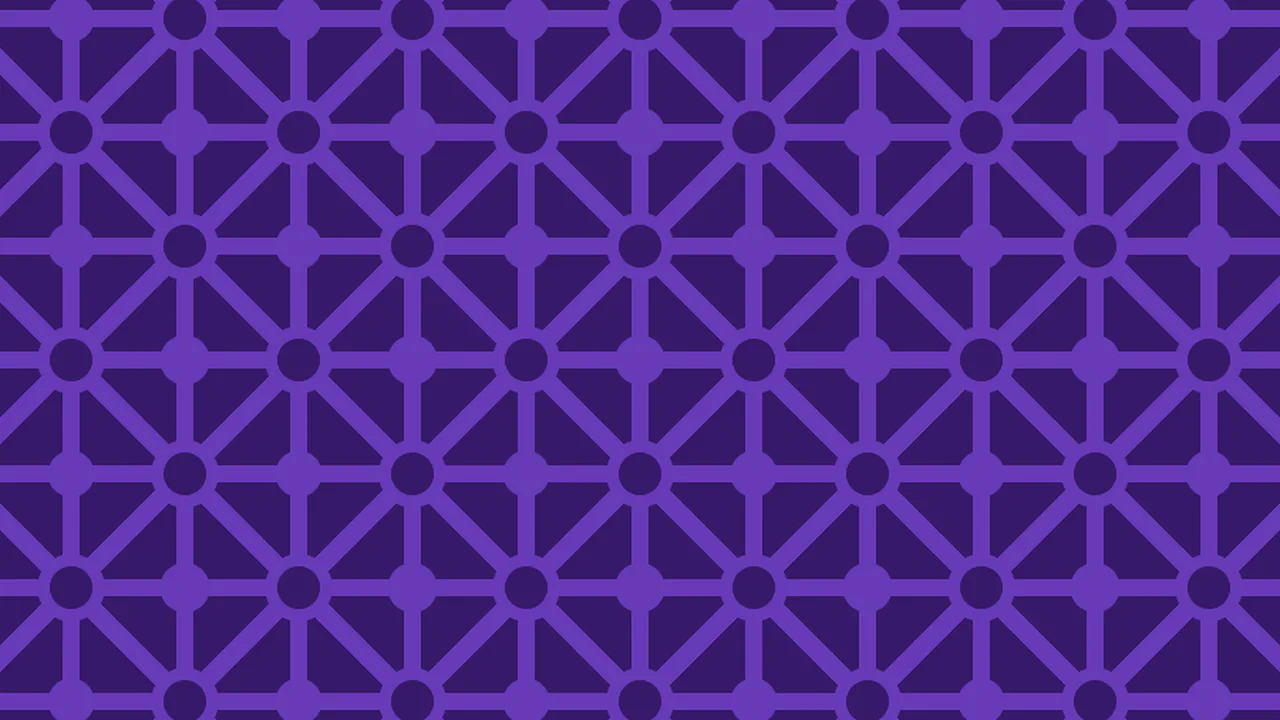
Pure CSS Circles & Lines Tessellated Pattern
Twenty-two radial and linear gradient layers on a 160×160px tile in two purples. Corner and edge circles at varying sizes (7%, 8%, 13%) form a dotted border. Diagonal crosses, a center circle, and 4%-thick horizontal/vertical lines weave into a concentric geometric ornament. Zero HTML, pure background stacking.
See the Pen Pure CSS Circles & Lines Tessellated Pattern.
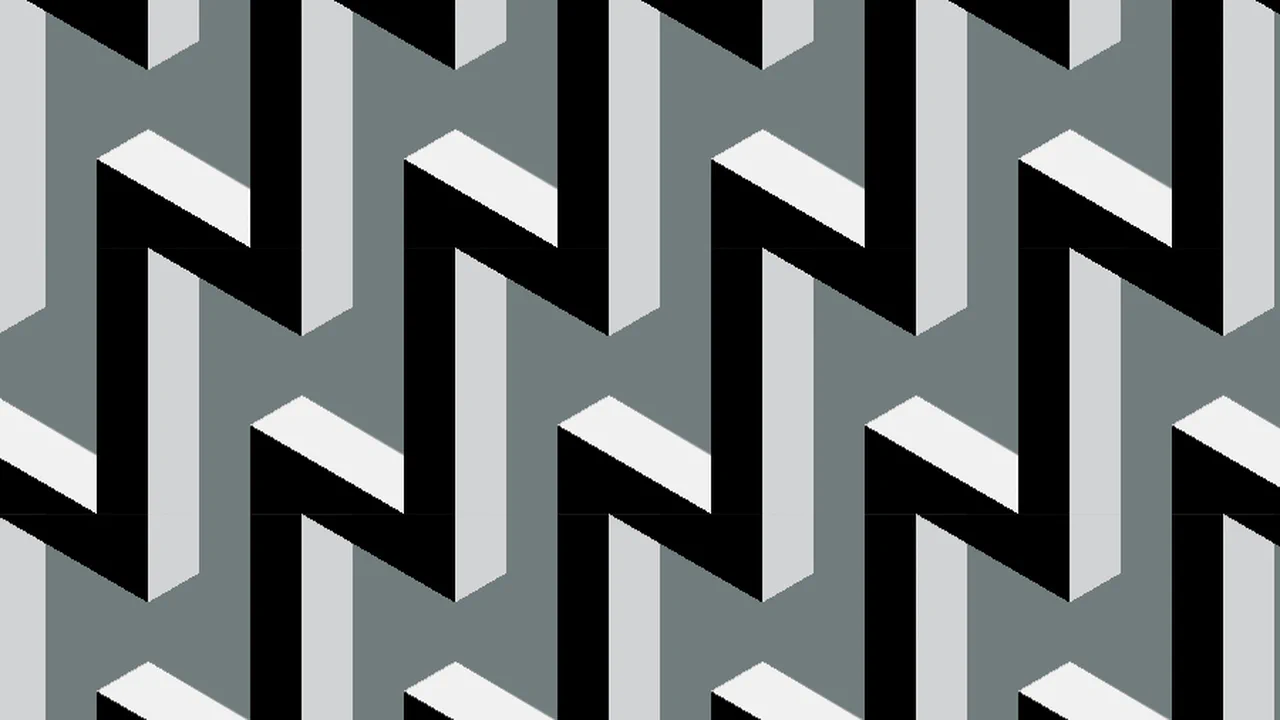
Pure CSS 3D Extruded Tetris T Pieces Tessellated Pattern
Four conic gradients at precise fractional positions (66.66%, 33.33%, 83.335%, 16.665%) tile at 105×122px to form isometric Tetris T-shapes in four greens. Each gradient covers specific 60-120° arcs, creating the 3D extruded faces — top, sides, and shadow. A single tiled background, zero HTML, pure geometric conic layering.
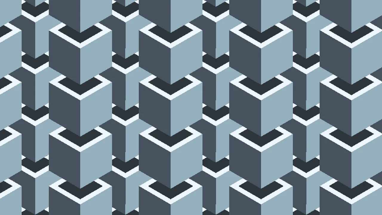
Pure CSS 3D Floating Cubes Tessellated Pattern
Eighteen conic gradients tile at 188×108px to render isometric floating cubes in four grey-blue tones. Each cube face is a separate conic layer at a specific 60-120° arc — top, front, side, and shadow planes. Gradients are duplicated to prevent edge bleeding at tile boundaries. Pure CSS, zero HTML, meticulous fractional positioning.
See the Pen Pure CSS 3D Floating Cubes Tessellated Pattern.
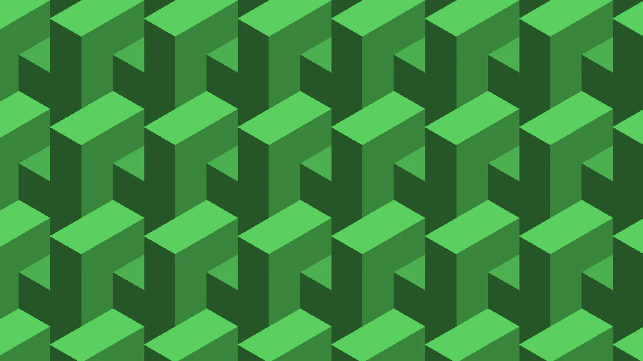
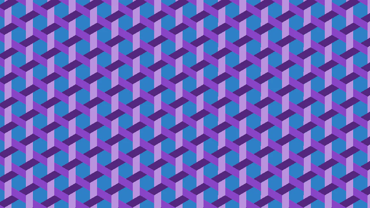
Pure CSS 3D Interspersed Cuboids Tessellated Pattern
Six conic gradients tile at 70×246px to form isometric 3D cuboids in three greens. The same set of gradients is duplicated — one copy offset by half the tile dimensions, creating an interspersed staggered layout. Each cuboid face uses specific 35-180° arcs for top, sides, and depth. Pure CSS, dual background trick, no HTML.
See the Pen Pure CSS 3D Interspersed Cuboids Tessellated Pattern.
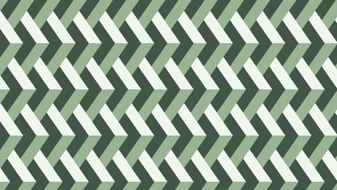
Blue and Purple Knitting
A knitted chevron textile pattern built from four conic gradients and two repeating-linear gradients. Conic layers at fractional positions (100%/6, 500%/6) form interlocking purple V-shapes. Diagonal linear stripes — purple and blue — create the woven background. The 0.866 multiplier in tile dimensions comes from sin(60°), hinting at an underlying hexagonal grid. Zero HTML, six backgrounds.
See the Pen Blue and Purple Knitting.
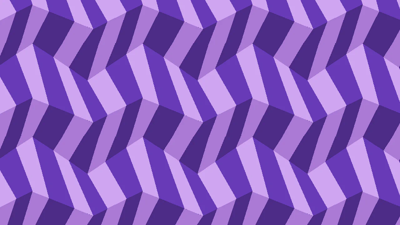
Pure CSS 3D ZigZagged ZigZag Tessellated Pattern
Eleven conic gradients tile at 198×168px to build a 3D zigzag landscape in purple and violet tones. Gradients are placed at decreasing left-edge positions (100% → 15%) with precise arc angles (84–217°), forming overlapping folded planes. The result simulates staggered geometric terrain with depth — no HTML, pure conic layering.
See the Pen Pure CSS 3D ZigZagged ZigZag Tessellated Pattern.

Pure CSS Police Line Tessellated Pattern
A yellow-and-black hazard barricade pattern on a 105×210px tile. Four conic gradients create the interlocking jagged stripes — two yellow, one amber, one black — while a diagonal linear gradient slices the tile into alternating color blocks. A semi-transparent overlay adds a subtle top shadow. Fits the “police line” visual trope with zero elements.
See the Pen Pure CSS Police Line Tessellated Pattern.
Another CSS Pattern
A checkerboard-like pattern of rounded diamond shapes in beige and silver on a dark charcoal ground. Two conic gradients — one beige, one grey — share the same at 45% 40%, #0000 75% clip. Four copies offset across a 200×100px tile create a staggered grid. Six lines of meaningful CSS.
See the Pen Another CSS Pattern.

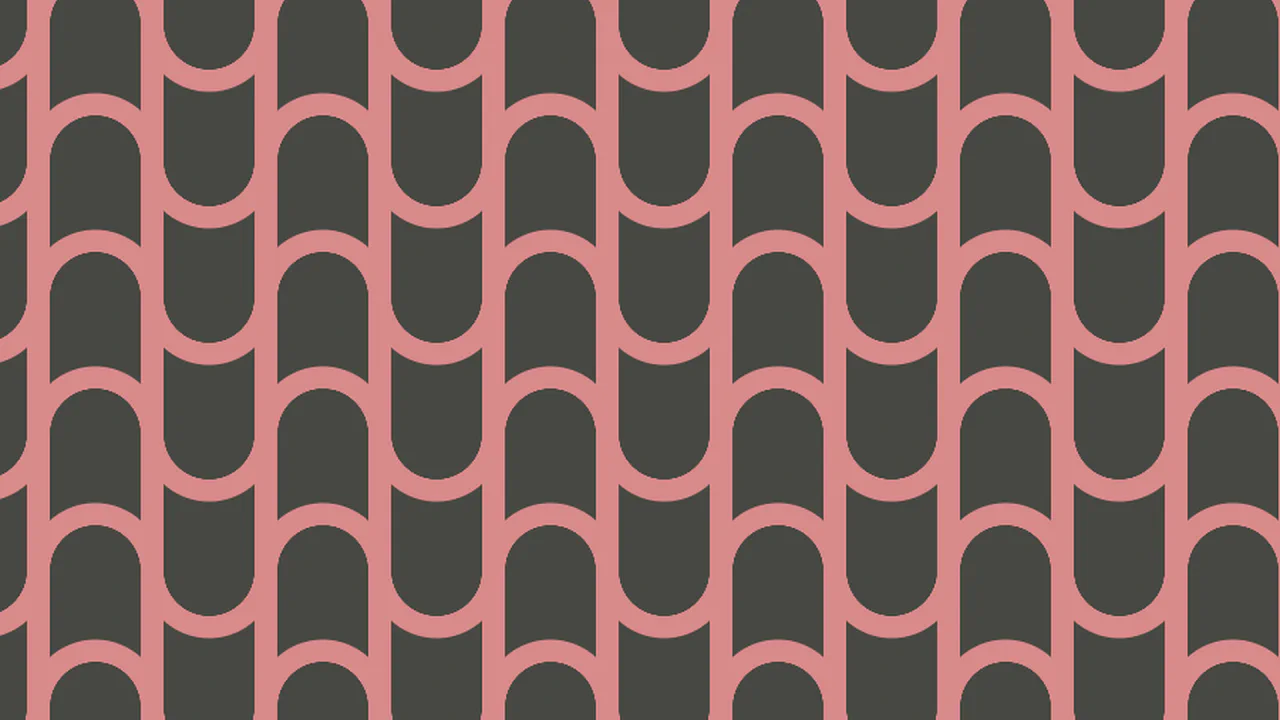
Pure CSS Rain Curtain Tessellated Pattern
A complex geometric background implemented in pure CSS using layered radial and conic gradients. By leveraging CSS variables, this pattern is easily scalable and customizable for any color scheme in modern web UI designs.
See the Pen Pure CSS Rain Curtain Tessellated Pattern.
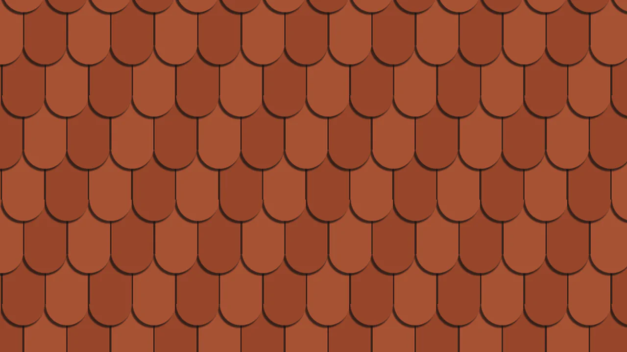
Pure CSS Roof Tile Tessellated Pattern
Nineteen background layers — radial gradients for rounded tile tops, conic gradients for overlapping edges, and a linear bottom strip — tile at 100×240px. The entire set is duplicated with a half-size offset to create staggered roof tiles in terracotta tones with dark shadows. Zero HTML, pure background stacking with dual-position trick.
See the Pen Pure CSS Roof Tile Tessellated Pattern.
Arrow CSS Patterns
A repeating arrow/chevron pattern in red and dark purple. Two conic gradients at opposite corners (75%/75% and 25%/25%) each quarter-fill with alternating colors, creating directional V-shapes. A repeating-conic base fills the gaps.
See the Pen Arrow CSS Patterns.
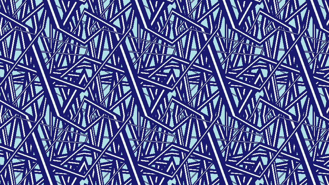
CSS Repeating Tangled Background
33 layered linear gradients on a single #tangled div, all tiling at 12em. Each gradient uses 4-5 narrow color stops (transparent → navy → white → navy → transparent) at varied angles — 5°, 7°, 30°, 70°, 80°, 100°, 110°, 115°, 119°, 127°, 130°, 131°, 133°, 140°, 170°. The result is a dense, hand-crafted tangle of intersecting navy-and-white ribbons on a powder-blue ground. Zero JS, just painstakingly tuned percentages.
See the Pen CSS Repeating Tangled Background.
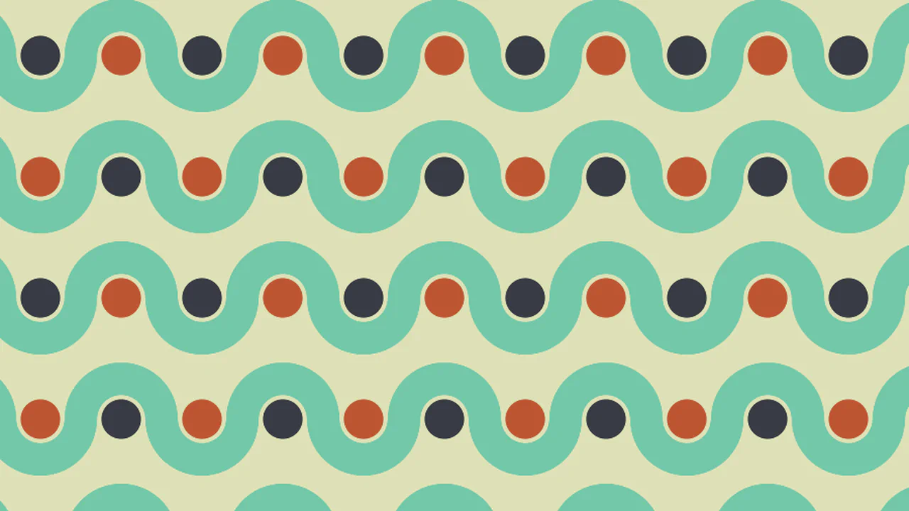
Wavy Dotted Pattern
Four backgrounds on <html>: radial gradients at 37.5% create green wavy arcs with clipped 39-94% color stops, offset copies fill the grid. A small radial dot layer and a repeating-conic checkerboard in red-brown and dark grey form the base. The 160×120px tile combines curvilinear waves with rigid geometric blocks.
See the Pen Wavy Dotted Pattern.
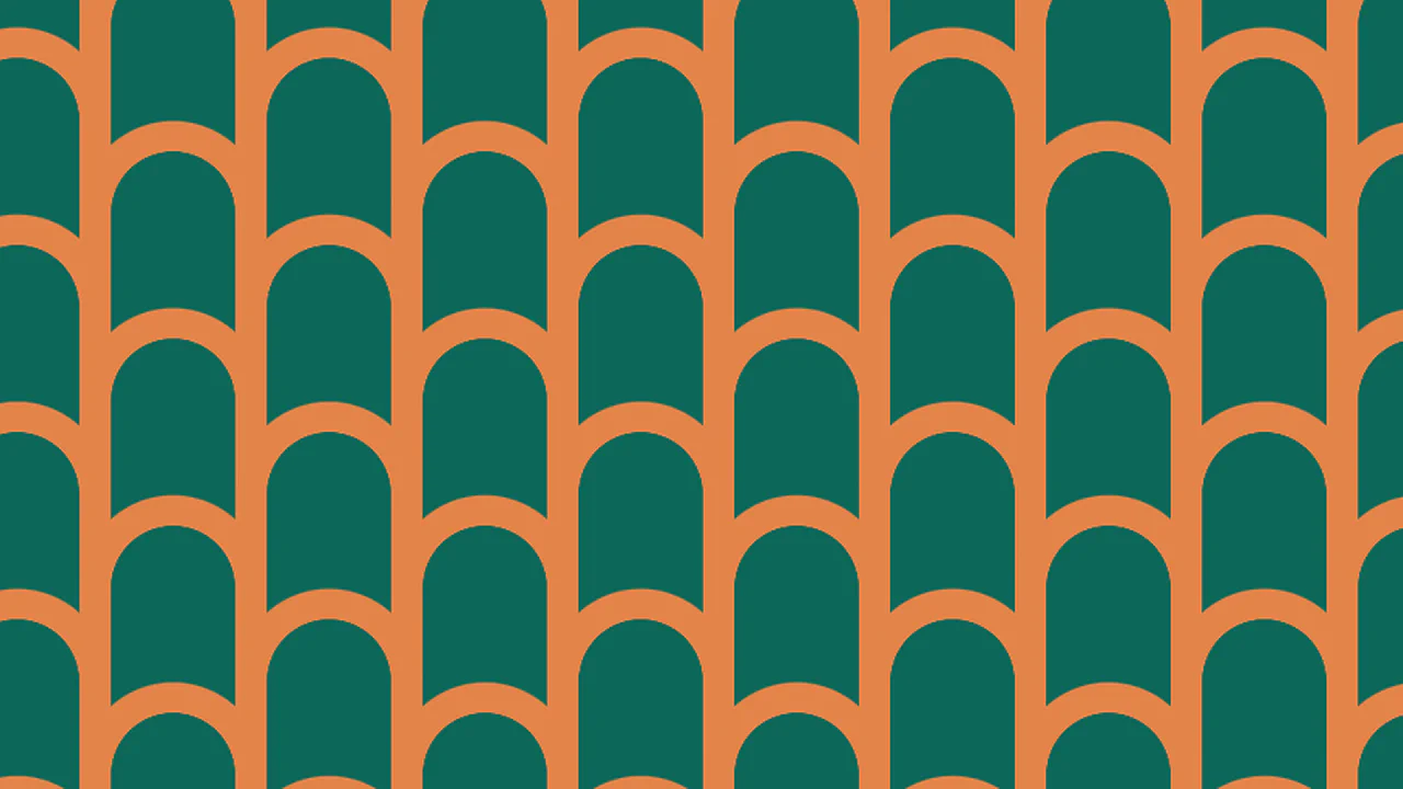
Another CSS Pattern
A 90px tile built from a radial-gradient ring (yellow inside, dark pink outside) and four conic corner pieces at 18.75% offset — each filling a quarter-circle in dark pink.
See the Pen Another CSS Pattern.
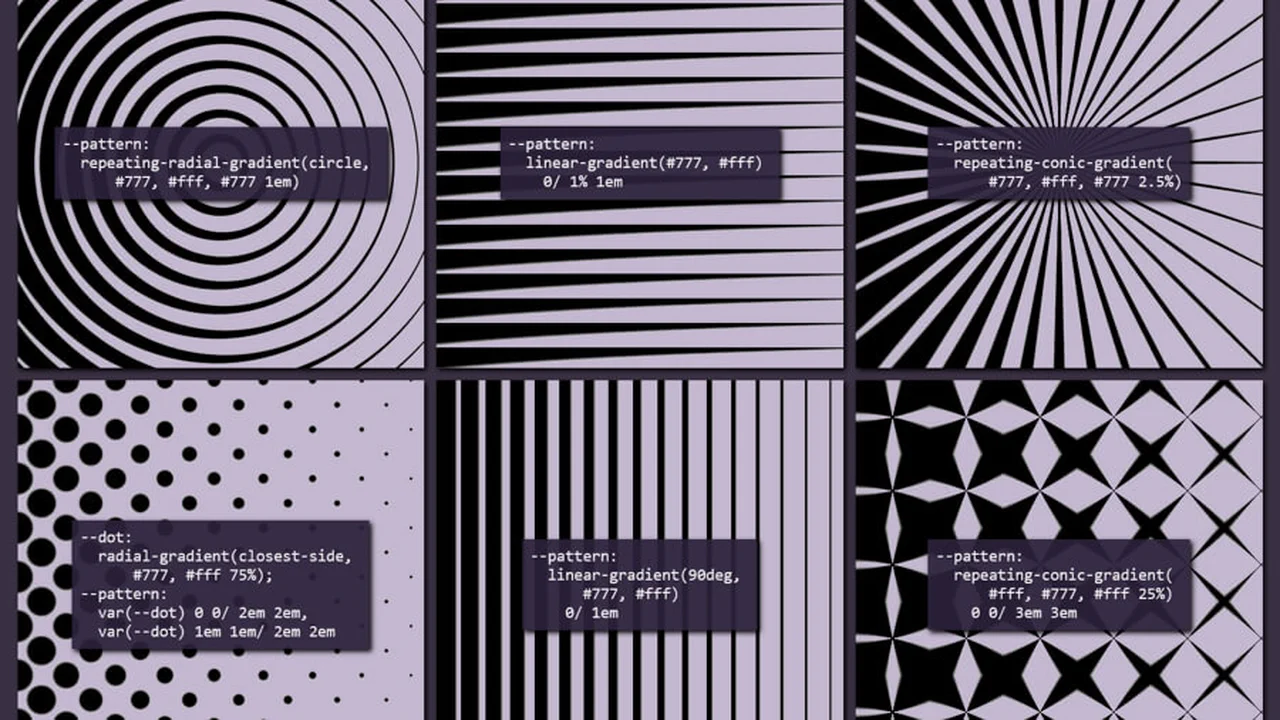
Halftone Variations
Six pattern variations and three map variations, all built from CSS custom properties.
See the Pen Halftone Variations.
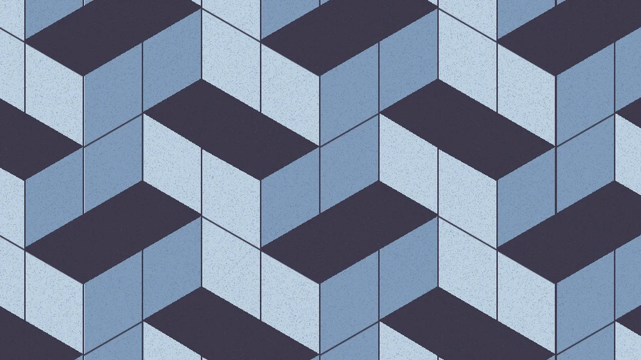
Pure CSS 3D Mini Cubes Tessellated Pattern
Thirteen background layers tile at 265×234px to render isometric mini cubes in a blue-grey palette. Six conic gradients carve the 3D faces — top, sides, bottom, and diagonal slices — at precise fractional positions (24.5%, 49.5%, 50%, 74.5%). Two repeating-conic noise layers add surface grain. Linear gradients define edges and shadows. Zero HTML, pure CSS geometry.
See the Pen Pure CSS 3D Mini Cubes Tessellated Pattern.
Another CSS Pattern
A scalloped tile pattern in red-brown and dark grey. Two radial gradients at opposite corners (30%/bottom and 70%/top) use clipped 67–98% color stops to form curved arcs — like overlapping semi-circles. A repeating-linear stripe base fills the 160×96px tile.
See the Pen Another CSS Pattern.
Another CSS Pattern
A staggered scalloped tile pattern in orange and teal. A single radial gradient with clipped 67–98% color stops creates curved arcs, duplicated with a half-tile offset (80×48px) to form overlapping semi-circles. A repeating-linear stripe base fills the 160×96px tile.
See the Pen Another CSS Pattern.
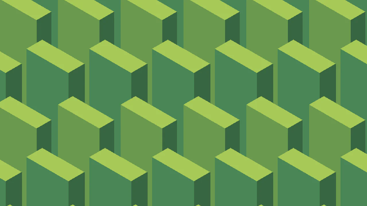
Pure CSS 3D Vertical Blocks Tessellated Pattern
Fifteen conic gradients tile at 154×266px to form isometric vertical blocks in four greens. Two reusable gradient variables (--b1, --b2) are each duplicated four times at offset positions. Conic arcs at 60-180° carve the 3D planes — top faces, front sides, and recessed shadows. A central gradient ties the column together. Zero HTML, pure conic geometry.
See the Pen Pure CSS 3D Vertical Blocks Tessellated Pattern.
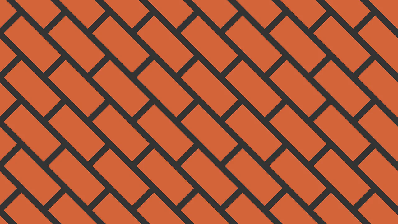
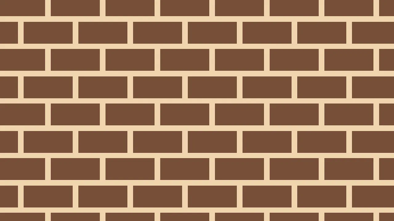
Another CSS Pattern
A diagonal plaid pattern in dark grey and terracotta on a 100px tile. A linear-gradient(135deg) creates a diagonal dark stripe across the tile (20–30% fill). A repeating-linear-gradient(45deg) adds alternating dark grey and terracotta bands.
See the Pen Another CSS Pattern.
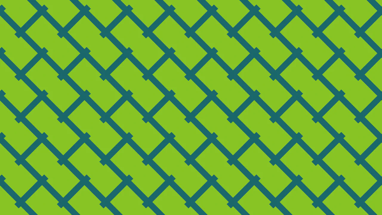
Another CSS Pattern
A diagonal grid of green diamonds on a dark teal ground. A linear-gradient(45deg) creates the large diamond frames (10–40% fill). Two repeating-linear-gradient layers — at ±45° — produce the small internal grid using a custom variable --g with teal bands at -5% to 5%. The result is a woven bamboo-like pattern.
See the Pen Another CSS Pattern.
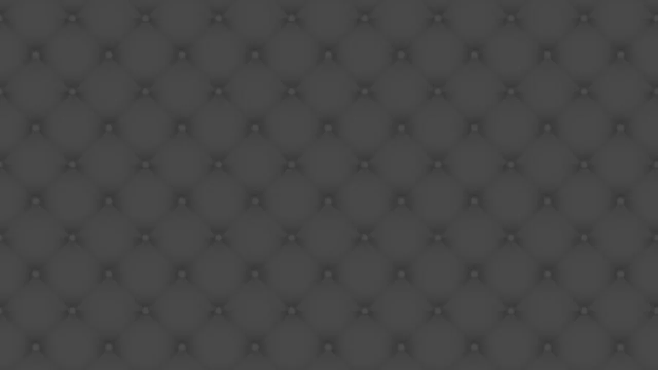
CSS Upholstery Pattern
Ten layered backgrounds on a 100×100px tile recreate a dark diamond-buttoned upholstery texture. Radial gradients form quilted bumps at staggered positions, diagonal linear gradients create the seam creases, and darker overlays add shadow depth.
See the Pen CSS Upholstery Pattern.
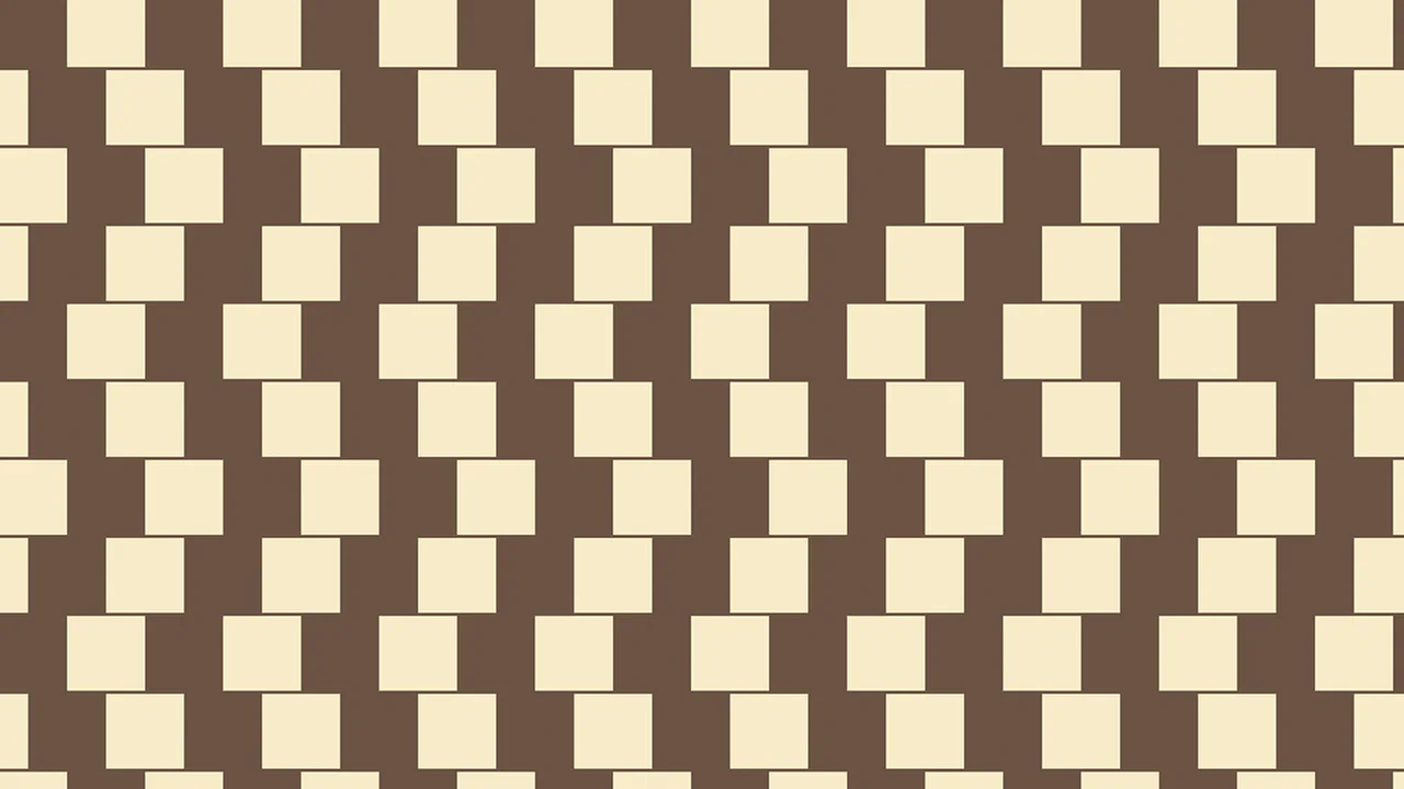
Another CSS Pattern
A conic gradient at 90% 40% clips a quarter-circle in brown — duplicated at 50px 50px offset on a beige ground. The two copies tile at 100×100px, creating a four-leaf clover pattern where the brown arcs meet at the center.
See the Pen Another CSS Pattern.
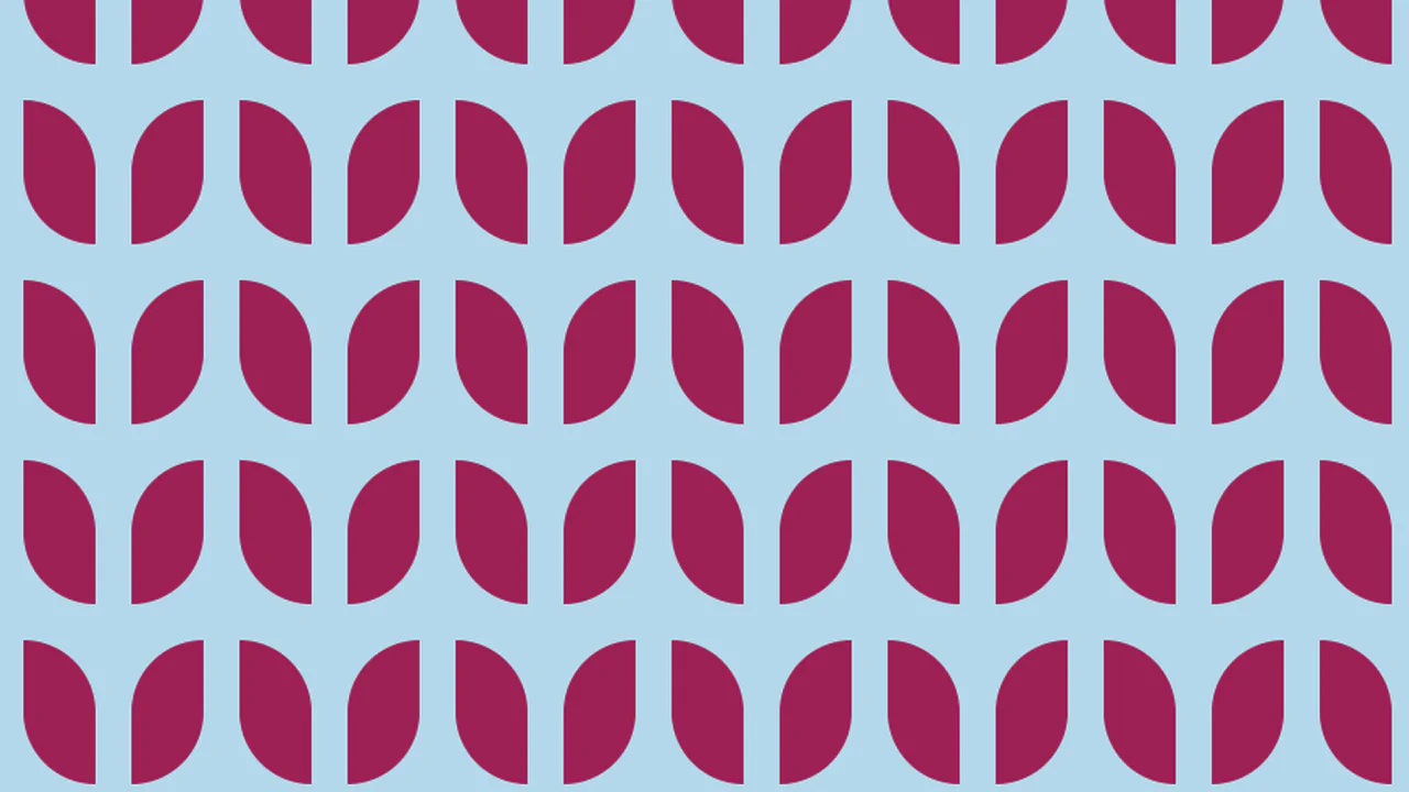
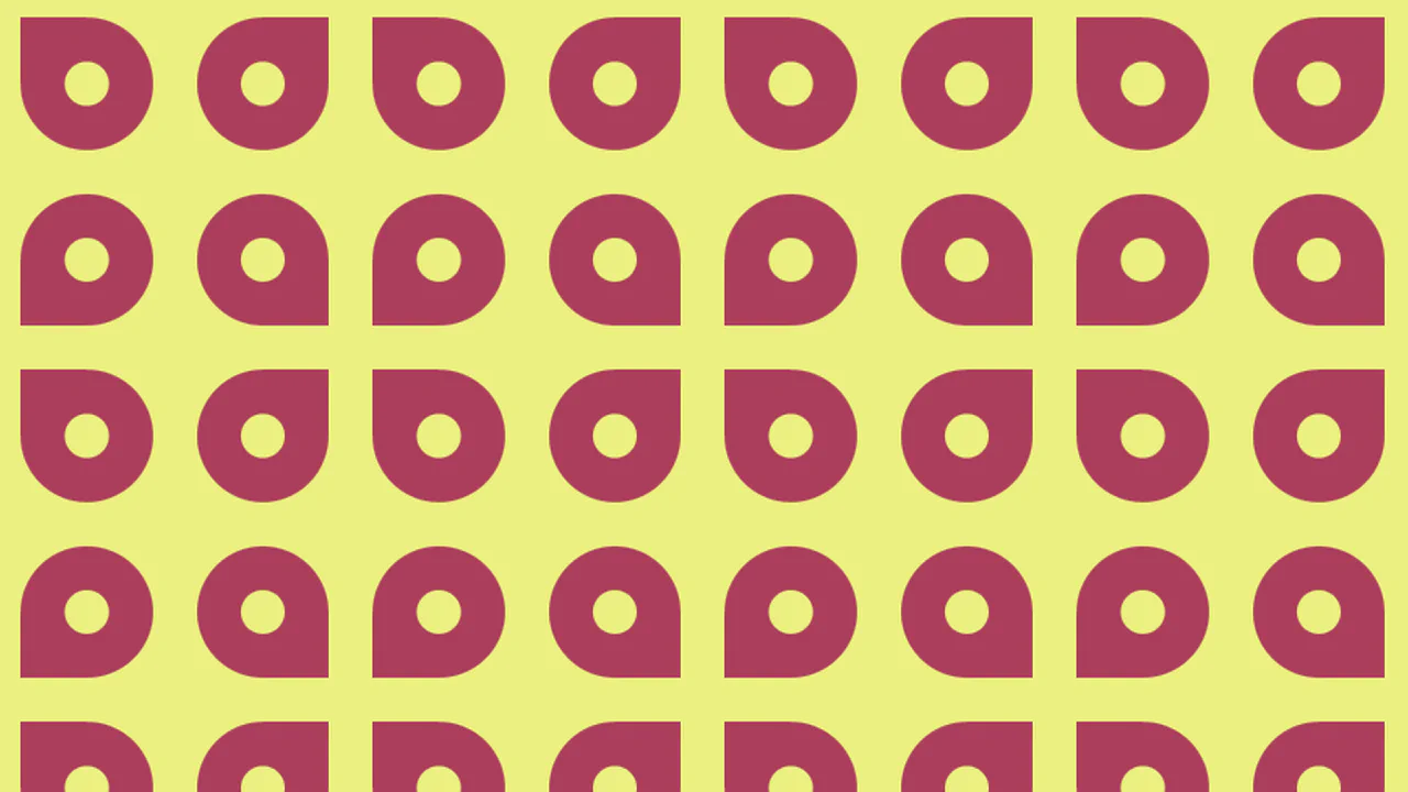
Another CSS Pattern
Four radial gradients at the four corners of a 138×115px tile — top-left, top-right, bottom-left, bottom-right — each drawing a quarter-circle in deep pink on a light blue ground. The corner circles overlap at the tile center, creating a four-petal flower-like shape.
See the Pen Another CSS Pattern.