10+ CSS Banners: Free Code Snippets & Design Examples
CSS banners introduce high-impact visual anchors into digital environments, framing critical alerts, promotional ribbons, and cookie notifications natively at the layout margins. By coordinating sliding headers, diagonal corner folds, and prominent call-to-actions, these responsive components command user focus without disrupting document loading speeds.
- Precise corner-ribbon folding and angled geometries are calculated natively using transform: rotate() properties paired with absolute container coordinates.
- Smooth sliding notification bars are driven by keyframe transitions on compositor-friendly properties, keeping animation threads separated from main-thread calculations.
- To preserve critical INP (Interaction to Next Paint) performance during close-out actions, active dismissal transitions rely on GPU hardware acceleration.
Explore these responsive layout designs to master the integration of native promotional ribbons and highly polished, layout-stable alert banners into your platforms.
Table of Contents:
Examples
Banner Google Engage CSS
An animated presentation where text transitions into a graphical simulation of an advertising “engine” (AdWords), culminating in a final call to action."
See the Pen Banner Google Engage CSS.
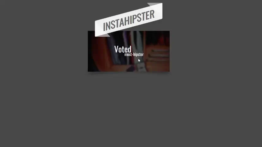
Fancy Banners
A stylish “hipster” image card featuring a lifted paper effect created with rotated pseudo-elements and shadows.
See the Pen Fancy Banners.
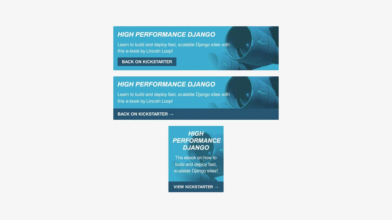
High Performance Django Ad
A set of responsive ad banners for a Kickstarter campaign, styled using SCSS mixins to ensure a consistent theme across various layouts.
See the Pen High Performance Django Ad.
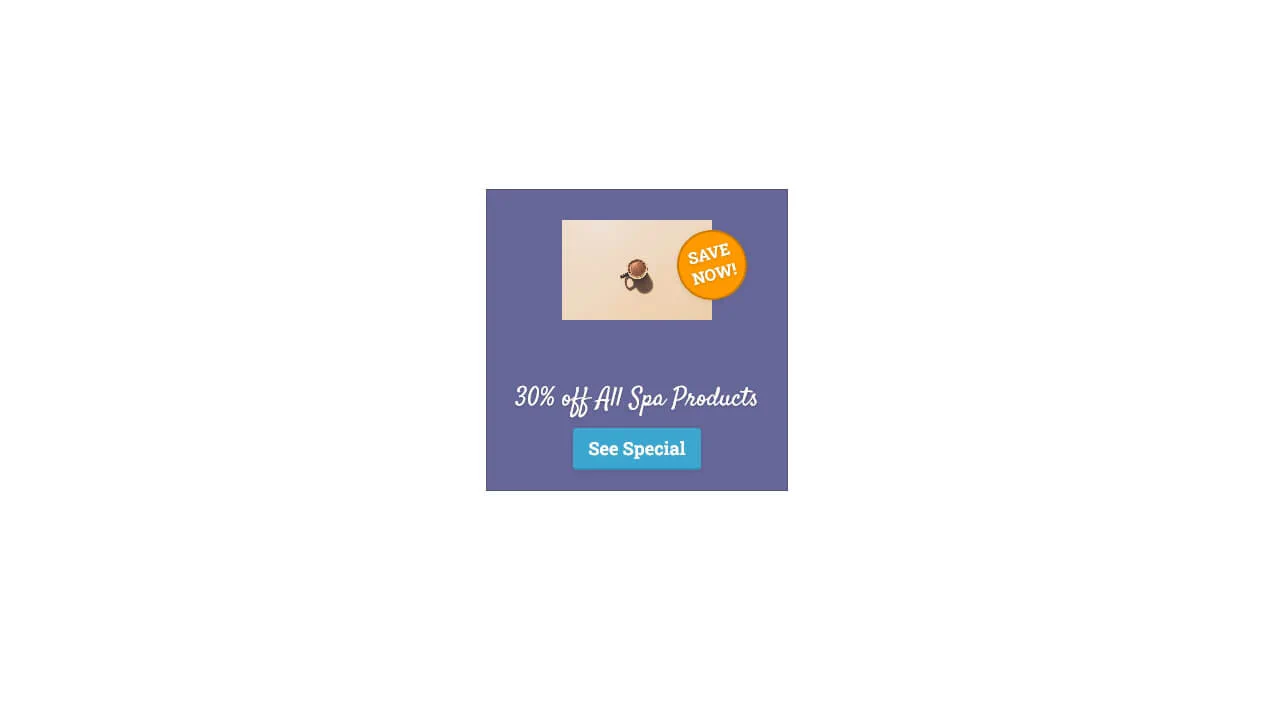
Pure CSS Animated Ad Banner
Banner with cascading animations: rotating target background, product scaling in, rolling‑in discount badge, fading text and button. Elements appear sequentially with delays, creating an assembly effect. Animations are defined via keyframes and controlled by animation‑delay.
See the Pen Pure CSS Animated Ad Banner.
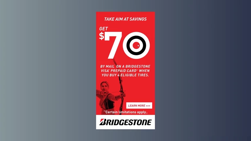
GSAP Banner Ad - 2 in 1 - (300x600)
This SVG banner uses two GreenSock timelines to create distinct animations for top and bottom hover triggers. Event listeners manage playback and reversal, ensuring smooth transitions.
See the Pen GSAP Banner Ad - 2 in 1 - (300x600).
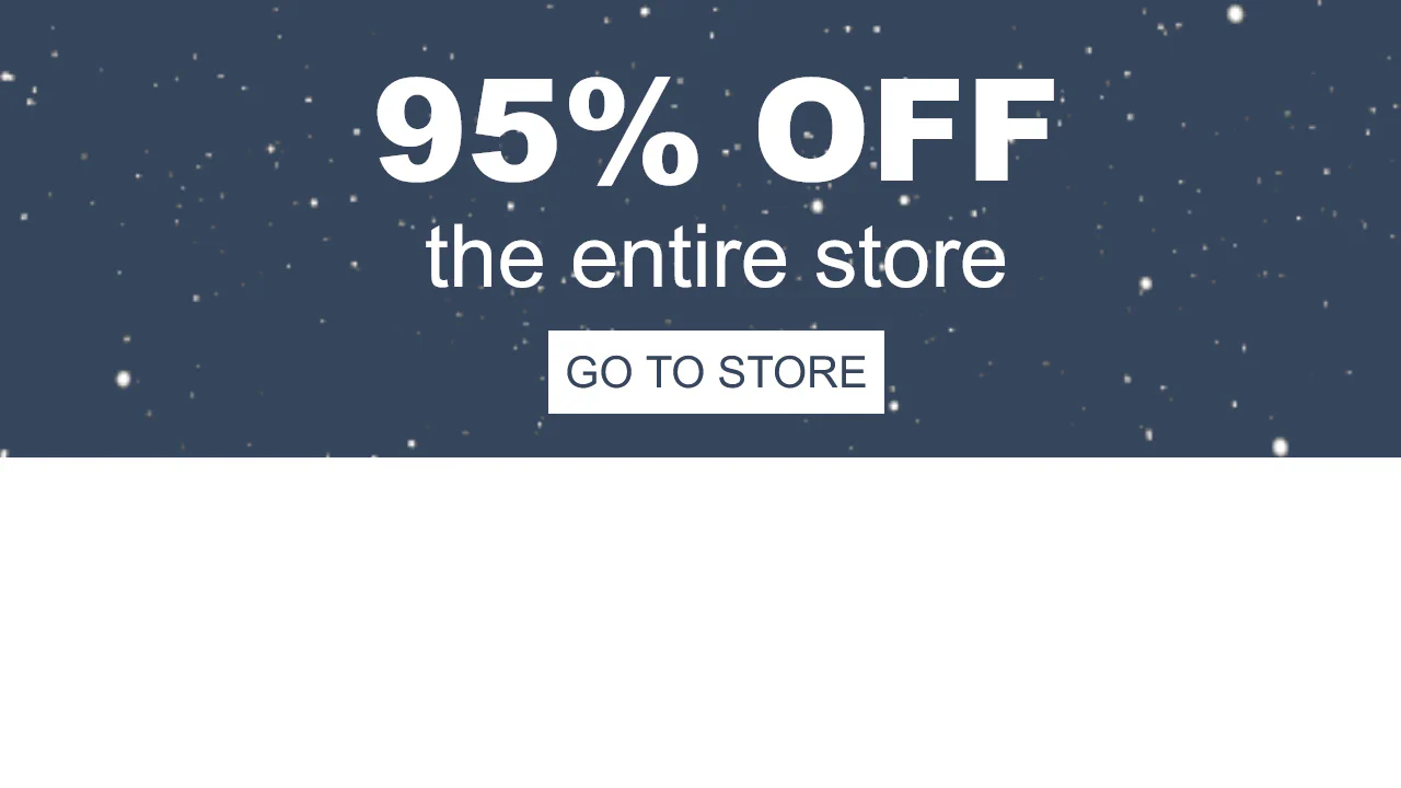
Holidays Banner
This banner uses animation to immediately capture attention — making the core offer highly visible. The button provides clear, responsive feedback on hover, creating a straightforward and engaging path to conversion. The structure is simple, ensuring the message stays front and center.
See the Pen Holidays Banner.
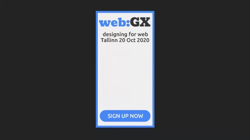
SVG Banner AD
This is a self-contained SVG banner with GSAP-powered animation. Three slides cycle automatically — each fades in while the text mask slides up. The button is present but has no active link.
See the Pen SVG Banner AD.
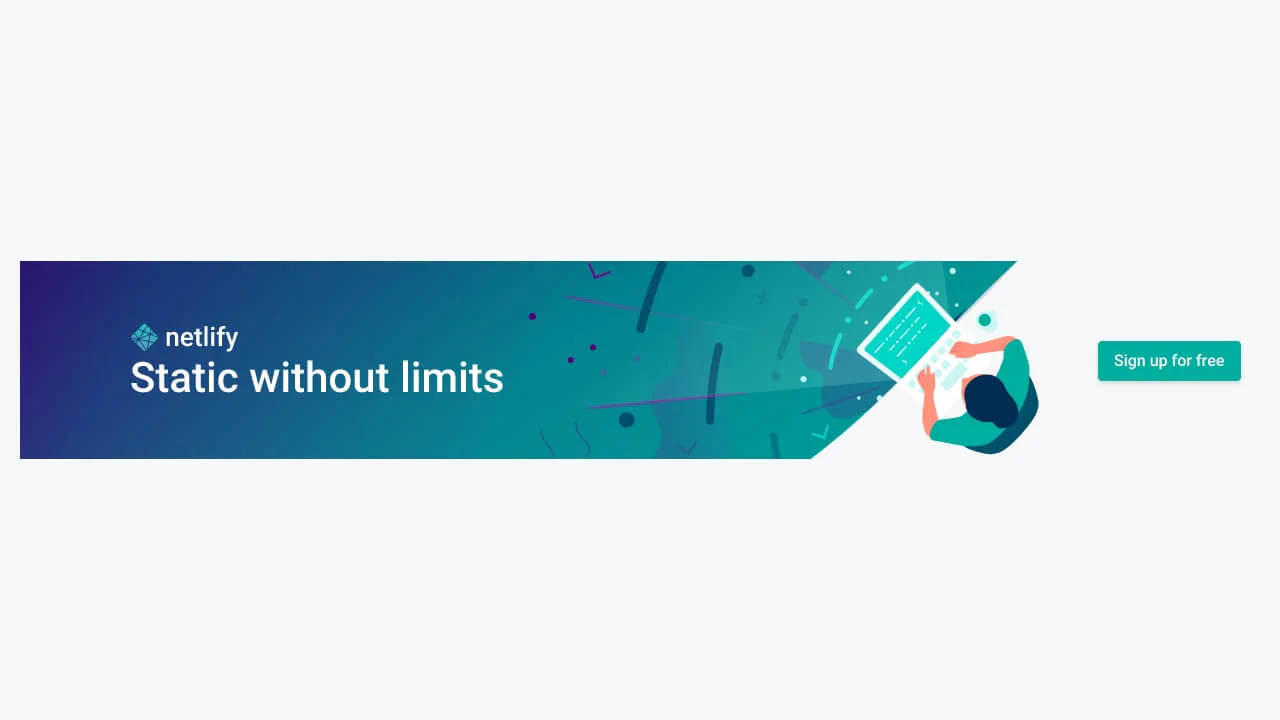
CSS-Tricks-Netlify-Banner
Clean layout with absolute‑positioned illustration and flexbox‑based content. Media queries handle repositioning and button alignment — responsive behaviour is baked in.
See the Pen CSS-Tricks-Netlify-Banner.
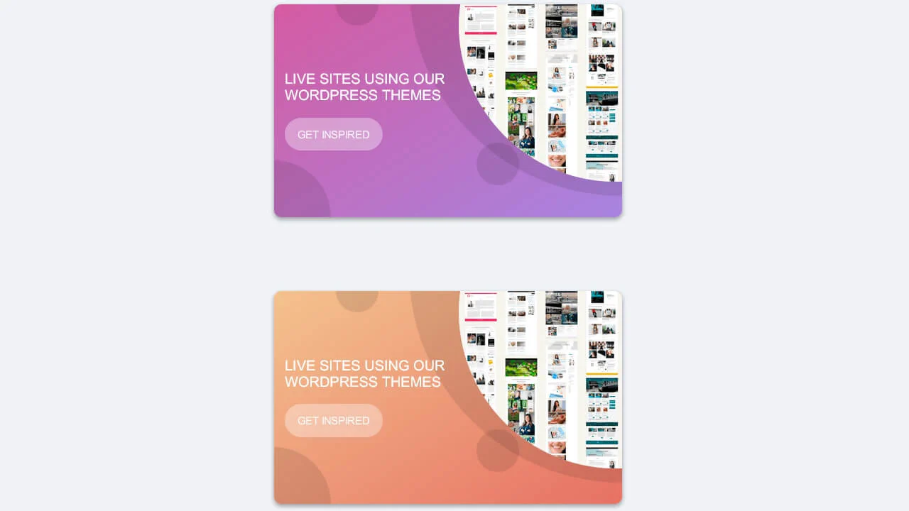
Responsive Horizontal Banner Using CSS Backgrounds
Three banners share identical structure — only the gradient changes. Flexbox and a media query handle content repositioning on wider screens. Decorative SVGs are absolutely positioned.
See the Pen Responsive Horizontal Banner Using CSS Backgrounds.
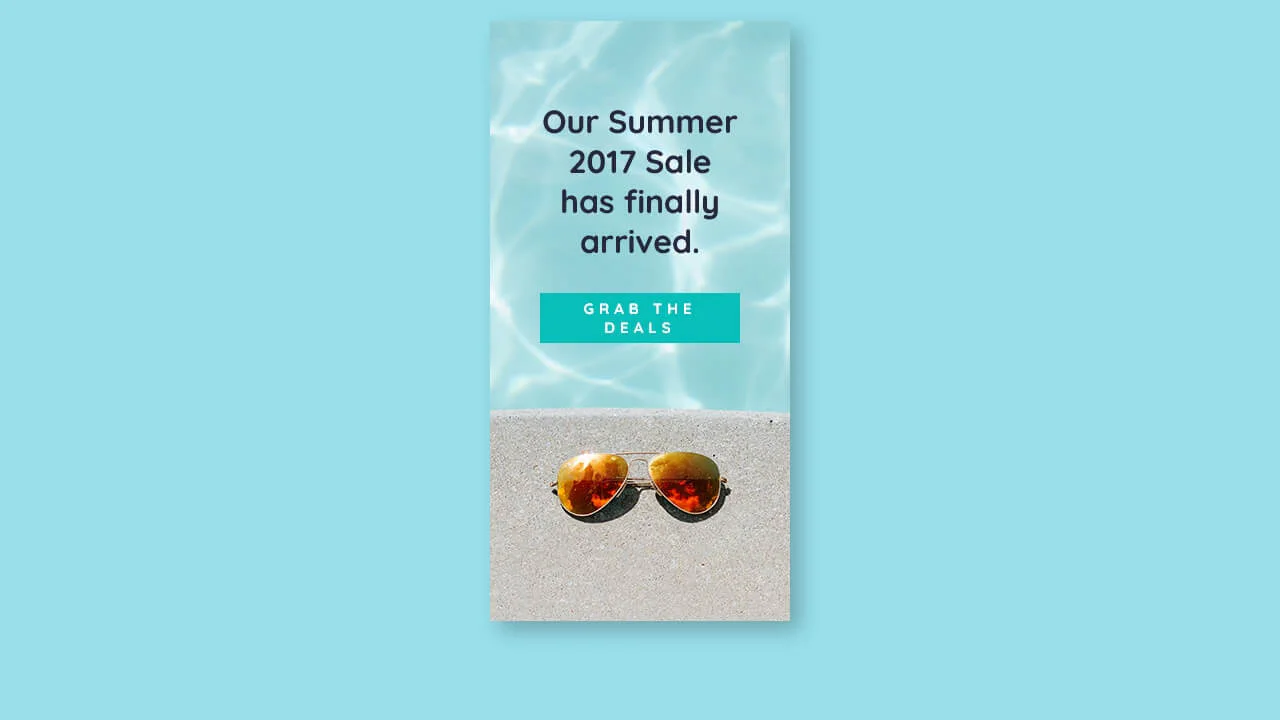
Summer CSS Banner Ad
Fixed‑size banner with a background image — centering relies on absolute positioning inside a relatively positioned container. The button changes colors and adds a shadow on hover.
See the Pen Summer CSS Banner Ad.
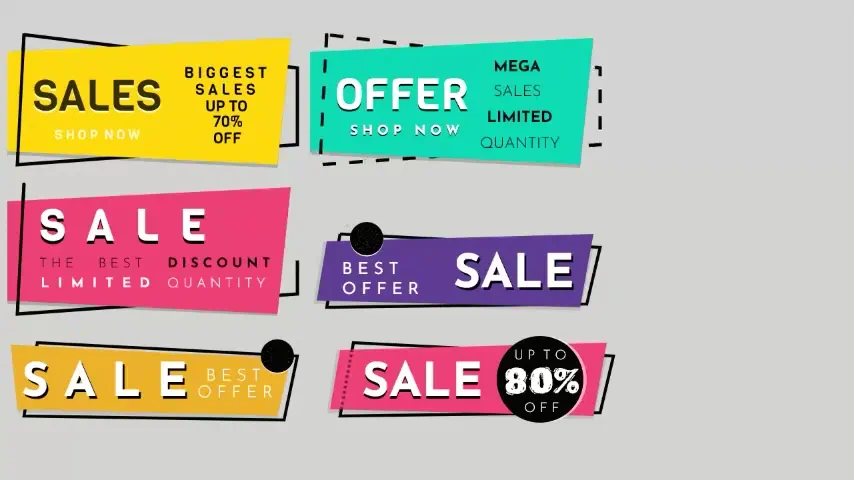
SVG Geometric Sale Banners
Six SVG banners are orchestrated with jQuery — each element fades in at a fixed delay. Clicking a banner resets and replays the sequence. Stroke‑dashoffset animations on borders create a drawing effect; some elements blink via keyframes.
See the Pen SVG Geometric Sale Banners.
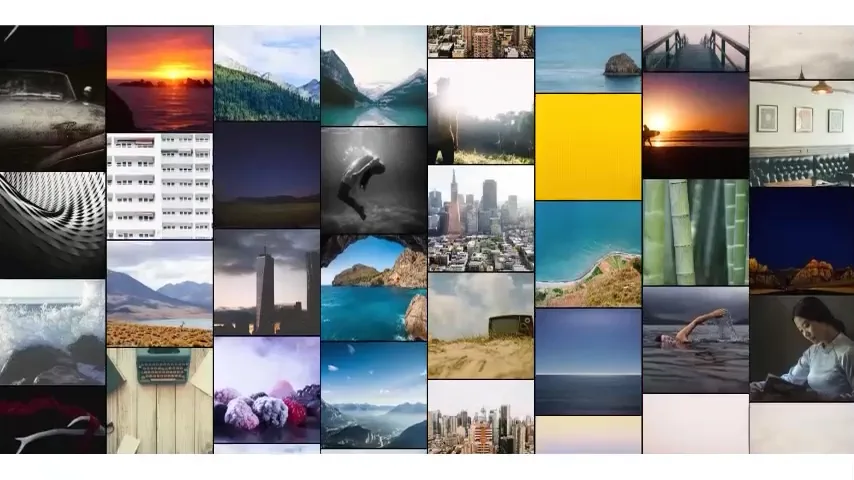
Animated Scrolling Banner
JavaScript duplicates column content to create a seamless scrolling loop. CSS animations move even and odd columns in opposite directions — hover pauses the motion. The header hover dims all images; individual hover restores opacity.
See the Pen Animated Scrolling Banner.
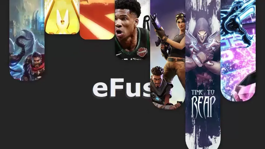
Banner Animation: Video Game Images
Seven columns animate height and border-radius in a cascading wave — each has a different delay. Background images are cropped with object-fit: cover and shifted via margin-top to fill the frame. The title sits beneath the columns; a semi‑transparent duplicate adds depth. Media queries hide columns at specific breakpoints — simple, but fixed.
See the Pen Banner Animation: Video Game Images.
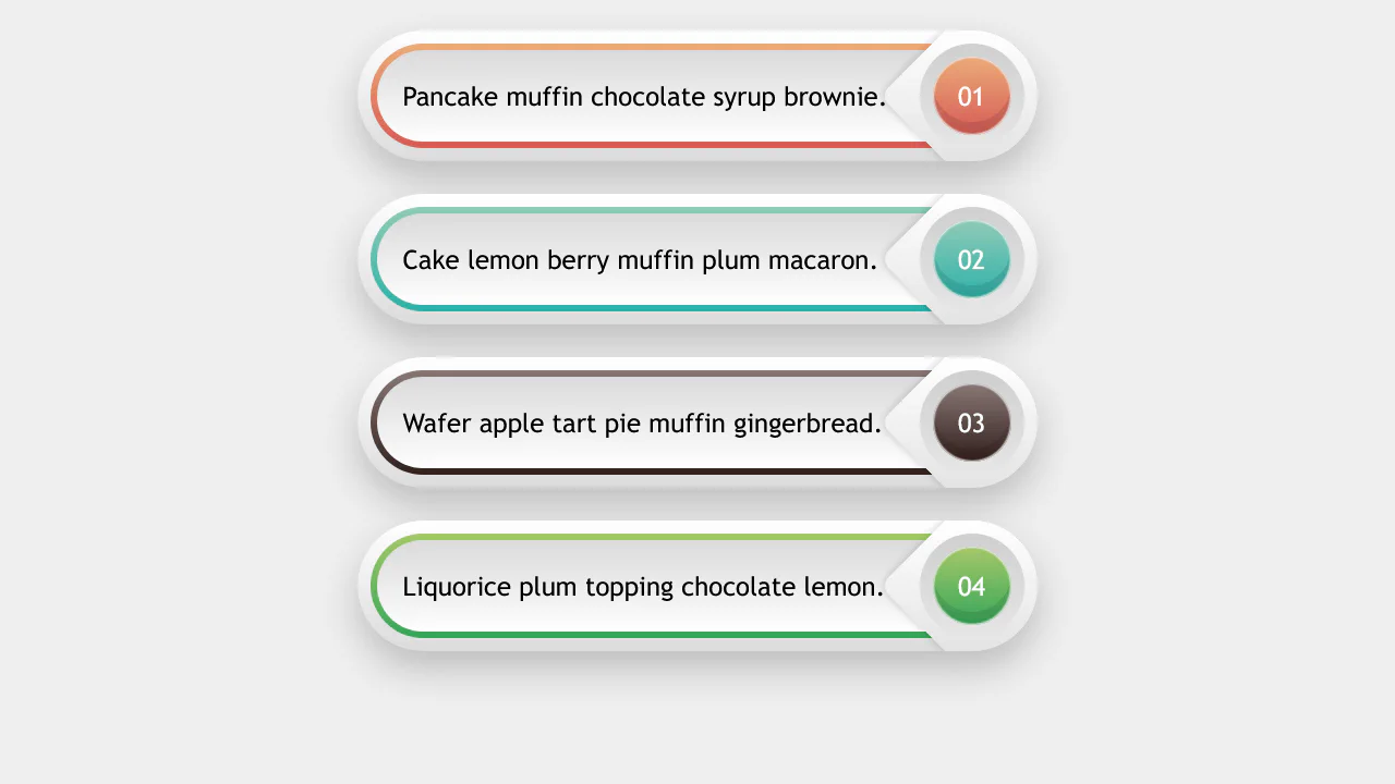
Banners
A precise CSS-only card layout showcasing complex gradient boundaries and procedural counters. It stacks gradients across content-box, padding-box, and border-box levels to render nested metallic outlines, drawing custom color paths from inline --slist variables. Includes a native CSS list counter.
See the Pen Banners.
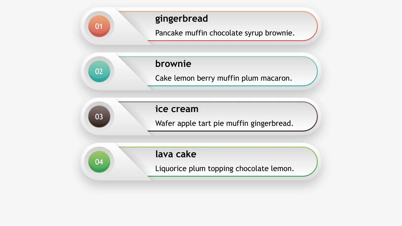
Responsive Banners
A responsive card layout utilizing complex CSS Math and box-model background stacking. It calculates card parameters (gap, size, layouts) conditionally inside a single calc() rule using a --wide variable toggle. Stacks multiple gradients across border-box bounds to achieve metallic framing.
See the Pen Responsive Banners.
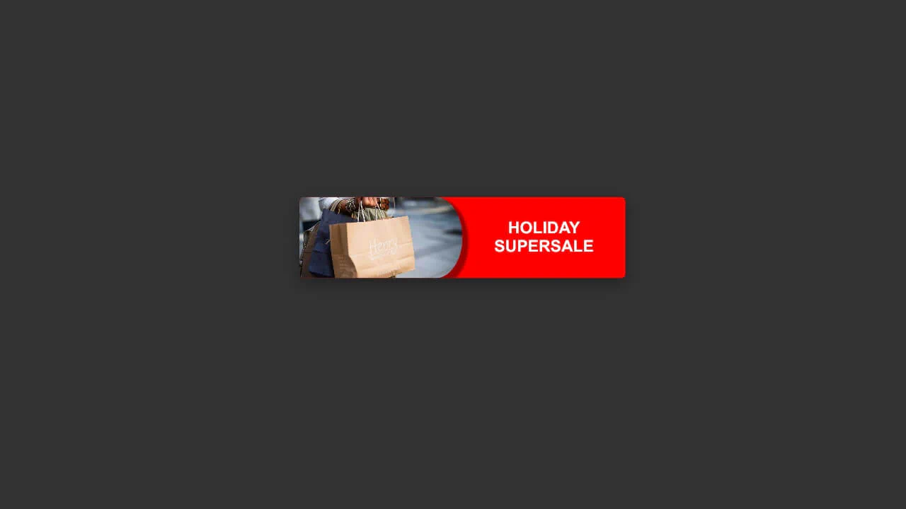
Banner Ad
A simple, highly reactive promo banner mockup using Flexbox column splits. It utilizes a stylized asymmetric border-radius ratio on the image container to render a clean curved boundary partition between the product shot and the text. Global transitions handle smooth scaling and shadow updates on hover. Fully JS-free.
See the Pen Banner Ad.
Sale Banner
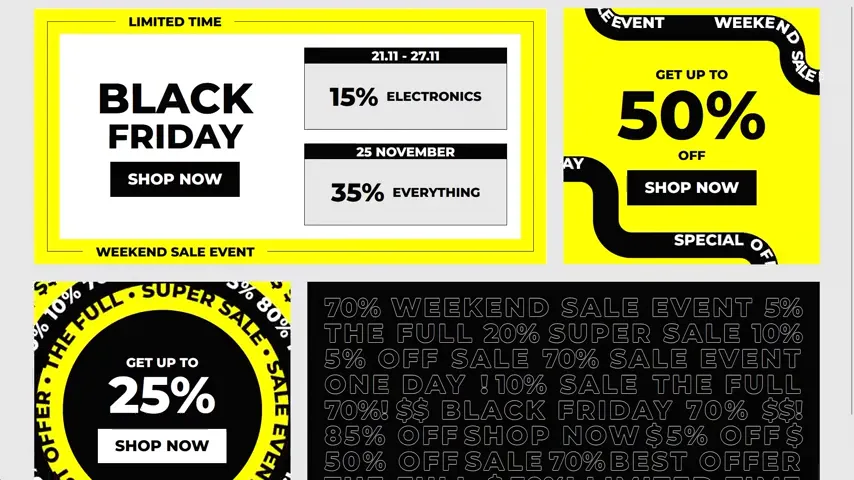
A dynamic, neo-brutalist Black Friday promo page featuring high-impact typography. It integrates SVG <textPath> layers with native SMIL <animate> tags to slide text along curved paths, alongside CSS @keyframes driving continuous circular rotations. Leverages text-shadow strokes and responsive vw coordinates. Entirely JS-free.
See the Pen Sale Banner.
UL Banner Cards
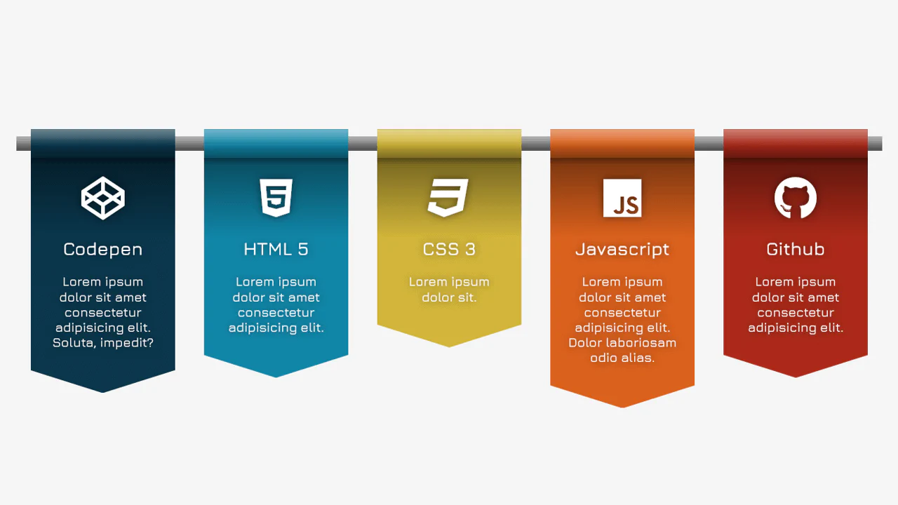
This circular ordered list cycles color accents using :nth-child(6n+x) rules. Each square card is converted into a circle using aspect-ratio: 1 and border-radius: 50%. The :before pseudo-element renders an oversized, clipped counter digit, while :after applies a realistic drop-shadow ring using filter and blur().
See the Pen UL Banner Cards.