20+ CSS Blockquotes: Free Examples & Code Snippets
Blockquotes are essential editorial components that establish visual hierarchy and break up long-form content by highlighting key insights. Well-styled quotes transform testimonials, articles, and case studies into scannable, impactful narratives.
- Semantic
<blockquote>and<figcaption>elements combined with ::before and ::after pseudo-elements render decorative quotation marks and attribution lines without adding presentational markup to the HTML structure. - CSS Grid and Flexbox align the quote body, author name, and avatar into cohesive testimonial cards, while clamp() and Container Queries ensure proportional scaling across every viewport.
- The cite attribute and the
<figure>element preserve semantic attribution chains, enabling screen readers to announce quoted content with appropriate context and inflection.
Browse this collection of CSS blockquotes to master editorial typography that elevates testimonials, articles, and pull-quotes into structurally sound, visually distinctive components.
Table of Contents:
Examples

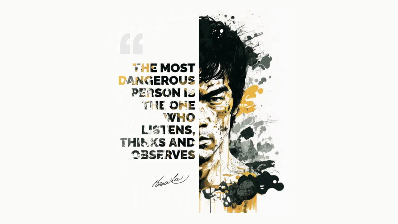
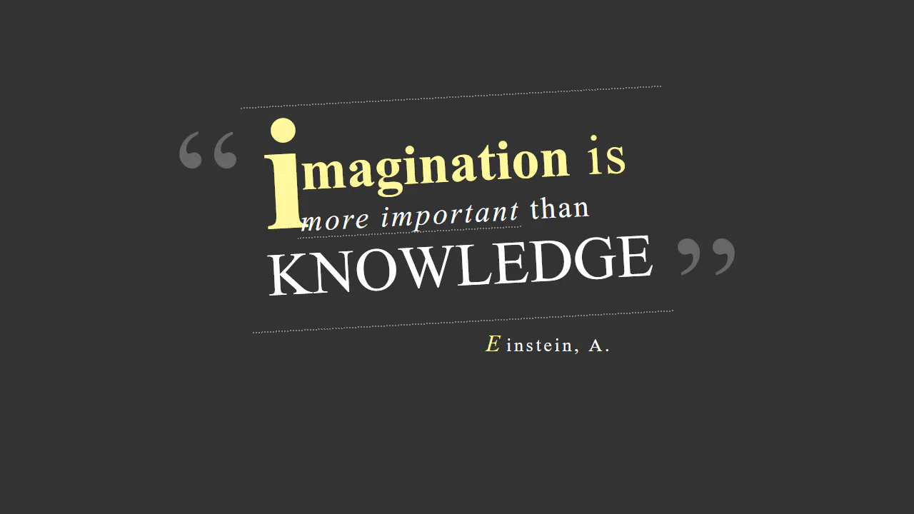
CSS Blockquote with Gradient Drop Cap
A unique drop cap is created with modern CSS techniques - its complex background is generated by layering linear-gradient and repeating-conic-gradient, while its responsive size is managed by calc().
See the Pen CSS Blockquote with Gradient Drop Cap.

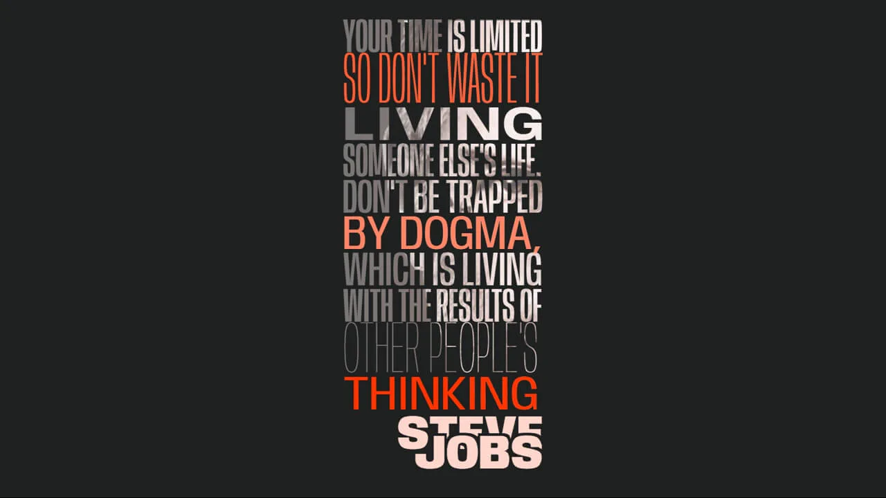
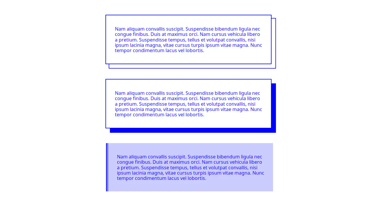
Blockquote
Elegant typography for a blockquote where the hanging-punctuation CSS property pushes quotes outside the text, and text-wrap: balance automatically balances line lengths. Visual emphasis is created with a ::before pseudo-element that adds a blurred background, creating a glow effect behind the text.
See the Pen Blockquote.
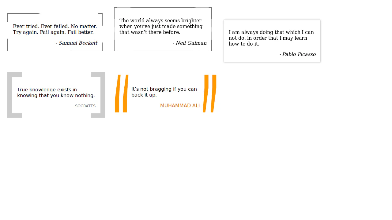
Quote Styles
The creation of two stylistically different blockquotes using CSS modifiers and pseudo-elements. The first variation uses text characters, while the second uses an inline SVG for decorative quotes.
See the Pen Quote Styles.
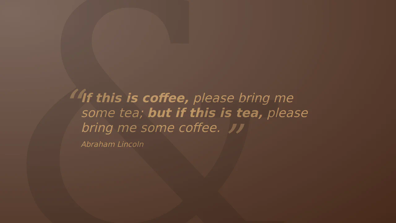
Pull Quotes
A content duplication technique to create a “typographic highlight” effect. The aside block contains two p elements with the same text, where one is hidden and the other is styled and positioned on top, creating an inset text effect.
See the Pen Pull Quotes.
A sophisticated pure CSS blockquote design that leverages conic and radial gradients to render custom quote marks and decorative elements with zero external assets. This snippet features a stylized drop cap and polished layout.
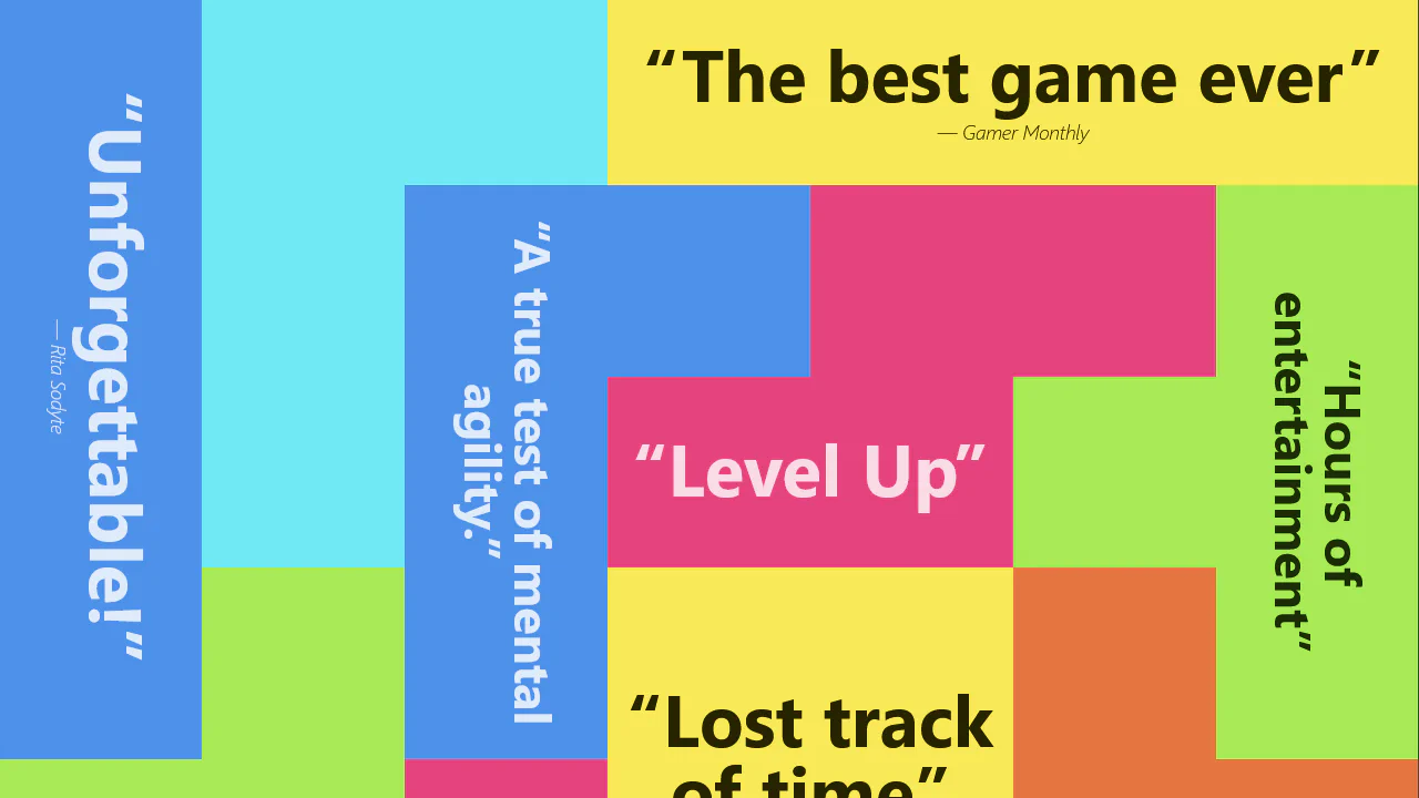
A creative Tetris-inspired layout powered by a 7x14 CSS Grid system and responsive typography using the clamp() function. This snippet showcases the use of writing-mode: vertical-rl for vertical text orientation and utility classes to build dynamic, game-themed user interfaces.
A striking quote poster built with pure CSS, utilizing the mix-blend-mode: lighten property to achieve a sophisticated cutout text effect. This snippet demonstrates advanced typography layering and responsive scaling with vmin units.
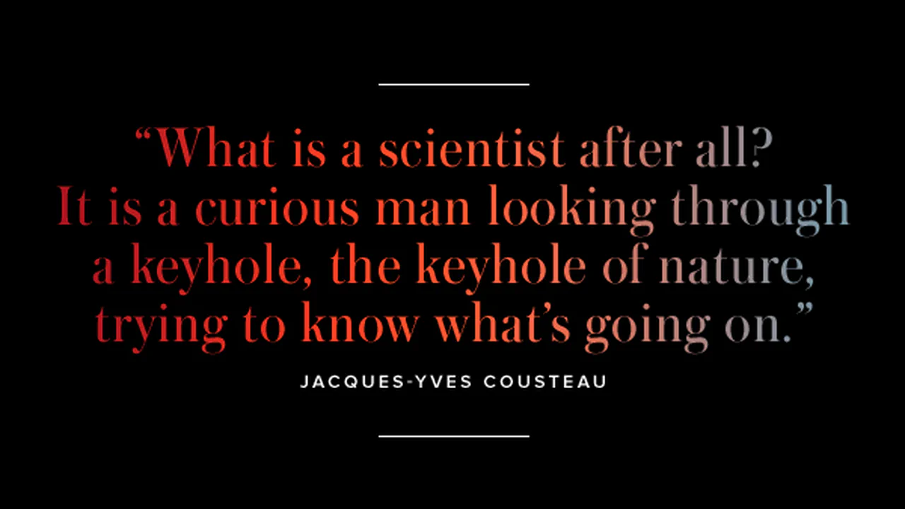
A professional CSS typography snippet designed for creating artistic posters using variable fonts and the background-clip: text property. This component showcases precise control over font width and weight via font-variation-settings.
A dramatic quote poster leveraging the background-clip: text property to apply an animated GIF texture to bold typography. This snippet features a dynamic shake animation and is built with frontend performance in mind, including full support for user accessibility preferences.
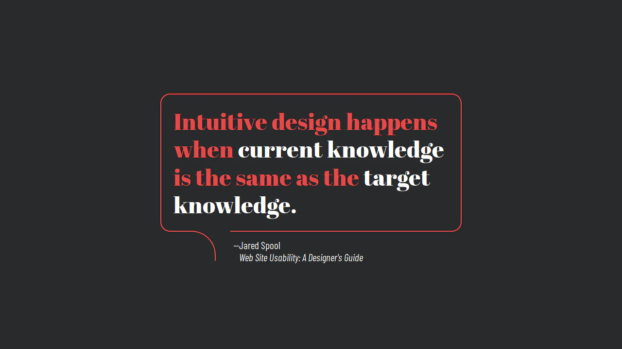
Blockquote Styles
Five pure CSS blockquote designs with zero JavaScript. Built on semantic <blockquote> and <cite> tags. Style tricks include rotated pseudo-element backgrounds, counter-rotating borders with @keyframes, pulsing box-shadow scale animations, oversized scaled quotation marks, and thick borders masked via nested inline layers.
See the Pen Blockquote Styles.
Blockquote, Flexbox, RGBA, Before content
An elegant full-screen quote design centered via Flexbox. It features a dark radial gradient background overlaid with a giant typographic & glyph via body::before. The semantic <blockquote> block features oversized absolute-positioned quotation marks using ::before/::after offsets.
See the Pen Blockquote, Flexbox, RGBA, Before content.
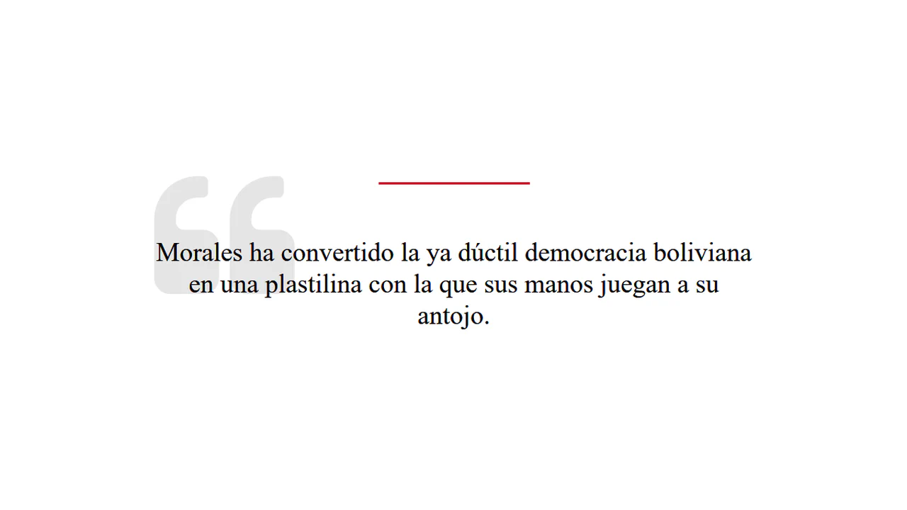
Quote Example
This stylesheet styles two elegant, retro-themed pull quotes using pseudo-elements. The first blockquote implements an absolute-positioned, semi-transparent 200px quote glyph watermark alongside a red top accent line. The second variant uses a thick left border with a large, colored Unicode open-quote character.
See the Pen Quote Example.
Pure CSS Quote
This stylesheet styles a modern blockquote inside a bordered speech bubble. The key trick is using pseudo-elements on the h1 to construct the pointer tail. :before uses a thick background-colored border mask to erase a section of the bottom line, while :after uses a curved border-radius to draw the down-pointing speech hook.
See the Pen Pure CSS Quote.
Quote Box Hover Effects
This interactive card pairs split borders with an opposing 3D hover animation. The outer box uses :before and :after to build a disjointed 20px white frame. On :hover, the parent rotates around rotateY(-20deg), while the nested text panel rotates in the exact opposite direction. This counter-rotation creates a deep 3D parallax illusion.
See the Pen Quote Box Hover Effects.
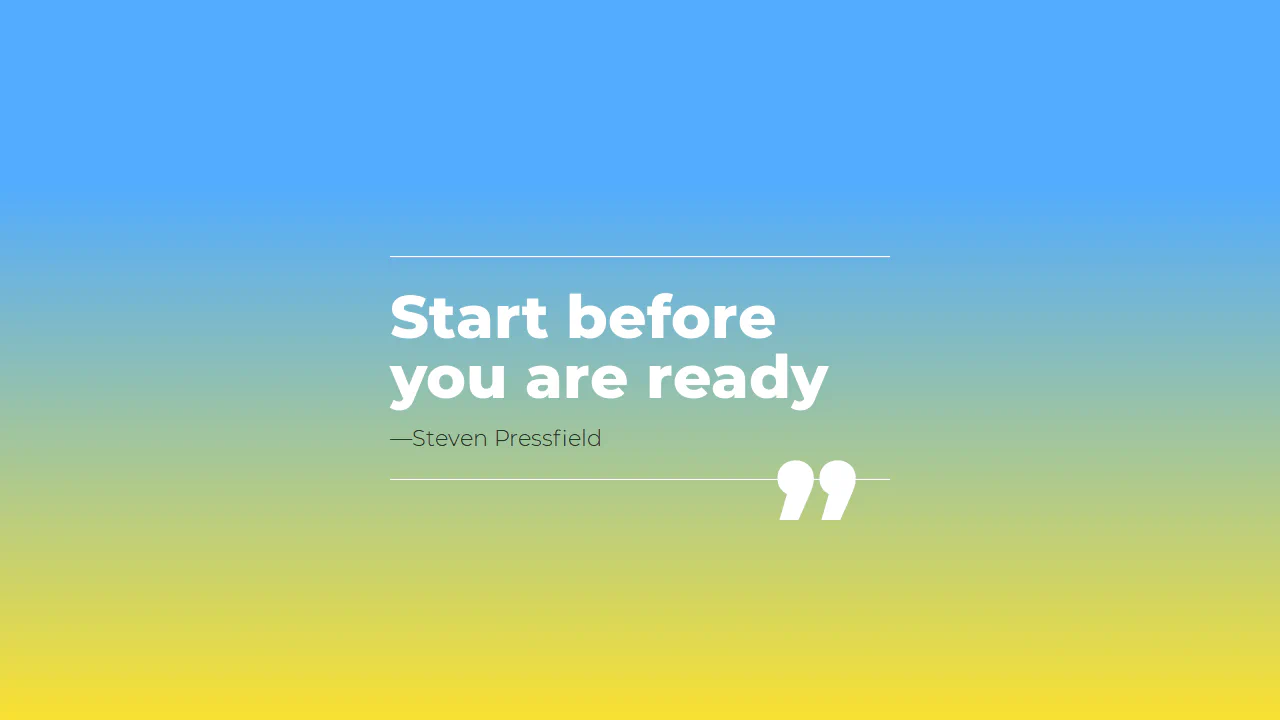
Quote: Steven Pressfield
This minimal quote card centers bold typography against a vibrant sky-blue to yellow gradient. The text block is bounded by simple one-pixel top and bottom white borders. The design’s focal point is a massive 10rem double quote glyph (”) inside :after that sits at the bottom right, intersecting the border line as an accent.
See the Pen Quote: Steven Pressfield.
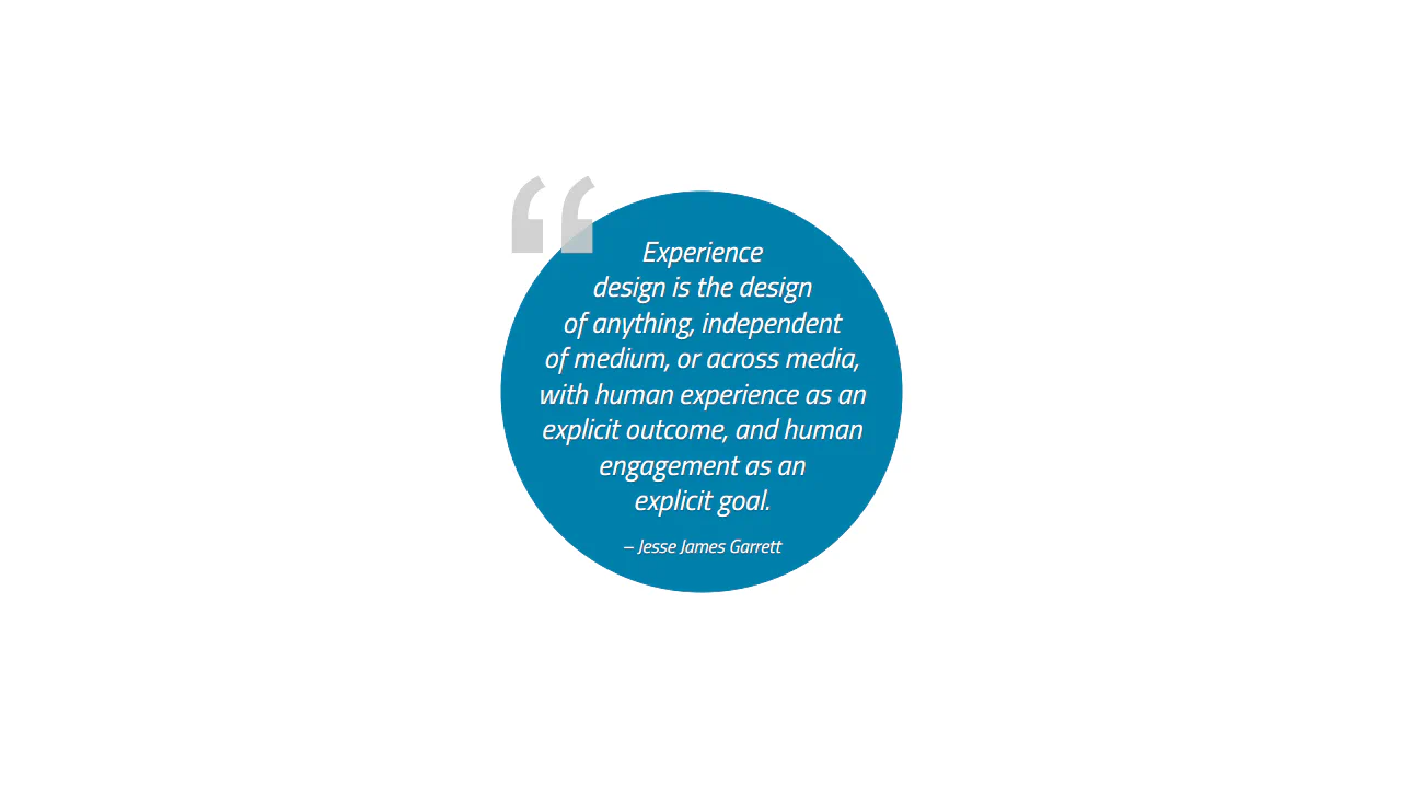
HTML Text Inside a Circle Shape
This stylesheet achieves circular text wrapping inside a radial background using a clever CSS Shapes workaround. Since shape-inside is not widely supported, it floats two empty pseudo-elements on the left and right. Each uses custom shape-outside polygon coordinates to force the central text to flow along curved margins.
See the Pen HTML Text Inside a Circle Shape.
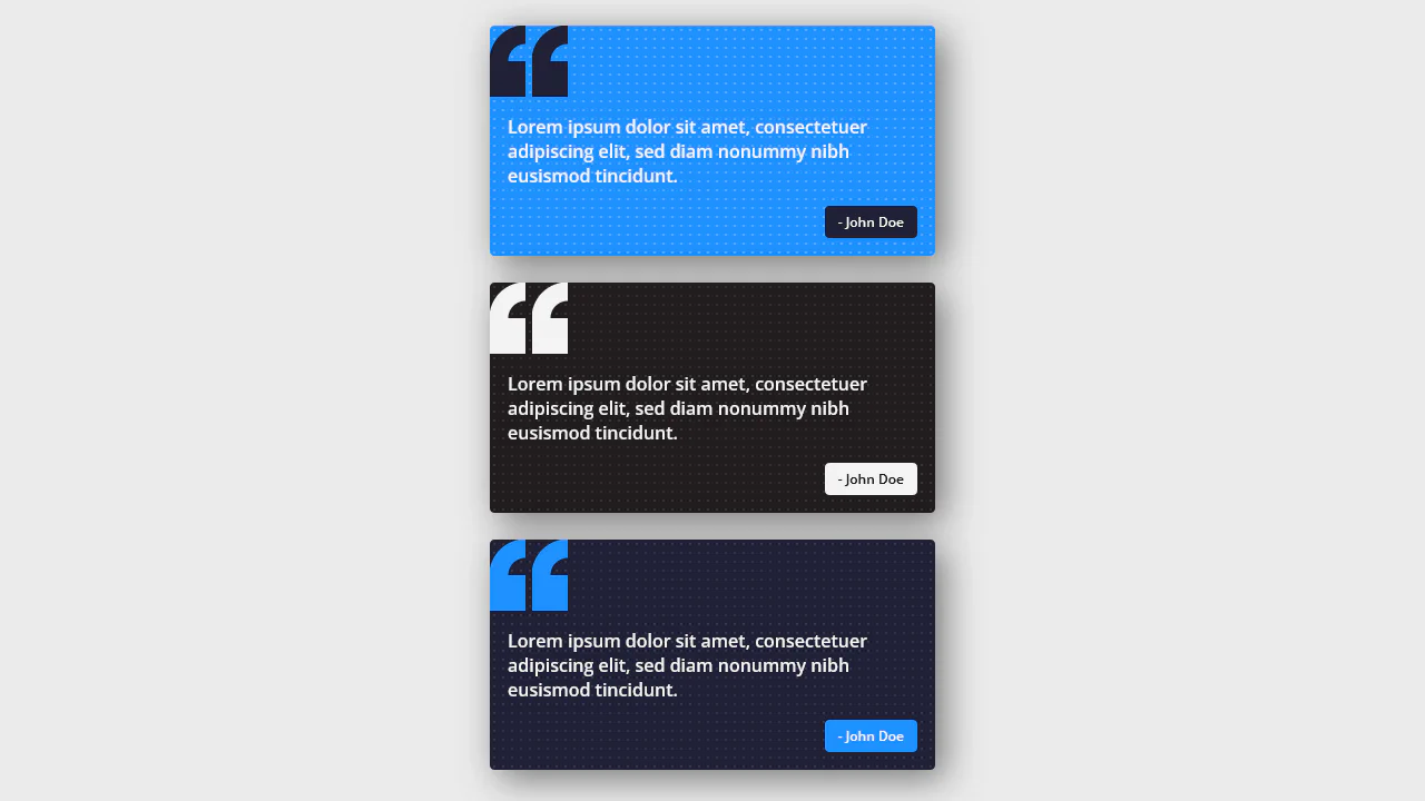
Quote Cards
These modern blockquote cards leverage CSS variables to configure colors and a tiled dotted background pattern. The key feature is the double quote mark in :before, drawn procedurally with nested radial-gradient and linear-gradient layers. This creates a clean vector quote glyph without depending on external web font assets.
See the Pen Quote Cards.
Compact Book Quotes
This clean typographical grid uses Tailwind, variable fonts, and CSS transitions to present a modular layout. Huge numbers styled with font-variation-settings anchor each column. On hover, a solid black, vertically-aligned text block slides upward via transform to act as a curtain, revealing the quote hidden underneath.
See the Pen Compact Book Quotes.
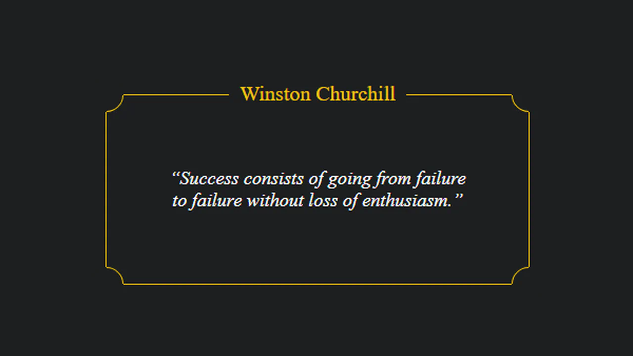
Quote Container
This clean citation frame uses a clever geometric border trick to create rounded, inward-bitten corners. Four circular .corner divs with background-colored fills are positioned over the frame’s sharp corners. By rotating them -45deg and coloring only one border edge gold, they mask the corner points and draw a seamless inward curve.
See the Pen Quote Container.
Subtle Quote
This snippet creates an elegant entrance animation for a centered quote panel. Upon page load, a brief JS timeout appends an .active class. This triggers a smooth cubic-bezier transition: the card slides upward, fades in, and extends its top and bottom divider width lines. The image also slowly cycles through a CSS hue-rotate filter.
See the Pen Subtle Quote.
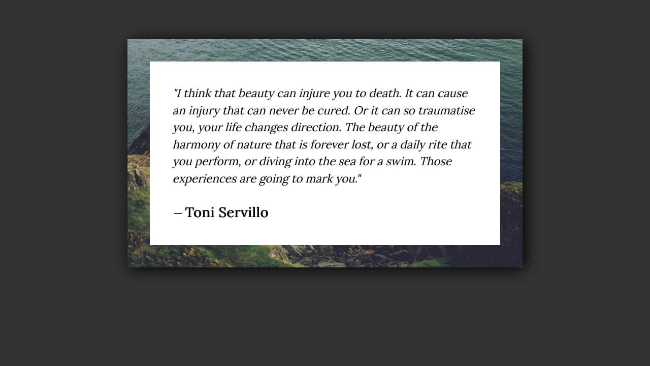
Continuous Image Border Quote
This quote blockout uses a clever double-background trick to construct a seamless image border. By combining a transparent 2em border with two nested background declarations—a white fill clipped to the padding-box and a sea photo clipped to the border-box—the underlying photo bleeds through the outer border as a textured frame.
See the Pen Continuous Image Border Quote.
Styling Blockquotes
This stylesheet demonstrates three retro, flat 3D blockquote layouts built with custom box-shadow configurations. The stacked card style chains white and blue offsets to overlay multiple paper layers. The ruled card alternates vertical blue and light-purple X-axis shadows to draw a striped left border without using pseudo-elements.
See the Pen Styling Blockquotes.
Stylish Blockquote
This editorial-style blockquote layout leverages custom web fonts and advanced CSS selectors to construct a dynamic, slanted typographical design. By targeting :first-line and :first-letter rules, the styles apply unique fonts and drop-cap offsets. The container is rotated slightly (rotate(-3deg)) and framed by dotted line dividers.
See the Pen Stylish Blockquote.
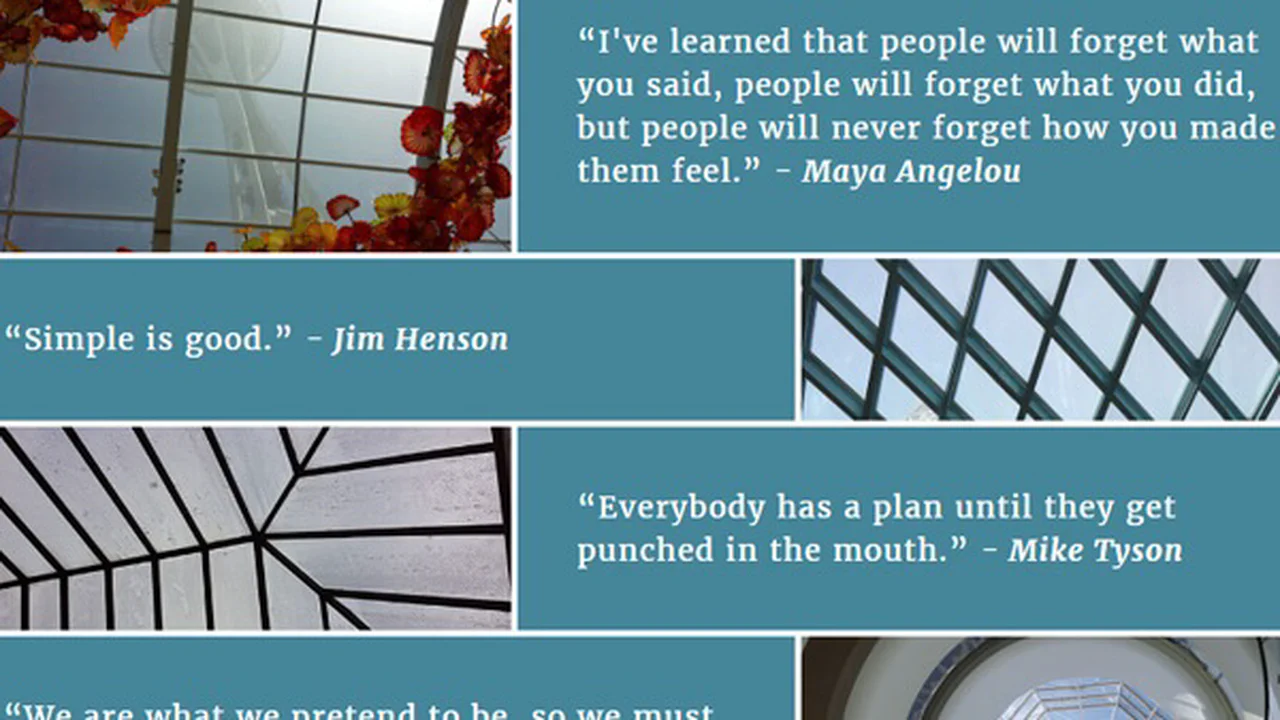
Flexbox Quote Bricks
This responsive quote layout constructs an alternating, equal-height checkerboard grid using CSS Flexbox. On mobile viewports, the images hide so that only the text cards stack vertically. On desktops, flex column ratios maintain clean alignment, while applying order: -1 on selected panels swaps the column render order dynamically.
See the Pen Flexbox Quote Bricks.

CSS Quote Effect
This interactive blockquote creates a continuous, smoky word-reveal loop. A JS loop reads custom data-duration, data-delay, and data-blur attributes from each inline <span> word. Using TweenLite, it applies dynamic CSS transitions to unfade and unblur each word independently. The sequence then recursively resets and restarts.
See the Pen CSS Quote Effect.
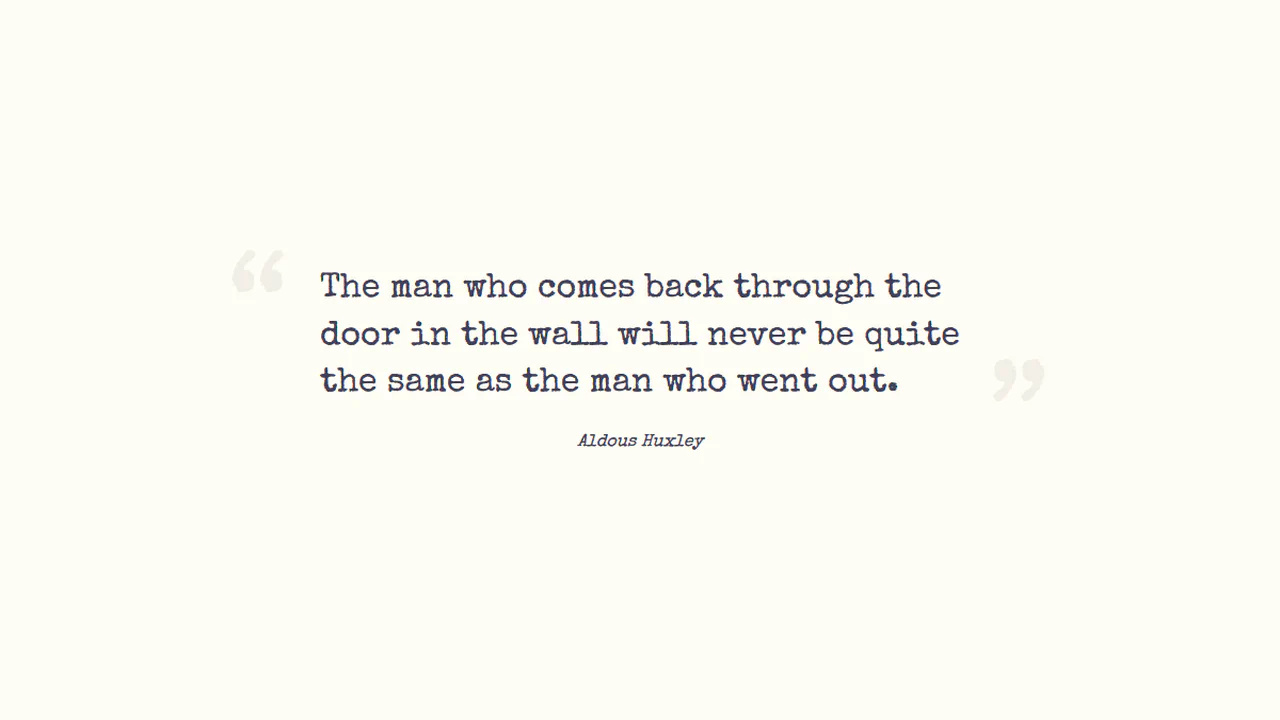
Quote Styling
This clean typewriter-style blockquote layout centers text over a warm cream background. It uses :before and :after pseudo-elements to render giant 8rem double quote marks. By absolute-positioning them to the left and right margins and coloring them a subtle, muted beige (#f1efe6), it frames the paragraph without clutter.
See the Pen Quote Styling.