20+ CSS Blog Cards: Free Examples & Code Snippets
Blog cards structure article previews into scannable, visually consistent grids that balance imagery, typography, and metadata. Well-crafted card layouts improve content discoverability without overwhelming the reader.
- CSS Grid with auto-fill and minmax() creates responsive card columns that reflow automatically, eliminating per-breakpoint media queries while maintaining consistent gap spacing.
- Fixed aspect-ratio containers with object-fit: cover reserve image space before assets load, preventing layout shifts and keeping the card grid stable during content hydration.
- The line-clamp property truncates multi-line excerpts consistently, ensuring all cards in the grid maintain equal height regardless of content length without hardcoded overflow values.
Browse this collection of CSS blog cards to master responsive, accessible article layouts that present your content with clarity and visual consistency.
Table of Contents:
Examples
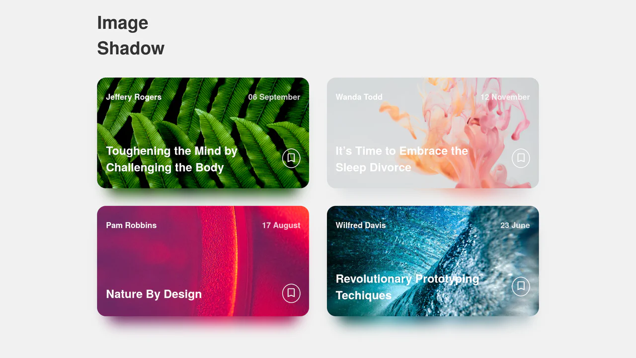
Dynamic Image Drop Shadow Cards
A responsive grid of article cards showcasing a dynamic, color-matched drop shadow effect. Built entirely with HTML and SCSS, the trick involves duplicating the card’s background image into a lower z-index container, shifting it downwards, and applying a heavy CSS filter: blur(). This creates a soft, glowing shadow that perfectly matches the hues of the original photograph.
 Chrome 57+
 Edge 16+
 Firefox 52+
 Safari 10.1+
See the Pen Dynamic Image Drop Shadow Cards.

Wall of Text: Blogged
A futuristic, interactive blog card featuring AI-generated content fetched dynamically via JavaScript. The layout utilizes advanced CSS techniques like :has() for expandable sections, masking and blend modes for rich graphical elements, and variable-driven cursor tracking animations, creating a dynamic and engaging reading experience.
See the Pen Wall of Text: Blogged.
Blog Entry Layouts
A responsive blog post card layout where Flexbox is used for the flexible arrangement of tags and the footer based on screen width, and icons are implemented via an SVG sprite - they are defined in <defs> and reused with <use>, optimizing graphics management.
See the Pen Blog Entry Layouts.
CSS Blog Card
A SCSS card with a multi-layered structure, where a text block smoothly “slides up” on hover. Dimensions and colors are defined by variables, while z-index and position: absolute are used to manage layers of text and overlays that darken the background for better readability.
See the Pen CSS Blog Card.
Blog Card
A multi-layered card that combines a classic float-based layout with position: absolute for offsetting elements, while multiple box-shadow properties create a depth effect - plus, an elegant image centering trick using transform: translate(-50%, -50%).
See the Pen Blog Card.
Blog Cards
A responsive blog card component built with Flexbox and SCSS transitions. Features an interactive image scale and a sliding metadata overlay triggered by hover states. Supports alternating layout directions to ensure visual variety within content grids.
See the Pen Blog Cards.
CSS Only News Cards
Interactive article cards utilizing SCSS transforms and the checkbox hack for menu logic. These snippets provide fluid hover states and pseudo-element data layers for news and blog layouts.
See the Pen CSS Only News Cards.
Blog Card
Media cards featuring SVG masks for transparent typography effects. Smooth background scaling on hover provides depth without adding bulk. The LESS-based architecture ensures structural logic and high performance.
See the Pen Blog Card.
Blog Post Item
Responsive blog card featuring dynamic overlays. CSS transitions reveal content and metadata on hover. Direct transform logic, zero bloat.
See the Pen Blog Post Item.
Large Blog Card
Responsive content card built with LESS using a two-column grid layout. Visual hierarchy is maintained through precise dividers and balanced typography. Direct media query logic ensures a clutter-free experience across all screen sizes.
See the Pen Large Blog Card.
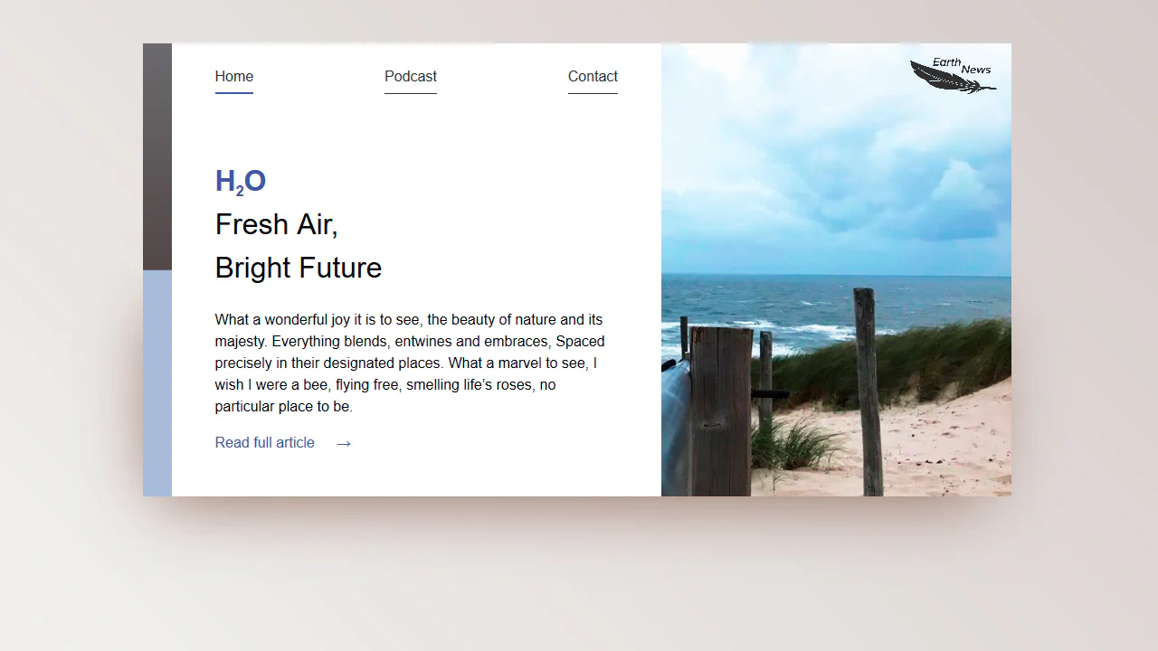
Blog Card: Earth News
A responsive card layout powered by CSS Grid and Custom Properties for precise spacing control. Features semantic navigation and a media-dependent column structure. The styling logic ensures a clean separation of content and visuals across all viewports.
See the Pen Blog Card: Earth News.
Blog-Card
A blog card featuring interactive axis offset transitions on hover. Built with CSS transforms and the clip property for precise image masking. Clear typographic hierarchy and fixed dimensions deliver a logical content layout.
See the Pen Blog-Card.
Card Grid
CSS Grid content layout with a responsive column structure. Leverages Flexbox for internal card alignment and discrete hover elevation. Hierarchy is established through a two-column span for the primary element.
See the Pen Card Grid.
Blog Card
Blog card UI utilizing CSS variables for centralized configuration and responsive typography via calc(). Grid layout ensures precise vertical and horizontal centering. Logical structure for efficient content rendering.
See the Pen Blog Card.
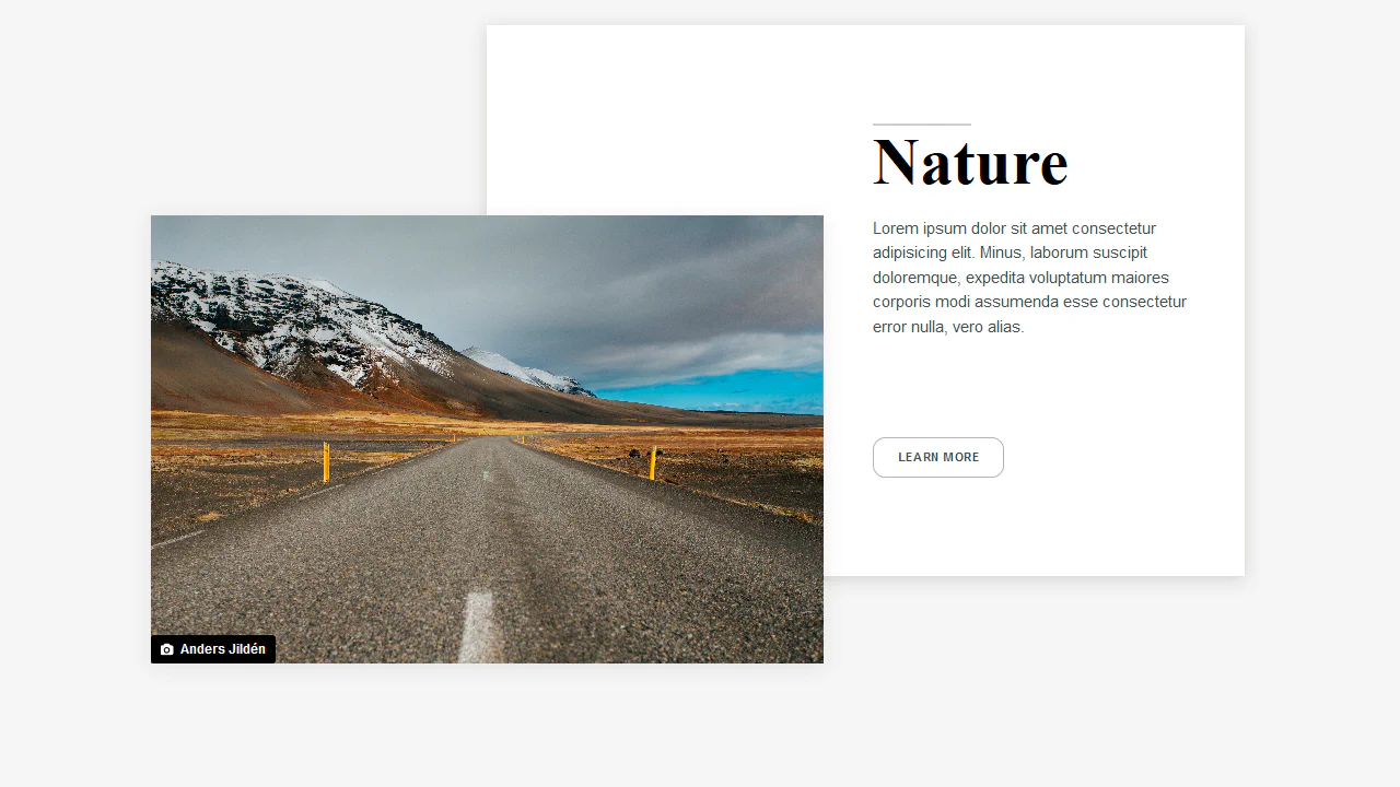
Grid Layout Blog Card
An editorial-style asymmetric layout powered by CSS Grid. On screens wider than 40em, the title, image, and text block are positioned using grid-template-areas. An overlapping white card backing is rendered via a section::after pseudo-element spanning custom grid columns for a staggered 3D depth effect.
See the Pen Grid Layout Blog Card.
Blog Posts Card Layout
A pure CSS card collection featuring a circular reveal animation. Initially masked with a dark image backdrop, hovering scales up two giant circular pseudo-elements (:before and :after) from scale(0) to scale(1). This generates a clean circular wipe, covering the image with white and swapping the text color for contrast.
See the Pen Blog Posts Card Layout.
Card Hover Effect with Cubic Bezier
A pure CSS blog post card featuring springy hover transitions. Hovering triggers a bouncy cubic-bezier layout shift that compresses the header image and expands the text container to 50% height. Concurrently, the header image scales up slightly, while inline tag underlines expand vertically to highlight categories.
See the Pen Card Hover Effect with Cubic Bezier.
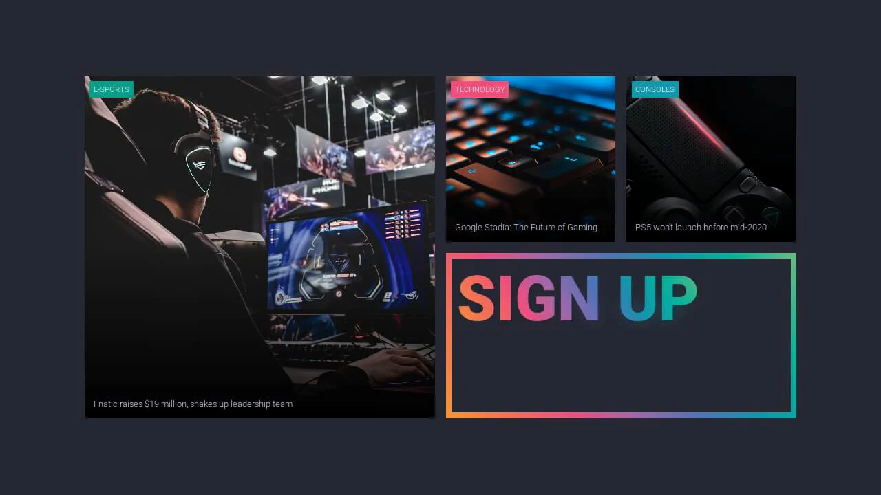
Featured News Cards
An asymmetrical CSS Grid dashboard. The layout organizes responsive cells via grid-template-areas with aspect ratios protected by a padding trick. The signup card implements a vibrant, neon-glowing typography effect by clipping gradients using background-clip: text and layering a blurred duplicate text with filter: blur(10px).
See the Pen Featured News Cards.
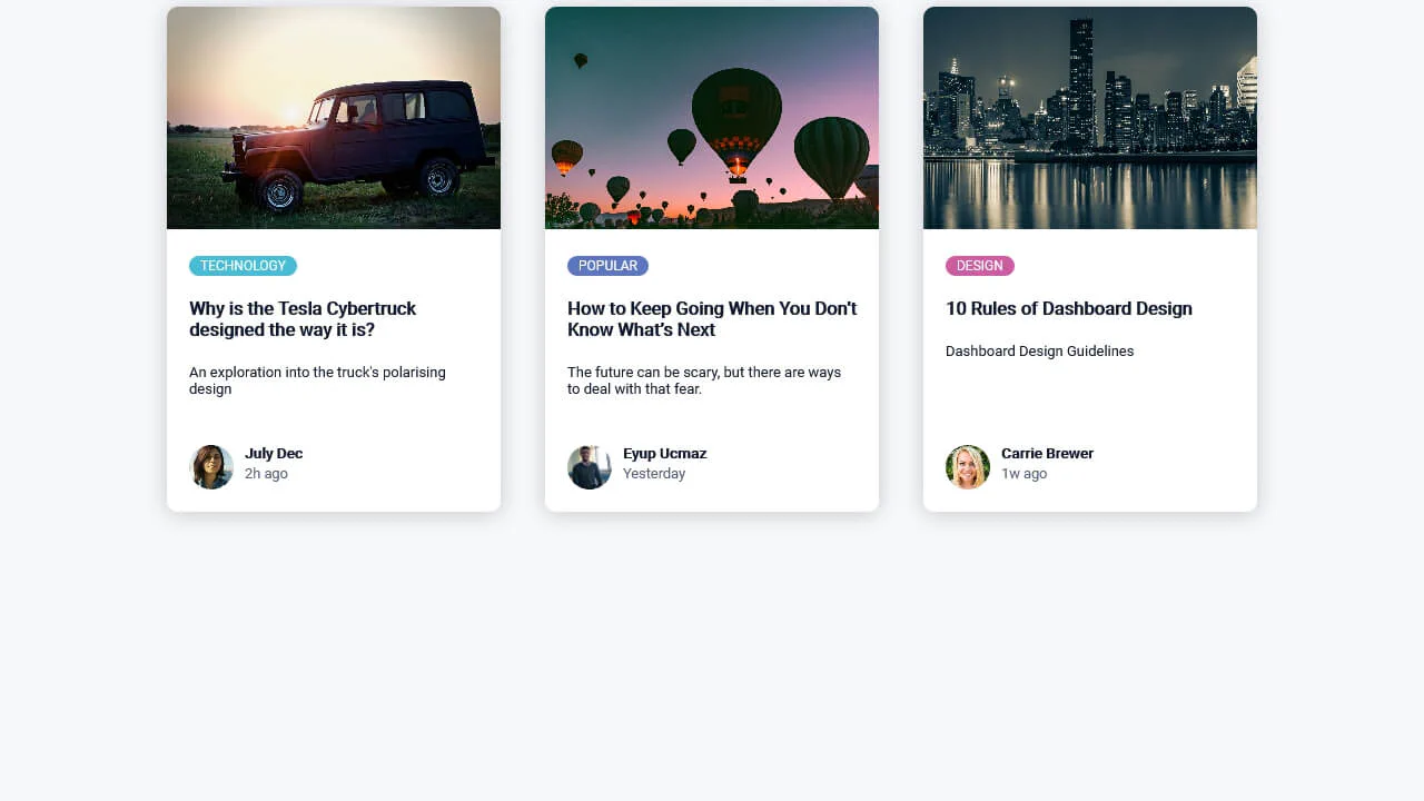
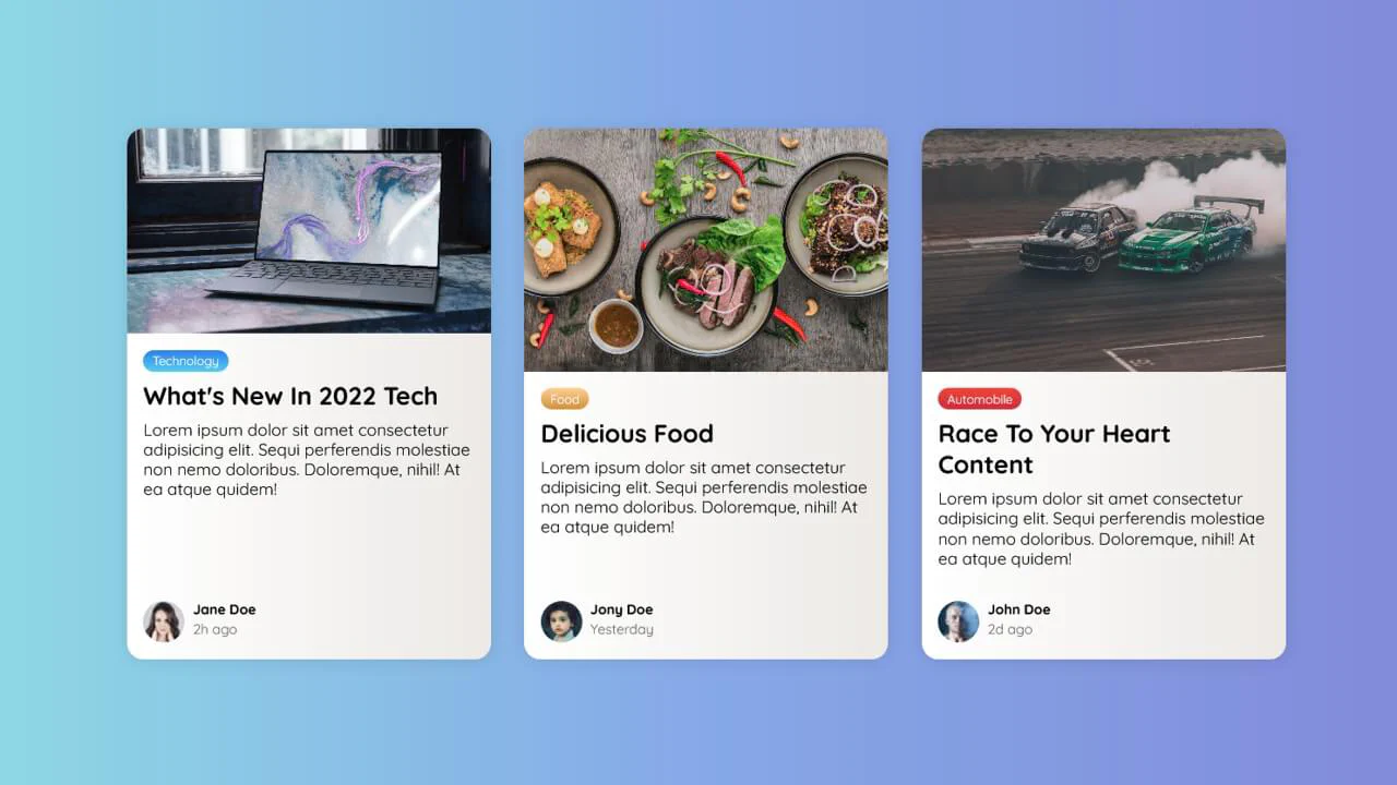
Article Card
A clean, responsive set of blog preview cards. Built with flexbox alignment, the card layout utilizes margin-top: auto to align the author metadata consistently at the bottom. It features color-coded category badges, object-fitted cover images cropped via overflow: hidden, and soft box-shadow depth.
See the Pen Article Card.
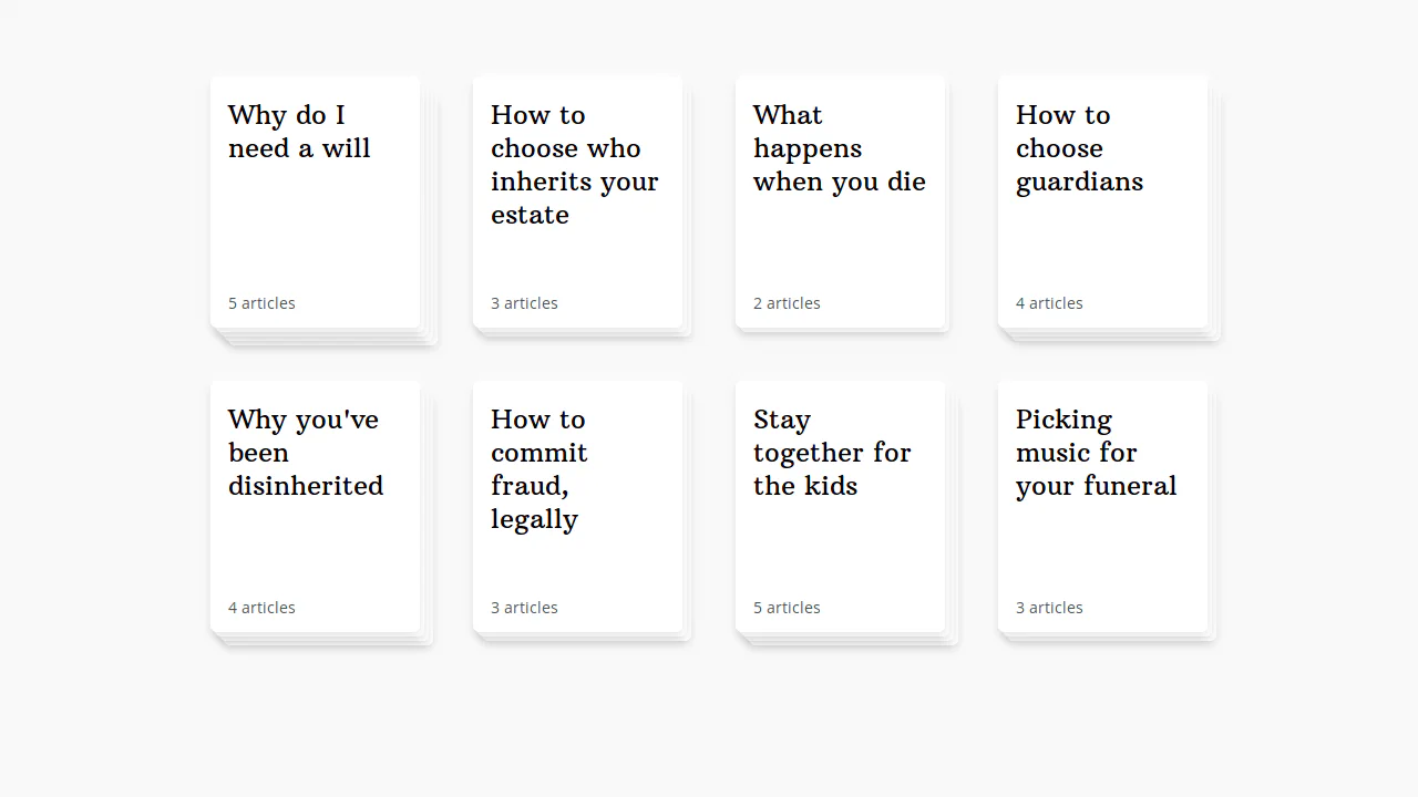
Article Deck
A pure CSS staggered card deck layout. It structures card cells in a responsive grid, utilizing custom properties to calculate distinct diagonal translate offsets on nested child layers to mimic a paper stack. Hovering shifts the base container up-left while increasing the offset multiplier, fanning out the layered stack.
See the Pen Article Deck.
Blog Card
A responsive layout of blog preview cards styled with smooth gradients. The container utilizes CSS clamp() to dynamically scale card widths, while margin-top: auto consistently anchors the author footers at the bottom of the columns. Features custom vertical gradient badges, subtle dual-tone card fills, and cropped cover images.
See the Pen Blog Card.
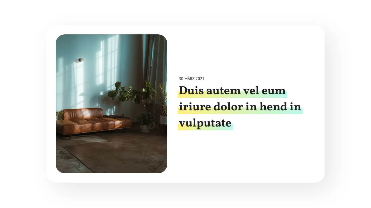
Modern Text Decoration with CSS box-decoration-break
A responsive, typography-rich editorial card styled with CSS gradients. On screens wider than 576px, the layout shifts from a stacked column to a side-by-side row. The multiline text highlight is built using an offset linear-gradient background-image paired with box-decoration-break: clone for seamless line wraps.
See the Pen Modern Text Decoration with CSS box-decoration-break.