20+ CSS Blur Effects: Free Code Snippets & UI Examples
CSS blur effects establish spatial depth and visual hierarchy within a layout, allowing developers to direct user focus by obscuring background layers or creating frosted glass overlays.
- Modern implementations leverage the backdrop-filter property to dynamically blur elements sitting beneath a translucent surface, calculating pixel interpolation in real-time based on the z-axis context.
- To mitigate rendering bottlenecks and protect INP metrics, performant architectures restrict blur operations to tight bounding boxes and avoid animating filter values, which forces expensive frame-by-frame rasterization.
- Advanced depth-of-field simulations combine standard CSS filters with CSS mask-image gradients, enabling smooth, progressive blurring that seamlessly fades into the surrounding spatial architecture.
Master these translucent rendering strategies to engineer sophisticated, layered interfaces that feel physically grounded without compromising thread execution.
Table of Contents:
Examples
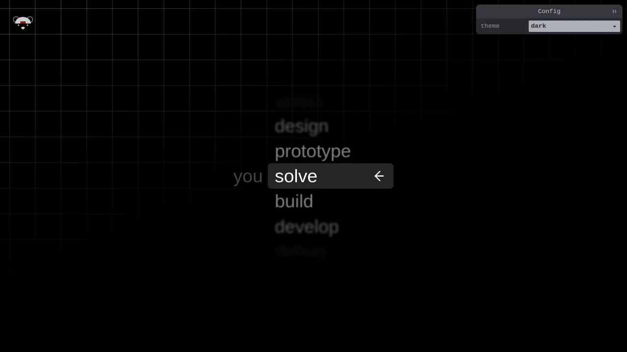
Scroll-Snapping Popover Select Dropdown Menu
An experimental custom select dropdown menu built on native HTML5 base-select specifications. The picker popover displays options in a vertically scroll-snapped viewport that fades and blurs adjacent values based on scroll proximity. A lightweight GSAP scrolling script automatically centers and aligns selected items in real time, while modern @starting-style manages discrete popover overlay entry transitions. (Requires: gsap.js, tweakpane.js)
 Chrome 130+
 Edge 130+
See the Pen Scroll-Snapping Popover Select Dropdown Menu.
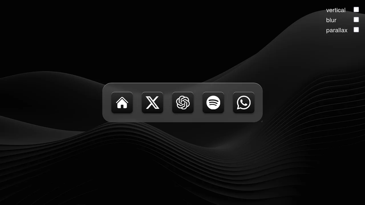
Scroll-Driven macOS iOS Dock Concept
Pure CSS Scroll-Driven macOS iOS Dock recreates Apple’s legendary dock using the native CSS Scroll-Driven Animations API. Icons dynamically scale, blur, and shift depth completely without JavaScript. Utilizing @supports (animation-timeline: scroll()), the layout safely handles horizontal and vertical snaps. A zero-dependency, ultra-lightweight demonstrator of modern CSS capabilities. (Requires: gsap.js, scroll-trigger.js)
Chrome 115+
Edge 115+
 Safari 26+
See the Pen Scroll-Driven macOS iOS Dock Concept.

CSS Scroll-Driven Radial Gallery
This is a Scroll-Driven Radial Gallery. It binds a circular, rotating layout directly to the viewport’s scroll position. Its function is to transform linear page scrolling into a dynamic, spatial carousel, keeping only the active item in sharp focus while pushing others into a blurred, grayscale periphery.
Chrome 132+
Edge 132+
Safari 26.2+
See the Pen CSS Scroll-Driven Radial Gallery.

Frameless Blurred Background Image Effect in CSS
This is a Frameless Blurred Background Image Effect. It uses an innovative CSS technique to generate a soft, atmospheric background for an image by duplicating, stretching, and blurring the image itself. The function is to create a polished, “pro” look for profile pictures or product thumbnails without requiring image editing software or complex JavaScript canvas manipulations.
Chrome 15+
Edge 12+
 Firefox 15+
Safari 6+
Firefox 15+
Safari 6+
See the Pen Frameless Blurred Background Image Effect in CSS.

CSS 3D Stacking Card List Effect
This 3D Stacking Card List Effect transforms a standard vertical list into an immersive, layered user interface. By leveraging CSS 3D transforms and focal blur filters, it simulates a physical deck of cards where background items appear distant and out of focus, settling into a clear layout only upon interaction.
Chrome 84+
Edge 84+
Firefox 63+
Safari 14.1+
See the Pen CSS 3D Stacking Card List Effect.
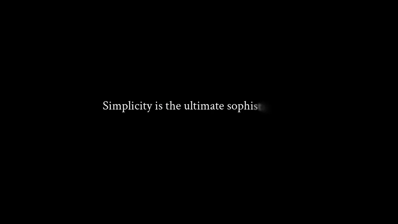
Text Animation
An elegant, cinematic text reveal where each letter smoothly ’emerges’ from the mist, lending significance and visual weight to the phrase.
See the Pen Text Animation.
Blurry Loading
As the counter reaches 100%, the blurry image sharpens into focus, while the counter itself dissolves and fades away, revealing the content.
See the Pen Blurry Loading.
Blurry Loading Page Animation
The use of a pure JavaScript timer for step-by-step update of the loading state, with synchronized inverse change of opacity for the counter and filter: blur for the background element.
See the Pen Blurry Loading Page Animation.
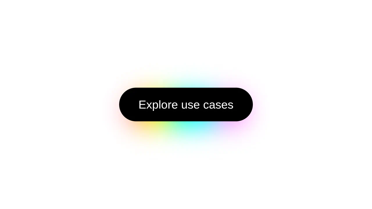
CSS Rainbow Shadow Button
Featuring a modern aesthetic, this button generates a soft aura using a blurred and offset pseudo-element whose color dynamics are precisely controlled by the oklch function and longer hue interpolation within the linear-gradient.
See the Pen CSS Rainbow Shadow Button.

CSS Sticky Progressive Blur on Scroll
A progressive blur on scroll effect is implemented, where a sticky element utilizes backdrop-filter: blur() to dynamically change its transparency and blur strength as content scrolls underneath, creating a modern UI “fade-out” effect.
See the Pen CSS Sticky Progressive Blur on Scroll.
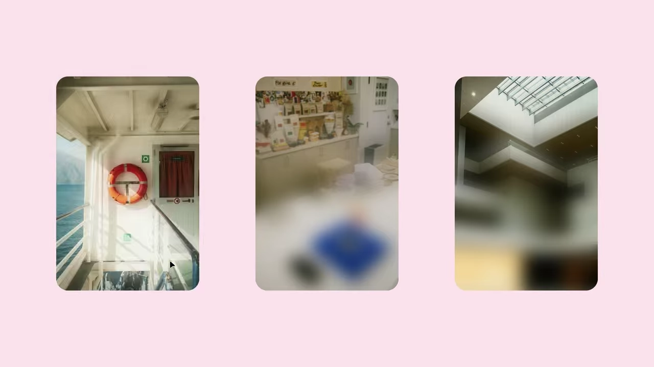
Progressive Blur with Animation
A demonstration of smooth progressive image blurring using the CSS @property feature to define animatable custom variables. The effect is achieved by layering a blurred pseudo-element with a mask-image: linear-gradient() mask, creating a dynamic focus effect on hover.
See the Pen Progressive Blur with Animation.
Fancy Banners
A stylish “hipster” image card featuring a lifted paper effect created with rotated pseudo-elements and shadows.
See the Pen Fancy Banners.

Blockquote
Elegant typography for a blockquote where the hanging-punctuation CSS property pushes quotes outside the text, and text-wrap: balance automatically balances line lengths. Visual emphasis is created with a ::before pseudo-element that adds a blurred background, creating a glow effect behind the text.
See the Pen Blockquote.
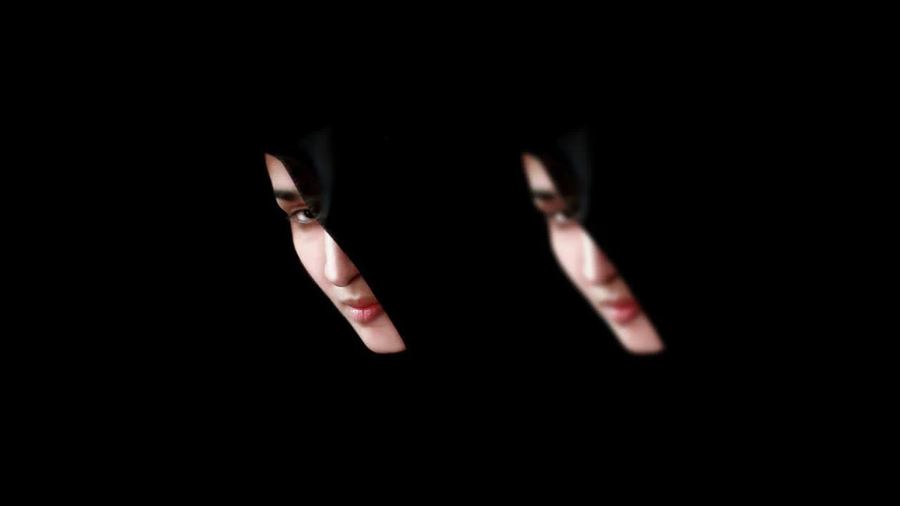
Cross-Browser Image Blur with CSS Transition
A relevant example showing how to use CSS transition to smoothly transition an image from a blurred to a sharp state on hover. A multi-tiered filter implementation (including an SVG fallback) is used to ensure identical smoothness and performance of the blur effect across different browsers.
See the Pen Cross-Browser Image Blur with CSS Transition.


This grid-based interaction component uses high-density CSS grid cells and filter: blur() to execute a granular, multi-stage visual transformation. The technical implementation offloads pixel-level rendering to the GPU by applying transformations to individual grid items, while transition: all 0s on hover ensures immediate state switching. The interaction distills imagery into a rhythmic, particulate unveiling that prioritizes precise, high-fidelity motion.
Pure CSS Text Blur
This typographic component utilizes text-shadow manipulation as a lightweight, performant alternative to standard blur filters. Technical implementation orchestrates a transition from a computed shadow-based blur to crisp, transparent text, offloading rendering to the browser’s compositor for efficient state switching. The interaction distills focus into a sharp, responsive reveal that prioritizes visual clarity.
See the Pen Pure CSS Text Blur.
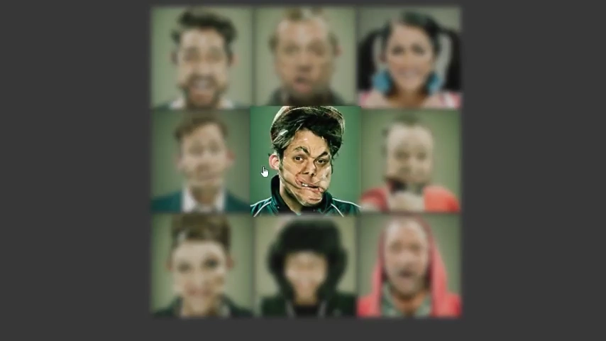
This grid component leverages filter: blur() and opacity scaling to create a high-contrast focus interaction. Technical implementation uses CSS transitions to manage selective state shifts, offloading blur rendering to the GPU for fluid hover feedback. The interaction distills modular focus into a rhythmic, responsive unveiling that prioritizes visual hierarchy.
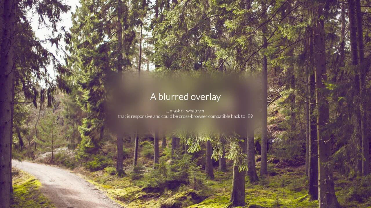
A Blurred Overlay
This frosted glass utilizes a pseudo-element with filter: blur() and background-attachment synchronization to simulate realistic depth. Technical implementation anchors the visual mask to the container’s coordinates, offloading blur rendering to the GPU for seamless compositing. This interaction creates a clean, cohesive visual layer that prioritizes spatial clarity and elegant information disclosure.
See the Pen A Blurred Overlay.
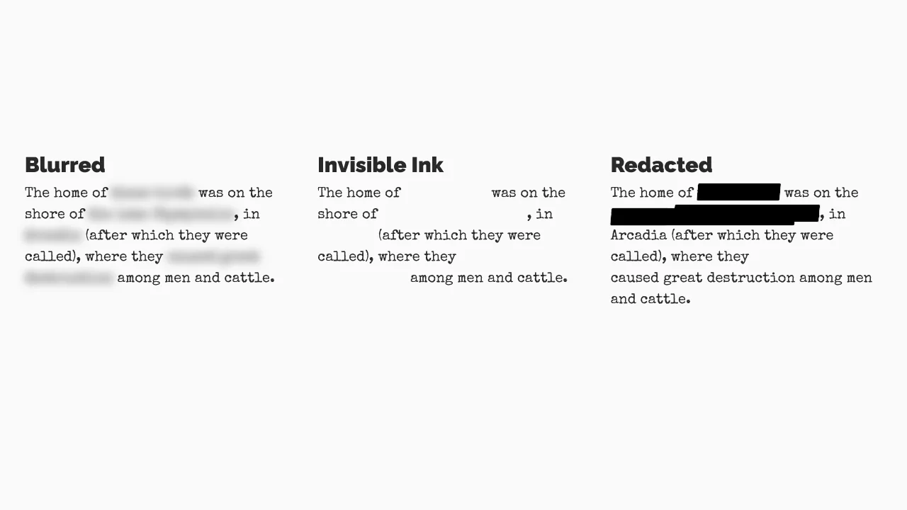
Blurred, Invisible Ink, and Redacted Text
This typographic masking component employs selective filter: blur() and pseudo-element overlays to perform live data obfuscation. Technical implementation leverages span-based isolation and skewed after elements to orchestrate modular visibility shifts, offloading rendering to the GPU for sharp, performance-efficient masking. The design distills sensitive information into raw, protected states, prioritizing visual security and structural clarity.
See the Pen Blurred, Invisible Ink, and Redacted Text.

Shifting Depth of Field
This typographic animation utilizes staggered filter: blur() keyframes to create a rhythmic, wave-like focus effect. Technical implementation relies on declarative CSS animations to shift visual fidelity across character layers, offloading compute-intensive blurring to the GPU for fluid, jitter-free performance. This interaction distills text into a pulsating, kinetic display, prioritizing atmospheric depth and clarity.
See the Pen Shifting Depth of Field.
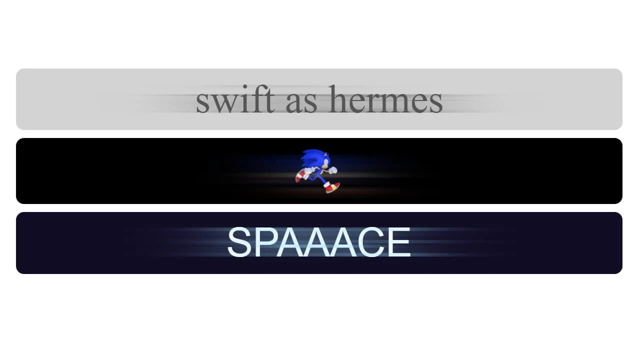
CSS Directional Motion Blur
This Motion Blur Overlay simulates high velocity by layering a blurred copy over the original. It relies on inverse scaling: the wrapper stretches the mask, while the inner element restores original proportions, creating a distinct “motion trail.” Utilizing GPU-accelerated transform and filter, it achieves fluid dynamics without heavy scripts, turning static content into a kinetic experience.
See the Pen CSS Directional Motion Blur.

This text reveal component orchestrates a choreographed sequence of blurred-to-sharp transitions using GSAP and custom data attributes. Each word is treated as an independent layer, with staggered durations and blur intensities calculated dynamically to ensure a rhythmic, atmospheric emergence. By leveraging will-change: opacity, the implementation minimizes repaint overhead, delivering a polished, performance-driven reveal that prioritizes focus and visual clarity.