20+ CSS Book Effects: Free Code Snippets & Examples
CSS book effects transform flat content into immersive, skeuomorphic reading experiences, bridging the gap between digital interfaces and physical print. By simulating realistic page flips, developers can create engaging presentations and portfolios that naturally capture user interaction while maintaining high structural performance.
- Advanced page-turning mechanics rely heavily on the transform-style property set to
preserve-3d, ensuring that nested page layers maintain mathematically accurate spatial coordinates during complex rotations. - Realistic depth and paper physics are calculated using dynamic gradients and shadows, executing strictly on the compositor thread to prevent main-thread layout reflows during continuous drag or hover interactions.
- Modern architectures construct the spine and leaves utilizing a robust CSS Grid layout, anchoring rotational axes with
transform-originto deliver deterministic, hardware-accelerated kinematics without relying on heavy WebGL contexts.
Analyze these dimensional reading components to master the intersection of spatial DOM manipulation and interactive typography.
Table of Contents:
Examples
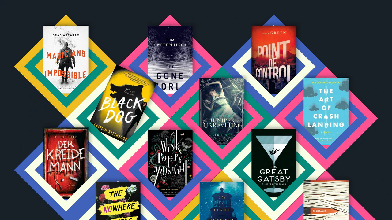
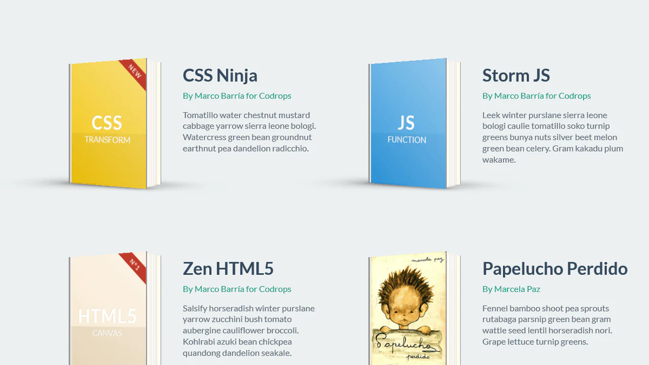
Responsive CSS Grid: Books
A unique, dynamic, and responsive collage of images that uses advanced CSS techniques to create a 3D-like geometric pattern.
See the Pen Responsive CSS Grid: Books.
CSS Sprite-Based Flip Carousel Using Scroll-Timeline
A modern implementation of interactive page flipping where the sprite animation (background-position) is fully synchronized with page scrolling using the new CSS scroll-timeline feature, eliminating JavaScript for timing control.
See the Pen CSS Sprite-Based Flip Carousel Using Scroll-Timeline.

Pure CSS Magazine Style
This interactive flipbook component uses CSS perspective and rotateY transforms to create a physical page-turning effect. State management relies on radio inputs and complex sibling selectors, avoiding JavaScript entirely. GPU-accelerated layers and clip-path masks ensure smooth transitions for visual content. The architecture prioritizes structural modularity and performance-oriented motion.
See the Pen Pure CSS Magazine Style.
George Orwell 1984 Book Cover
A stylish 3D book effect with a realistic cover, created purely with CSS. Interactive page-flipping (rotateY) is activated on hover, demonstrating a masterful use of transform-style: preserve-3d and shadows.
See the Pen George Orwell 1984 Book Cover.
3D Book Design
This component simulates a 3D isometric object using skew and rotate transforms. Pseudo-elements construct side and bottom faces to create the illusion of depth without external libraries. box-shadow and static coordinates minimize layout calculations, ensuring efficient performance.
See the Pen 3D Book Design.
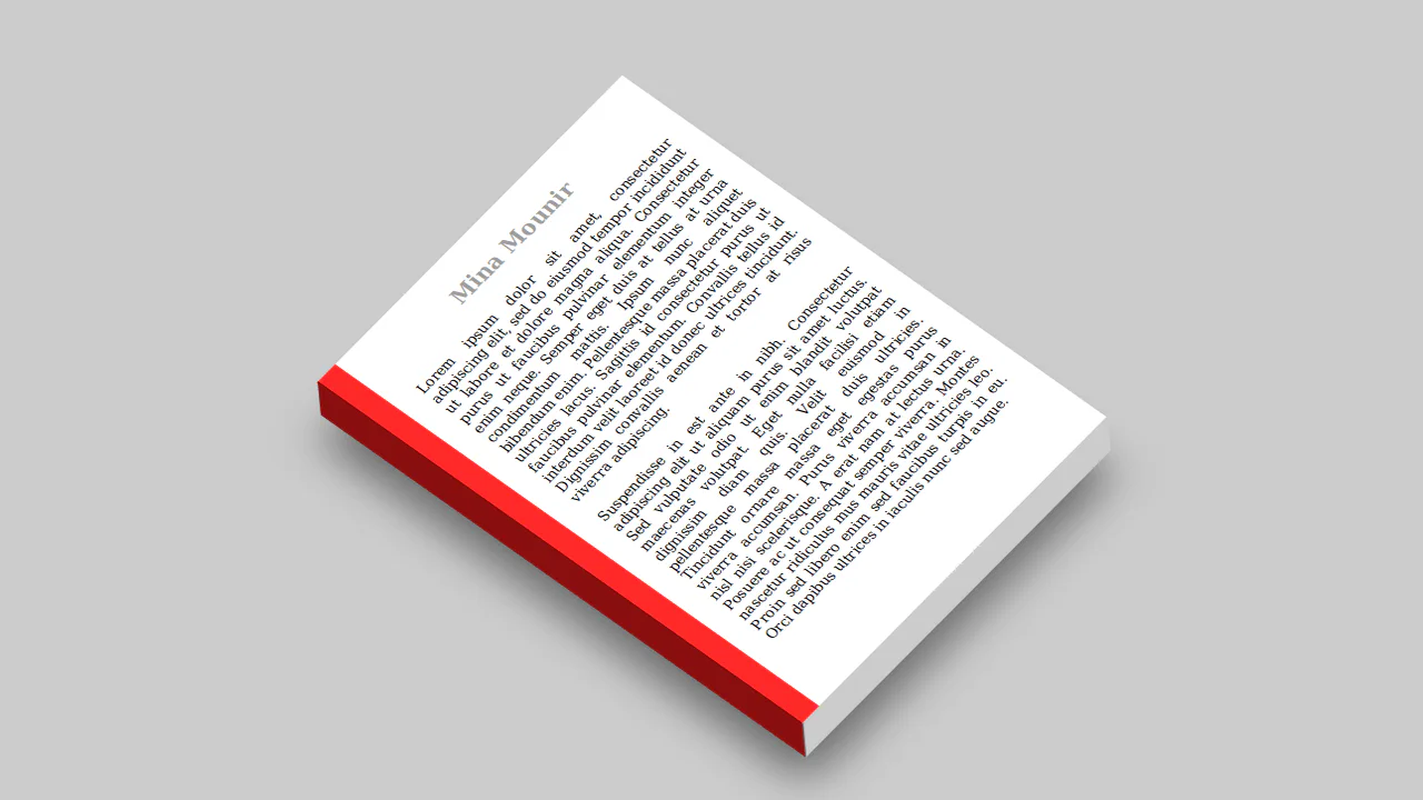
CSS-Only Foundation Book Preview
This component simulates a book flip using transform: rotateY and perspective. State is managed via hidden input elements, eliminating JS. Layers utilize transform-style: preserve-3d for volumetric rendering. This architecture ensures hardware acceleration and motion precision.
See the Pen CSS-Only Foundation Book Preview.
CSS Coffee Table Book Effect
This component constructs a 3D book projection using complex isometric transform strings and layered linear-gradient stacks to simulate physical volume. By offloading intricate shadow and binding rendering to the GPU-accelerated compositor, it maintains high-fidelity static geometry. The design distills flat imagery into a tactile, sculptural form, prioritizing material realism.
See the Pen CSS Coffee Table Book Effect.

Single DIV Book
This static graphic component utilizes layered linear-gradient stacks and box-shadow geometry to simulate a stylized book. By offloading complex shape rendering to the CSS engine, it maintains a compact, resolution-independent vector display. The design distills iconography into a clean, geometric form, prioritizing visual efficiency.
See the Pen Single DIV Book.
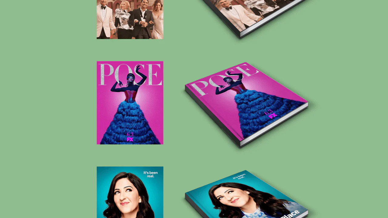
3D Ebook Flip Animation
This mobile interface uses perspective and translateZ to simulate a 3D book cover reveal. State transitions rely on sibling selectors to shift layers via hardware-accelerated transforms. The design translates physical book mechanics into a digital interaction, prioritizing spatial perception and responsiveness.
See the Pen 3D Ebook Flip Animation.
Book Preloader
This object replicates a cyclic page-flip animation using transform: rotateY and perspective. Synchronized keyframes manage layer states, creating a volumetric illusion without external scripts. Delegating rendering to the GPU ensures a stable frame rate despite high animation density.
See the Pen Book Preloader.
CSS 3D Book
This interactive object simulates page-turning using transform-style: preserve-3d and rotatey. State management is handled via JavaScript, toggling CSS classes to trigger transformation animations for individual pages. The architecture leverages GPU-accelerated translatez to generate depth, maintaining high performance while rendering a large number of layers.
See the Pen CSS 3D Book.
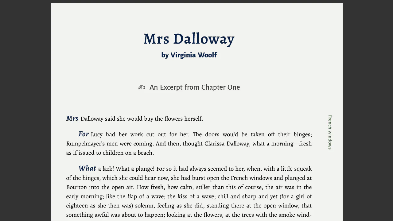
Book Text: Word Initials and Margin Section Labels
This text block utilizes background-clip: text to create a gradient fade-out effect, simulating a seamless disappearance. Vector graphics are embedded directly via data:image/svg+xml, reducing HTTP requests. The flexbox layout ensures stable positioning across varying scales.
See the Pen Book Text: Word Initials and Margin Section Labels.
CSS Book Text
This layout utilizes semantic markup and typography to create a clean reading space. An absolutely positioned pseudo-element header:after provides decorative contrast, while vertical margins and borders define the hierarchy. The absence of extraneous graphics and strict adherence to a grid ensure focus remains on the content.
See the Pen CSS Book Text.
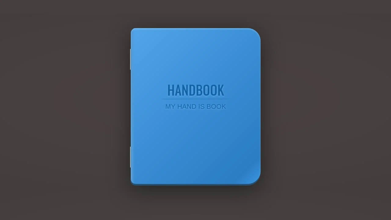
Handbook CSS3
This object models a stylized handbook using multi-layered gradients and box-shadow to simulate cover texture. Pseudo-elements form binding details, while text-shadow provides typographic emphasis. Strict geometry and high-contrast transitions highlight the physical properties of the object within digital space.
See the Pen Handbook CSS3.
This object simulates a physical book using perspective and transform-style: preserve-3d to create a fully 3D space. Pages and covers animate via rotateY, which, combined with shadows and edge thickness, creates a realistic opening effect. Rendering is offloaded to the GPU, ensuring high motion precision.
CSS 3D Bending Effect - Page Flip
This object simulates the physics of page-turning using transform-style: preserve-3d and nested layers. Smooth bending is achieved by dividing the page into narrow segments, each rotating around its axis. GPU hardware acceleration ensures synchronized animation performance, creating a realistic sense of volume without requiring scripts.
See the Pen CSS 3D Bending Effect - Page Flip.
Book Opening Animation
This object simulates book opening using perspective and rotateY. Page transitions are sequenced via animation-delay, creating a staggered flip effect. Hardware acceleration via GPU ensures fluid z-index and transformation shifts, forming a deep visual structure without external scripts.
See the Pen Book Opening Animation.
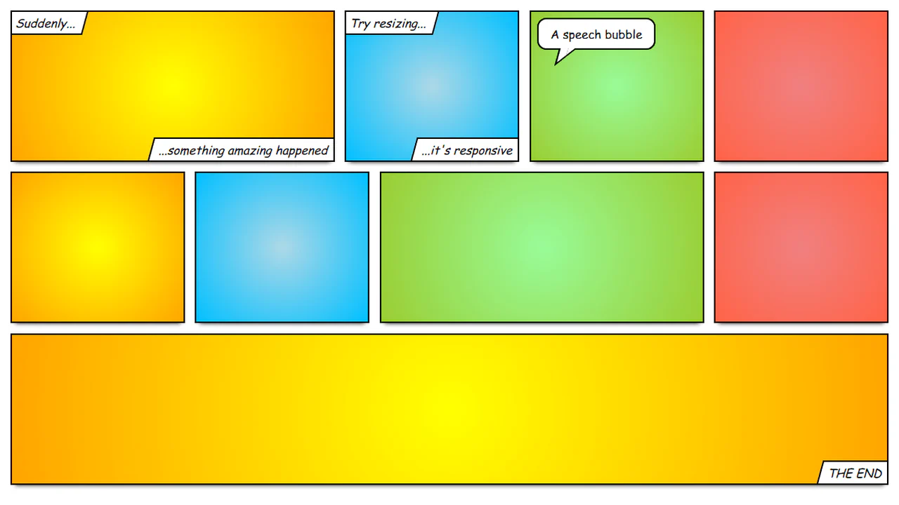
Responsive Comic Book Layout
This layout utilizes flex-wrap and flex-basis to form a responsive grid simulating a comic book structure. Decorative elements, like speech bubble tails, are created via border manipulation on before and after pseudo-elements with a skew transform. The arrangement ensures predictable block behavior during resizing, maintaining visual integrity.
See the Pen Responsive Comic Book Layout.
Spinning 3D Book Using Only CSS
This 3D object simulates a book assembled from flat planes using perspective and translate3d. Each face is positioned in space via nested transformations and rotateY / rotateX rotations. Rotation is managed at the parent container level, delegating calculations to the GPU to ensure fluid motion.
See the Pen Spinning 3D Book Using Only CSS.
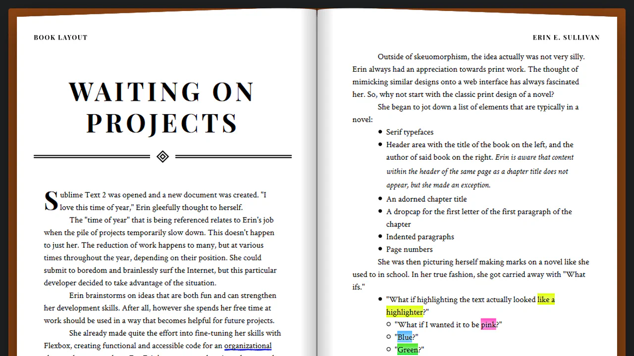
Book Layout
This layout utilizes column-count and column-gap to replicate a printed book spread. Responsiveness is handled via media queries that simplify the grid and strip decorative elements on smaller screens. CSS masks and pseudo-elements construct the book structure, maintaining clean markup without external scripts.
See the Pen Book Layout.
CSS Book Animation
This object uses transform: rotate with will-change to create a tilt effect on the cover. Pseudo-elements before generate shadows via background images, while transition ensures a smooth return on hover. The architecture minimizes style recalculation by offloading transformation rendering to the GPU.
See the Pen CSS Book Animation.

Book Group UI
This list utilizes perspective and rotateY to create a 3D book-cover flip effect upon selection. JS toggles classes to trigger CSS animations, fluidly adjusting block dimensions and positioning. Hardware-accelerated transforms ensure responsiveness during state transitions, maintaining a clean visual hierarchy.
See the Pen Book Group UI.
Books Hover Animation
This layout simulates a 3D bookshelf by layering two identical lists: one blurred via filter: blur, the other providing sharp hover feedback. rotateY and rotateZ transforms, combined with box-shadow offsets, create depth and volume. GPU hardware acceleration ensures fluid interactions during state changes.
See the Pen Books Hover Animation.

CSS Flipping Book
This object simulates book opening using perspective and transform-style: preserve-3d. Each page animates individually via rotateY, creating a fan-like spread effect. Hardware-accelerated transforms and box-shadow provide depth and fluid motion during state transitions without requiring JS.
See the Pen CSS Flipping Book.