40+ CSS Borders: Free Examples & Code Snippets
Borders are fundamental structural elements that define boundaries and establish visual order without adding bulk. Beyond simple solid lines, modern CSS enables gradient borders, multi-layered outlines, and decorative frames that remain fully semantic.
- Gradient borders use border-image-source with linear-gradient or conic-gradient and border-image-slice: 1, rendering directly on the border surface without extra pseudo-elements or presentational markup.
- Double and offset borders leverage outline with outline-offset combined with border, creating layered frame effects entirely on the compositor thread without affecting the element’s box model.
- Partial and masked borders apply mask-image with linear-gradient stops to selectively reveal border segments, enabling dashed, dotted, or fragmented appearances through compositor-friendly masking operations.
Browse this collection of CSS borders to master lightweight, themeable frame techniques that define your components with precision and zero image overhead.
Table of Contents:
Examples
Scroll-Driven Crawling Border Frame
Scroll-Driven Crawling Border Frame draws a colorful frame around the viewport as the user scrolls. Utilizing native CSS Scroll-Driven Animations (animation-timeline: scroll()) and sequence keyframes, the borders of two fixed elements expand in height and width. The styling utilizes modern oklch() color math for a vibrant gradient. Clean, pure CSS decoration with no JS overhead.
 Chrome 119+
 Edge 119+
 Firefox (with polyfill)
 Safari (with polyfill)
See the Pen Scroll-Driven Crawling Border Frame.

Retro Airmail Envelope Border
This is a Retro Airmail Envelope Border. It wraps a container with continuous diagonal red and blue stripes. Its function is to provide a nostalgic, thematic framing for content without relying on external raster image assets.
Chrome 108+
Edge 108+
Firefox 101+
Safari 15.4+
See the Pen Retro Airmail Envelope Border.

Animated Border Drawing Button
This is an Animated Border Drawing Button. It transforms a standard call-to-action into a multi-stage micro-interaction. Upon hovering over the button, the component triggers a sequential animation where four corner dots appear, followed by four dashed border lines that “draw” themselves around the button’s perimeter, creating a high-end, futuristic feel.
Chrome 105+
Edge 105+
Firefox 121+
Safari 15.4+
See the Pen Animated Border Drawing Button.

Frameless Blurred Background Image Effect in CSS
This is a Frameless Blurred Background Image Effect. It uses an innovative CSS technique to generate a soft, atmospheric background for an image by duplicating, stretching, and blurring the image itself. The function is to create a polished, “pro” look for profile pictures or product thumbnails without requiring image editing software or complex JavaScript canvas manipulations.
Chrome 15+
Edge 12+
Firefox 15+
Safari 6+
See the Pen Frameless Blurred Background Image Effect in CSS.
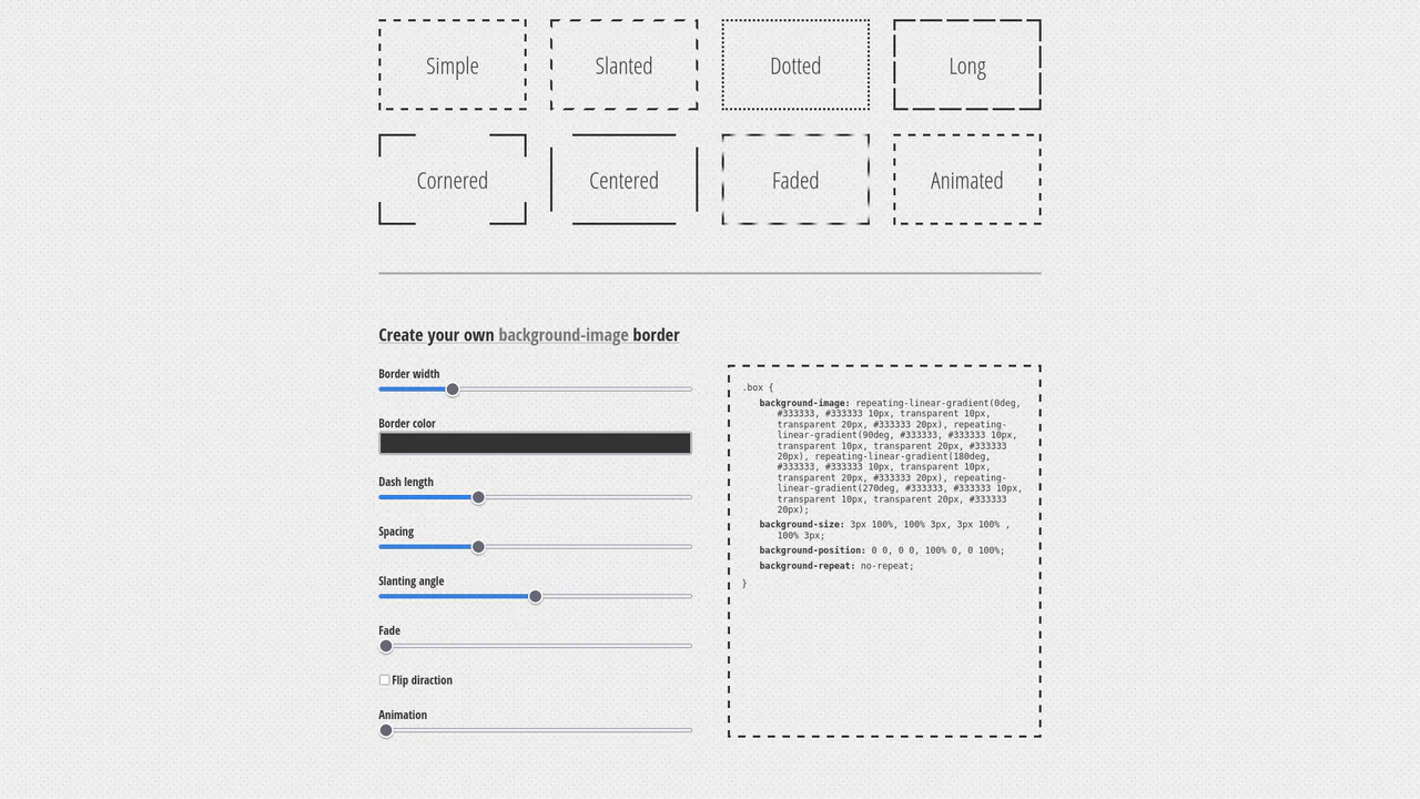
Dashed Gradient Border Generator
This is an Animated Gradient Border Generator. It bypasses standard CSS border limitations by utilizing stacked repeating-linear-gradient functions applied to the background-image. Its function is to provide developers with a visual interface to dial in specific parameters — slant, gap, fade, and velocity — while instantly outputting the required, mathematically precise CSS code.
Chrome 80+
Edge 80+
Firefox 75+
Safari 13.1+
See the Pen Dashed Gradient Border Generator.

Animated Electric Border CSS Card
This is an Animated Electric Border CSS Card. It utilizes an embedded SVG filter to render a dynamic, unstable boundary. Its function is to isolate data and establish a clear focal point. The effect is self-contained and persistent, demanding attention through continuous motion.
Chrome 111+
Edge 111+
Firefox 113+
Safari 15.4+
See the Pen Animated Electric Border CSS Card.

Stripe-Inspired Cards Hover Effect
This Stripe-Inspired Cards Hover Effect replicates the sophisticated “flashlight” border interaction seen on modern SaaS websites. Instead of a simple color change, a soft radial gradient follows the user’s mouse cursor across a grid of cards. This creates a cohesive, lighting-aware interface where elements seem to illuminate as you interact with them.
Chrome 49+
Edge 15+
Firefox 31+
Safari 9.1+
See the Pen Stripe-Inspired Cards Hover Effect.
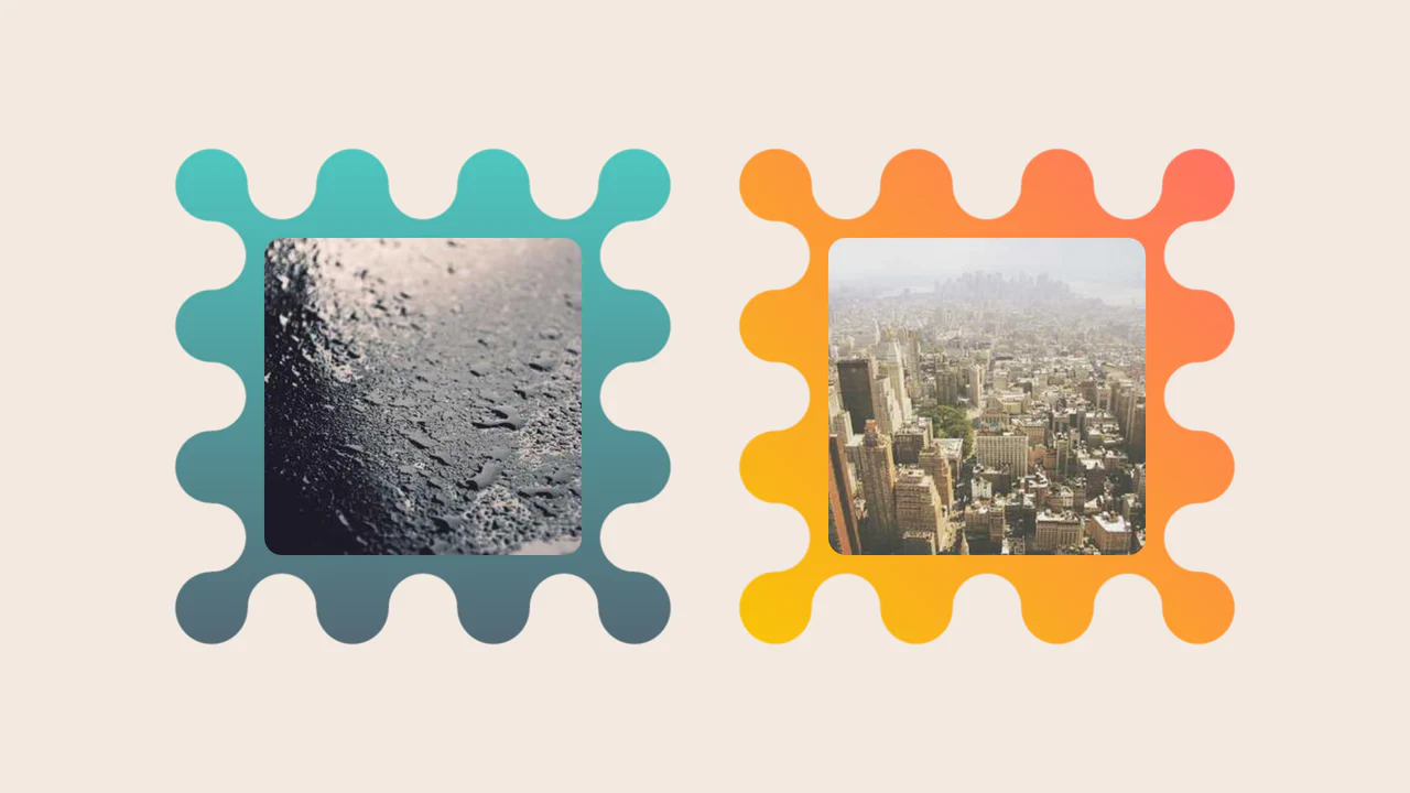
Images Inside Wiggly Boxes
A decorative image frame created entirely with CSS mask compositing. It combines radial-gradient layers with conic-gradient and the intersect composite operator to sculpt a scalloped, wavy border, while the CSS round() function ensures perfect pattern alignment along the edges.
See the Pen Images Inside Wiggly Boxes.

Modern Our Team Section
A stylish, modern employee profile grid on a dark background featuring subtle, elegant gradient borders and atmospheric glowing effects.
See the Pen Modern Our Team Section.
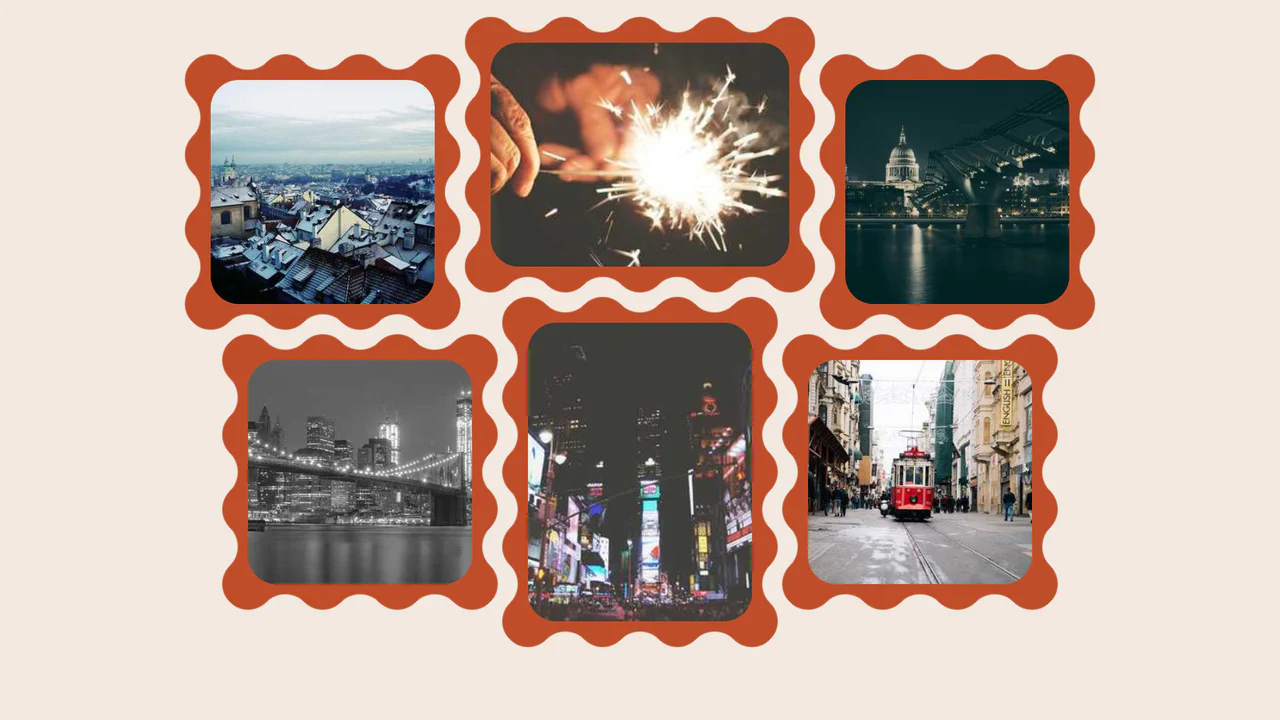
Wavy Image Gallery
Images appear as jigsaw puzzle pieces with interlocking edges that can visually fit together.
See the Pen Wavy Image Gallery.

Art Deco Card
An elegant Art Deco style card created purely with CSS/SCSS, utilizing a sophisticated technique with pseudo-elements to construct complex, multi-layered geometric borders and corners.
See the Pen Art Deco Card.
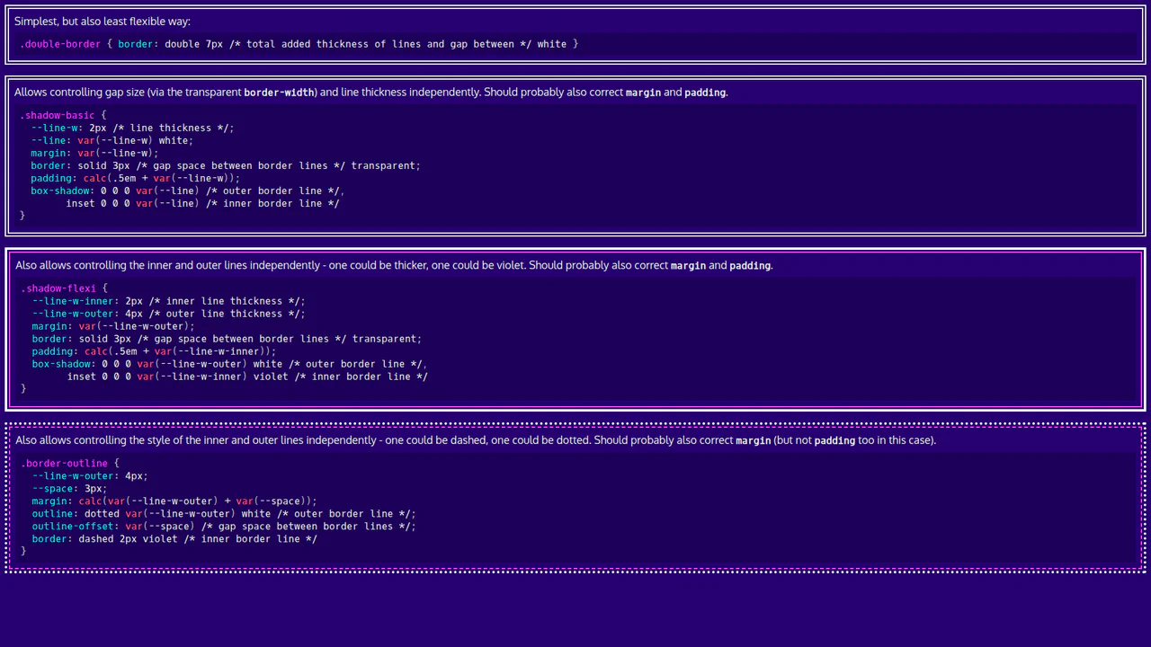
Basic CSS Snippets: Double Borders
This demo is a visual guide to creating double borders and frames using pure CSS. It showcases elegant and flexible approaches with box-shadow, outline, and CSS variables, making the code clean and easily customizable.
See the Pen Basic CSS Snippets: Double Borders.
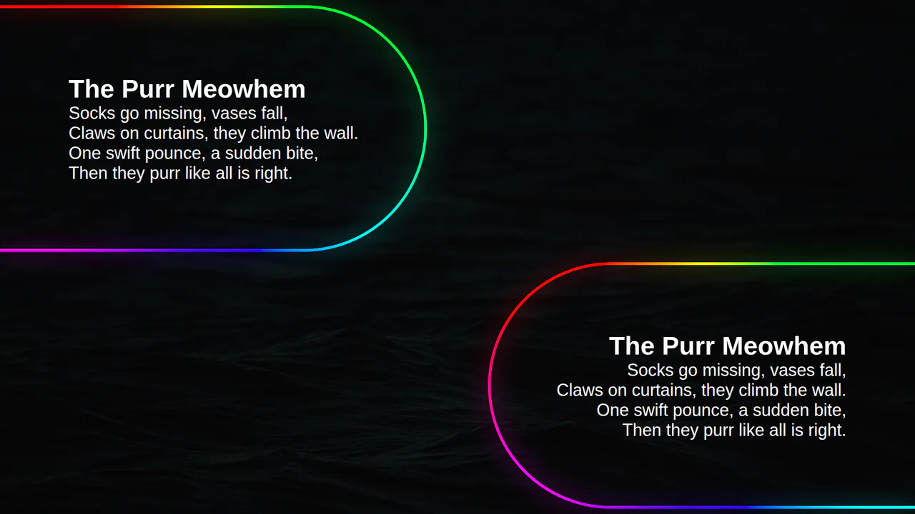
Animated Border Gradient Glow
An animated rainbow border effect with a neon glow, implemented using @property, conic-gradient, and SVG filters. The @keyframes animation smoothly changes the --a CSS variable, which controls the hue in the conic-gradient, creating a continuous color transition.
See the Pen Animated Border Gradient Glow.
Partial Dashed Bottom Border
A stylish custom dashed underline built with repeating-linear-gradient as a background image for superior control. This snippet offers precise adjustment of dash lengths and gaps via SCSS variables.
See the Pen Partial Dashed Bottom Border.
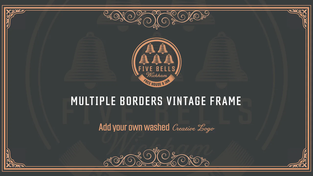
Full Screen Vintage Frame with Multiple Borders
This responsive layout constructs an ornate vintage frame around text using nested concentric borders. The .outer-border, .mid-border, and .inner-border rules stack thin and thick rules with custom paddings. Decorative corner and edge images are placed using position: absolute and flipped using simple scale() transforms.
See the Pen Full Screen Vintage Frame with Multiple Borders.
Cool img Borders With Background
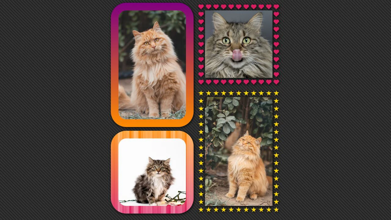
A sophisticated CSS masonry grid featuring mathematically-generated borders and patterns powered by SCSS. This snippet showcases the use of conic and radial gradients to render intricate shapes like stars and hearts within the border-box.
See the Pen Cool img Borders With Background.

Cross-browser Offset Gradient Border From Image Source
A sophisticated CSS image gallery featuring blurred glassmorphism borders achieved through backdrop-filter and advanced CSS masking. This snippet utilizes border-image with dynamic source URLs and mask-composite: exclude to isolate the blur effect to the border area.

CSS-only Wavy Borders
A sophisticated CSS wavy border effect powered by advanced masking and modern math functions like round() and sqrt(). This performance-driven snippet utilizes conic-gradient to create scalable decorative frames.
See the Pen CSS-only Wavy Borders.

CSS Only Infinite Borders
This snippet generates multiple concentric circular borders around images using a single CSS element. The layout calculates padding and gradient offsets mathematically using variables. An intricate repeating-radial-gradient is applied via border-image to loop color and transparent rings, while clip-path keeps the corners rounded.
See the Pen CSS Only Infinite Borders.

Stamp Border
This stylesheet crafts a realistic postage stamp perforated border using nested CSS background gradients. By layering a tiled radial-gradient of transparent circles over a shrunken, solid white linear-gradient, the circles act as edge cutouts. The background-repeat: round rule ensures a seamless fit of scallops on any viewport size.
See the Pen Stamp Border.

Untitled
This stylesheet crafts a sci-fi, angled gaming HUD frame around an image using @layer rules and advanced CSS masking. By combining a layered ::before pseudo-element with clip-path: polygon(), it carves matching chamfered corner cuts. Calculating inset coordinates on the image reveals a clean, thick border outline and a styled title tag.
See the Pen Untitled.

Native Rounded Outline
This typography layout renders a continuous line-by-line outline frame around multi-line text. By configuring the paragraph block as display: inline, the text flows naturally. Applying a solid outline with an outline-offset and border-radius directly onto the inline elements wraps each line fragment in a rounded bubble.
See the Pen Native Rounded Outline.
Travel Website With Inverted border-radius
This clean dashboard grid styles three-column tour cards with custom tabs. The standout design detail is the inverted rounded corners on the .more and .tag labels. These corner notches are built using absolute-positioned pseudo-elements styled with a transparent fill, a border-radius, and a thick solid white box-shadow mask.
See the Pen Travel Website With Inverted border-radius.
Gradient Border
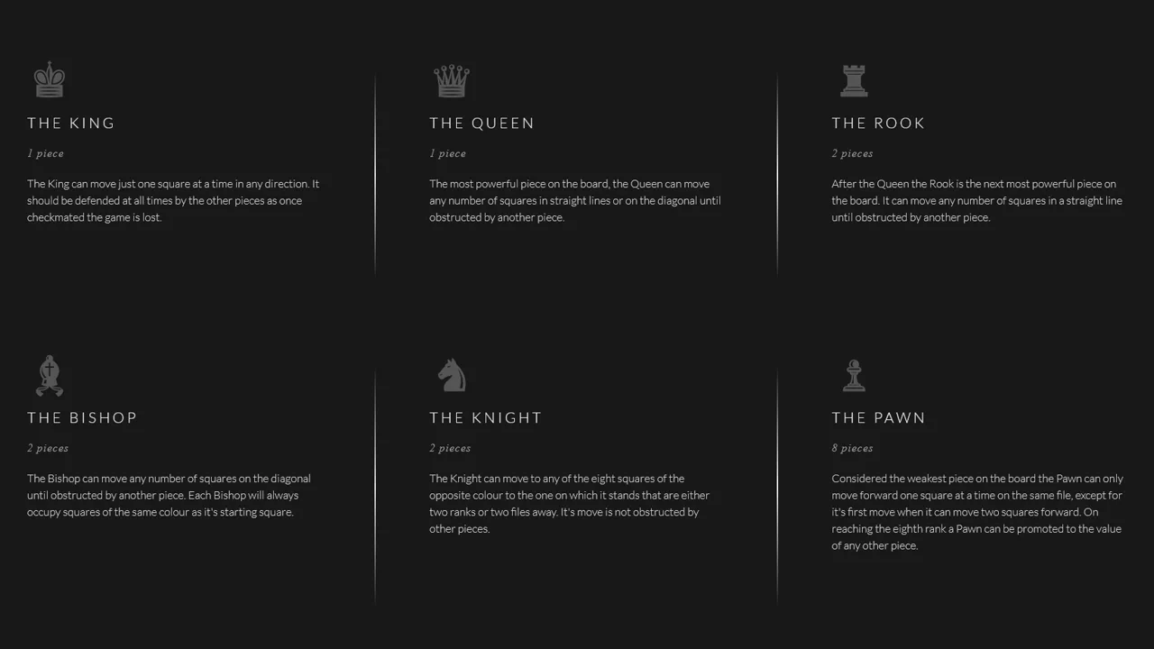
This clean chess dashboard layout arranges text columns with fading vertical dividers using flexbox. By utilizing border-image with a linear gradient, the borders seamlessly fade in from the dark background color (#181818) at the top, peak in brightness at the center, and fade back to the body color at the bottom.
See the Pen Gradient Border.

Multiple Border-Radius Values
This interactive card demonstrates the advanced 8-value elliptical border-radius syntax in CSS. By defining separate horizontal and vertical radius values for each corner (such as 37px 140px), the container gets an organic, hand-drawn, sketch-like silhouette. Upon hover, the skewed card tilts dynamically alongside its labels.
See the Pen Multiple Border-Radius Values.
Offset and XOR Frame: Lively
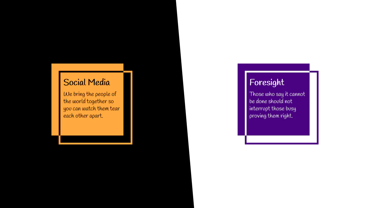
This stylesheet demonstrates a complex geometrical layout built using overlapping blocks and CSS blend modes. The article elements leverage asymmetrical transparent borders and inset box-shadows. By applying mix-blend-mode: difference on the :before pseudo-elements, the intersecting segments render contrasting, hollow outlines.
See the Pen Offset and XOR Frame: Lively.
8-bit Pixel Border
This clean stylesheet styles an interlocking, geometric box frame using absolute-positioned border elements. The top, bottom, left, and right lines are offset outward from the main .box. Tiny 8px square pseudo-elements (::before and ::after) are placed on the horizontal bar tips to mimic a wooden joints mortise-and-tenon look.
See the Pen 8-bit Pixel Border.
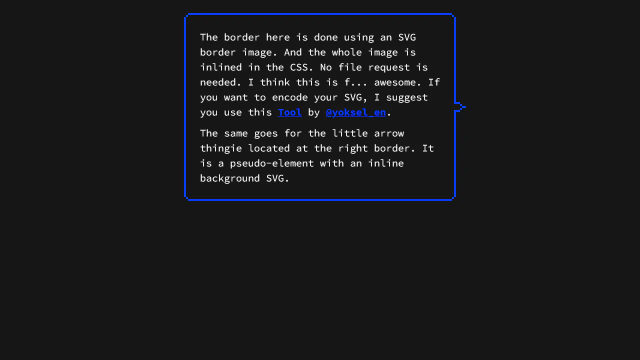
8bit border-image
This stylesheet implements a retro, pixelated border and pointer arrow using zero-request inline vector graphics. By using URL-encoded SVGs inside border-image and background-image declarations, it draws a scalable double-outline frame and custom pointer. This approach scales cleanly without triggering additional HTTP network requests.
See the Pen 8bit border-image.
Avatar Border Effect. 15 Declarations, 1 Element, No Pseudos
This stylesheet crafts a segmented circular border with rounded junctions using pure CSS math and masking. It positions radial-gradient dots at exact quadrant joints (0deg, 90deg, etc.) using trigonometric cos() and sin() functions. An advanced mask with a subtract composite punches out the center, leaving only the outer ring.
Border Linear-Gradient + Border-Radius
This stylesheet styles a clean, layered card layout featuring glowing offset borders and deep shadows. The parent .item uses an absolute-positioned :before layer, scaled slightly larger and filled with an angled pink gradient to mimic a glowing edge. The nested .inner card anchors the design with a soft-focus #FBE4E0 shadow.
See the Pen Border Linear-Gradient + Border-Radius.