40+ CSS Borders: Free Examples & Code Snippets (Page 2)
Examples
Gradient Border Effect
This interactive card grid features glowing borders on hover using pure CSS layering. Each .card has an absolute-positioned :before element with a diagonal yellow gradient. The inner .card-content is slightly inset by 1px to mask the center of the gradient, revealing only a thin, glowing border rim when hovered.
See the Pen Gradient Border Effect.

Partial Gradient Border
This interactive round frame builds a dynamic, progress-style circular border using CSS gradients and masking. The :after pseudo-element maps a two-color conic-gradient cut off by --distance, while a radial-gradient mask punches out the center. Sliders run JS to update the custom property values on input in real-time.
See the Pen Partial Gradient Border.
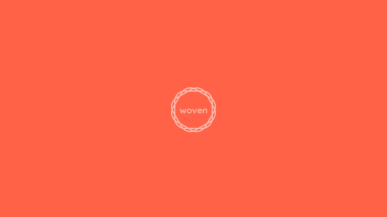
Border-Radius Weave
This stylesheet crafts a geometric, 12-pointed woven star frame around text using layered pseudo-elements. By stacking three identical rounded square boxes — comprising the base .weave class and its :before and :after children — rotated at 0, 30, and 60 degrees, their borders intersect to form a clean, custom mandala emblem.
See the Pen Border-Radius Weave.
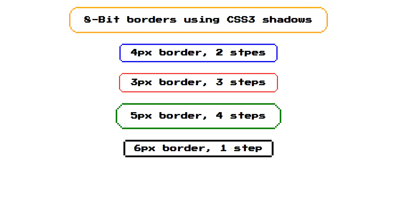
8-bit Borders Using Shadows
These pixelated retro-gaming buttons render scalable, 8-bit corner borders using multiple box-shadow declarations. By layering shadows at precise grid-step offsets (such as double or triple the border width) and coloring inner steps to match the card, they construct blocky, step-down frames on single HTML elements without SVGs.
See the Pen 8-bit Borders Using Shadows.
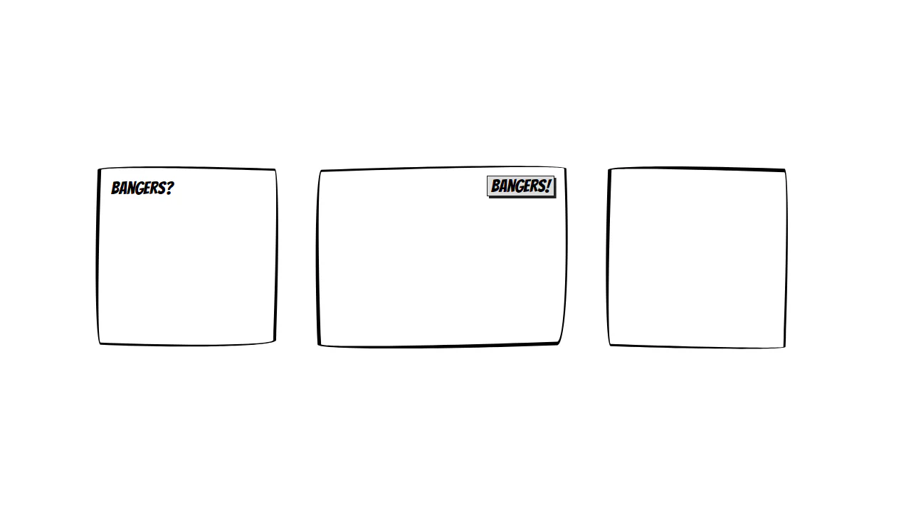
Comic Style Border
This stylesheet crafts a wobbly, hand-drawn comic book border effect using purely native CSS. By pairing asymmetrical border-width sizes with the advanced slash-notation on border-radius (such as 95% 4%... / 4% 95%...), it bends straight borders into organic curves. Opposing rotations on the parent and child realign the text.
See the Pen Comic Style Border.
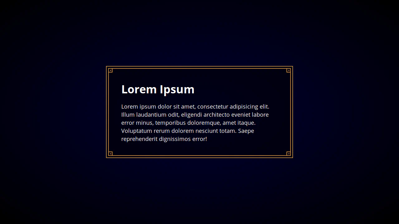
Fancy Border Box
This stylesheet styles a vintage, steam-punk inspired card frame using double borders and decorative rivets. The parent .box and nested .box-inner each use gold borders. By placing absolute-positioned pseudo-elements containing bullet characters (•) inside small borders, it renders matching corner bolts at all four corners.
See the Pen Fancy Border Box.

CSS Gradient Clip-Path Borders
This visual showcase demonstrates a library of CSS clipping shapes with colored, responsive borders. By nesting a slightly smaller .shape-inner image inside a larger gradient-filled .shape-outer block, it reveals an offset border. Applying matching clip-path: polygon() masks to both layers carves clean, vector-style framing.
See the Pen CSS Gradient Clip-Path Borders.

CSS Gradient Rounded Borders
This stylesheet crafts a clean, multi-colored gradient border around circular portraits without extra markup. By assigning a transparent border and setting background-clip to content-box, border-box, it confines the image to the inner boundaries while allowing the underlying background gradient to bleed through the border area.
See the Pen CSS Gradient Rounded Borders.
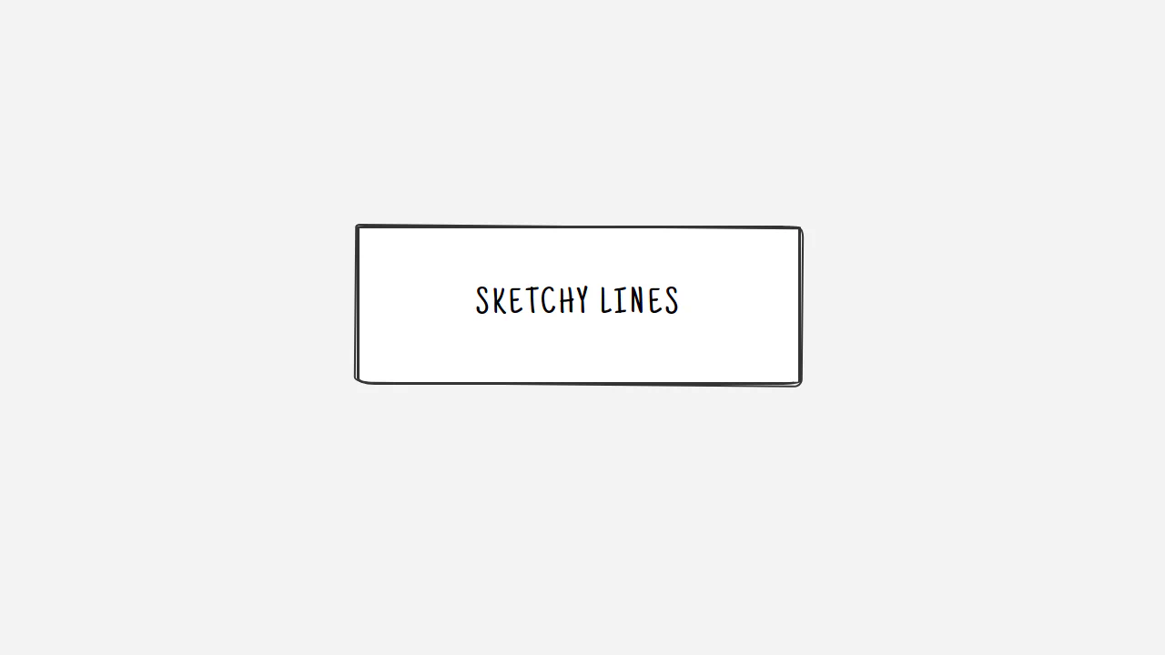
Sketchy Border
This stylesheet crafts a wobbly, double-sketched pencil border effect using pure CSS. By pairing uneven slash-notation border-radius curves with an absolute-positioned :before element, it stacks two borders. The second line is slightly rotated (rotate(0.5deg)) and scaled up to create organic, hand-drawn overlap lines.
See the Pen Sketchy Border.
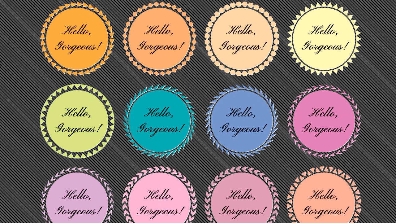
Pure CSS Circular Border Patterns
This visual showcase constructs highly detailed gear-shaped circular badges using pure CSS. By placing an absolute-positioned :after pseudo-element over each card, it maps an inherited background fill. The magic lies in complex, mathematically plotted clip-path: polygon() strings that carve the outer borders into sharp, concentric jagged teeth.
See the Pen Pure CSS Circular Border Patterns.